让数据“动”起来:Python动态图表制作!
- 2026-10-11 06:50:30
让数据“动”起来:Python动态图表制作!关注+星标,每天学习Python新技能 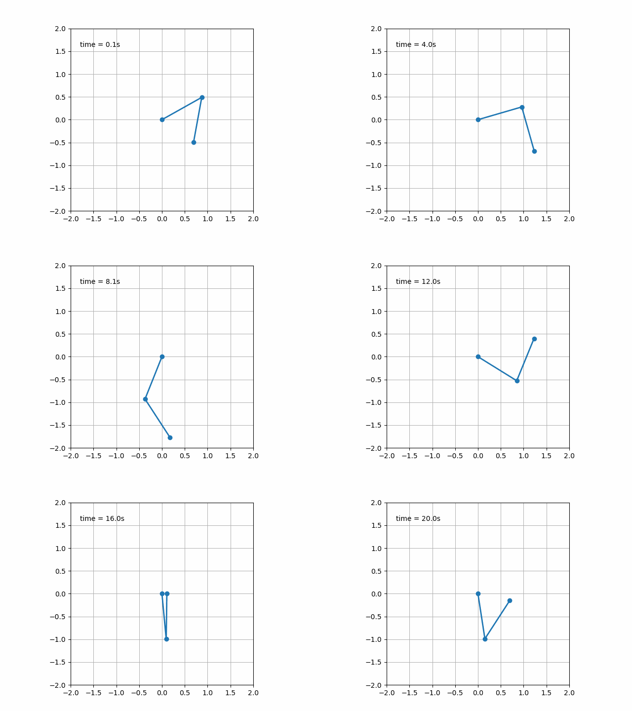
数据暴增的年代,数据科学家、分析师在被要求对数据有更深的理解与分析的同时,还需要将结果有效地传递给他人。如何让目标听众更直观地理解?当然是将数据可视化啊,而且最好是动态可视化。 本文将以线型图、条形图和饼图为例,系统地讲解如何让你的数据图表动起来。 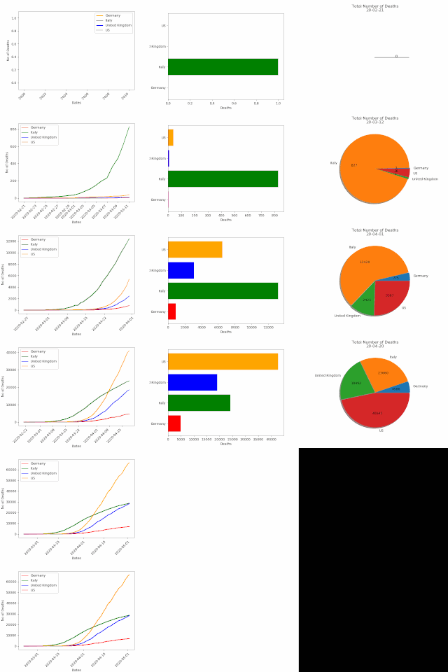
这些动态图表是用什么做的? 接触过数据可视化的同学应该对 Python 里的 Matplotlib 库并不陌生。它是一个基于 Python 的开源数据绘图包,仅需几行代码就可以帮助开发者生成直方图、功率谱、条形图、散点图等。这个库里有个非常实用的扩展包——FuncAnimation,可以让我们的静态图表动起来。 FuncAnimation 是 Matplotlib 库中 Animation 类的一部分,后续会展示多个示例。如果是首次接触,你可以将这个函数简单地理解为一个 While 循环,不停地在 “画布” 上重新绘制目标数据图。 如何使用 FuncAnimation? 这个过程始于以下两行代码: 从中我们可以看到 FuncAnimation 的几个输入: 这是三个关键输入,当然还有更多可选输入,感兴趣的读者可查看原文档,这里不再赘述。 下一步要做的就是将数据图表参数化,从而转换为一个函数,然后将该函数时间序列中的点作为输入,设置完成后就可以正式开始了。 在开始之前依旧需要确认你是否对基本的数据可视化有所了解。也就是说,我们先要将数据进行可视化处理,再进行动态处理。 按照以下代码进行基本调用。另外,这里将采用大型流行病的传播数据作为案例数据(包括每天的死亡人数)。 绘制三种常见动态图表 动态曲线图 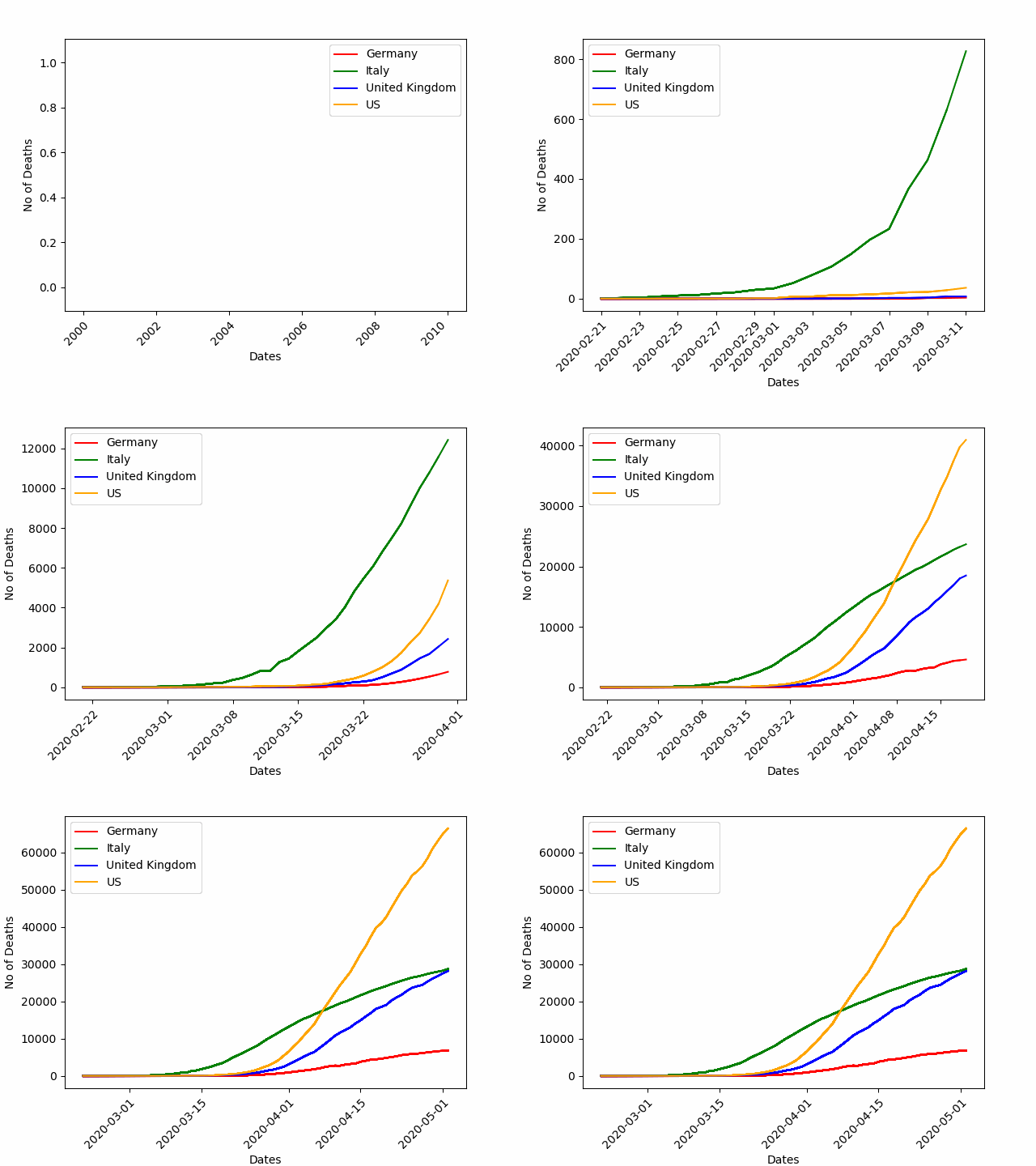
如下所示,首先需要做的第一件事是定义图的各项,这些基础项设定之后就会保持不变。它们包括:创建 figure 对象,x 标和 y 标,设置线条颜色和 figure 边距等: 接下来设置 curve 函数,进而使用 .FuncAnimation 让它动起来: 动态饼状图 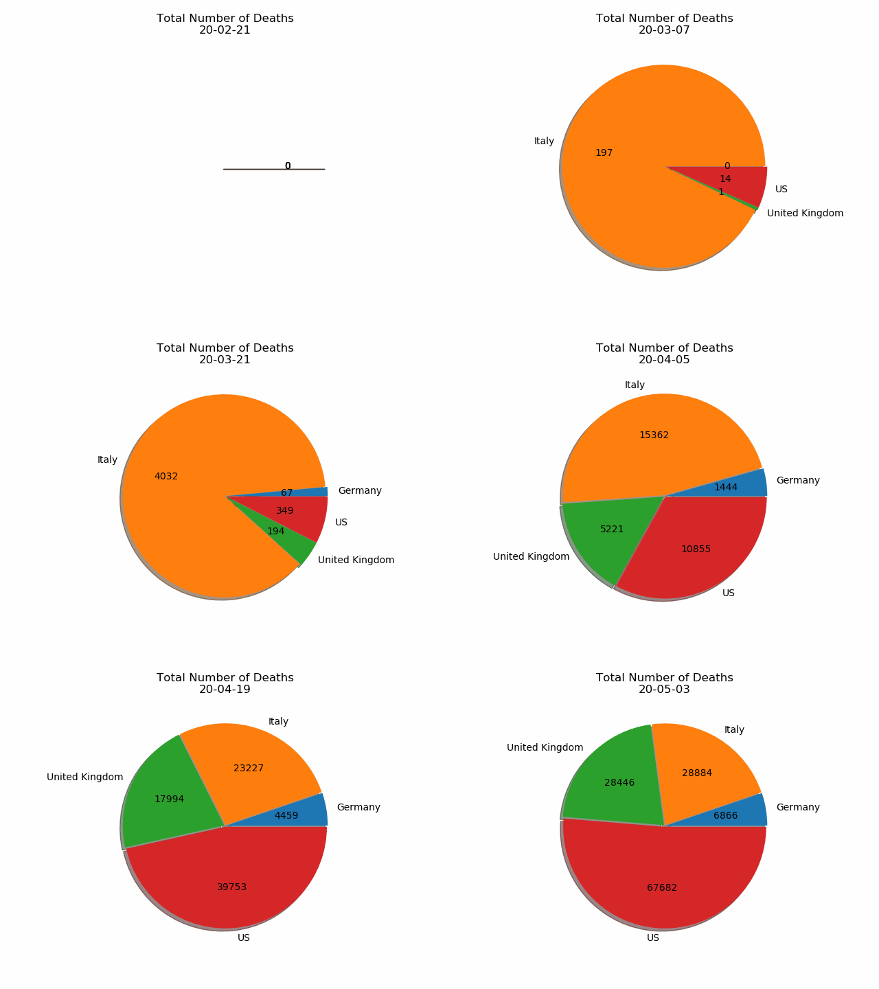
可以观察到,其代码结构看起来与线型图并无太大差异,但依旧有细小的差别。 主要区别在于,动态饼状图的代码每次循环都会返回一组数值,但在线型图中返回的是我们所在点之前的整个时间序列。返回时间序列通过 df1.head(i) 来实现,而. max()则保证了我们仅获得最新的数据,因为流行病导致死亡的总数只有两种变化:维持现有数量或持续上升。 动态条形图 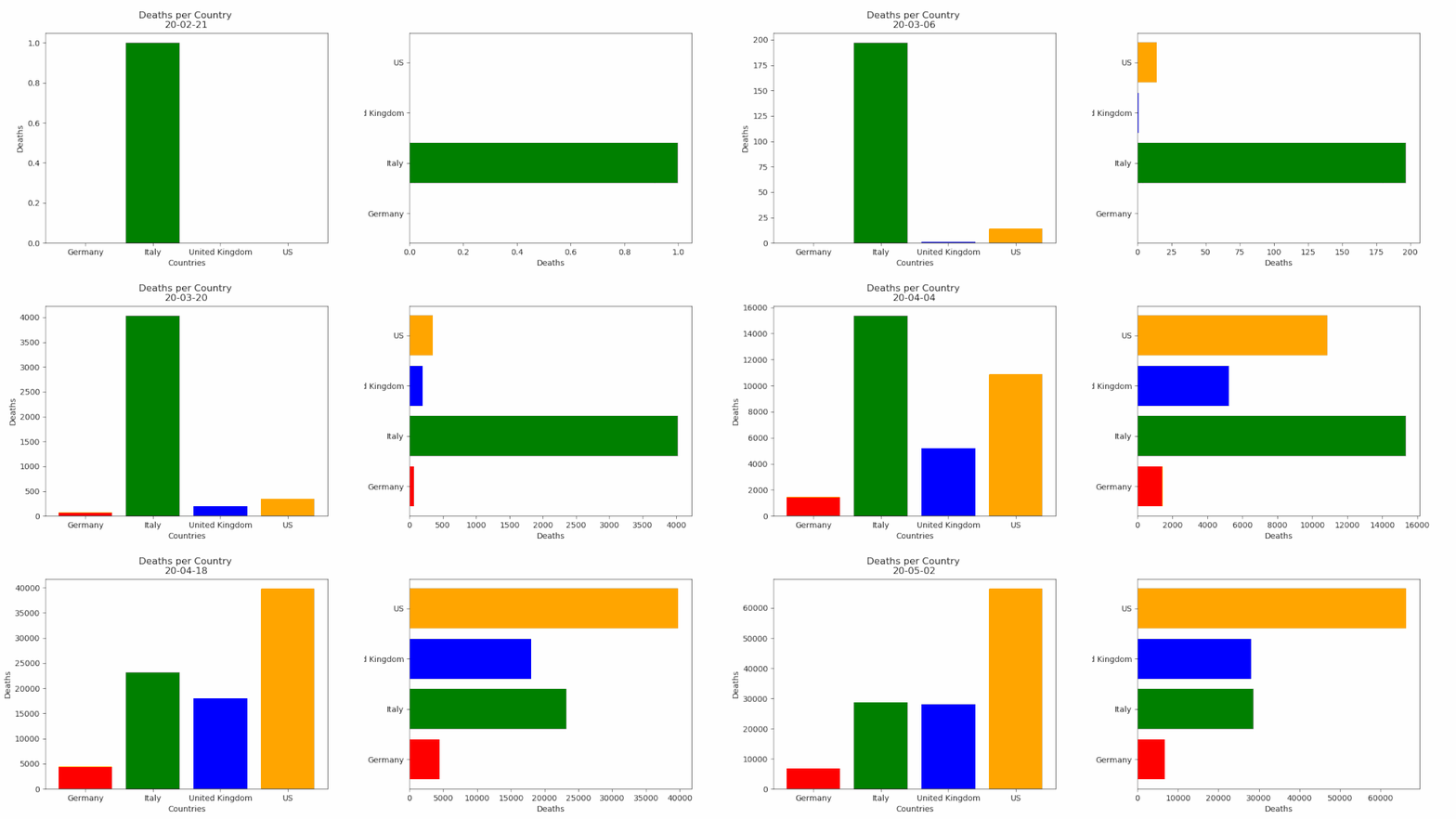
创建动态条形图的难度与上述两个案例并无太大差别。在这个案例中,作者定义了水平和垂直两种条形图,读者可以根据自己的实际需求来选择图表类型并定义变量栏。 保存动画图 在制作完成后,存储这些动态图就非常简单了,可直接使用以下代码: 
来源:网络
在读技术博客的过程中,我们会发现那些能够把知识、成果讲透的博主很多都会做动态图表。他们的图是怎么做的?难度大吗?这篇文章就介绍了 Python 中一种简单的动态图表制作方法。
import matplotlib.animation as anianimator = ani.FuncAnimation(fig, chartfunc, interval = 100)fig 是用来 「绘制图表」的 figure 对象;
chartfunc 是一个以数字为输入的函数,其含义为时间序列上的时间;
interval 这个更好理解,是帧之间的间隔延迟,以毫秒为单位,默认值为 200。
import matplotlib.animation as aniimport matplotlib.pyplot as pltimport numpy as npimport pandas as pdurl = 'https://raw.githubusercontent.com/CSSEGISandData/COVID-19/master/csse_covid_19_data/csse_covid_19_time_series/time_series_covid19_deaths_global.csv'df = pd.read_csv(url, delimiter=',', header='infer')df_interest = df.loc[ df['Country/Region'].isin(['United Kingdom', 'US', 'Italy', 'Germany']) & df['Province/State'].isna()]df_interest.rename( index=lambda x: df_interest.at[x, 'Country/Region'], inplace=True)df1 = df_interest.transpose()df1 = df1.drop(['Province/State', 'Country/Region', 'Lat', 'Long'])df1 = df1.loc[(df1 != 0).any(1)]df1.index = pd.to_datetime(df1.index)import numpy as npimport matplotlib.pyplot as pltcolor = ['red', 'green', 'blue', 'orange']fig = plt.figure()plt.xticks(rotation=45, ha="right", rotation_mode="anchor") #rotate the x-axis valuesplt.subplots_adjust(bottom = 0.2, top = 0.9) #ensuring the dates (on the x-axis) fit in the screenplt.ylabel('No of Deaths')plt.xlabel('Dates')defbuildmebarchart(i=int): plt.legend(df1.columns) p = plt.plot(df1[:i].index, df1[:i].values) #note it only returns the dataset, up to the point ifor i in range(0,4): p[i].set_color(color[i]) #set the colour of each curveimport matplotlib.animation as anianimator = ani.FuncAnimation(fig, buildmebarchart, interval = 100)plt.show()import numpy as npimport matplotlib.pyplot as pltfig,ax = plt.subplots()explode=[0.01,0.01,0.01,0.01] #pop out each slice from the piedef getmepie(i):defabsolute_value(val):#turn % back to a number a = np.round(val/100.*df1.head(i).max().sum(), 0)return int(a) ax.clear() plot = df1.head(i).max().plot.pie(y=df1.columns,autopct=absolute_value, label='',explode = explode, shadow = True) plot.set_title('Total Number of Deaths\n' + str(df1.index[min( i, len(df1.index)-1 )].strftime('%y-%m-%d')), fontsize=12)import matplotlib.animation as anianimator = ani.FuncAnimation(fig, getmepie, interval = 200)plt.show()df1.head(i).max()fig = plt.figure()bar = ''def buildmebarchart(i=int): iv = min(i, len(df1.index)-1) #the loop iterates an extra one time, which causes the dataframes to go out of bounds. This was the easiest (most lazy) way to solve this :) objects = df1.max().index y_pos = np.arange(len(objects)) performance = df1.iloc[[iv]].values.tolist()[0]if bar == 'vertical': plt.bar(y_pos, performance, align='center', color=['red', 'green', 'blue', 'orange']) plt.xticks(y_pos, objects) plt.ylabel('Deaths') plt.xlabel('Countries') plt.title('Deaths per Country \n' + str(df1.index[iv].strftime('%y-%m-%d')))else: plt.barh(y_pos, performance, align='center', color=['red', 'green', 'blue', 'orange']) plt.yticks(y_pos, objects) plt.xlabel('Deaths') plt.ylabel('Countries')animator = ani.FuncAnimation(fig, buildmebarchart, interval=100)plt.show()animator.save(r'C:\temp\myfirstAnimation.gif')长按或扫描下方二维码,免费获取 Python公开课和大佬打包整理的几百G的学习资料,内容包含但不限于Python电子书、教程、项目接单、源码等等
▲扫描二维码-免费领取

推荐阅读
点击 阅读原文了解更多
本文来自网友投稿或网络内容,如有侵犯您的权益请联系我们删除,联系邮箱:596563534@qq.com 。
