python数据可视化技巧的100个练习 -- 49. 绘制线性回归图
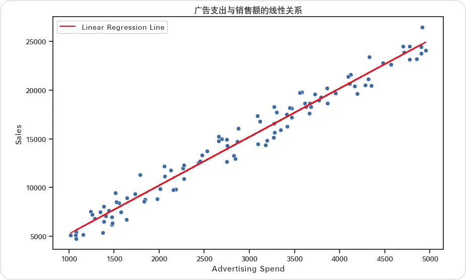
你是一家零售公司的数据分析师。公司希望了解广告支出与销售额之间的关系。你的任务是创建给定数据的散点图,并拟合一条线性回归线以可视化这种关系。在代码中生成数据,创建图表并显示它。使用 Python 的数据处理和可视化库来实现。【数据生成代码示例】
import numpy as npimport pandas as pd# 生成样本数据np.random.seed(0)advertising_spend = np.random.uniform(1000, 5000, 100)sales = 5 * advertising_spend + np.random.normal(0, 1000, 100)# 创建 DataFramedata = pd.DataFrame({'Advertising Spend': advertising_spend, 'Sales': sales})
【图表答案】
【代码答案】
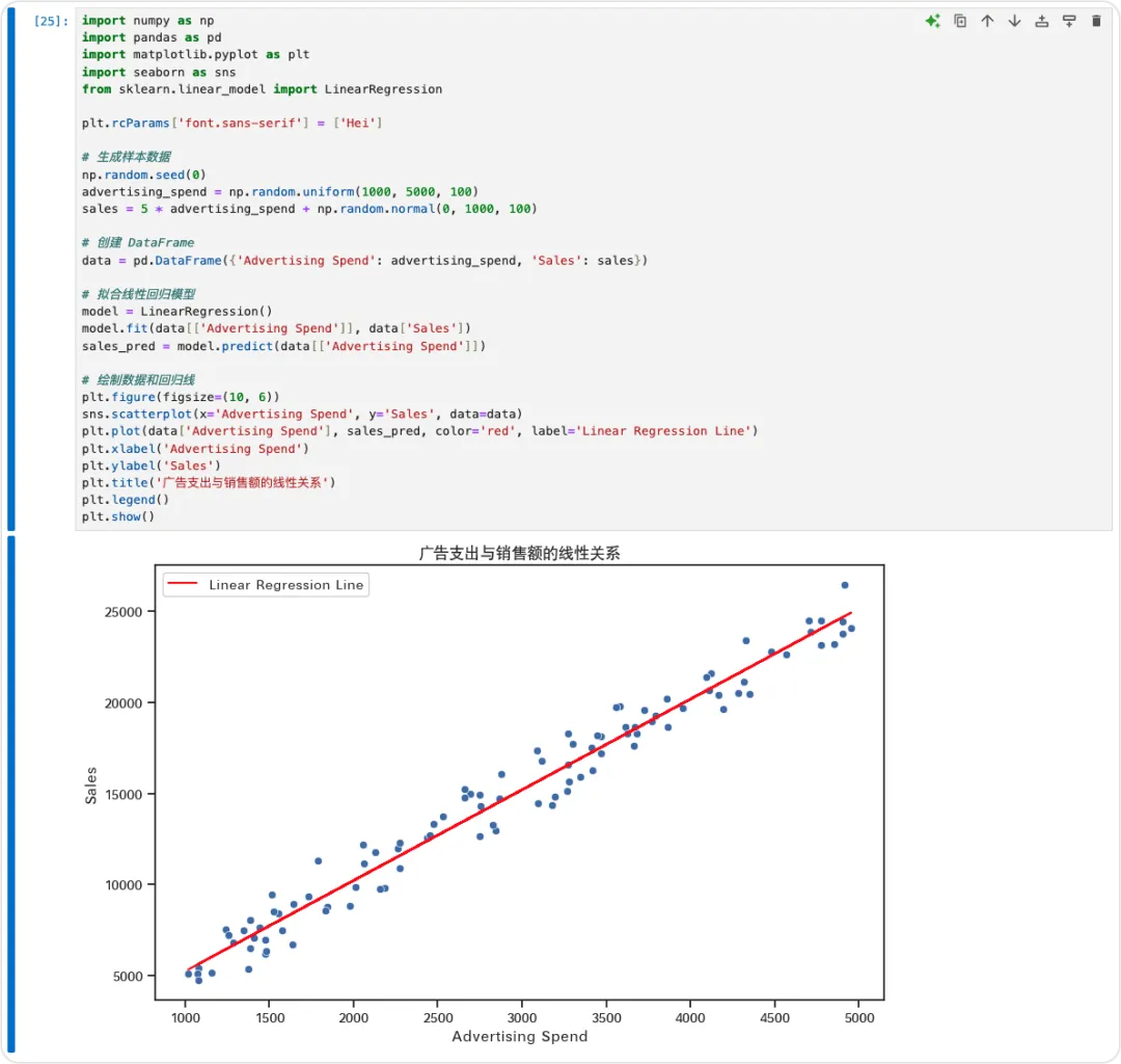
import numpy as npimport pandas as pdimport matplotlib.pyplot as pltimport seaborn as snsfrom sklearn.linear_model import LinearRegression# 生成样本数据np.random.seed(0)advertising_spend = np.random.uniform(1000, 5000, 100)sales = 5 * advertising_spend + np.random.normal(0, 1000, 100)# 创建 DataFramedata = pd.DataFrame({'Advertising Spend': advertising_spend, 'Sales': sales})# 拟合线性回归模型model = LinearRegression()model.fit(data[['Advertising Spend']], data['Sales'])sales_pred = model.predict(data[['Advertising Spend']])# 绘制数据和回归线plt.figure(figsize=(10, 6))sns.scatterplot(x='Advertising Spend', y='Sales', data=data)plt.plot(data['Advertising Spend'], sales_pred, color='red', label='Linear Regression Line')plt.xlabel('Advertising Spend')plt.ylabel('Sales')plt.title('广告支出与销售额的线性关系')plt.legend()plt.show()
首先,我们导入必要的库:numpy、pandas、matplotlib、seaborn 和 sklearn。numpy 用于数值运算,pandas 用于数据处理,matplotlib 和 seaborn 用于绘图,sklearn 用于线性回归模型。我们使用 numpy 的 uniform 函数生成广告支出的随机数据,创建了 100 个介于 1000 和 5000 之间的数据点。为了模拟销售数据,我们假设销售额是广告支出的五倍加上一些随机噪声。这种噪声是通过 numpy 的 normal 函数添加的,使数据更接近现实。我们将生成的数据存储在 pandas DataFrame 中,以便于操作和绘图。接下来,我们使用 sklearn 的 LinearRegression 类拟合线性回归模型。我们以广告支出作为自变量,销售额作为因变量来训练模型。对于可视化,我们使用 seaborn 的 scatterplot 函数绘制广告支出与销售额的散点图。我们还使用 matplotlib 的 plot 函数绘制回归线,将 x 值设置为广告支出,y 值设置为预测的销售额。为了清晰起见,我们添加了标签和标题,并使用图例区分数据点和回归线。【小知识】
它假设输入变量(自变量)与单个输出变量(因变量)之间存在线性关系。目标是找到最适合数据的直线,最小化观测值与预测值之间平方差的总和。这种方法具有高度的可解释性,使其在经济学、生物学和社会科学等各个领域中,对于理解变量之间的关系具有重要价值。
系列完整内容可以在公众号主页搜索或点击分栏找到,欢迎扫码关注预防迷路找不到。感谢您的支持与相伴。

 10个月宝宝每天需要喝多少奶粉?