期刊图片复现|Python绘制XGBoost+SHAP的特征重要性条形-玫瑰组合图
- 2026-06-27 01:45:51
期刊图片复现|Python绘制XGBoost+SHAP的特征重要性条形-玫瑰组合图

论文:The new perspective of future multi-scenario analysis: Decoding impact pathways of land use dynamics on sustainable development goals 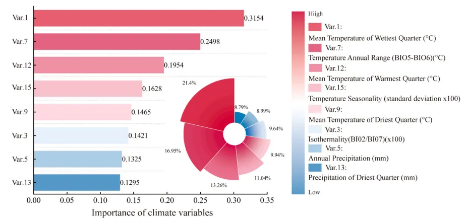
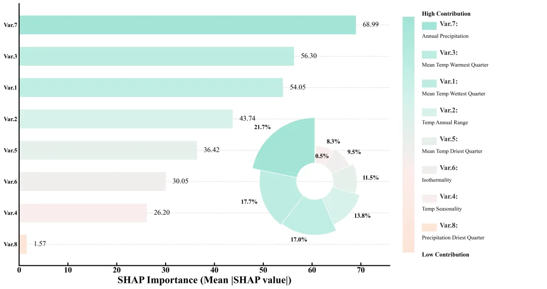
论文原图 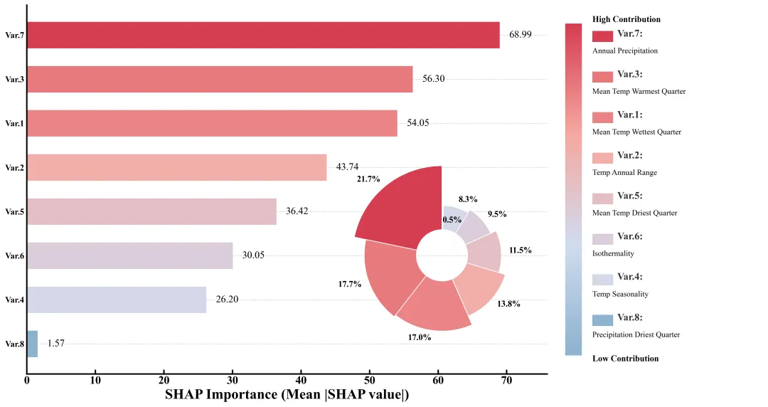
仿图 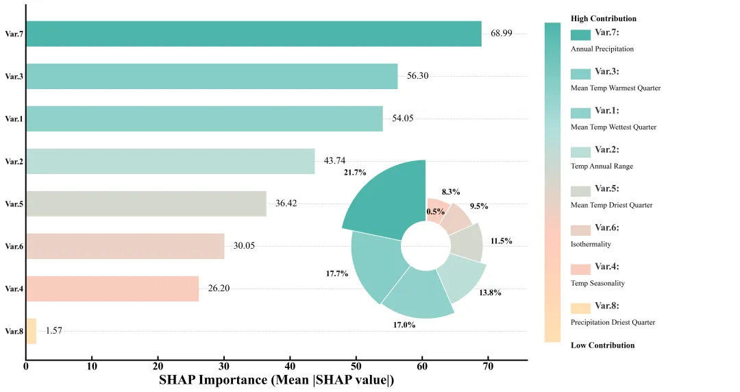
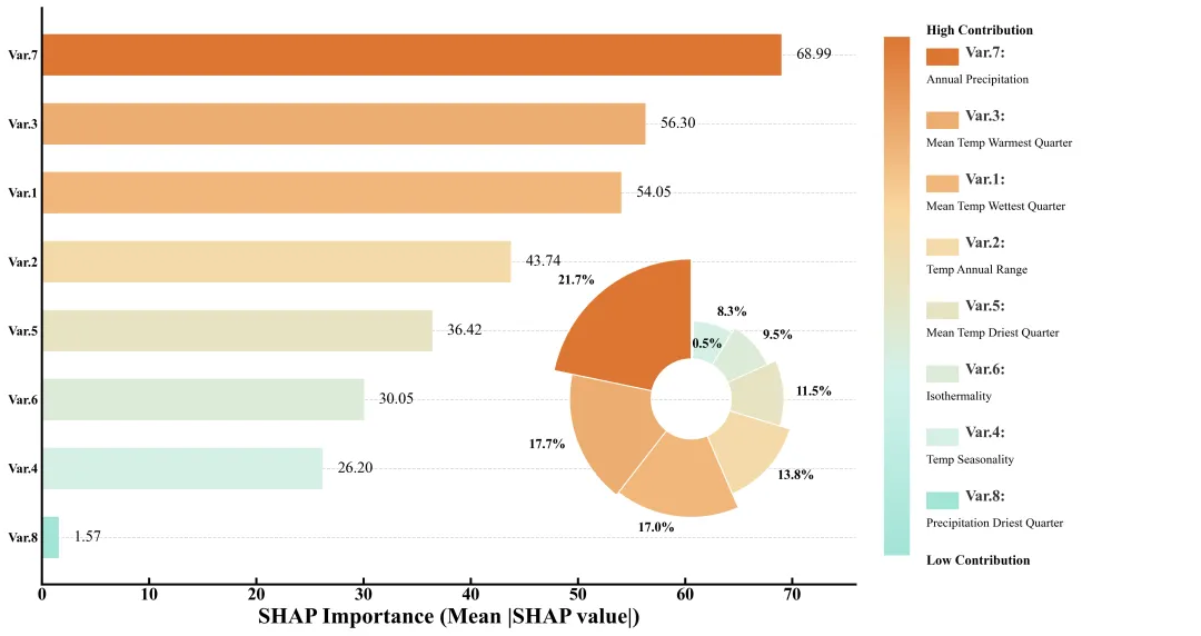
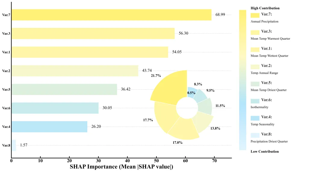
多种配色 


库的导入以及字体设置 

颜色库的设置以及配色方案的选择 

绘图函数:数据准备与画布设置 

绘图函数:背景网格线绘制,条形图绘制,shap值标注 

绘图函数:内嵌的南丁格尔玫瑰图绘制,在条形图的空白区域插入一个新的坐标系,设置为极坐标,用于绘制玫瑰图。扇形的宽度由特征的重要性占比决定。扇形的半径由SHAP 值决定。在扇形外侧标记百分比数值。关闭极坐标系的轴线和刻度,只保留图形本身。 

绘图函数:绘制右侧图例区域,调整刻度线。 

执行部分,负责数据处理、模型训练、SHAP分析和调用绘图函数。包括读取数据,将数据划分为训练集和测试集。初始化 XGBoost 回归器。定义超参数搜索空间。进行随机搜索和交叉验证,找到最好的模型参数。使用


期刊图片复现|Python绘制二维偏依赖PDP图 期刊复现|python绘制基于SHAP分析和GAM模型拟合的单特征依赖图 期刊图片复现|python绘制带有渐变颜色shap特征重要性组合图(条形图+蜂巢图) 期刊复现|用Python绘制SHAP特征重要性总览图、依赖图、双特征交互效应SHAP图,解锁XGBoost模型的终极奥秘 期刊图片复现|Python绘制shap重要性蜂巢图+单特征依赖图+交互效应强度气泡图+交互效应依赖图(回归+二分类+分类) 

公众号中的所有所有的免费代码都已经下架了,都并入到付费部分里了,付费合集代码和数据的购买通道已经开通,全部合集100元,后续将会持续更新,决定购买请后台私信我,注意只会分享练习数据和代码文件,不会提供答疑服务,代码文件中已经包含了每行代码的完整注释,购买前请确保真的需要!!!
代码绘制成果展示
代码解释
第一部分
# =========================================================================================# ====================================== 1. 环境设置 =======================================# =========================================================================================import matplotlib.pyplot as pltimport matplotlib.patches as patchesimport matplotlib.colors as mcolorsimport numpy as npimport pandas as pdimport osfrom xgboost import XGBRegressorfrom sklearn.model_selection import train_test_split, RandomizedSearchCV
第二部分
# =========================================================================================# ======================================2.颜色库=======================================# =========================================================================================COLOR_SCHEMES = {1: ["#8CB2CF", "#D0DCEF", "#F6A8A1", "#D63E51"],}scheme_id = 40 #选用的配色方案colors_list = COLOR_SCHEMES.get(scheme_id, COLOR_SCHEMES[1]) #获取颜色
第三部分
# =========================================================================================# ======================================3.绘图函数=======================================# =========================================================================================def draw_climate_importance_chart(data):ids = [d["id"] for d in data] #提取IDvalues = [d["val"] for d in data] #提取SHAP值pcts = [d["pct"] for d in data] #提取百分比custom_cmap = mcolors.LinearSegmentedColormap.from_list("custom_theme", colors_list) #创建自定义渐变色norm = mcolors.Normalize(vmin=min(values), vmax=max(values)) #创建颜色归一化对象colors = [custom_cmap(norm(v)) for v in values] #根据每个值生成对应的颜色#创建画布fig = plt.figure(figsize=(15, 8), facecolor='white')# 创建网格布局gs = fig.add_gridspec(1, #行2,#列width_ratios=[3, 1.2])#比例ax_bar = fig.add_subplot(gs[0]) #第一个,用于条形图ax_legend = fig.add_subplot(gs[1]) #第二个,用于自定义图例y_pos = np.arange(len(ids)) #生成Y轴的位置索引数组
第四部分
#网格线ax_bar.grid(axis='y', #Y轴linestyle='--', #样式alpha=0.5, #透明度zorder=0) #层级#水平条形图bars = ax_bar.barh(y_pos, #位置values, # 宽度color=colors, #颜色height=0.6, #高度align='center', #对齐zorder=2) #层级#刻度参数ax_bar.tick_params(direction='in', top=False, right=False)ax_bar.invert_yaxis() #反转Y轴ax_bar.set_yticks(y_pos) #Y轴刻度位置ax_bar.set_yticklabels(ids, fontsize=12) #Y轴刻度标签#x轴标题ax_bar.set_xlabel('SHAP Importance (Mean |SHAP value|)',fontsize=20,fontweight='bold')ax_bar.set_xlim(0, max(values) * 1.1) #X轴范围#隐藏边框ax_bar.spines['top'].set_visible(False)ax_bar.spines['right'].set_visible(False)
第五部分
#极坐标图位置rect = [0.4,#左0.15,#下0.35,#宽0.45] #高ax_rose = fig.add_axes(rect, polar=True) #添加子图# 根据百分比计算每个扇形的弧度宽度widths = [p / 100 * 2 * np.pi for p in pcts]starts = np.cumsum([0] + widths[:-1]) #每个扇形的起始角度#遍历每个扇形参数以添加标签for angle, height, width, pct in zip(starts, heights, widths, pcts):label_angle = angle + width / 2 #标签的角度位置label_r = bottom + height + 0.12 #径向位置rot_angle = np.degrees(label_angle) % 360 #将弧度转换为角度#文本水平对齐方式alignment_h = 'left' if (rot_angle < 90 or rot_angle > 270) else 'right'#添加文本ax_rose.text(label_angle, #角度位置label_r, #半径f"{pct:.1f}%", #文本内容ha=alignment_h, #水平对齐va='center', #垂直对齐fontsize=12, #大小fontweight='bold') #加粗ax_rose.set_axis_off() #隐藏坐标轴及其刻度
第六部分
ax_legend.axis('off') #关闭右侧图例区域的坐标轴显示# 生成渐变数据gradient = np.linspace(1, 0, 256).reshape(-1, 1)#颜色条坐标轴ax_cbar = ax_legend.inset_axes([0.05, 0.05, 0.08, 0.9])ax_cbar.imshow(gradient, aspect='auto', cmap=custom_cmap) #绘制颜色条ax_cbar.axis('off') #隐藏颜色条的坐标轴#设置所有边框for spine in ax_bar.spines.values():spine.set_linewidth(2.0) #设置线宽ax_bar.set_yticks(y_pos)ax_bar.set_yticklabels(ids, fontsize=12)#标注字体加粗plt.setp(ax_bar.get_yticklabels(), fontweight='bold')plt.setp(ax_bar.get_xticklabels(), fontweight='bold')#颜色条高低值文本ax_legend.text(0.18, #X0.96, #Y"High Contribution", #内容fontsize=12, #大小va='center', #垂直居中fontweight='bold') #加粗ax_legend.text(0.18, #X0.04, #Y"Low Contribution", #内容fontsize=12, #大小va='center', #垂直居中fontweight='bold') #加粗
第七部分
执行部分,负责数据处理、模型训练、SHAP分析和调用绘图函数。包括读取数据,将数据划分为训练集和测试集。初始化 XGBoost 回归器。定义超参数搜索空间。进行随机搜索和交叉验证,找到最好的模型参数。使用shap解释训练好的XGBoost模型,计算测试集SHAP值。计算全局特征重要性。计算每个特征的重要性占比。构建列表,包含特征的 ID、数值、百分比和原始名称。按 SHAP 值从大到小对数据进行排序。调用之前定义的函数,传入处理好的数据进行绘图。
# =========================================================================================# ======================================4.执行部分=======================================# =========================================================================================if __name__ == "__main__":input_file = r"Data.xlsx" #输入文件路径df = pd.read_excel(input_file) #读取X = df.iloc[:, :-1] #提取特征y = df.iloc[:, -1] #提取目标feature_names = X.columns.tolist() #获取特征名称# 划分训练集和测试集X_train, X_test, y_train, y_test = train_test_split(X, y, test_size=0.2, random_state=42)xgb = XGBRegressor(random_state=42) #初始化XGBoost#超参数param_dist = { # 定义超参数搜索空间'n_estimators': [100, 200, 300, 400, 500],'max_depth': [3, 4, 5, 6, 8],'learning_rate': [0.01, 0.05, 0.1, 0.2],}search = RandomizedSearchCV(xgb, param_dist, n_iter=5, cv=3, random_state=42) #初始化随机搜索search.fit(X_train, y_train) #拟合best_model = search.best_estimator_ #最佳模型explainer = shap.TreeExplainer(best_model) #解释最佳模型shap_values = explainer.shap_values(X_test) #计算测试集的SHAP值mean_shap = np.abs(shap_values).mean(axis=0) #绝对值平均值total_importance = np.sum(mean_shap) #总重要性analysis_data = [] #初始化分析数据列表for i in range(len(feature_names)): # 遍历每个特征analysis_data.append({"id": f"Var.{i + 1}", #ID"val": mean_shap[i], #SHAP平均值"pct": (mean_shap[i] / total_importance) * 100, #百分比"desc": feature_names[i] #特征名称})analysis_data = sorted(analysis_data, key=lambda x: x['val'], reverse=True) #根据SHAP值大小排序# 调用函数draw_climate_importance_chart(analysis_data)
如何应用到你自己的数据
1.设置要使用的配色方案:
scheme_id = 40 #选用的配色方案2.设置绘图结果的保存路径:
plt.savefig(fr"\{scheme_id}.png", dpi=300, bbox_inches='tight')3.设置原始数据的路径:
input_file = r"Data.xlsx" #输入文件路径4.分类特征数据以及目标数据:
X = df.iloc[:, :-1] #提取特征y = df.iloc[:, -1] #提取目标
5.设置超参数:
param_dist = {'n_estimators': [100, 200, 300, 400, 500],'max_depth': [3, 4, 5, 6, 8],'learning_rate': [0.01, 0.05, 0.1, 0.2],}
推荐
获取方式
本文来自网友投稿或网络内容,如有侵犯您的权益请联系我们删除,联系邮箱:wyl860211@qq.com 。

