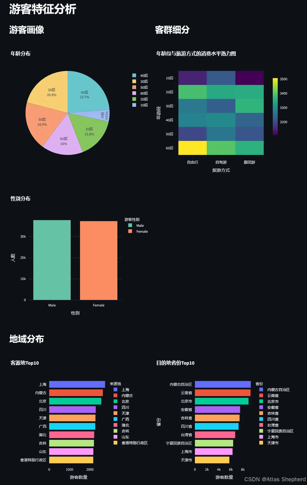
import pandas as pdimport numpy as npimport streamlit as stimport plotly.express as pximport plotly.graph_objects as gofrom plotly.subplots import make_subplotsimport plotly.figure_factory as fffrom sklearn.cluster import KMeansfrom sklearn.preprocessing import StandardScalerfrom sklearn.linear_model import LinearRegressionfrom sklearn.ensemble import RandomForestClassifierfrom sklearn.model_selection import train_test_splitfrom sklearn.metrics import classification_reportimport warningswarnings.filterwarnings('ignore')# 页面配置st.set_page_config( page_title="旅游数据多维度分析平台", page_icon="🏔️", layout="wide", initial_sidebar_state="expanded")# 自定义CSSst.markdown("""<style> .main-title { font-size: 2.5rem; font-weight: bold; color: #1f77b4; text-align: center; margin-bottom: 1rem; } .metric-card { background: linear-gradient(135deg, #667eea 0%, #764ba2 100%); padding: 1rem; border-radius: 10px; color: white; text-align: center; } .stMetric { background-color: #f0f2f6; padding: 1rem; border-radius: 10px; }</style>""", unsafe_allow_html=True)# 标题st.markdown('<p class="main-title">🏔️ 旅游数据多维度分析平台</p>', unsafe_allow_html=True)st.markdown("---")# 加载数据@st.cache_datadef load_data(): df = pd.read_csv('dataset.csv') # 转换日期 df['游玩日期'] = pd.to_datetime(df['游玩日期']) df['年月'] = pd.to_datetime(df['年月'], format='%y-%b', errors='coerce') return dfdf = load_data()# 侧边栏筛选st.sidebar.header("📊 数据筛选")selected_year = st.sidebar.multiselect("选择年份", sorted(df['年份'].unique()), default=sorted(df['年份'].unique()))selected_month = st.sidebar.multiselect("选择月份", sorted(df['月份'].unique()), default=sorted(df['月份'].unique()))selected_province = st.sidebar.multiselect("选择省份", sorted(df['省份'].unique()), default=sorted(df['省份'].unique())[:10])# 应用筛选df_filtered = df[ (df['年份'].isin(selected_year)) & (df['月份'].isin(selected_month)) & (df['省份'].isin(selected_province))]# 顶部指标卡col1, col2, col3, col4 = st.columns(4)with col1: st.metric("总游客数", f"{df_filtered['游客编号'].nunique():,}")with col2: st.metric("总消费金额", f"¥{df_filtered['消费金额(元)'].sum():,.0f}")with col3: st.metric("平均满意度", f"{df_filtered['满意度评分'].mean():.2f}")with col4: st.metric("热门景点数", f"{df_filtered['景点名称'].nunique():,}")st.markdown("---")# 选项卡tab1, tab2, tab3, tab4, tab5, tab6, tab7 = st.tabs([ "👥 游客特征", "💰 消费行为", "🏛️ 景点分析", "📅 时间维度", "😊 满意度分析", "🤖 高级模型", "🗺️ 可视化"])# ==================== 选项卡1: 游客特征分析 ====================with tab1: st.header("游客特征分析") col1, col2 = st.columns(2) with col1: st.subheader("游客画像") # 年龄分布 fig_age = px.pie( df_filtered, values='游客编号', names='年龄段', title='年龄分布', color_discrete_sequence=px.colors.qualitative.Pastel ) fig_age.update_traces(textposition='inside', textinfo='percent+label') st.plotly_chart(fig_age, use_container_width=True) # 性别分布 gender_data = df_filtered['游客性别'].value_counts().reset_index() gender_data.columns = ['游客性别', 'count'] fig_gender = px.bar( gender_data, x='游客性别', y='count', title='性别分布', color='游客性别', color_discrete_sequence=px.colors.qualitative.Set2 ) fig_gender.update_layout(xaxis_title="性别", yaxis_title="人数") st.plotly_chart(fig_gender, use_container_width=True) with col2: st.subheader("客群细分") # 年龄段+旅游方式+消费金额热力图 heatmap_data = df_filtered.groupby(['年龄段', '旅游方式'])['消费金额(元)'].mean().reset_index() heatmap_pivot = heatmap_data.pivot(index='年龄段', columns='旅游方式', values='消费金额(元)') fig_heatmap = px.imshow( heatmap_pivot, title='年龄段与旅游方式的消费水平热力图', color_continuous_scale='Viridis', aspect="auto" ) st.plotly_chart(fig_heatmap, use_container_width=True) # 地域分布 st.subheader("地域分布") col1, col2 = st.columns(2) with col1: # 客源地Top10 source_top10 = df_filtered['来源地'].value_counts().head(10).reset_index() source_top10.columns = ['来源地', 'count'] fig_source = px.bar( source_top10, x='count', y='来源地', orientation='h', title='客源地Top10', color='来源地', color_discrete_sequence=px.colors.qualitative.Plotly ) fig_source.update_layout(yaxis_title="", xaxis_title="游客数量") st.plotly_chart(fig_source, use_container_width=True) with col2: # 目的地省份Top10 province_top10 = df_filtered['省份'].value_counts().head(10).reset_index() province_top10.columns = ['省份', 'count'] fig_province = px.bar( province_top10, x='count', y='省份', title='目的地省份Top10', color='省份', color_discrete_sequence=px.colors.qualitative.Plotly ) fig_province.update_layout(xaxis_title="游客数量", yaxis_title="省份") st.plotly_chart(fig_province, use_container_width=True)# ==================== 选项卡2: 消费行为分析 ====================with tab2: st.header("消费行为分析") col1, col2 = st.columns(2) with col1: st.subheader("消费水平分析") # 消费金额分布 fig_spending_dist = px.histogram( df_filtered, x='消费金额(元)', nbins=50, title='消费金额分布', color_discrete_sequence=['#1f77b4'] ) st.plotly_chart(fig_spending_dist, use_container_width=True) # 消费统计 st.markdown("### 消费统计") stats_data = { '指标': ['平均消费', '中位数消费', '最高消费', '最低消费'], '金额': [ f"¥{df_filtered['消费金额(元)'].mean():,.2f}", f"¥{df_filtered['消费金额(元)'].median():,.2f}", f"¥{df_filtered['消费金额(元)'].max():,.2f}", f"¥{df_filtered['消费金额(元)'].min():,.2f}" ] } st.table(pd.DataFrame(stats_data)) with col2: st.subheader("消费影响因素") # 性别与消费 fig_gender_spending = px.box( df_filtered, x='游客性别', y='消费金额(元)', title='性别与消费金额关系', color='游客性别' ) st.plotly_chart(fig_gender_spending, use_container_width=True) # 旅游方式与消费 fig_travel_spending = px.box( df_filtered, x='旅游方式', y='消费金额(元)', title='旅游方式与消费金额关系', color='旅游方式' ) st.plotly_chart(fig_travel_spending, use_container_width=True) # 价格敏感度分析 st.subheader("价格敏感度分析") price_sensitivity = df_filtered.groupby('景点类型').agg({ '景点门票价格(元)': 'mean', '消费金额(元)': 'mean', '满意度评分': 'mean' }).reset_index() fig_price = px.scatter( price_sensitivity, x='景点门票价格(元)', y='消费金额(元)', size='满意度评分', hover_name='景点类型', title='门票价格与消费金额关系(气泡大小表示满意度)', size_max=50, color='满意度评分', color_continuous_scale='RdYlGn' ) st.plotly_chart(fig_price, use_container_width=True)# ==================== 选项卡3: 景点/景区分析 ====================with tab3: st.header("景点/景区分析") col1, col2 = st.columns(2) with col1: st.subheader("热门景点Top20") scenic_top20 = df_filtered.groupby('景点名称').agg({ '景点数量': 'count', '景区销量': 'first', '满意度评分': 'mean' }).sort_values('景点数量', ascending=False).head(20).reset_index() fig_scenic = px.bar( scenic_top20, x='景点数量', y='景点名称', orientation='h', title='热门景点Top20(按游客量)', color='满意度评分', color_continuous_scale='RdYlGn', hover_data=['景区销量'] ) fig_scenic.update_layout(yaxis_title="", xaxis_title="游客数量") st.plotly_chart(fig_scenic, use_container_width=True) with col2: st.subheader("景区销量Top20") sales_top20 = df_filtered.groupby('景点名称').agg({ '景区销量': 'first', '满意度评分': 'mean' }).sort_values('景区销量', ascending=False).head(20).reset_index() fig_sales = px.bar( sales_top20, x='景区销量', y='景点名称', orientation='h', title='景区销量Top20', color='满意度评分', color_continuous_scale='RdYlGn' ) fig_sales.update_layout(yaxis_title="", xaxis_title="销量") st.plotly_chart(fig_sales, use_container_width=True) # 景点类型偏好 st.subheader("景点类型偏好分析") col1, col2 = st.columns(2) with col1: # 各类型景点游客量 type_count = df_filtered['景点类型'].value_counts().reset_index() type_count.columns = ['景点类型', 'count'] fig_type_count = px.pie( type_count, values='count', names='景点类型', title='各类型景点游客占比', hole=0.4 ) st.plotly_chart(fig_type_count, use_container_width=True) with col2: # 各类型景点满意度 type_satisfaction = df_filtered.groupby('景点类型')['满意度评分'].mean().sort_values(ascending=False).reset_index() fig_type_satisfaction = px.bar( type_satisfaction, x='景点类型', y='满意度评分', title='各类型景点满意度评分', color='满意度评分', color_continuous_scale='RdYlGn' ) fig_type_satisfaction.update_layout(xaxis_title="景点类型", yaxis_title="满意度评分") st.plotly_chart(fig_type_satisfaction, use_container_width=True) # 景区综合表现 st.subheader("景区综合表现分析") scenic_performance = df_filtered.groupby('景点名称').agg({ '景区销量': 'first', '满意度评分': 'mean', '景点门票价格(元)': 'mean' }).reset_index() fig_performance = px.scatter( scenic_performance, x='景区销量', y='满意度评分', size='景点门票价格(元)', hover_name='景点名称', title='景区销量与满意度关系(气泡大小表示平均门票价格)', size_max=60, color='满意度评分', color_continuous_scale='RdYlGn' ) st.plotly_chart(fig_performance, use_container_width=True)# ==================== 选项卡4: 时间维度分析 ====================with tab4: st.header("时间维度分析") # 季节性分析 st.subheader("季节性分析") col1, col2 = st.columns(2) with col1: # 月度游客量趋势 monthly_visitors = df_filtered.groupby('月份')['游客编号'].count().reset_index() fig_monthly = px.line( monthly_visitors, x='月份', y='游客编号', title='月度游客量趋势', markers=True, line_shape='spline' ) fig_monthly.update_layout(xaxis_title="月份", yaxis_title="游客数量") st.plotly_chart(fig_monthly, use_container_width=True) with col2: # 季度分析 quarterly_data = df_filtered.groupby('季度').agg({ '游客编号': 'count', '消费金额(元)': 'sum' }).reset_index() fig_quarterly = go.Figure() fig_quarterly.add_trace(go.Bar( x=quarterly_data['季度'], y=quarterly_data['游客编号'], name='游客数量', marker_color='#1f77b4' )) fig_quarterly.add_trace(go.Scatter( x=quarterly_data['季度'], y=quarterly_data['消费金额(元)'] / 1000, name='消费金额(千元)', yaxis='y2', line=dict(color='#ff7f0e', width=3) )) fig_quarterly.update_layout( title='季度游客量与消费趋势', xaxis=dict(title='季度'), yaxis=dict(title='游客数量', side='left'), yaxis2=dict(title='消费金额(千元)', side='right', overlaying='y'), barmode='group' ) st.plotly_chart(fig_quarterly, use_container_width=True) # 周度规律 st.subheader("周度规律分析") col1, col2 = st.columns(2) with col1: # 星期游客分布 weekday_names = {1: '周一', 2: '周二', 3: '周三', 4: '周四', 5: '周五', 6: '周六', 7: '周日'} weekday_data = df_filtered.groupby('星期').agg({ '游客编号': 'count', '消费金额(元)': 'mean' }).reset_index() weekday_data['星期名称'] = weekday_data['星期'].map(weekday_names) fig_weekday = px.bar( weekday_data, x='星期名称', y='游客编号', title='星期游客量分布', color='游客编号', color_continuous_scale='Blues' ) st.plotly_chart(fig_weekday, use_container_width=True) with col2: # 周末vs工作日消费对比 weekday_data['是否周末'] = weekday_data['星期'].apply(lambda x: '周末' if x in [6, 7] else '工作日') weekend_spending = weekday_data.groupby('是否周末').agg({ '游客编号': 'sum', '消费金额(元)': 'mean' }).reset_index() fig_weekend = px.bar( weekend_spending, x='是否周末', y='消费金额(元)', title='周末与工作日平均消费对比', color='是否周末', text='消费金额(元)' ) fig_weekend.update_traces(texttemplate='%{text:.0f}', textposition='outside') st.plotly_chart(fig_weekend, use_container_width=True) # 趋势分析 st.subheader("趋势分析") monthly_trend = df_filtered.groupby('年月').agg({ '游客编号': 'count', '消费金额(元)': 'sum', '满意度评分': 'mean' }).reset_index() fig_trend = make_subplots( rows=2, cols=2, subplot_titles=('游客量趋势', '消费金额趋势', '满意度趋势', '综合趋势'), specs=[[{"secondary_y": True}, {"secondary_y": True}], [{"secondary_y": True}, {"type": "scatter"}]] ) fig_trend.add_trace( go.Scatter(x=monthly_trend['年月'], y=monthly_trend['游客编号'], name='游客量'), row=1, col=1 ) fig_trend.add_trace( go.Scatter(x=monthly_trend['年月'], y=monthly_trend['消费金额(元)'], name='消费金额'), row=1, col=2 ) fig_trend.add_trace( go.Scatter(x=monthly_trend['年月'], y=monthly_trend['满意度评分'], name='满意度'), row=2, col=1 ) fig_trend.add_trace( go.Scatter(x=monthly_trend['年月'], y=monthly_trend['游客编号'], name='游客量'), row=2, col=2 ) fig_trend.add_trace( go.Scatter(x=monthly_trend['年月'], y=monthly_trend['消费金额(元)']/1000, name='消费(千)'), row=2, col=2 ) fig_trend.update_layout(height=800, showlegend=True, title_text="业务趋势综合分析") st.plotly_chart(fig_trend, use_container_width=True)# ==================== 选项卡5: 满意度与情感分析 ====================with tab5: st.header("满意度与情感分析") col1, col2 = st.columns(2) with col1: st.subheader("满意度评分分布") fig_satisfaction_dist = px.histogram( df_filtered, x='满意度评分', nbins=20, title='满意度评分分布', color_discrete_sequence=['#2ecc71'] ) st.plotly_chart(fig_satisfaction_dist, use_container_width=True) # 满意度统计 sat_stats = { '指标': ['平均满意度', '最高满意度', '最低满意度', '标准差'], '数值': [ f"{df_filtered['满意度评分'].mean():.2f}", f"{df_filtered['满意度评分'].max():.2f}", f"{df_filtered['满意度评分'].min():.2f}", f"{df_filtered['满意度评分'].std():.2f}" ] } st.table(pd.DataFrame(sat_stats)) with col2: st.subheader("情感倾向分析") sentiment_data = df_filtered['评论情感倾向'].value_counts().reset_index() sentiment_data.columns = ['评论情感倾向', 'count'] fig_sentiment = px.pie( sentiment_data, values='count', names='评论情感倾向', title='评论情感倾向分布', hole=0.4, color_discrete_sequence=px.colors.qualitative.Pastel ) st.plotly_chart(fig_sentiment, use_container_width=True) # 满意度驱动因素 st.subheader("满意度驱动因素分析") col1, col2 = st.columns(2) with col1: # 消费金额与满意度关系 fig_spending_sat = px.scatter( df_filtered.sample(min(5000, len(df_filtered))), x='消费金额(元)', y='满意度评分', title='消费金额与满意度关系', color='旅游方式', opacity=0.6 ) st.plotly_chart(fig_spending_sat, use_container_width=True) with col2: # 游玩时长与满意度关系 fig_duration_sat = px.box( df_filtered, x='游玩时长(天)', y='满意度评分', title='游玩时长与满意度关系', color='游玩时长(天)' ) st.plotly_chart(fig_duration_sat, use_container_width=True) # 景点数量与满意度 st.subheader("景点数量与满意度关系") scenic_count_sat = df_filtered.groupby('景点数量')['满意度评分'].mean().reset_index() fig_scenic_sat = px.line( scenic_count_sat, x='景点数量', y='满意度评分', title='景点数量与平均满意度关系', markers=True, line_shape='spline' ) fig_scenic_sat.update_layout(xaxis_title="景点数量", yaxis_title="平均满意度") st.plotly_chart(fig_scenic_sat, use_container_width=True) # 问题诊断 - 低满意度分析 st.subheader("问题诊断 - 低满意度分析") low_satisfaction = df_filtered[df_filtered['满意度评分'] < 3.0] col1, col2 = st.columns(2) with col1: # 低满意度景点类型 low_sat_type = low_satisfaction['景点类型'].value_counts().head(10).reset_index() low_sat_type.columns = ['景点类型', 'count'] fig_low_sat_type = px.bar( low_sat_type, x='count', y='景点类型', orientation='h', title='低满意度景点类型Top10', color='景点类型', color_discrete_sequence=px.colors.qualitative.Plotly ) st.plotly_chart(fig_low_sat_type, use_container_width=True) with col2: # 低满意度旅游方式 low_sat_travel = low_satisfaction['旅游方式'].value_counts().reset_index() low_sat_travel.columns = ['旅游方式', 'count'] fig_low_sat_travel = px.pie( low_sat_travel, values='count', names='旅游方式', title='低满意度旅游方式分布', hole=0.4 ) st.plotly_chart(fig_low_sat_travel, use_container_width=True)# ==================== 选项卡6: 高级分析模型 ====================with tab6: st.header("高级分析模型") # 1. 关联规则分析(简化版) st.subheader("1. 旅游方式与景点类型偏好关联分析") association_data = df_filtered.groupby(['旅游方式', '景点类型']).size().unstack(fill_value=0) association_heatmap = px.imshow( association_data, title='旅游方式与景点类型偏好热力图', color_continuous_scale='YlOrRd', aspect="auto", text_auto=True ) st.plotly_chart(association_heatmap, use_container_width=True) # 2. 聚类分析 - 客群分群 st.subheader("2. 基于消费行为的客群聚类分析") # 准备聚类数据 cluster_features = df_filtered[['消费金额(元)', '游玩时长(天)', '景点数量', '满意度评分']].dropna() scaler = StandardScaler() cluster_scaled = scaler.fit_transform(cluster_features) # 执行K-means聚类 kmeans = KMeans(n_clusters=4, random_state=42, n_init=10) df_filtered.loc[cluster_features.index, '客群'] = kmeans.fit_predict(cluster_scaled) # 可视化聚类结果 fig_cluster = px.scatter_3d( df_filtered.sample(min(2000, len(df_filtered))), x='消费金额(元)', y='游玩时长(天)', z='景点数量', color='客群', title='客群聚类3D可视化', hover_data=['满意度评分', '旅游方式'], color_discrete_sequence=px.colors.qualitative.Set3 ) st.plotly_chart(fig_cluster, use_container_width=True) # 客群特征分析 cluster_summary = df_filtered.groupby('客群').agg({ '消费金额(元)': ['mean', 'std'], '游玩时长(天)': 'mean', '景点数量': 'mean', '满意度评分': 'mean', '游客编号': 'count' }).round(2) st.write("客群特征汇总:") st.dataframe(cluster_summary) # 3. 回归分析 - 预测消费金额 st.subheader("3. 消费金额影响因素回归分析") # 准备回归数据 regression_df = df_filtered[['消费金额(元)', '游客年龄', '游玩时长(天)', '景点数量', '景点门票价格(元)']].dropna() X = regression_df[['游客年龄', '游玩时长(天)', '景点数量', '景点门票价格(元)']] y = regression_df['消费金额(元)'] X_train, X_test, y_train, y_test = train_test_split(X, y, test_size=0.2, random_state=42) # 训练模型 lr_model = LinearRegression() lr_model.fit(X_train, y_train) # 特征重要性 feature_importance = pd.DataFrame({ '特征': ['游客年龄', '游玩时长', '景点数量', '门票价格'], '系数': lr_model.coef_ }) fig_importance = px.bar( feature_importance, x='系数', y='特征', orientation='h', title='消费金额影响因素回归系数', color='系数', color_continuous_scale='RdYlGn' ) st.plotly_chart(fig_importance, use_container_width=True) # 模型评估 train_score = lr_model.score(X_train, y_train) test_score = lr_model.score(X_test, y_test) st.write(f"训练集R²得分: {train_score:.4f}") st.write(f"测试集R²得分: {test_score:.4f}") # 4. 分类模型 - 预测满意度高低 st.subheader("4. 满意度预测分类模型") # 创建满意度标签 df_filtered['满意度标签'] = pd.cut(df_filtered['满意度评分'], bins=[0, 3, 4, 5], labels=['低满意度', '中满意度', '高满意度']) # 准备分类数据 classification_df = df_filtered[['消费金额(元)', '游玩时长(天)', '景点数量', '满意度标签']].dropna() if len(classification_df) > 1000: classification_sample = classification_df.sample(5000, random_state=42) X_clf = classification_sample[['消费金额(元)', '游玩时长(天)', '景点数量']] y_clf = classification_sample['满意度标签'] X_train_clf, X_test_clf, y_train_clf, y_test_clf = train_test_split(X_clf, y_clf, test_size=0.2, random_state=42) # 训练随机森林分类器 rf_model = RandomForestClassifier(n_estimators=100, random_state=42) rf_model.fit(X_train_clf, y_train_clf) # 特征重要性 rf_importance = pd.DataFrame({ '特征': ['消费金额', '游玩时长', '景点数量'], '重要性': rf_model.feature_importances_ }) fig_rf_importance = px.bar( rf_importance, x='重要性', y='特征', orientation='h', title='满意度预测特征重要性', color='重要性', color_continuous_scale='Viridis' ) st.plotly_chart(fig_rf_importance, use_container_width=True) # 模型性能 train_score_clf = rf_model.score(X_train_clf, y_train_clf) test_score_clf = rf_model.score(X_test_clf, y_test_clf) st.write(f"分类模型训练集准确率: {train_score_clf:.4f}") st.write(f"分类模型测试集准确率: {test_score_clf:.4f}") # 5. 时间序列预测(简化版) st.subheader("5. 游客量趋势预测") monthly_data = df_filtered.groupby('年月')['游客编号'].count().reset_index() fig_forecast = px.line( monthly_data, x='年月', y='游客编号', title='游客量月度趋势', markers=True ) # 添加趋势线 fig_forecast.add_scatter( x=monthly_data['年月'], y=monthly_data['游客编号'].rolling(window=3, center=True).mean(), mode='lines', name='3月移动平均', line=dict(color='red', dash='dash') ) st.plotly_chart(fig_forecast, use_container_width=True) # 6. 路径分析 st.subheader("6. 游客路径分析 - 客源地→目的地") # 计算客源地到目的地的流量 path_data = df_filtered.groupby(['来源地', '省份']).size().reset_index(name='游客数量') path_data = path_data.sort_values('游客数量', ascending=False).head(20) fig_path = px.treemap( path_data, path=['来源地', '省份'], values='游客数量', title='客源地→目的地流量Top20', color='游客数量', color_continuous_scale='YlOrRd' ) st.plotly_chart(fig_path, use_container_width=True)# ==================== 选项卡7: 可视化展示 ====================with tab7: st.header("综合可视化展示") # 1. 景点类型多维度对比 - 雷达图 st.subheader("景点类型多维度对比") type_radar = df_filtered.groupby('景点类型').agg({ '游客编号': 'count', '消费金额(元)': 'mean', '满意度评分': 'mean', '景点门票价格(元)': 'mean', '景区销量': 'mean' }).reset_index() # 归一化数据 type_radar_norm = type_radar.copy() for col in ['游客编号', '消费金额(元)', '满意度评分', '景点门票价格(元)', '景区销量']: type_radar_norm[col] = (type_radar[col] - type_radar[col].min()) / (type_radar[col].max() - type_radar[col].min()) # 重命名列以简化显示 type_radar_norm = type_radar_norm.rename(columns={ '游客编号': '游客数量', '消费金额(元)': '消费水平', '满意度评分': '满意度', '景点门票价格(元)': '门票价格', '景区销量': '景区销量' }) # 选择Top5景点类型 top5_types = type_radar.nlargest(5, '游客编号')['景点类型'] radar_data = type_radar_norm[type_radar_norm['景点类型'].isin(top5_types)] fig_radar = go.Figure() categories = ['游客数量', '消费水平', '满意度', '门票价格', '景区销量'] for attraction_type in radar_data['景点类型'].unique(): values = radar_data[radar_data['景点类型'] == attraction_type][categories].values[0] values = list(values) + [values[0]] # 闭合雷达图 fig_radar.add_trace(go.Scatterpolar( r=values, theta=categories + [categories[0]], fill='toself', name=attraction_type )) fig_radar.update_layout( polar=dict(radialaxis=dict(visible=True, range=[0, 1])), showlegend=True, title="景点类型多维度对比雷达图" ) st.plotly_chart(fig_radar, use_container_width=True) # 2. 旅游方式转化漏斗图 st.subheader("旅游方式转化漏斗图") travel_funnel = df_filtered['旅游方式'].value_counts().reset_index() travel_funnel.columns = ['旅游方式', '游客数量'] fig_funnel = px.funnel( travel_funnel, x='游客数量', y='旅游方式', title='各旅游方式游客数量漏斗图', color_discrete_sequence=px.colors.qualitative.Pastel ) st.plotly_chart(fig_funnel, use_container_width=True) # 3. 消费与满意度散点图矩阵 st.subheader("消费与满意度散点图矩阵") scatter_df = df_filtered.sample(min(2000, len(df_filtered)), random_state=42) fig_scatter_matrix = px.scatter_matrix( scatter_df, dimensions=['消费金额(元)', '游玩时长(天)', '景点数量', '满意度评分'], color='旅游方式', title='消费与满意度关键指标散点图矩阵' ) st.plotly_chart(fig_scatter_matrix, use_container_width=True) # 4. 地理分布热力图(简化版 - 按省份) st.subheader("目的地省份景点类型游客量热力图") province_heatmap = df_filtered.groupby(['省份', '景点类型'])['游客编号'].count().reset_index() province_pivot = province_heatmap.pivot(index='省份', columns='景点类型', values='游客编号').fillna(0) fig_province_heatmap = px.imshow( province_pivot, title='各省份景点类型游客量热力图', color_continuous_scale='YlOrRd', aspect="auto" ) st.plotly_chart(fig_province_heatmap, use_container_width=True) # 5. 综合趋势图 st.subheader("综合趋势分析 - 月度多指标") comprehensive_trend = df_filtered.groupby('年月').agg({ '游客编号': 'count', '消费金额(元)': 'sum', '满意度评分': 'mean', '游玩时长(天)': 'mean' }).reset_index() fig_comprehensive = make_subplots( rows=2, cols=2, subplot_titles=('月度游客量', '月度消费总额', '月度满意度', '月度平均游玩时长') ) fig_comprehensive.add_trace( go.Scatter(x=comprehensive_trend['年月'], y=comprehensive_trend['游客编号'], name='游客量'), row=1, col=1 ) fig_comprehensive.add_trace( go.Scatter(x=comprehensive_trend['年月'], y=comprehensive_trend['消费金额(元)'], name='消费额'), row=1, col=2 ) fig_comprehensive.add_trace( go.Scatter(x=comprehensive_trend['年月'], y=comprehensive_trend['满意度评分'], name='满意度'), row=2, col=1 ) fig_comprehensive.add_trace( go.Scatter(x=comprehensive_trend['年月'], y=comprehensive_trend['游玩时长(天)'], name='游玩时长'), row=2, col=2 ) fig_comprehensive.update_layout(height=600, showlegend=False, title_text="月度综合趋势分析") st.plotly_chart(fig_comprehensive, use_container_width=True)# 页脚st.markdown("---")st.markdown("""<div style='text-align: center; color: #666;'> <p>🏔️ 旅游数据多维度分析平台 | 基于 Streamlit & Plotly 构建</p></div>""", unsafe_allow_html=True)
 10个月宝宝每天需要喝多少奶粉?
