13_Python数据分析:图表可视化
- 2026-06-29 20:11:47
13_Python数据分析:图表可视化
Python数据分析:图表可视化
1. 核心知识点概述
Pandas基于matplotlib提供了便捷的绘图功能,通过plot()方法可以快速创建各种图表:
plot(): 基础绘图方法,支持多种图表类型。 - 图表类型
: 折线图、柱状图、散点图、饼图、直方图、箱线图等。 - 样式设置
: 颜色、标记、线条样式、图例、标题等。 - 子图
: 使用 subplots创建多图布局。
关键参数说明
kind: 图表类型, 'line'、'bar'、'scatter'、'pie'、'hist'、'box'等。figsize: 图大小,格式为 (宽, 高)。title: 图表标题。 xlabel/ ylabel: 坐标轴标签。color: 颜色设置。 grid: 是否显示网格线。
2. 示例代码
2.1 准备数据
In [1]:
import pandas as pd import numpy as np import matplotlib.pyplot as plt # 设置中文字体(如果需要显示中文) plt.rcParams['font.sans-serif'] = ['SimHei', 'DejaVu Sans'] plt.rcParams['axes.unicode_minus'] = False # 创建时间序列数据 dates = pd.date_range('2024-01-01', periods=30, freq='D') np.random.seed(42) df_ts = pd.DataFrame({ 'date': dates, 'sales': np.random.randint(100, 500, 30), 'profit': np.random.randint(20, 100, 30), 'customers': np.random.randint(50, 200, 30) }) df_ts.set_index('date', inplace=True) # 创建分类数据 df_cat = pd.DataFrame({ 'product': ['A', 'B', 'C', 'D', 'E'], 'sales': [350, 280, 420, 190, 310], 'profit': [80, 65, 95, 45, 75] }) print("时间序列数据:") print(df_ts.head(10)) print("\n分类数据:") print(df_cat)
时间序列数据: sales profit customers date 2024-01-01 202 68 84 2024-01-02 448 78 130 2024-01-03 370 61 99 2024-01-04 206 79 153 2024-01-05 171 99 181 2024-01-06 288 34 51 2024-01-07 120 81 183 2024-01-08 202 81 103 2024-01-09 221 66 155 2024-01-10 314 81 53 分类数据: product sales profit 0 A 350 80 1 B 280 65 2 C 420 95 3 D 190 45 4 E 310 75
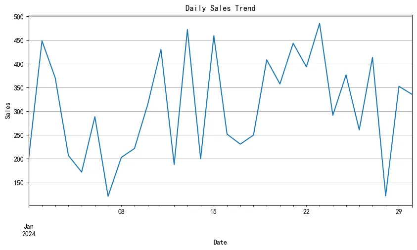
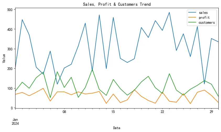
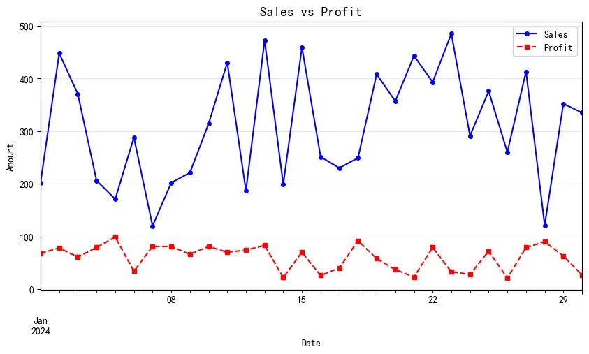
2.2 折线图 (Line Plot)
展示数据随时间变化的趋势。
In [2]:
# 基础折线图 df_ts['sales'].plot(figsize=(10, 5), title='Daily Sales Trend') plt.xlabel('Date') plt.ylabel('Sales') plt.grid(True) plt.show() # 多列折线图 df_ts.plot(figsize=(10, 5), title='Sales, Profit & Customers Trend') plt.xlabel('Date') plt.ylabel('Value') plt.legend(loc='best') plt.show() # 自定义样式 ax = df_ts['sales'].plot(figsize=(10, 5), color='blue', linestyle='-', marker='o', markersize=4) df_ts['profit'].plot(ax=ax, color='red', linestyle='--', marker='s', markersize=4) plt.title('Sales vs Profit', fontsize=14) plt.xlabel('Date') plt.ylabel('Amount') plt.legend(['Sales', 'Profit']) plt.grid(True, alpha=0.3) plt.show()
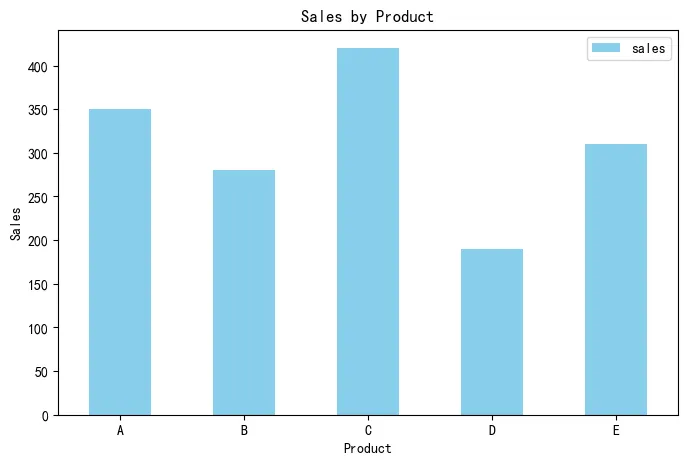
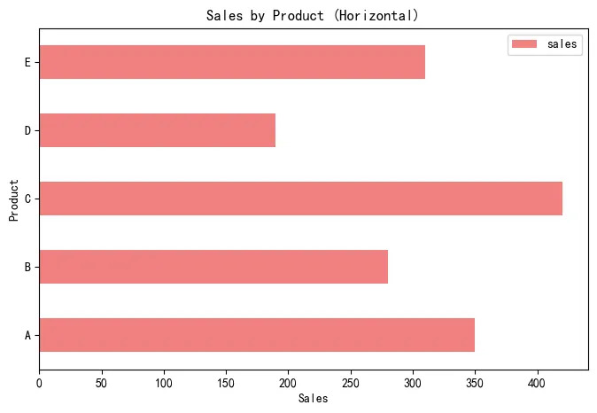
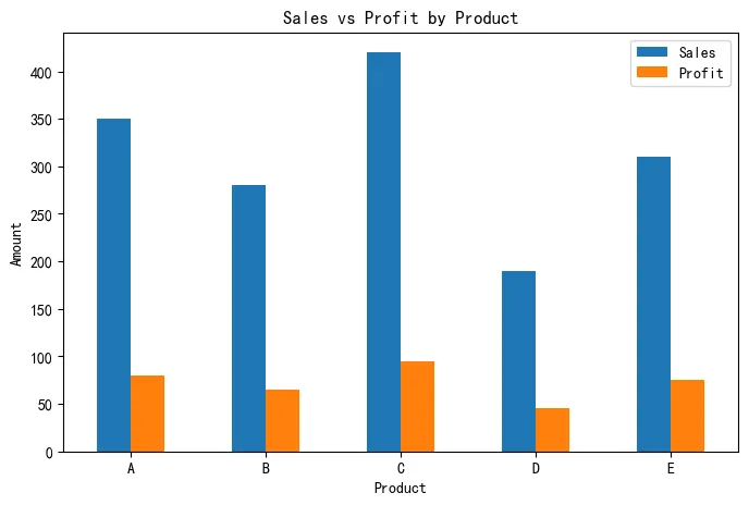
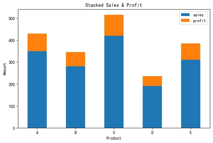
2.3 柱状图 (Bar Plot)
比较不同类别的数值大小。
In [3]:
# 垂直柱状图 df_cat.plot(x='product', y='sales', kind='bar', figsize=(8, 5), color='skyblue', title='Sales by Product') plt.xlabel('Product') plt.ylabel('Sales') plt.xticks(rotation=0) plt.show() # 水平柱状图 df_cat.plot(x='product', y='sales', kind='barh', figsize=(8, 5), color='lightcoral', title='Sales by Product (Horizontal)') plt.xlabel('Sales') plt.ylabel('Product') plt.show() # 分组柱状图 df_cat.plot(x='product', y=['sales', 'profit'], kind='bar', figsize=(8, 5), title='Sales vs Profit by Product') plt.xlabel('Product') plt.ylabel('Amount') plt.xticks(rotation=0) plt.legend(['Sales', 'Profit']) plt.show() # 堆叠柱状图 df_cat.plot(x='product', y=['sales', 'profit'], kind='bar', stacked=True, figsize=(8, 5), title='Stacked Sales & Profit') plt.xlabel('Product') plt.ylabel('Amount') plt.xticks(rotation=0) plt.show()
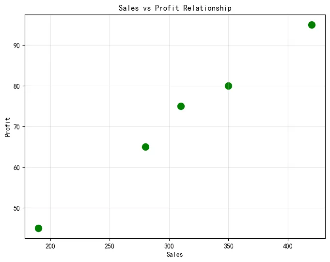
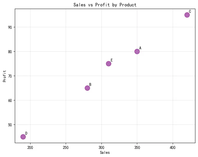
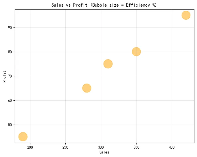
2.4 散点图 (Scatter Plot)
展示两个变量之间的关系。
In [4]:
# 基础散点图 df_cat.plot(x='sales', y='profit', kind='scatter', figsize=(8, 6), s=100, color='green', title='Sales vs Profit Relationship') plt.xlabel('Sales') plt.ylabel('Profit') plt.grid(True, alpha=0.3) plt.show() # 带标签的散点图 ax = df_cat.plot(x='sales', y='profit', kind='scatter', figsize=(8, 6), s=150, c='purple', alpha=0.6) for i, txt in enumerate(df_cat['product']): ax.annotate(txt, (df_cat['sales'].iloc[i], df_cat['profit'].iloc[i]), xytext=(5, 5), textcoords='offset points') plt.title('Sales vs Profit by Product') plt.xlabel('Sales') plt.ylabel('Profit') plt.grid(True, alpha=0.3) plt.show() # 气泡图(大小表示第三个变量) df_bubble = df_cat.copy() df_bubble['efficiency'] = df_bubble['profit'] / df_bubble['sales'] * 100 df_bubble.plot(x='sales', y='profit', kind='scatter', s=df_bubble['efficiency']*20, figsize=(8, 6), alpha=0.5, color='orange') plt.title('Sales vs Profit (Bubble size = Efficiency %)') plt.xlabel('Sales') plt.ylabel('Profit') plt.grid(True, alpha=0.3) plt.show()
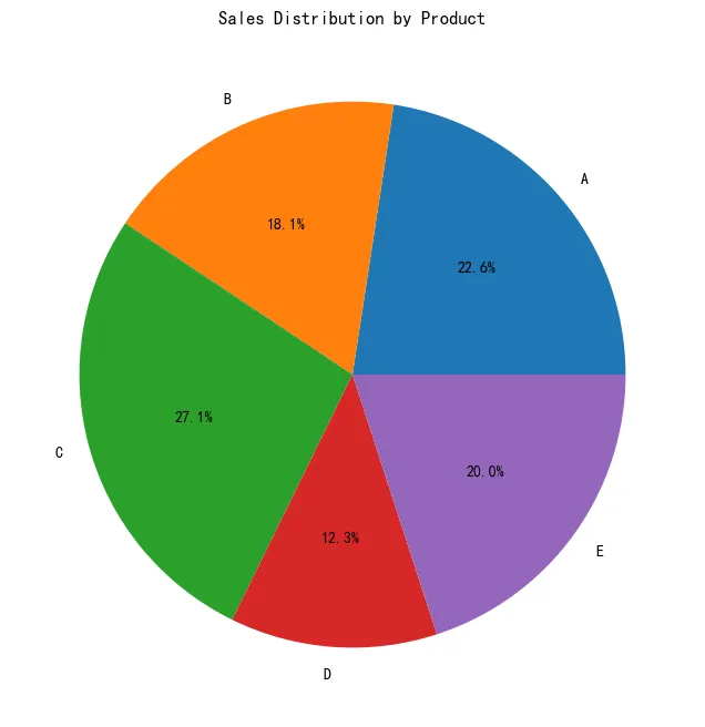
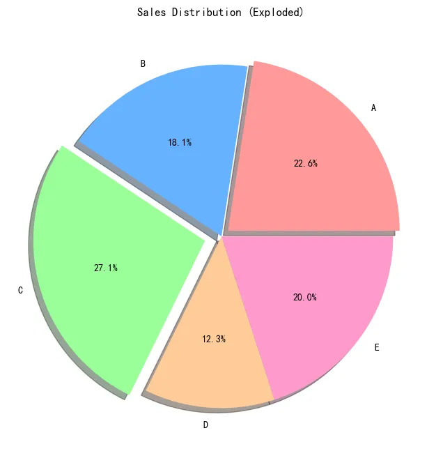
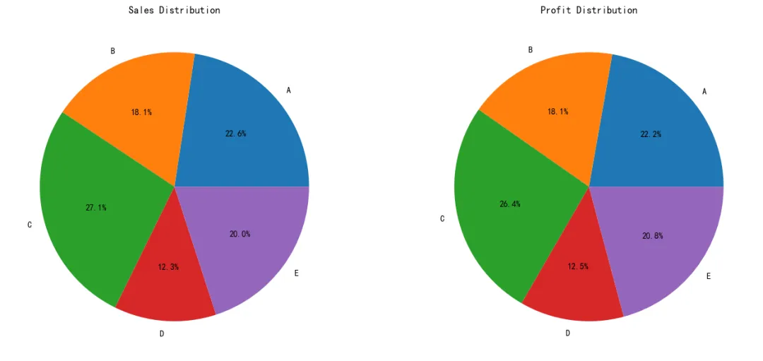
2.5 饼图 (Pie Chart)
展示各部分占整体的比例。
In [5]:
# 基础饼图 df_cat.set_index('product')['sales'].plot(kind='pie', figsize=(8, 8), autopct='%1.1f%%', title='Sales Distribution by Product') plt.ylabel('') # 隐藏y轴标签 plt.show() # 带爆炸效果的饼图 explode = (0.05, 0, 0.1, 0, 0) # 突出显示第1和第3个扇形 colors = ['#ff9999', '#66b3ff', '#99ff99', '#ffcc99', '#ff99cc'] df_cat.set_index('product')['sales'].plot(kind='pie', figsize=(8, 8), autopct='%1.1f%%', explode=explode, colors=colors, shadow=True, title='Sales Distribution (Exploded)') plt.ylabel('') plt.show() # 子饼图(显示sales和profit) fig, axes = plt.subplots(1, 2, figsize=(14, 6)) df_cat.set_index('product')['sales'].plot(kind='pie', ax=axes[0], autopct='%1.1f%%', title='Sales Distribution') axes[0].set_ylabel('') df_cat.set_index('product')['profit'].plot(kind='pie', ax=axes[1], autopct='%1.1f%%', title='Profit Distribution') axes[1].set_ylabel('') plt.tight_layout() plt.show()
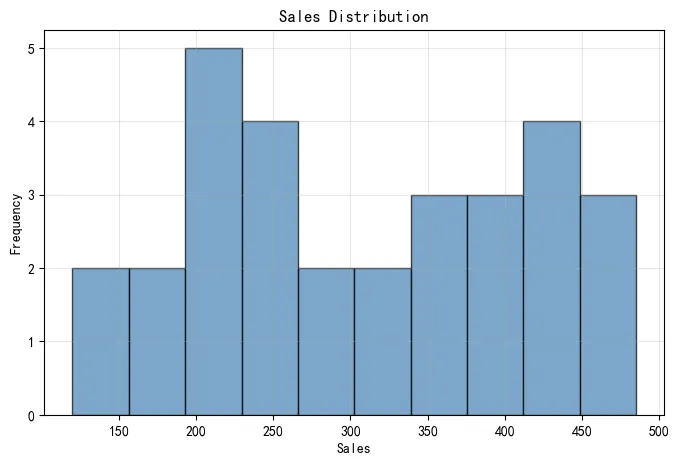
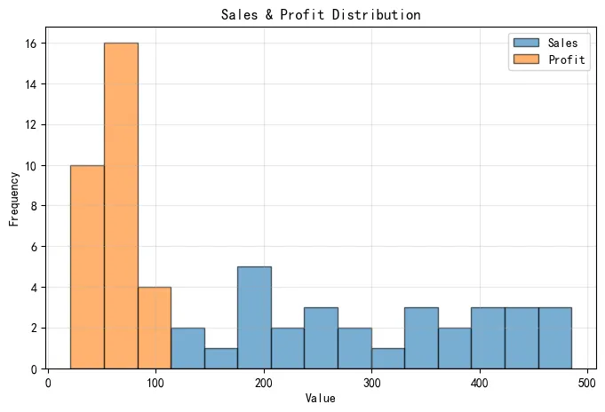
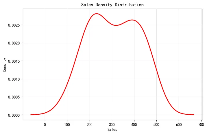
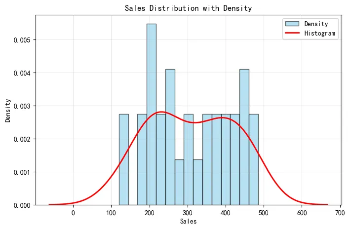
2.6 直方图 (Histogram)
展示数据的分布情况。
In [6]:
# 基础直方图 df_ts['sales'].plot(kind='hist', bins=10, figsize=(8, 5), color='steelblue', alpha=0.7, edgecolor='black') plt.title('Sales Distribution') plt.xlabel('Sales') plt.ylabel('Frequency') plt.grid(True, alpha=0.3) plt.show() # 多列直方图 df_ts[['sales', 'profit']].plot(kind='hist', bins=15, figsize=(8, 5), alpha=0.6, edgecolor='black') plt.title('Sales & Profit Distribution') plt.xlabel('Value') plt.ylabel('Frequency') plt.legend(['Sales', 'Profit']) plt.grid(True, alpha=0.3) plt.show() # 密度图(KDE) df_ts['sales'].plot(kind='kde', figsize=(8, 5), color='red', linewidth=2) plt.title('Sales Density Distribution') plt.xlabel('Sales') plt.ylabel('Density') plt.grid(True, alpha=0.3) plt.show() # 直方图 + 密度图 ax = df_ts['sales'].plot(kind='hist', bins=15, figsize=(8, 5), density=True, alpha=0.6, color='skyblue', edgecolor='black') df_ts['sales'].plot(kind='kde', ax=ax, color='red', linewidth=2) plt.title('Sales Distribution with Density') plt.xlabel('Sales') plt.ylabel('Density') plt.legend(['Density', 'Histogram']) plt.grid(True, alpha=0.3) plt.show()
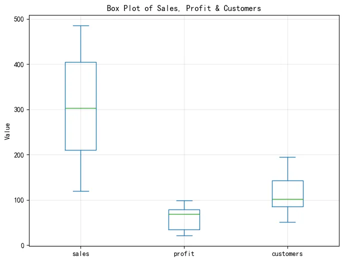
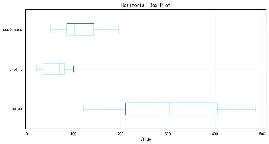
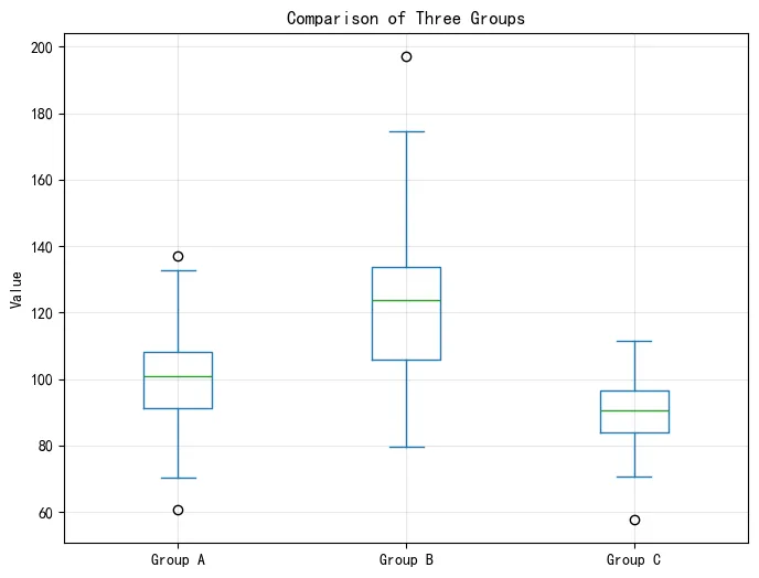
2.7 箱线图 (Box Plot)
展示数据的统计分布,包括中位数、四分位数和异常值。
In [7]:
# 基础箱线图 df_ts.plot(kind='box', figsize=(8, 6), title='Box Plot of Sales, Profit & Customers') plt.ylabel('Value') plt.grid(True, alpha=0.3) plt.show() # 水平箱线图 df_ts.plot(kind='box', vert=False, figsize=(10, 5), title='Horizontal Box Plot') plt.xlabel('Value') plt.grid(True, alpha=0.3) plt.show() # 分组箱线图 # 创建分组数据 df_grouped = pd.DataFrame({ 'Group A': np.random.normal(100, 15, 100), 'Group B': np.random.normal(120, 20, 100), 'Group C': np.random.normal(90, 10, 100) }) df_grouped.plot(kind='box', figsize=(8, 6), title='Comparison of Three Groups') plt.ylabel('Value') plt.grid(True, alpha=0.3) plt.show()
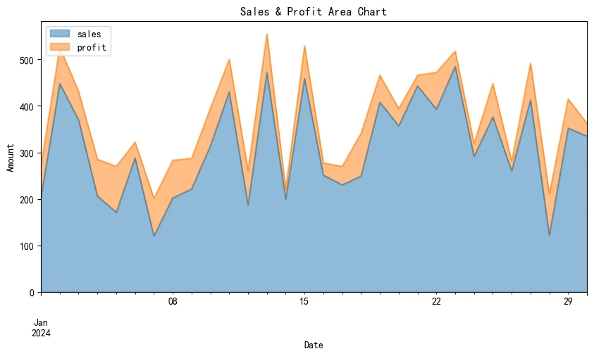
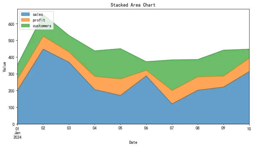
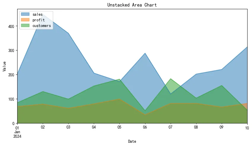
2.8 面积图 (Area Plot)
展示累积趋势或部分与整体的关系。
In [8]:
# 基础面积图 df_ts[['sales', 'profit']].plot(kind='area', figsize=(10, 5), alpha=0.5, title='Sales & Profit Area Chart') plt.xlabel('Date') plt.ylabel('Amount') plt.legend(loc='upper left') plt.show() # 堆叠面积图 df_area = df_ts[['sales', 'profit', 'customers']].head(10).copy() df_area.plot(kind='area', stacked=True, figsize=(10, 5), alpha=0.7, title='Stacked Area Chart') plt.xlabel('Date') plt.ylabel('Value') plt.legend(loc='upper left') plt.show() # 非堆叠面积图 df_area.plot(kind='area', stacked=False, figsize=(10, 5), alpha=0.5, title='Unstacked Area Chart') plt.xlabel('Date') plt.ylabel('Value') plt.legend(loc='upper left') plt.show()
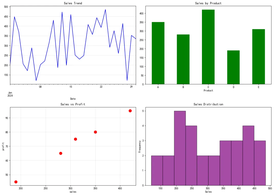
2.9 多子图布局
在一个画布上创建多个子图。
In [9]:
# 2x2子图布局 fig, axes = plt.subplots(2, 2, figsize=(14, 10)) # 子图1: 折线图 df_ts['sales'].plot(ax=axes[0, 0], title='Sales Trend', color='blue') axes[0, 0].set_xlabel('Date') axes[0, 0].grid(True, alpha=0.3) # 子图2: 柱状图 df_cat.plot(x='product', y='sales', kind='bar', ax=axes[0, 1], color='green', legend=False) axes[0, 1].set_title('Sales by Product') axes[0, 1].set_xlabel('Product') axes[0, 1].tick_params(axis='x', rotation=0) # 子图3: 散点图 df_cat.plot(x='sales', y='profit', kind='scatter', ax=axes[1, 0], s=100, color='red') axes[1, 0].set_title('Sales vs Profit') axes[1, 0].grid(True, alpha=0.3) # 子图4: 直方图 df_ts['sales'].plot(kind='hist', ax=axes[1, 1], bins=10, color='purple', alpha=0.7, edgecolor='black') axes[1, 1].set_title('Sales Distribution') axes[1, 1].set_xlabel('Sales') plt.tight_layout() plt.show()
2.10 样式美化
使用样式表美化图表。
In [10]:
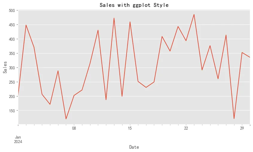
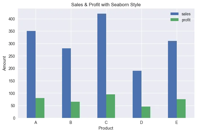
# 查看可用样式 print("可用样式:") print(plt.style.available[:10]) # 只显示前10个 # 使用ggplot样式 plt.style.use('ggplot') df_ts['sales'].plot(figsize=(10, 5), title='Sales with ggplot Style') plt.xlabel('Date') plt.ylabel('Sales') plt.show() # 使用seaborn样式 plt.style.use('seaborn-v0_8') df_cat.plot(x='product', y=['sales', 'profit'], kind='bar', figsize=(8, 5), title='Sales & Profit with Seaborn Style') plt.xlabel('Product') plt.ylabel('Amount') plt.xticks(rotation=0) plt.show() # 恢复默认样式 plt.style.use('default')
可用样式: ['Solarize_Light2', '_classic_test_patch', '_mpl-gallery', '_mpl-gallery-nogrid', 'bmh', 'classic', 'dark_background', 'fast', 'fivethirtyeight', 'ggplot']
3. 常见应用场景总结
- 趋势分析
:使用折线图展示时间序列数据的趋势变化。 - 对比分析
:使用柱状图比较不同类别的数值大小。 - 相关性分析
:使用散点图探索两个变量之间的关系。 - 占比分析
:使用饼图展示各部分占总体的比例。 - 分布分析
:使用直方图和箱线图了解数据的分布特征。 - 累积趋势
:使用面积图展示累积效果或部分与整体的关系。
本文来自网友投稿或网络内容,如有侵犯您的权益请联系我们删除,联系邮箱:wyl860211@qq.com 。
随机文章
-
 10个月宝宝每天需要喝多少奶粉?
- 用python编程语言实现两台腾讯云服务器之间的通信
- 2026Python入门教程(全网最详细),零基础入门到精通,从看这一篇开始!
- Python编程基础学习指南
- Python、Rust、AI全栈技能生态树(收藏版)
- Python基础语法也就这五张图
- 放弃 Python,微软带头:这场席卷技术圈的“Rust 狂潮”到底图什么?
- 封不住!Claude Code爆改Python版加冕最快10万星,且clone且珍惜
- 在日常数据清洗与分析中,是选择 Python 的 Pandas 还是 SQL 更高效?当 Pandas 的内存操作模型遇到海量数据时,效率的边界在哪里?
- 网安大佬常用的200个Kali Linux命令!
- 救命!Linux线程同步与互斥,专治“分身抢活”乱象
