当你完成了一项关于某药物辅助治疗急性心肌梗死的随机对照研究(HR = 0.72, 95% CI: 0.58–0.89, p = 0.003),审稿人回复:"Please present the subgroup analysis in a forest plot."但你用 forestplot 包画出了图——坐标轴重叠、字体太小、色调整体"灰蒙蒙"。你意识到:能跑出图和能投稿,中间隔着一整条审美鸿沟。那么,该如何绘制符合发表要求且美观的图呢?接下来逐步给你演示。
一、森林图的结构:每一个元素都有意义
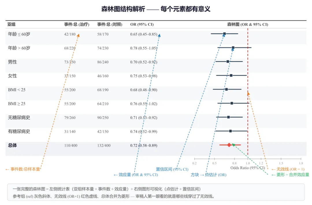
森林图本质是一种以点估计和区间估计为核心的可视化。在写代码之前,先确保我们叫得出每个零件的名字。
| | |
|---|
| 左侧统计表 | 变量 / 亚组 | |
| n | |
| 效应量 | 根据分析类型不同:OR(病例对照/横断面)、HR(生存/Cox 回归)、MD(连续变量均值差),均含 95% CI |
| 辅助统计量 | 可选:权重(meta 分析)、P 值、Z 值、β 系数等,根据研究设计灵活选用 |
| 右侧森林图 | 横线 | 每个亚组的置信区间(95% CI),越长说明估计越不精确 |
| 方块 / 菱形 | 点估计值,方块面积与权重成正比;菱形表示合并效应量 |
| 红色竖线 | 无效线(null effect line),OR/HR = 1 或 MD = 0,线两侧分别为"有利于实验组/对照组" |
| 分色标记 | |
关键认知:审稿人看森林图,第一眼就是看那条竖线——哪些横线穿过了它,哪些没有。竖线的视觉权重必须足够明显。
图1 森林图结构解析 —— 左侧统计表(亚组、事件数、OR 及 95% CI),右侧图形可视化。箭头标注各元素:置信区间、点估计、无效线、合并菱形
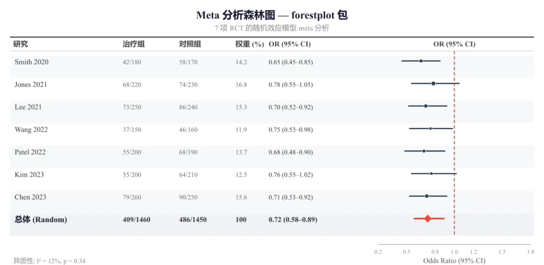
二、R 方案一:forestplot 包(通用快速)
forestplot 包是绘制森林图的老牌工具,特点代码简洁,自动完成大部分排版。适合快速出图、亚组分析展示。
# ==========================================# forestplot 包 —— Meta 分析森林图# 特点:展示多项研究 + 权重 + 合并效应# ==========================================library(forestplot)library(dplyr)# ---------- 模拟 7 项 RCT 数据 ----------df <- data.frame( study = c("Smith 2020", "Jones 2021", "Lee 2021", "Wang 2022", "Patel 2022", "Kim 2023", "Chen 2023", "总体 (Random)"), events_t = c(42, 68, 73, 37, 55, 55, 79, 409), n_t = c(180, 220, 250, 150, 200, 200, 260, 1460), events_c = c(58, 74, 86, 46, 68, 64, 90, 486), n_c = c(170, 230, 240, 160, 190, 210, 250, 1450), weight = c(14.2, 16.8, 15.3, 11.9, 13.7, 12.5, 15.6, 100), or_est = c(0.65, 0.78, 0.70, 0.75, 0.68, 0.76, 0.71, 0.72), ci_low = c(0.45, 0.55, 0.52, 0.53, 0.48, 0.55, 0.53, 0.58), ci_high = c(0.85, 1.05, 0.92, 0.98, 0.90, 1.02, 0.92, 0.89), is_sum = c(F, F, F, F, F, F, F, T))# ---------- 表格标签(含权重列) ----------table_text <- cbind( "研究" = c("研究", df$study), "治疗组" = c("治疗组", paste0(df$events_t, "/", df$n_t)), "对照组" = c("对照组", paste0(df$events_c, "/", df$n_c)), "权重(%)" = c("权重(%)", sprintf("%.1f", df$weight)), "OR (95% CI)" = c("OR (95% CI)", sprintf("%.2f (%.2f–%.2f)", df$or_est, df$ci_low, df$ci_high)))# ---------- 绘图 ----------tiff("meta_forestplot.tiff", width=10, height=5.5, units="in", res=300, compression="lzw")forestplot( labeltext = table_text, mean = c(NA, df$or_est), lower = c(NA, df$ci_low), upper = c(NA, df$ci_high), is.summary = c(F, df$is_sum), zero = 1, clip = c(0.3, 1.3), col = fpColors(box="#2C3E50", line="#2C3E50", zero="#B71C1C", summary="#E74C3C"), boxsize = df$weight / 100, # 方块大小与权重成正比 lwd.zero = 1.8, graph.pos = 6, xlab = "Odds Ratio (95% CI)", title = "Meta 分析森林图", txt_gp = fpTxtGp( label=gpar(fontfamily="sans", cex=0.85), ticks=gpar(fontfamily="sans", cex=0.8), xlab=gpar(fontfamily="sans", cex=0.9)))dev.off()
图2 Meta 分析森林图 —— forestplot 包输出。展示 7 项 RCT 的随机效应模型合并,方块大小与权重成正比,菱形为合并效应量
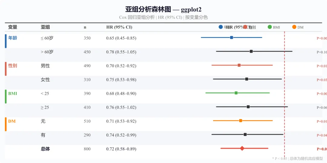
三、R 方案二:ggplot2 自定义(更灵活)
当你需要更细腻的控制——亚组之间用颜色区分、自由调整主题、或把森林图嵌入更大排版中——ggplot2 是更强大的选择。
# ==========================================# ggplot2 自定义 —— Cox 回归亚组森林图(HR)# ==========================================library(ggplot2)# ---------- 模拟数据(Cox 回归 HR)----------df <- data.frame( variable = c("年龄", "", "性别", "", "BMI", "", "糖尿病史", "", ""), subgroup = factor(c("≤ 60岁", "> 60岁", "男性", "女性", "< 25", "≥ 25", "无", "有", "总体"), levels = rev(c("≤ 60岁", "> 60岁", "男性", "女性", "< 25", "≥ 25", "无", "有", "总体"))), category = c("年龄", "年龄", "性别", "性别", "BMI", "BMI", "糖尿病史", "糖尿病史", "总体"), n = c(350, 450, 490, 310, 390, 410, 510, 290, 800), hr_est = c(0.65, 0.78, 0.70, 0.75, 0.68, 0.76, 0.71, 0.74, 0.72), ci_low = c(0.45, 0.55, 0.52, 0.53, 0.48, 0.55, 0.53, 0.52, 0.58), ci_high = c(0.85, 1.05, 0.92, 0.98, 0.90, 1.02, 0.92, 0.99, 0.89), p_val = c(0.003, 0.100, 0.012, 0.038, 0.008, 0.065, 0.011, 0.043, 0.002))# ---------- 配色 ----------var_colors <- c("年龄" = "#2166AC", "性别" = "#D6604D", "BMI" = "#4DAF4A", "糖尿病史" = "#FF7F00", "总体" = "#333333")# ---------- 森林图主体 ----------p <- ggplot(df, aes(x = hr_est, y = subgroup)) + geom_vline(xintercept = 1, linetype = "dashed", color = "#B71C1C", linewidth = 1.0) + geom_errorbarh(aes(xmin = ci_low, xmax = ci_high, color = category), height = 0.15, linewidth = 1.2) + geom_point(aes(fill = category, size = category), shape = 21, color = "white", stroke = 0.8) + scale_fill_manual(values = var_colors, guide = "none") + scale_color_manual(values = var_colors, guide = "none") + scale_size_manual(values = c("年龄" = 3.5, "性别" = 3.5, "BMI" = 3.5, "糖尿病史" = 3.5, "总体" = 6)) + scale_x_continuous(breaks = seq(0.2, 1.2, 0.2), limits = c(0.15, 1.35)) + labs(title = "亚组分析森林图 — ggplot2", subtitle = "Cox 回归 HR (95% CI) | 按变量类别分色", x = "Hazard Ratio (95% CI)", y = NULL) + theme_minimal(base_size = 12) + theme( plot.title = element_text(face = "bold", size = 14, hjust = 0.5), plot.subtitle = element_text(size = 10, hjust = 0.5, color = "grey40"), panel.grid.major.y = element_line(color = "grey90", linewidth = 0.4), panel.grid.major.x = element_line(color = "grey90", linewidth = 0.3), panel.grid.minor = element_blank() ) + geom_text(aes(label = paste0("P=", round(p_val, 3))), x = 1.25, color = "grey40", size = 3, hjust = 0)ggsave("forestplot_ggplot2.tiff", plot = p, width = 10, height = 5.5, dpi = 300, compression = "lzw")# 注意:本例展示的是 Cox 回归的 HR(风险比),# 不同于 Fig2 的 OR(病例对照研究)和 Fig4 的 MD(连续变量)。# 不同分析类型应使用各自的效应量指标,不可混用。
图3 亚组分析森林图 —— ggplot2 绘制。Cox 回归 HR (95% CI),按变量类别分色(蓝/红/绿/橙),左侧彩色竖条标识变量分组,右侧标注 P 值
ggplot2 方案优势:
- 用
fill 和 color 分别控制方块内色和边框,实现"哑光学术风" geom_vline- 用
category 变量将亚组归类上色,读者一眼看出哪些属于同一类 - 直接调用
ggsave 输出 tiff/pdf/png,一站式管理分辨率
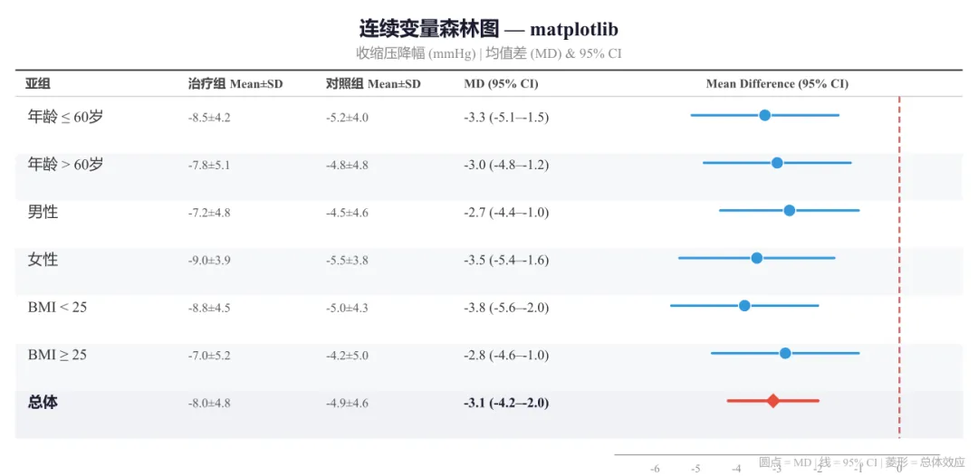
四、Python 版:matplotlib 画森林图
如果你是 Python 生态用户,matplotlib 同样能画出高质量的森林图。
# ==========================================# Python matplotlib —— 连续变量森林图(MD)# ==========================================import matplotlib.pyplot as pltimport numpy as np# ---------- 模拟数据(连续变量:收缩压降幅)----------# 结构:(亚组, 治疗组n, 治疗组Mean, 治疗组SD,# 对照组n, 对照组Mean, 对照组SD,# MD, CI下限, CI上限)data = [ ("年龄 ≤ 60岁", 180, -8.5, 4.2, 170, -5.2, 4.0, -3.3, -5.1, -1.5), ("年龄 > 60岁", 220, -7.8, 5.1, 230, -4.8, 4.8, -3.0, -4.8, -1.2), ("男性", 250, -7.2, 4.8, 240, -4.5, 4.6, -2.7, -4.4, -1.0), ("女性", 150, -9.0, 3.9, 160, -5.5, 3.8, -3.5, -5.4, -1.6), ("BMI < 25", 200, -8.8, 4.5, 190, -5.0, 4.3, -3.8, -5.6, -2.0), ("BMI ≥ 25", 200, -7.0, 5.2, 210, -4.2, 5.0, -2.8, -4.6, -1.0), ("总体", 400, -8.0, 4.8, 400, -4.9, 4.6, -3.1, -4.2, -2.0),]# ---------- 创建画布 ----------fig, ax_tbl = plt.subplots(figsize=(10, 5))ax_tbl.set_facecolor("white")# 隐藏主坐标轴(用于表格)ax_tbl.axis("off")# ---------- 左侧统计量表 ----------col_labels = ["亚组", "治疗组\\nMean±SD", "对照组\\nMean±SD", "MD (95% CI)"]cell_text = []for d in data: sub, nt, mt, sdt, nc, mc, sdc, md, lo, hi = d cell_text.append([sub, f"{mt:.1f}±{sdt:.1f}", f"{mc:.1f}±{sdc:.1f}", f"{md:.1f} ({lo:.1f}–{hi:.1f})"])tbl = ax_tbl.table( cellText=cell_text, colLabels=col_labels, cellLoc="left", loc="left", bbox=[0.0, 0.05, 0.55, 0.90])# 表格样式for (row, col), cell in tbl.get_celld().items(): if row == 0: cell.set_facecolor("#eef0f5") cell.get_text().set_weight("bold") cell.get_text().set_fontsize(9) elif row <= len(data) and cell_text[row-1][0] == "总体": cell.set_facecolor("#f0f2f6") cell.get_text().set_weight("bold") elif row % 2 == 0: cell.set_facecolor("#f7f8fa") cell.get_text().set_fontsize(9)# ---------- 右侧森林图 ----------ax_forest = fig.add_axes([0.58, 0.12, 0.38, 0.80])# 无效线(MD = 0)ax_forest.axvline(x=0, color="#B71C1C", linestyle="--", linewidth=1.5, alpha=0.7, zorder=1)# 绘制每个亚组for i, d in enumerate(data): sub, nt, mt, sdt, nc, mc, sdc, md, lo, hi = d y_pos = len(data) - 1 - i is_ov = (sub == "总体") lc = "#E74C3C" if is_ov else "#3498db" lw = 2.5 if is_ov else 2.0 ax_forest.plot([lo, hi], [y_pos, y_pos], color=lc, linewidth=lw, solid_capstyle="round", zorder=2) if is_ov: ax_forest.scatter(md, y_pos, s=120, marker="D", color="#E74C3C", edgecolors="white", linewidth=0.8, zorder=3) else: ax_forest.scatter(md, y_pos, s=80, marker="o", color="#3498db", edgecolors="white", linewidth=0.8, zorder=3)ax_forest.set_ylim(-0.5, len(data))ax_forest.set_xlim(-7, 1.5)ax_forest.set_yticks([])ax_forest.set_xlabel("均值差 (MD) — 有利于治疗组 →", fontsize=10)ax_forest.tick_params(axis="x", labelsize=8)for spine in ["top", "right", "left"]: ax_forest.spines[spine].set_visible(False)fig.suptitle("连续变量森林图 — matplotlib", fontsize=14, fontweight="bold", y=0.97)plt.tight_layout(rect=[0, 0, 1, 0.93])# ---------- 导出 ----------plt.savefig("forestplot_python.tiff", dpi=300, bbox_inches="tight", pil_kwargs={"compression": "tiff_lzw"})plt.savefig("forestplot_python.pdf", dpi=300, bbox_inches="tight")# 思路:连续变量森林图,效应量为均值差 (MD)。# 圆点代表各亚组点估计(蓝色),菱形表示总体合并效应(红色)。# 无效线为 MD = 0,左侧为有利于治疗组。
图4 连续变量森林图 —— matplotlib 绘制。收缩压降幅的均值差 (MD) 及 95% CI,圆点表示亚组点估计,蓝色简洁风格,菱形表示总体合并效应
五、图片导出核心设置(所有方案通用)
无论是 R 还是 Python,投稿级图片的导出需满足以下参数:
R 统一管理
# TIFF(投稿首选)tiff("输出.tiff", width=10, height=6, units="in", res=300, compression="lzw")# ... 绘图代码 ...dev.off()# PDF(矢量图)pdf("输出.pdf", width=10, height=6)# ... 绘图代码 ...dev.off()
# TIFF(投稿首选)plt.savefig("输出.tiff", dpi=300, bbox_inches="tight", pil_kwargs={"compression": "tiff_lzw"})# PDF(矢量图)plt.savefig("输出.pdf", dpi=300, bbox_inches="tight")
六、常见问题与避坑指南
Q1:亚组很多,森林图挤成一团怎么办?
增大图片高度。经验公式:每个亚组分配 0.5–0.6 inch 高度。8 个亚组 + 1 个总体 ≈ 5–6 inch。
Q2:有的亚组置信区间特别宽,把坐标轴拉得很长?
用 clip(forestplot)、coord_cartesian()(ggplot2)或 set_xlim()(matplotlib)限制显示范围,并在图中注明 "CI truncated"。
Q3:审稿人说"颜色看不清"?
避免红绿搭配(红绿色盲人群占 8% 男性)。推荐 ColorBrewer 或 Lancet 配色——蓝色 + 橙红色系最稳妥。
Q4:如何让"总体"那一行更突出?
增大方块尺寸,或加粗整行字体,或在左侧加分隔线。详见上方代码中 size / boxsize 的控制。
 10个月宝宝每天需要喝多少奶粉?
