用iris数据,python绘制柱状图,有差异分析和标记,包括组间差异
在 R 语言中,实现带有差异分析和自动标记的柱状图,最优雅且符合现代科研绘图标准的方法是使用 ggplot2 配合 ggpubr 扩展包。
1. 环境准备
首先,你需要安装并加载必要的 R 包(如果尚未安装,请先运行 install.packages(c("ggplot2", "ggpubr", "dplyr"))):
library(ggplot2)library(ggpubr)library(dplyr)
2. 完整代码实现
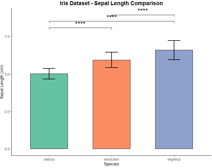
这段代码会加载内置的 iris 数据集,计算不同品种(Species)花萼长度(Sepal.Length)的均值,进行 T 检验,并自动在柱状图上标注显著性差异(如 *, ** 或 ns)。
# 1. 数据准备与均值计算# 使用内置的 iris 数据集,计算各品种的均值和标准差iris_summary <- iris %>% group_by(Species) %>% summarise( mean = mean(Sepal.Length), sd = sd(Sepal.Length) ) %>% ungroup()# 2. 绘制基础柱状图 (带误差棒)p <- ggplot(iris_summary, aes(x = Species, y = mean, fill = Species)) + geom_bar(stat = "identity", width = 0.6, color = "black") + # 绘制柱状图 geom_errorbar(aes(ymin = mean - sd, ymax = mean + sd), width = 0.2, size = 0.8) + # 添加标准差误差棒 scale_fill_brewer(palette = "Set2") + # 使用美观的配色 labs(title = "Iris Dataset - Sepal Length Comparison", x = "Species", y = "Sepal Length (cm)") + theme_minimal() + # 使用简洁的主题 theme(plot.title = element_text(hjust = 0.5, size = 14, face = "bold"))# 3. 定义需要进行组间比较的配对my_comparisons <- list(c("setosa", "versicolor"), c("setosa", "virginica"), c("versicolor", "virginica"))# 4. 自动进行统计检验并添加标注# 使用 stat_compare_means 函数自动添加显著性标记final_plot <- p + stat_compare_means( comparisons = my_comparisons, # 指定比较的组别 method = "t.test", # 指定统计检验方法为独立样本T检验 label = "p.signif", # 标注格式显示为星号(如 *, **) vjust = 0.5, # 调整标注文字的垂直位置 size = 6 # 调整标注文字的大小)# 5. 显示图表print(final_plot)
代码核心原理解析:
- 数据聚合 (
dplyr)ggplot2 绘制柱状图时,如果直接传入原始数据,默认会进行计数。因此,我们先用 dplyr 的 group_by 和 summarise 提前计算出每组花萼长度的均值 (mean) 和标准差 (sd)。 - 基础绘图 (
ggplot2) geom_bar(stat = "identity"):告诉 ggplot 直接使用我们计算好的均值来绘制柱子的高度。geom_errorbar:利用计算好的标准差,为每个柱子添加上下波动的误差线。
- 差异分析与标记 (
ggpubr) stat_compare_means() 是 ggpubr 包的核心函数,它可以无缝叠加在 ggplot 图形上。comparisonsmethod = "t.test"指定使用独立样本 T 检验(如果你需要非参数检验,可以将其替换为 "wilcox.test")。label = "p.signif"会自动将计算出的 P 值转化为直观的星号(例如 P < 0.05 显示 *,P < 0.01 显示 **,不显著则显示 ns)。
运行上述代码后,你将得到一张高度定制化的柱状图,不仅包含了误差棒,还自动完成了组间差异的统计学检验和显著性标记。

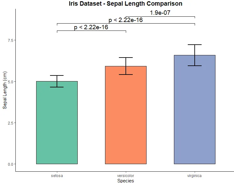
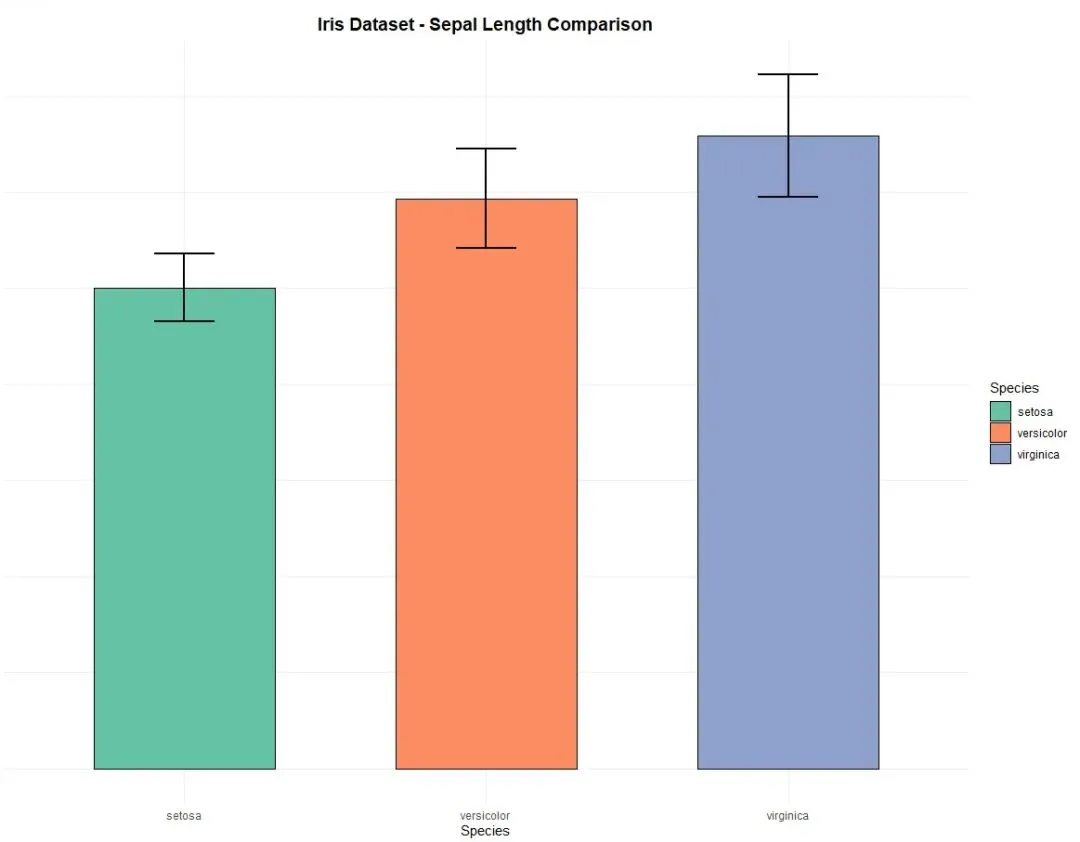
library(ggplot2)library(ggpubr)library(dplyr)# 定义比较组my_comparisons <- list( c("setosa", "versicolor"), c("setosa", "virginica"), c("versicolor", "virginica"))# 绘制带有坐标轴线且无背景网格的柱状图ggplot(iris, aes(x = Species, y = Sepal.Length, fill = Species)) + # 绘制柱状图(自动计算均值) stat_summary(fun = mean, geom = "bar", width = 0.6, color = "black") + # 绘制误差棒(自动计算标准差) stat_summary(fun.data = mean_sd, geom = "errorbar", width = 0.2, size = 0.8) + # 设置配色 scale_fill_brewer(palette = "Set2") + # 添加显著性差异横线 stat_compare_means( comparisons = my_comparisons, method = "t.test", label = "p.signif", vjust = 0.5, size = 6 ) + # 基础标签设置 labs(title = "Iris Dataset - Sepal Length Comparison", x = "Species", y = "Sepal Length (cm)") + # 【核心修改】使用经典主题(自带坐标轴线,无背景网格) theme_classic() + # 微调标题样式 theme( plot.title = element_text(hjust = 0.5, size = 14, face = "bold"), legend.position = "none" )
library(ggplot2)library(ggpubr)library(dplyr)# 定义需要进行两两比较的组别my_comparisons <- list( c("setosa", "versicolor"), c("setosa", "virginica"), c("versicolor", "virginica"))# 绘制带有具体P值的柱状图ggplot(iris, aes(x = Species, y = Sepal.Length, fill = Species)) + # 绘制柱状图 stat_summary(fun = mean, geom = "bar", width = 0.6, color = "black") + # 绘制误差棒 stat_summary(fun.data = mean_sd, geom = "errorbar", width = 0.2, size = 0.8) + # 设置配色 scale_fill_brewer(palette = "Set2") + # 核心修改:将 label 改为 "p.format" 以显示具体P值 stat_compare_means( comparisons = my_comparisons, method = "t.test", label = "p.format", # 【核心修改】显示具体P值 label.x = 1.5, # 【可选】微调P值标注的横向位置,防止重叠 vjust = 0.5, # 微调P值标注的纵向位置 size = 5 # 调整P值文字的大小 ) + # 标签与主题设置 labs(title = "Iris Dataset - Sepal Length Comparison", x = "Species", y = "Sepal Length (cm)") + theme_classic() + theme( plot.title = element_text(hjust = 0.5, size = 14, face = "bold"), legend.position = "none" )
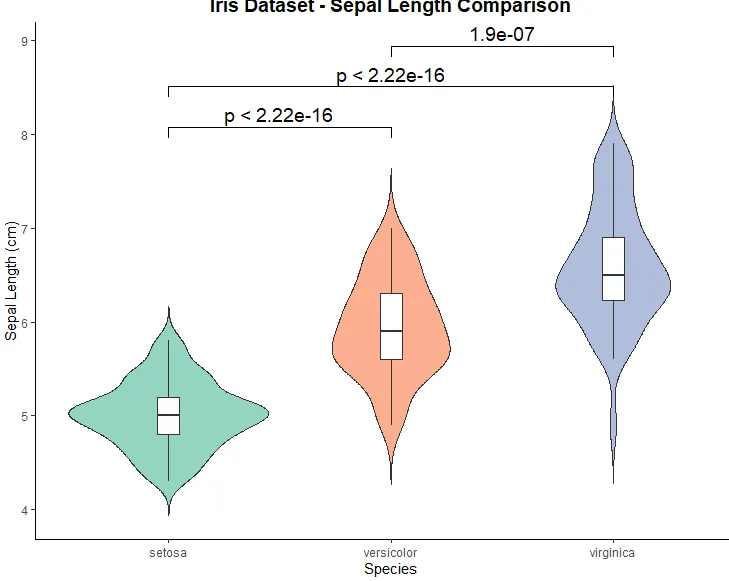
library(ggplot2)library(ggpubr)library(dplyr)# 定义需要进行两两比较的组别my_comparisons <- list( c("setosa", "versicolor"), c("setosa", "virginica"), c("versicolor", "virginica"))# 绘制叠加白色箱线图的小提琴图ggplot(iris, aes(x = Species, y = Sepal.Length, fill = Species)) + # 绘制小提琴图 geom_violin(trim = FALSE, alpha = 0.7) + # 【核心新增】叠加窄箱线图,设置填充为白色 geom_boxplot(width = 0.1, fill = "white", outlier.shape = NA) + # 设置配色 scale_fill_brewer(palette = "Set2") + # 添加显著性差异横线并标注具体P值 stat_compare_means( comparisons = my_comparisons, method = "t.test", label = "p.format", # 显示具体P值 vjust = 0.5, size = 5 ) + # 标签与主题设置 labs(title = "Iris Dataset - Sepal Length Comparison", x = "Species", y = "Sepal Length (cm)") + # 使用经典主题(自带坐标轴线,无背景网格) theme_classic() + theme( plot.title = element_text(hjust = 0.5, size = 14, face = "bold"), legend.position = "none" )


 10个月宝宝每天需要喝多少奶粉?
