期刊图片复现|Python绘制和弦图/有向环形关系图/环形网络图
- 2026-09-04 17:22:55
期刊图片复现|Python绘制和弦图/有向环形关系图/环形网络图

论文:Potential planetary health impacts of the airborne plastisphere 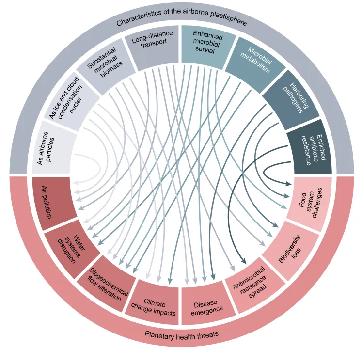
论文原图 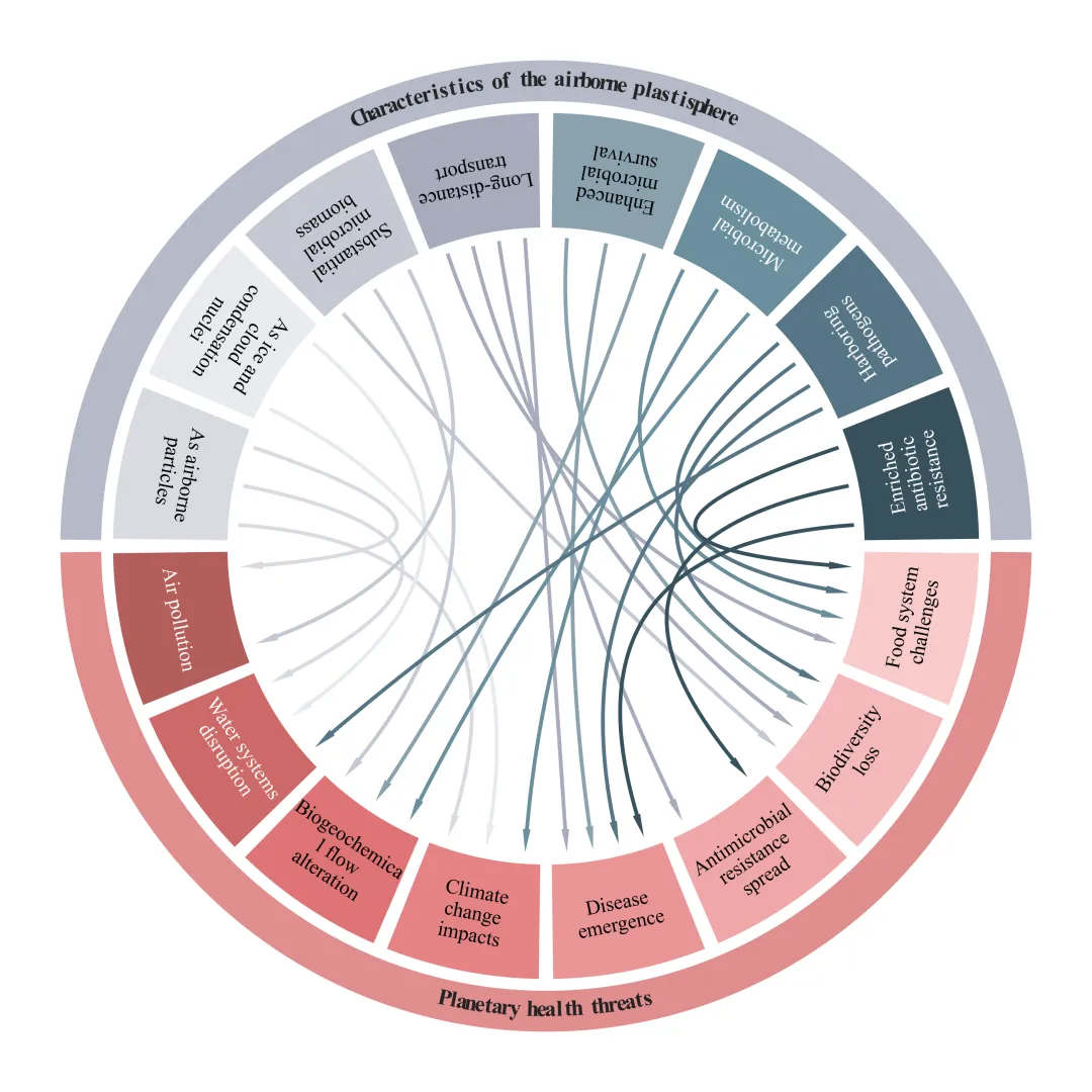
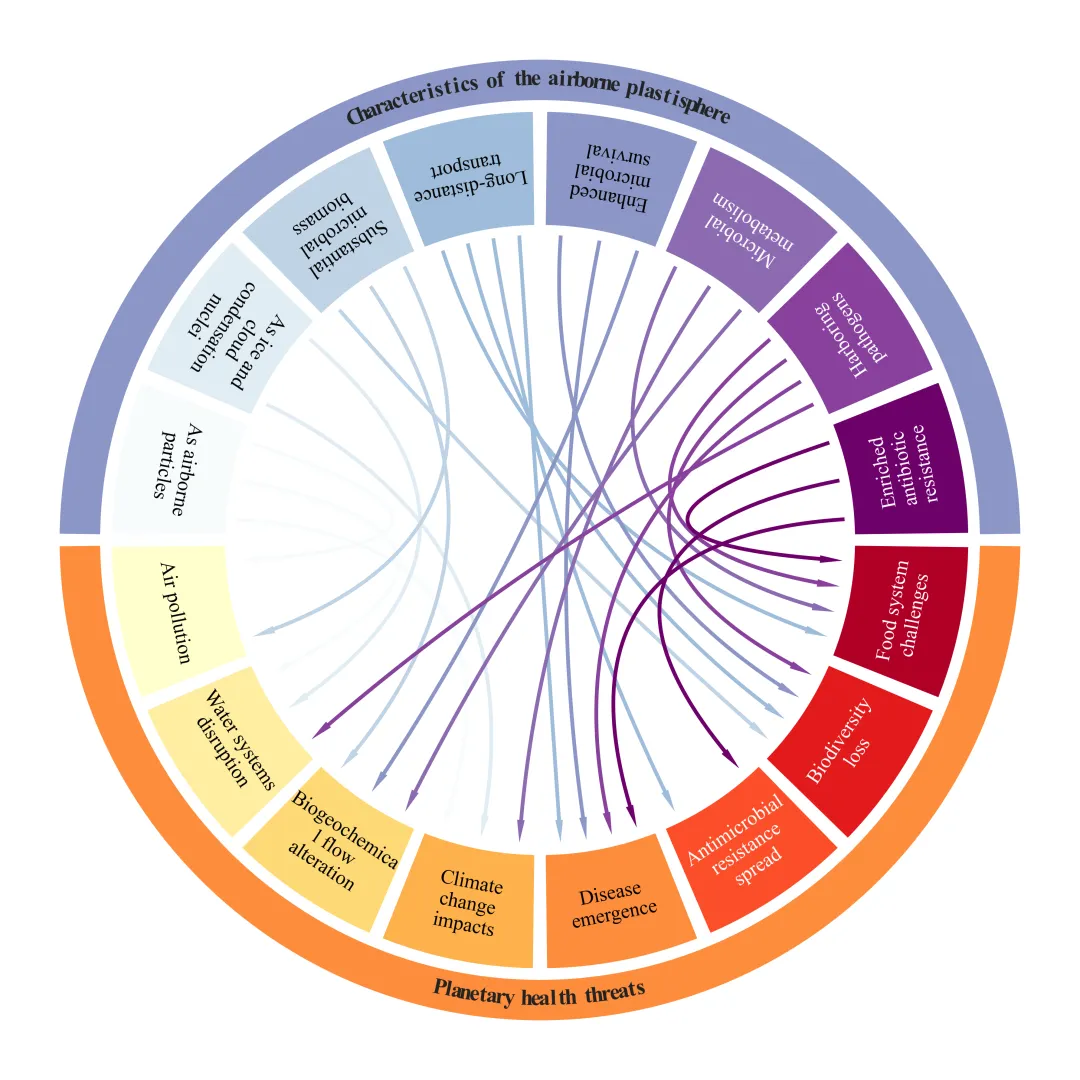
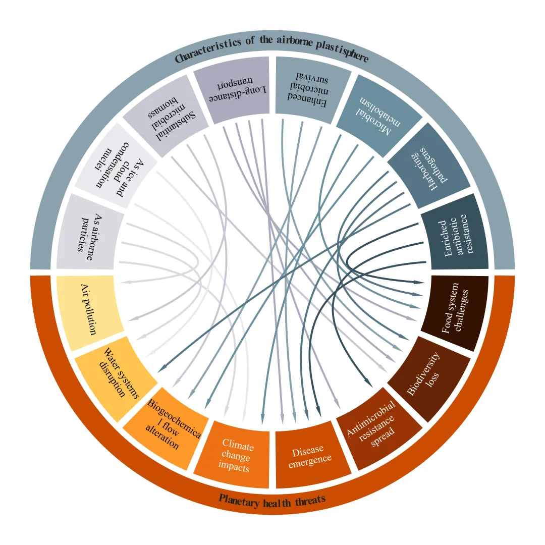
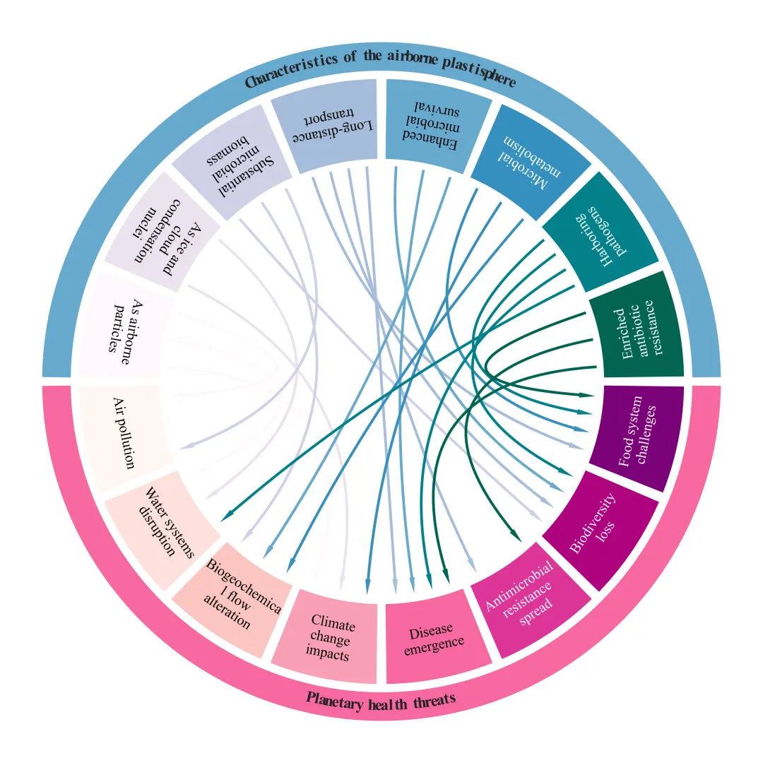
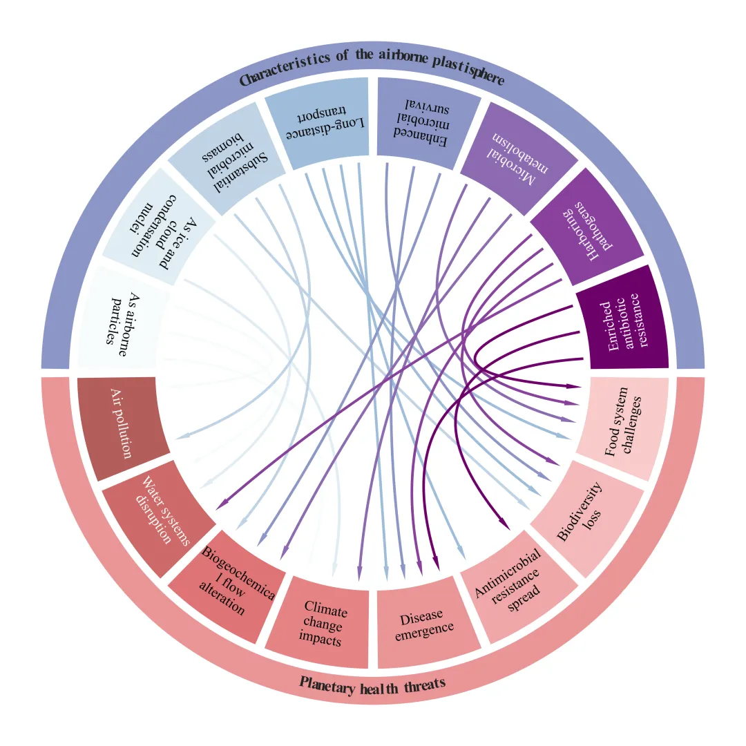
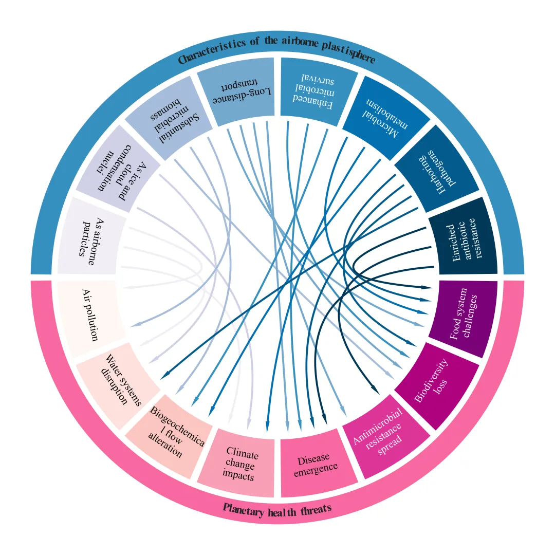
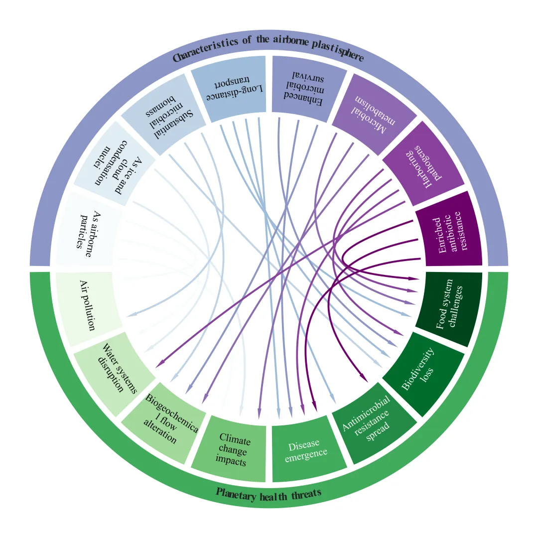
仿图 此图用于展示airborne plastisphere的各种特性与其可能引发的planetary health threats之间的关联性 。上半圆代表8个主要特征,下半圆代表 8 个受威胁的领域。图中从上半圆指向下半圆的每一条箭头,代表着作者假设的影响路径。例如,“Harboring pathogens”发出的箭头指向了“Disease emergence”、“Food system challenges”和“Biodiversity loss”等领域,说明这一特定特征预计将对这些特定的健康和生态领域造成威胁 。 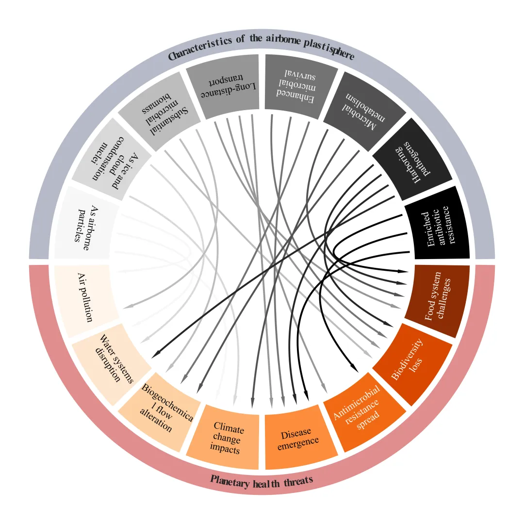
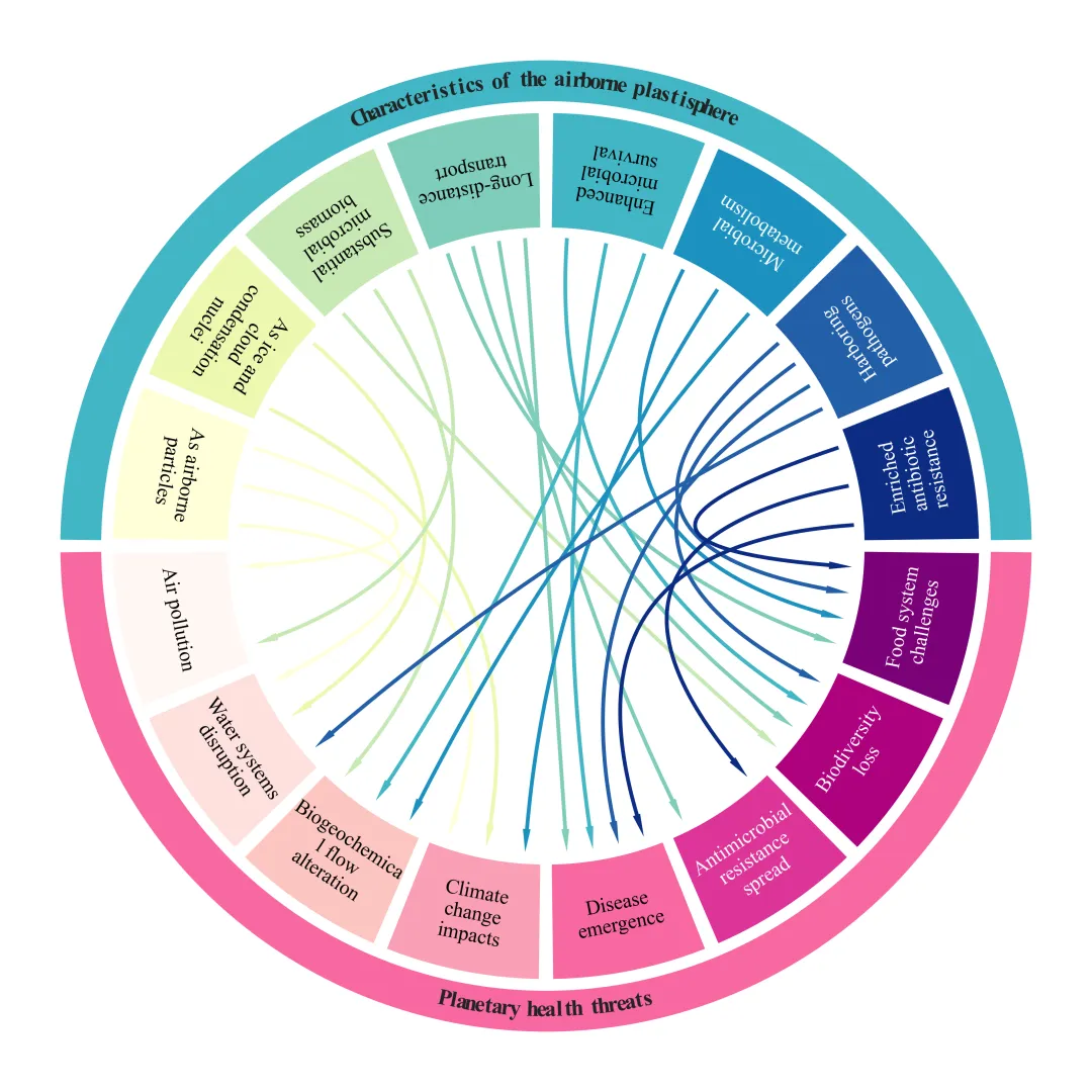
多种配色 



库的导入以及字体设置 

设置颜色库 

绘图函数:变量初始化与画布设置 

绘图函数:节点角度计算 

绘图函数:扇形绘制辅助函数 

绘图函数:箭头连线绘制辅助函数 

绘图函数:外圈弯曲文本绘制辅助函数 

绘图函数:外圈环、扇区等部分绘制 

绘图函数:绘制箭头连线部分 

执行部分 



期刊图片复现|Python绘制配对云雨图 期刊图片复现|Python绘制SHAP交互作用与依赖趋势图 Python实现多模型对比与SHAP解析的多分类模型性能评估与可解释性分析全流程框架 期刊图片复现|Python绘制高颜值南丁格尔玫瑰图 Python 空间解释性机器学习实战:基于 RF 与 GeoShapley 的全流程代码解析 期刊图片复现|Python回归分析全流程深度解析-回归拟合图、SHAP特征重要性总览图、交互作用强度气泡图、单特征依赖图、双特征交互效应图 

公众号中的所有所有的免费代码都已经下架了,都并入到付费部分里了,付费合集代码和数据的购买通道已经开通,全部合集100元,后续将会持续更新,决定购买请后台私信我,注意只会分享练习数据和代码文件,不会提供答疑服务,代码文件中已经包含了每行代码的完整注释,购买前请确保真的需要!!!
代码绘制成果展示
代码解释
第一部分
# =========================================================================================# ====================================== 1. 环境设置 =======================================# =========================================================================================import matplotlib.pyplot as pltimport matplotlib.patches as patchesimport pandas as pdimport numpy as npimport textwrapfrom collections import defaultdictplt.rcParams['font.family'] = 'Times New Roman'plt.rcParams['font.sans-serif'] = ['Times New Roman']plt.rcParams['axes.unicode_minus'] = False
第二部分
# =========================================================================================# ======================================2.颜色库=======================================# =========================================================================================COLOR_SCHEMES = {1: {'top': ['#d9dbe2', '#e9eaee', '#c4c8d3', '#a7acbd', '#8aa2ae', '#6a8f9d', '#567585', '#37505d'],'bottom': ['#b45d5a', '#cd6a69', '#df7375', '#e58385', '#eb9597', '#f0a7a8', '#f4b9ba', '#f8cbcb']},}
第三部分
# =========================================================================================# ======================================3.绘图函数=======================================# =========================================================================================def plot_advanced_forest_chart(df_real, scheme_id, line_width=3):top_labels = df_real['top_labels'] #顶部标签bottom_labels = df_real['bottom_labels'] #底部标签connections = df_real['connections'] #连接关系r_inner = 0.60 #内部半径r_wedge_in = 0.62 #扇形内径r_wedge_out = 0.85 #扇形外径r_ring_in = 0.87 #外环内径r_ring_out = 0.95 #外环外径gap = 1.5 #扇形间距
第四部分
top_start, top_end = 0.75, 179.25 #上半部分角度范围bottom_start, bottom_end = 180.75, 359.25 #下半部分角度范围bottom_wedge_angle = (bottom_end - bottom_start - gap * (len(bottom_labels) - 1)) / len(bottom_labels) #下半部分单个扇形角度bottom_angles = [] #下半部分角度列表curr = bottom_start #当前角度从起始开始#遍历下半部分标签for _ in range(len(bottom_labels)):bottom_angles.append((curr, curr + bottom_wedge_angle)) #记录起止角度curr += bottom_wedge_angle + gap #更新当前角度
第五部分
#扇形绘制函数def draw_sectors(labels, angles_list, colors):#遍历标签、角度、颜色for label, (th1, th2), color in zip(labels, angles_list, colors):th_center = (th1 + th2) / 2 #中心角th_rad = np.radians(th_center) #转弧度#添加扇区文本ax.text(x, #xy, #ylabel, #文本ha='center', #水平va='center', #垂直rotation=rot, #转fontsize=16, #字体大小color=get_text_color(color), #字体颜色fontweight='normal') #字体粗细
第六部分
#箭头绘制函数def draw_chord_arrow(th_src, th_tgt, color):rad_src, rad_tgt = np.radians(th_src), np.radians(th_tgt) #角度转弧度p0 = np.array([r_inner * np.cos(rad_src), r_inner * np.sin(rad_src)]) #起点curve = np.outer((1 - t) ** 2, p0) + np.outer(2 * (1 - t) * t, p1) + np.outer(t ** 2, p2) #贝塞尔曲线#箭头arrow_head = patches.Polygon([tip, p_left, p_right], #坐标closed=True, #闭合facecolor=color, #填充色edgecolor=color, #边色alpha=1, #透明度linewidth=0, #边宽zorder=3) #层ax.add_patch(arrow_head) #添加到图上
第七部分
#外圈弯曲文字绘制函数def draw_curved_text(text, r, center_angle, char_spacing=1.1, bottom=False):chars = list(text) #拆分文本total_arc = char_spacing * (len(chars) - 1) #总跨度角#上版部分if bottom:th_start = center_angle - total_arc / 2 #起角th_end = center_angle + total_arc / 2 #终角#下半部分else:va='center', #垂直rotation=rot, #旋转fontsize=18, #大小color='#222222', #颜色fontweight='bold') #加粗
第八部分
#绘制扇区draw_sectors(top_labels, top_angles, top_colors)draw_sectors(bottom_labels, bottom_angles, bottom_colors)#获取外环颜色top_ring_color = top_colors[len(top_colors) // 2]bottom_ring_color = bottom_colors[len(bottom_colors) // 2]#顶部外圈ax.add_patch(center=(0, 0), #坐标edgecolor='none')) #draw_curved_text("Characteristics of the airborne plastisphere", (r_ring_in + r_ring_out) / 2, 90) #顶部标题draw_curved_text("Planetary health threats", (r_ring_in + r_ring_out) / 2, 270, bottom=True) #底部标题
第九部分
out_counts, in_counts = defaultdict(int), defaultdict(int) #初始化发出连线的数量和接收连线的数量字典#遍历连接for src, tgt in connections:out_counts[src] += 1 #统计节点发出连线in_counts[tgt] += 1 #统计节点接收连线src_th = (th1_s + th2_s) / 2 #居中out_curr[src] += 1 #更新该节点连线次数th1_t, th2_t = bottom_angles[tgt] #提取目标扇形起止角span_t = th2_t - th1_t #目标扇形宽#多条线if in_counts[tgt] > 1:step = (span_t * 0.7) / (in_counts[tgt] - 1) #均分tgt_th = th1_t + span_t * 0.15 + in_curr[tgt] * step #汇入角
第十部分
# =========================================================================================# ======================================4.执行部分=======================================# =========================================================================================if __name__ == "__main__":excel_path = r'data.xlsx' #原始数据#读取数据df_nodes = pd.read_excel(excel_path, sheet_name='Nodes')df_edges = pd.read_excel(excel_path, sheet_name='Connections')raw_top_labels = df_nodes[df_nodes['NodeType'] == 'Top']['Label'].tolist() #顶部标签raw_bottom_labels = df_nodes[df_nodes['NodeType'] == 'Bottom']['Label'].tolist() #底部标签scheme_id = 1selected_hex_colors = COLOR_SCHEMES[scheme_id]print('正在绘制并保存方案:', scheme_id)plot_advanced_forest_chart(df_real, scheme_id)
如何应用到你自己的数据
1.设置原始数据的保存路径,执行部分:
excel_path = r'data.xlsx' #原始数据2.读取指定数据,执行部分:
df_nodes = pd.read_excel(excel_path, sheet_name='Nodes')df_edges = pd.read_excel(excel_path, sheet_name='Connections')raw_top_labels = df_nodes[df_nodes['NodeType'] == 'Top']['Label'].tolist() #顶部标签raw_bottom_labels = df_nodes[df_nodes['NodeType'] == 'Bottom']['Label'].tolist() #底部标签
3.设置是否要进行批量绘图,执行部分:
plot_all = True #是否批量绘图4.设置绘图结果的保存地址,绘图函数部分:
plt.savefig(fr'\scheme_{scheme_id}.pdf', bbox_inches='tight')推荐
获取方式
本文来自网友投稿或网络内容,如有侵犯您的权益请联系我们删除,联系邮箱:596563534@qq.com 。
随机文章
-
 10个月宝宝每天需要喝多少奶粉?
- OSCP百日备考17|Linux权限提升(下):sudo滥用、Cron劫持、通配符注入到root的终极手册
- 【Linux社区短距简报】linux-bluetooth周动态(20260625~0701)
- Tmux 3.7 重磅更新:Linux 终端界面终于“进化”了,浮动窗口太惊艳
- [Linux下wc常用用法]
- 测试iSH用新版本AlpineLinux
- 【Linux社区短距简报】linux-wireless周动态(20260625~0701)
- Linux 磁盘 IO 飙高,别慌,按这几步排查
- Linux公式编辑器MathCapture
- 23k stars 的 Omarchy Linux,到底是真香还是又一个 Ubuntu?
- 碾压!Windows狂揽94.1% Linux仅剩3.69%