论文图表总被打回?这篇Python数据可视化教程快来看!
- 2026-09-10 20:05:14
01
02
bashpip install matplotlib seaborn pandas numpy |
Matplotlib:Python可视化的基石,底层绘图引擎
Seaborn:基于Matplotlib封装的高级统计绘图库,默认样式就很好看
Pandas:数据处理神器,画图前的数据清洗全靠它
Numpy:数值计算基础库,生成模拟数据必备
pythonimport matplotlib.pyplot as pltimport seaborn as snsimport pandas as pdimport numpy as np# 解决中文显示问题plt.rcParams["font.sans-serif"] = ["SimHei", "Arial"]plt.rcParams["axes.unicode_minus"] = False# 设置论文级别的默认样式sns.set_theme(style="whitegrid", font_scale=1.2)# 设置默认分辨率和图片大小plt.rcParams["figure.dpi"] = 300plt.rcParams["figure.figsize"] = (8, 5) |
💡小提示:SCI论文一般要求图片分辨率至少300DPI,线条图建议600DPI以上,提前设置好省得后期返工。 |
03
python# 模拟数据:三个模型在训练集上的准确率变化epochs = np.arange(1, 51)model_a = 0.85 + 0.1 * (1 - np.exp(-epochs/10)) + np.random.normal(0, 0.01, 50)model_b = 0.80 + 0.12 * (1 - np.exp(-epochs/8)) + np.random.normal(0, 0.01, 50)model_c = 0.78 + 0.08 * (1 - np.exp(-epochs/12)) + np.random.normal(0, 0.01, 50)# 创建画布 - 面向对象方式更可控fig, ax = plt.subplots(figsize=(8, 5))# 绘制三条折线ax.plot(epochs, model_a, label="Ours", linewidth=2.5, color="#2E86AB")ax.plot(epochs, model_b, label="Baseline A", linewidth=2, color="#A23B72", linestyle="--")ax.plot(epochs, model_c, label="Baseline B", linewidth=2, color="#F18F01", linestyle="-.")# 设置坐标轴和标题ax.set_xlabel("Epoch", fontsize=12, fontweight="bold")ax.set_ylabel("Accuracy", fontsize=12, fontweight="bold")ax.set_title("Model Performance Comparison", fontsize=14, fontweight="bold", pad=15)# 添加图例和网格ax.legend(frameon=True, loc="lower right", fontsize=10)ax.grid(True, alpha=0.3)# 去掉上右边框,更简洁ax.spines["top"].set_visible(False)ax.spines["right"].set_visible(False)plt.tight_layout()plt.show() |
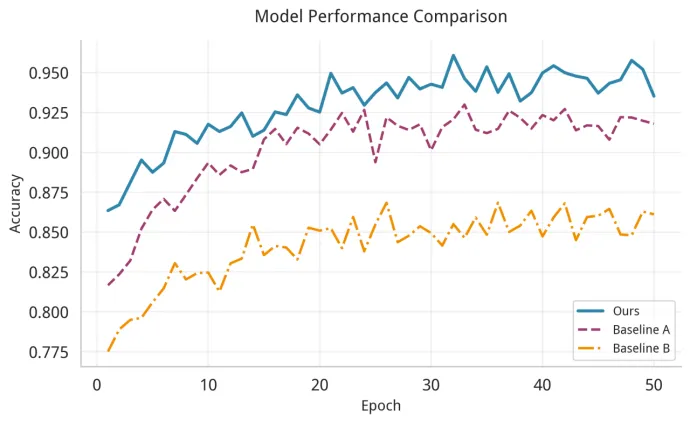
自己的方法用实线+亮色,对比方法用虚线+暗色,突出重点
去掉上右边框(spines),视觉上更清爽
线条宽度设为2-2.5,打印出来也清晰
python# 模拟数据:四种方法在三个数据集上的F1分数data = {"Dataset": ["Dataset A", "Dataset A", "Dataset A", "Dataset A","Dataset B", "Dataset B", "Dataset B", "Dataset B","Dataset C", "Dataset C", "Dataset C", "Dataset C"],"Method": ["Method 1", "Method 2", "Method 3", "Ours"] * 3,"F1-Score": [0.78, 0.82, 0.85, 0.91,0.75, 0.79, 0.83, 0.89,0.72, 0.76, 0.80, 0.87]}df = pd.DataFrame(data)fig, ax = plt.subplots(figsize=(10, 6))# 用Seaborn画分组柱状图sns.barplot(data=df, x="Dataset", y="F1-Score", hue="Method", palette="viridis", edgecolor="black", linewidth=0.8, ax=ax)# 添加数值标签for container in ax.containers:ax.bar_label(container, fmt="%.2f", padding=3, fontsize=9)ax.set_ylim(0.6, 1.0)ax.set_xlabel("", fontsize=12)ax.set_ylabel("F1-Score", fontsize=12, fontweight="bold")ax.set_title("Performance Comparison Across Datasets", fontsize=14, fontweight="bold", pad=15)ax.legend(title="", frameon=True, loc="upper right")ax.spines["top"].set_visible(False)ax.spines["right"].set_visible(False)plt.tight_layout()plt.show() |
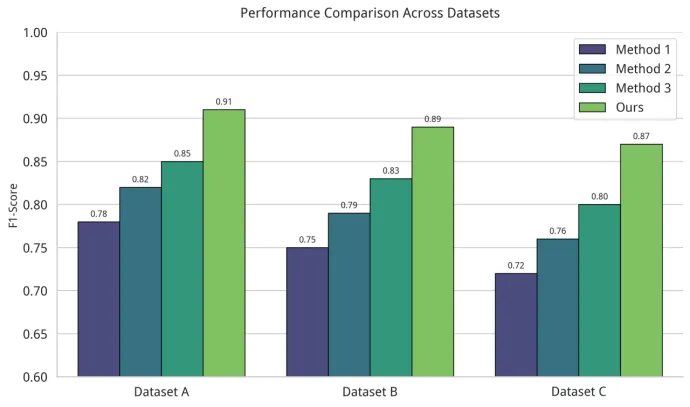
每个柱子上方标注具体数值,审稿人不用对着Y轴猜
Y轴不要从0开始(除非有特殊要求),让差异更明显
配色选viridis、plasma这类科学配色,既专业又色盲友好
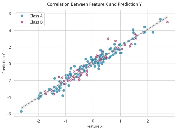
python# 模拟数据:特征X与预测值Y的关系np.random.seed(42)x = np.random.normal(0, 1, 200)y = 2 * x + np.random.normal(0, 0.5, 200)category = np.random.choice(["Class A", "Class B"], 200, p=[0.6, 0.4])df_scatter = pd.DataFrame({"Feature X": x, "Prediction Y": y, "Category": category})fig, ax = plt.subplots(figsize=(8, 6))sns.scatterplot(data=df_scatter, x="Feature X", y="Prediction Y", hue="Category", style="Category", s=80, alpha=0.8,palette=["#2E86AB", "#A23B72"], ax=ax)# 添加拟合线sns.regplot(data=df_scatter, x="Feature X", y="Prediction Y", scatter=False, color="gray", line_kws={"linestyle": "--"}, ax=ax)ax.set_xlabel("Feature X", fontsize=12, fontweight="bold")ax.set_ylabel("Prediction Y", fontsize=12, fontweight="bold")ax.set_title("Correlation Between Feature X and Prediction Y", fontsize=14, fontweight="bold", pad=15)ax.legend(frameon=True)ax.spines["top"].set_visible(False)ax.spines["right"].set_visible(False)plt.tight_layout()plt.show() |
python# 模拟数据:10个特征之间的相关性矩阵np.random.seed(42)features = [f"Feature {chr(65+i)}" for i in range(8)]corr_matrix = np.random.randn(8, 8)corr_matrix = (corr_matrix + corr_matrix.T) / 2 # 对称化np.fill_diagonal(corr_matrix, 1.0) # 对角线设为1df_corr = pd.DataFrame(corr_matrix, index=features, columns=features)fig, ax = plt.subplots(figsize=(9, 7))sns.heatmap(df_corr, annot=True, fmt=".2f", cmap="RdBu_r", center=0, square=True, linewidths=0.5,cbar_kws={"shrink": 0.8}, ax=ax)ax.set_title("Feature Correlation Matrix", fontsize=14, fontweight="bold", pad=15)plt.xticks(rotation=45, ha="right")plt.yticks(rotation=0)plt.tight_layout()plt.show() |
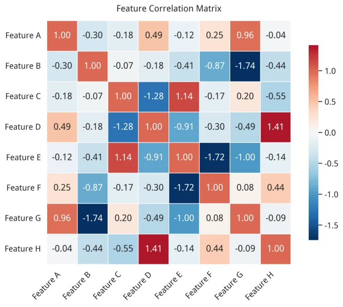
相关性矩阵用RdBu_r配色,红蓝对比清晰,中心设为0
每个格子标注数值,方便读者精确读取
设置square=True让格子变成正方形,更美观
python# 模拟数据:四种算法的运行时间分布np.random.seed(42)data_box = {"Algorithm": ["Alg A"]*50 + ["Alg B"]*50 + ["Alg C"]*50 + ["Ours"]*50,"Time (s)": np.concatenate([np.random.normal(10, 2, 50),np.random.normal(8, 1.5, 50),np.random.normal(12, 3, 50),np.random.normal(5, 1, 50)])}df_box = pd.DataFrame(data_box)fig, ax = plt.subplots(figsize=(8, 5))sns.boxplot(data=df_box, x="Algorithm", y="Time (s)", palette="Set2", width=0.5, ax=ax)# 在箱线图上叠加散点,展示原始数据分布sns.stripplot(data=df_box, x="Algorithm", y="Time (s)", size=4, color="gray", alpha=0.5, ax=ax)ax.set_xlabel("", fontsize=12)ax.set_ylabel("Running Time (seconds)", fontsize=12, fontweight="bold")ax.set_title("Running Time Comparison of Different Algorithms", fontsize=14, fontweight="bold", pad=15)ax.spines["top"].set_visible(False)ax.spines["right"].set_visible(False)plt.tight_layout()plt.show() |
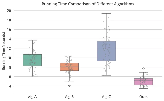
箱线图+散点图叠加,既能看统计量又能看原始数据分布
自己的方法用最醒目的颜色突出
异常点(离群值)要在论文中解释原因,别让审稿人疑惑
04
python# 导出为PNG(300DPI,适合大多数期刊)plt.savefig("figure1.png", dpi=300, bbox_inches="tight", facecolor="white")# 导出为PDF(矢量图,无限放大不模糊,顶级期刊首选)plt.savefig("figure1.pdf", bbox_inches="tight")# 导出为SVG(矢量图,可在Illustrator中编辑)plt.savefig("figure1.svg", bbox_inches="tight") |
💡重点:bbox_inches="tight" 这个参数一定要加,不然导出的图可能会被切掉边缘。 |
少即是多:一张图不要超过5种颜色,多了就乱
语义一致:同一组实验在不同图里用相同的颜色
色盲友好:避免红+绿组合,用viridis、plasma、Set2这些科学配色
突出重点:你的方法用亮色/暖色,对比方法用灰色/冷色
坐标轴标签必须清晰,单位不能省(比如"Accuracy"不如"Accuracy (%)"专业)
图注(Legend)不要挡住数据,实在挡就移到图外面
所有文字大小要协调,标题 > 坐标轴标签 > 图例 > 刻度标签
变量名用斜体,单位用正体,符合学术规范
05
❌ 坑1:Y轴截断夸大差异
❌ 坑2:3D效果华而不实
❌ 坑3:误差线缺失
❌ 坑4:图注不完整
06
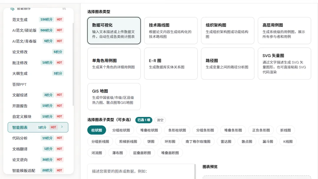
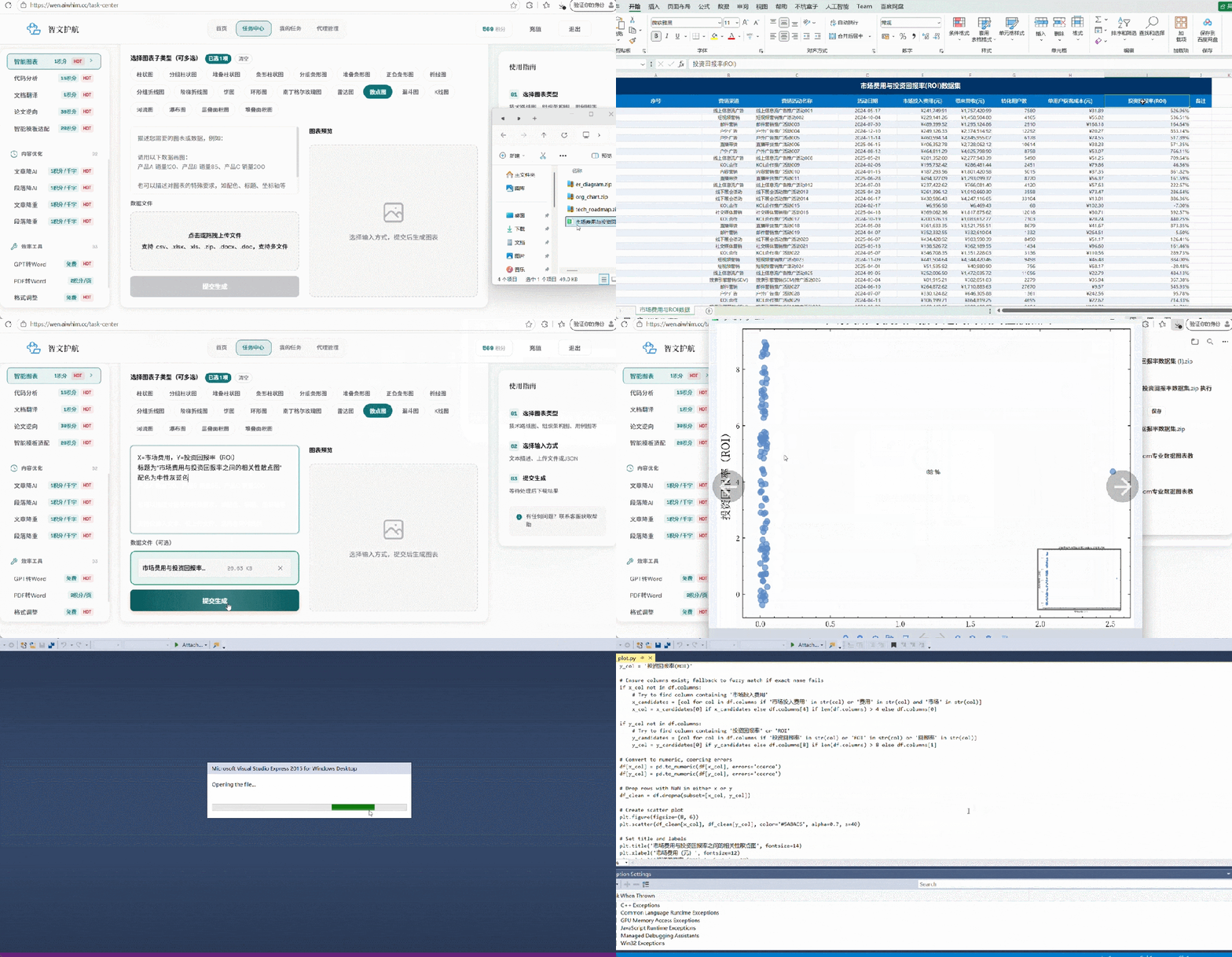
选择图表类型:支持.csv、.xlsx、.xls、.zip、.docx、.doc,也可多文件 文本描述智能生成:描述坐标轴、配色、标题等需求,1分钟出图 一键下载Zip包:查看高清原图和源代码很轻松
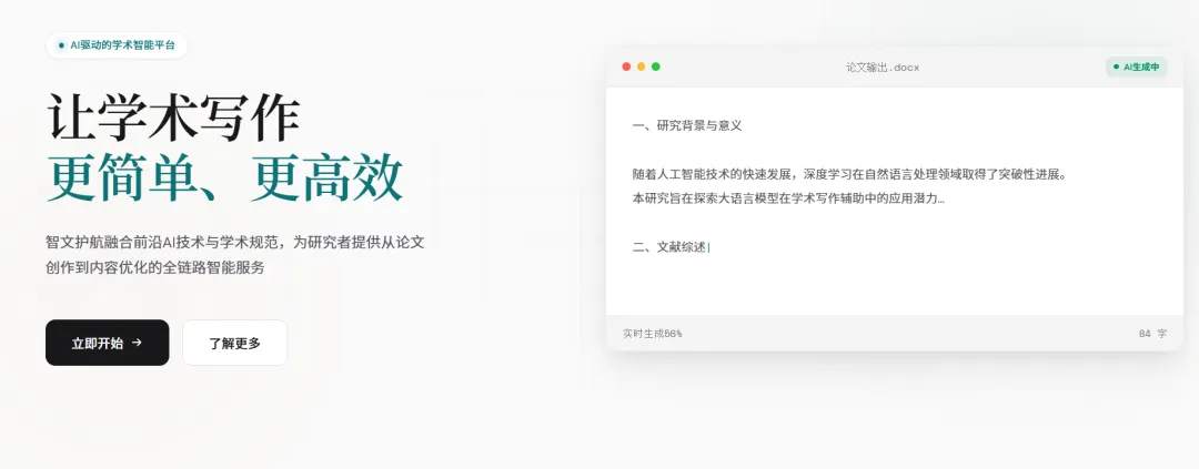
AI论文写作:输入研究方向,自动生成引言、方法、实验等完整章节
文献综述助手:一键梳理领域研究脉络,自动生成综述框架
语法润色:中英双语润色,让你的表达更地道、更学术
格式排版:一键套用目标期刊模板,参考文献自动格式化

5.3 限时福利
Python精选学习资料
智文护航科研神器积分送送送!
平台使用教程
随机文章
-
 10个月宝宝每天需要喝多少奶粉?
- 智能机器人C++开发经理(LINUX系统开发工程师)
- 简历项目汇总:从MCU到RTOS到Linux产品级项目推荐
- Linux 文本处理三剑客-grep-awk-sed
- 一周就能练完的32个python爬虫项目
- ESP-VISION发布:几行Python,ESP32-S3就能跑通YOLO视觉AI
- 学习人工智能第一步:python基础编程(小白第一步)
- AI 基础设施的"去 Python 化":Rust 与 C# 的两条替代路径
- 清华大学出版!【Python王者归来】用800个程序实例、5万行代码手把手教你,PDF拿走不谢
- 【python3.7.0setup】python3.7.0setup软件安装包下载python激活安装
- 敲Linux十年,才发现 ls/cd/pwd 这些"入门命令"藏着老司机的暗坑