一天一个科研小技巧——Python复刻桑葚环形图
- 2026-10-11 05:33:59
一天一个科研小技巧——Python复刻桑葚环形图审稿人爱看怎样的图表?🤔 往往不是越复杂越花哨的3D图🚫,而是能用最简明的二维平面📐,讲出多维度、多领域交叉数据故事的环形关系图。 📊✨ 今天,我们把目光锁定在顶刊经常翻牌子的👑双半环关联弦图上。用一段 Python 代码🐍,教你如何把一张复杂的关系矩阵,升级为包含“上游特征、下游威胁、分类渐变、关系弦线”四合一的高颜值信息载体。 🎨高颜值关系图:一图四用的黄金组合 图中的关系图其实是一个“信息组合拳”💪——它把系统特征 + 危害结果 + 模块化配色 + 复杂关联网络结合在了一起。 双半环结构(Upper/Lower Arcs):上半环展示“空气塑料圈特征”(如颗粒物属性、微生物生物量、跨区域传输),下半环展示“行星健康威胁”(如气候变化、疾病爆发、水系统破坏)。 渐变色彩映射(Color Spectrum):采用冷色调(灰蓝)代表上游特征,暖色调(红粉)代表下游风险,通过颜色的深浅分块映射不同的细分维度,视觉层次极强。 外层分类环(Outer Labels):在扇形环外侧包裹大分类外环,高瞻远瞩地归纳主题,避免散乱。 贝塞尔关系弦(Chord Arrows):内部使用带箭头的贝塞尔曲线,直观呈现从“上游特征”指向“下游威胁”的复杂因果或关联路径。 顶刊论文常用它来展示环境微生物、微塑料传播、生态毒理学以及行星健康等跨学科的机制关联。🌍 下面我们用 Python 的 matplotlib 把它画出来。👀(注:连接数据运用随机数生成,实际操作中替换为你的真实关系矩阵即可),目标图参照:SCI神仙配色大盘点(附色卡)第十二期:环形图与复杂因果图的高级科研美学 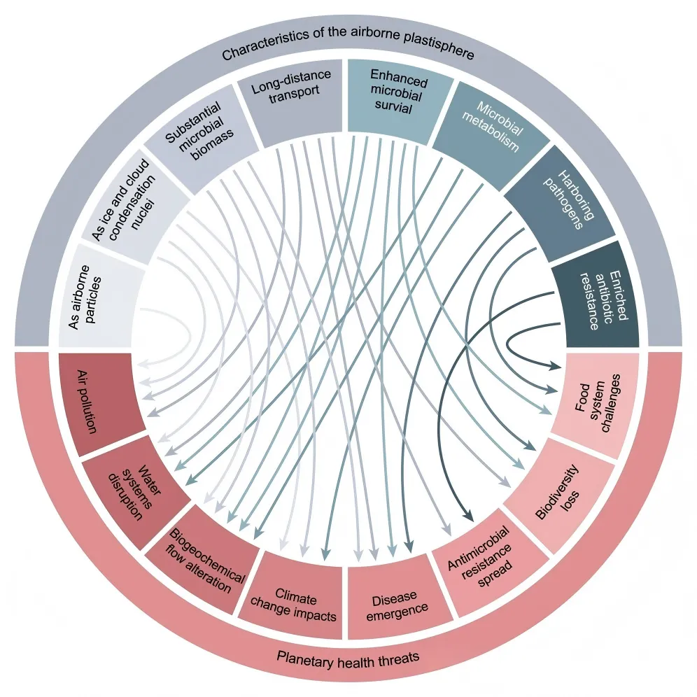
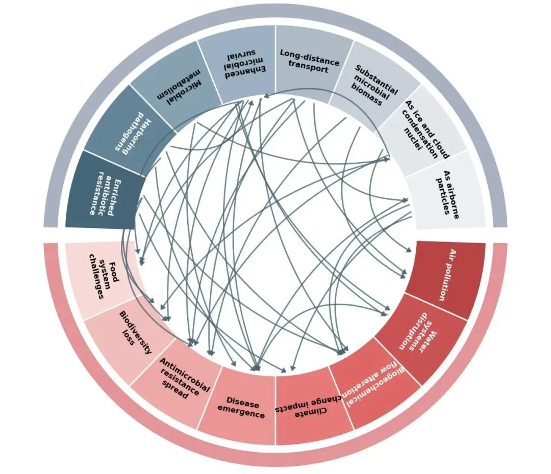
无需重型依赖的纯原生实现:很多同学想画弦图/环形图往往去装复杂的生信包或 R 语言工具,这段代码完全基于 Python 的 matplotlib.patches.Wedge 与 FancyArrowPatch,原生轻量,极易定制! 极佳的文本防倒置与对齐机制:扇形标签最怕倒过来显示。代码内部通过 mid_theta 计算旋转角度,确保无论标签在什么方位,人类视觉阅读始终保持舒服的方向。 动态对比度字体颜色:代码能够根据背景扇区色彩的深浅(冷/暖渐变),自动切换黑白文字,彻底解决深色背景下黑字看不清的尴尬。 流畅的贝塞尔曲线引导:利用 FancyArrowPatch 的 connectionstyle="arc3,rad=..." 属性,让内部穿插的连线自带优美的弧度与箭头指向,完美呈现复杂系统的流转逻辑。 这种双半环关联图尤其适合环境科学、生态学、微生物学、公共卫生等需要展现上游驱动力与下游影响机制的数据场景📦。 觉得有用的话,点个「在看」👍 或转发给同门,一起卷起来~ 我们下一个小技巧见 👋😊
🎯 目标图预览
🐍核心代码思路
import matplotlib.pyplot as pltfrom matplotlib.patches import Wedge, FancyArrowPatchimport numpy as npimport randomrandom.seed(42)top_labels = ["As airborne\nparticles","As ice and cloud\ncondensation\nnuclei","Substantial\nmicrobial\nbiomass","Long-distance\ntransport","Enhanced\nmicrobial\nsurvial","Microbial\nmetabolism","Harboring\npathogens","Enriched\nantibiotic\nresistance"]bottom_labels = ["Food\nsystem\nchallenges","Biodiversity\nloss","Antimicrobial\nresistance\nspread","Disease\nemergence","Climate\nchange impacts","Biogeochemical\nflow alteration","Water\nsystems\ndisruption","Air pollution"]top_colors = ['#EDEFF1', '#E3E6EA', '#C8CFD7', '#AFBAC7','#9BB1C2', '#86A1B2', '#638497', '#456679']bottom_colors = ['#F7D9D8', '#F1BDBB', '#EEA8A6', '#EB9493','#E77B79', '#DE6866', '#CB5354', '#B94446']# 环形的半径R_in = 3.0 # 内环半径R_out = 4.5 # 外环半径R_outer_ring_in = 4.65 # 分类标识外环内半径R_outer_ring_out = 4.95 # 分类标识外环外半径gap = 4 # 上下半圆之间的缝隙(度数)# 计算角度top_start, top_end = gap / 2, 180 - gap / 2bot_start, bot_end = 180 + gap / 2, 360 - gap / 2top_angles = np.linspace(top_start, top_end, len(top_labels) + 1)bot_angles = np.linspace(bot_start, bot_end, len(bottom_labels) + 1)fig, ax = plt.subplots(figsize=(14, 14), dpi=120)ax.set_aspect('equal')ax.axis('off')def draw_wedges(labels, angles, colors, is_top=True):centers = []for i in range(len(labels)):theta1, theta2 = angles[i], angles[i + 1]mid_theta = (theta1 + theta2) / 2centers.append(mid_theta)# 绘制扇区w = Wedge((0, 0), R_out, theta1, theta2, width=R_out - R_in,facecolor=colors[i], edgecolor='white', linewidth=2.5) # 边缘加粗ax.add_patch(w)# 计算文字旋转角度mid_rad = np.deg2rad(mid_theta)rot = mid_theta# 确保文字不会上下颠倒if 90 < rot <= 270:rot += 180# 针对不同位置的扇区微调字体颜色以保证对比度text_color = 'white' if (is_top and i >= 6) or (not is_top and i >= 5) else 'black'# 放置文本,调大字体r_text = (R_in + R_out) / 2x = r_text * np.cos(mid_rad)y = r_text * np.sin(mid_rad)ax.text(x, y, labels[i], ha='center', va='center', rotation=rot - 90,fontsize=14, color=text_color, fontweight='bold') # 字体大小从9增加到10.5,加粗return centers# 绘制上下模块top_centers = draw_wedges(top_labels, top_angles, top_colors, True)bot_centers = draw_wedges(bottom_labels, bot_angles, bottom_colors, False)w_top_outer = Wedge((0, 0), R_outer_ring_out, top_start, top_end,width=R_outer_ring_out - R_outer_ring_in, facecolor='#A9B1C1', edgecolor='none')ax.add_patch(w_top_outer)ax.text(0, R_outer_ring_out + 0.25, "Characteristics of the airborne plastisphere",ha='center', va='bottom', fontsize=14, color='black', fontweight='bold') # 字体从12增加到14w_bot_outer = Wedge((0, 0), R_outer_ring_out, bot_start, bot_end,width=R_outer_ring_out - R_outer_ring_in, facecolor='#E39496', edgecolor='none')ax.add_patch(w_bot_outer)ax.text(0, -(R_outer_ring_out + 0.25), "Planetary health threats",ha='center', va='top', fontsize=14, color='black', fontweight='bold') # 字体从12增加到14# 绘制内部的随机弦图连线(带箭头)num_arrows = 35 # 随机箭头的数量all_centers = top_centers + bot_centersfor _ in range(num_arrows):if random.random() > 0.15:start_theta = random.choice(top_centers)end_theta = random.choice(bot_centers)else:pool = top_centers if random.random() > 0.5 else bot_centersstart_theta, end_theta = random.sample(pool, 2)# 给起始和终止角度添加微小的随机偏移,防止线段完全重合start_theta += random.uniform(-6, 6)end_theta += random.uniform(-6, 6)start_rad = np.deg2rad(start_theta)end_rad = np.deg2rad(end_theta)# 箭头的起始点和终点(略微缩进,不要贴在边界上)r_arrow = R_in - 0.05start_pt = (r_arrow * np.cos(start_rad), r_arrow * np.sin(start_rad))end_pt = (r_arrow * np.cos(end_rad), r_arrow * np.sin(end_rad))# 计算曲线弧度 (两点距离越远,弧度越大)dist = np.sqrt((start_pt[0] - end_pt[0]) ** 2 + (start_pt[1] - end_pt[1]) ** 2)rad_curve = 0.2 if dist > 4 else 0.5# 绘制带弧度的箭头,加粗线条和箭头arrow = FancyArrowPatch(posA=start_pt, posB=end_pt,connectionstyle=f"arc3,rad={rad_curve}",color='#4A6572', alpha=0.8, lw=2.5, # 线宽从1.2增加到2.5,调整颜色和透明度arrowstyle='-|>,head_length=6,head_width=4') # 箭头尺寸加大ax.add_patch(arrow)# 自适应并展示图片ax.set_xlim(-R_outer_ring_out - 0.8, R_outer_ring_out + 0.8)ax.set_ylim(-R_outer_ring_out - 0.8, R_outer_ring_out + 0.8)plt.tight_layout()plt.show()
✨ 最终效果
📋 完整的CSV导入版本代码
import matplotlib.pyplot as pltfrom matplotlib.patches import Wedge, FancyArrowPatchimport numpy as npimport pandas as pdimport random# ================= 从CSV导入数据 =================def load_data_from_csv(top_labels_file, bottom_labels_file, connections_file):"""从CSV文件加载数据top_labels.csv 格式: 一列,每行一个标签bottom_labels.csv 格式: 一列,每行一个标签connections.csv 格式: start_idx,end_idx,weight,direction"""# 读取标签top_df = pd.read_csv(top_labels_file, header=None)bottom_df = pd.read_csv(bottom_labels_file, header=None)top_labels = top_df[0].tolist()bottom_labels = bottom_df[0].tolist()# 读取连接数据conn_df = pd.read_csv(connections_file)# 检查必要的列required_cols = ['start_idx', 'end_idx', 'weight', 'direction']if not all(col in conn_df.columns for col in required_cols):raise ValueError(f"CSV文件必须包含以下列: {required_cols}")connections = conn_df[required_cols].values.tolist()return top_labels, bottom_labels, connections# ================= 绘图函数 =================def create_circular_plot(top_labels, bottom_labels, connections,top_colors=None, bottom_colors=None,R_in=3.0, R_out=4.5, gap=4,num_arrows=None, figsize=(14, 14),outer_top_label="Characteristics of the airborne plastisphere",outer_bottom_label="Planetary health threats"):"""创建环形连接图"""# 自动生成颜色(如果未提供)if top_colors is None:top_colors = plt.cm.Blues(np.linspace(0.3, 0.9, len(top_labels)))if bottom_colors is None:bottom_colors = plt.cm.Reds(np.linspace(0.3, 0.9, len(bottom_labels)))# 确保颜色数量匹配if len(top_colors) != len(top_labels):raise ValueError(f"top_colors长度({len(top_colors)})与top_labels长度({len(top_labels)})不匹配")if len(bottom_colors) != len(bottom_labels):raise ValueError(f"bottom_colors长度({len(bottom_colors)})与bottom_labels长度({len(bottom_labels)})不匹配")# 计算角度top_start, top_end = gap / 2, 180 - gap / 2bot_start, bot_end = 180 + gap / 2, 360 - gap / 2top_angles = np.linspace(top_start, top_end, len(top_labels) + 1)bot_angles = np.linspace(bot_start, bot_end, len(bottom_labels) + 1)# 创建图表fig, ax = plt.subplots(figsize=figsize, dpi=120)ax.set_aspect('equal')ax.axis('off')# 绘制扇区和收集中心角度top_centers = draw_wedges(ax, top_labels, top_angles, top_colors, True, R_in, R_out)bot_centers = draw_wedges(ax, bottom_labels, bot_angles, bottom_colors, False, R_in, R_out)# 绘制外层环标签draw_outer_rings(ax, top_start, top_end, bot_start, bot_end,R_out, outer_top_label, outer_bottom_label)# 绘制连接draw_connections(ax, top_centers, bot_centers, connections, R_in, num_arrows)# 设置坐标轴范围R_outer_ring_out = R_out + 0.45ax.set_xlim(-R_outer_ring_out - 0.8, R_outer_ring_out + 0.8)ax.set_ylim(-R_outer_ring_out - 0.8, R_outer_ring_out + 0.8)plt.tight_layout()return fig, axdef draw_wedges(ax, labels, angles, colors, is_top, R_in, R_out):"""绘制扇形区块"""centers = []for i in range(len(labels)):theta1, theta2 = angles[i], angles[i + 1]mid_theta = (theta1 + theta2) / 2centers.append(mid_theta)# 绘制扇区w = Wedge((0, 0), R_out, theta1, theta2, width=R_out - R_in,facecolor=colors[i], edgecolor='white', linewidth=2.5)ax.add_patch(w)# 文字放置mid_rad = np.deg2rad(mid_theta)rot = mid_thetaif 90 < rot <= 270:rot += 180# 自动判断文字颜色if isinstance(colors[i], str):# 如果是颜色字符串,简单判断亮度text_color = 'white' if i >= len(labels) - 2 else 'black'else:text_color = 'white' if (is_top and i >= 6) or (not is_top and i >= 5) else 'black'r_text = (R_in + R_out) / 2x = r_text * np.cos(mid_rad)y = r_text * np.sin(mid_rad)ax.text(x, y, labels[i], ha='center', va='center', rotation=rot - 90,fontsize=14, color=text_color, fontweight='bold')return centersdef draw_outer_rings(ax, top_start, top_end, bot_start, bot_end, R_out,top_label, bottom_label):"""绘制外层环和标签"""R_outer_ring_in = R_out + 0.15R_outer_ring_out = R_out + 0.45# 上半部分外层环w_top_outer = Wedge((0, 0), R_outer_ring_out, top_start, top_end,width=R_outer_ring_out - R_outer_ring_in,facecolor='#A9B1C1', edgecolor='none')ax.add_patch(w_top_outer)ax.text(0, R_outer_ring_out + 0.25, top_label,ha='center', va='bottom', fontsize=14, color='black', fontweight='bold')# 下半部分外层环w_bot_outer = Wedge((0, 0), R_outer_ring_out, bot_start, bot_end,width=R_outer_ring_out - R_outer_ring_in,facecolor='#E39496', edgecolor='none')ax.add_patch(w_bot_outer)ax.text(0, -(R_outer_ring_out + 0.25), bottom_label,ha='center', va='top', fontsize=14, color='black', fontweight='bold')def draw_connections(ax, top_centers, bot_centers, connections, R_in, num_arrows=None):"""根据连接数据绘制箭头"""# 如果指定了箭头总数,根据权重生成多个箭头if num_arrows is not None:# 计算总权重total_weight = sum(conn[2] for conn in connections)if total_weight == 0:return# 根据权重分配箭头数量all_arrows = []for start_idx, end_idx, weight, direction in connections:n_arrows = max(1, int(num_arrows * weight / total_weight))for _ in range(n_arrows):all_arrows.append([start_idx, end_idx, direction])# 打乱顺序random.shuffle(all_arrows)connections_to_draw = all_arrowselse:# 直接使用connections中的每条记录画一个箭头connections_to_draw = [[c[0], c[1], c[3]] for c in connections]# 绘制每个箭头for start_idx, end_idx, direction in connections_to_draw:try:# 获取角度if direction == 'top_to_bottom':start_theta = top_centers[start_idx]end_theta = bot_centers[end_idx]elif direction == 'top_to_top':start_theta = top_centers[start_idx]end_theta = top_centers[end_idx]elif direction == 'bottom_to_bottom':start_theta = bot_centers[start_idx]end_theta = bot_centers[end_idx]elif direction == 'bottom_to_top':start_theta = bot_centers[start_idx]end_theta = top_centers[end_idx]else:print(f"警告: 未知的方向 '{direction}',跳过")continueexcept IndexError as e:print(f"警告: 索引超出范围 - {e},跳过")continue# 添加随机偏移避免完全重合start_theta += random.uniform(-3, 3)end_theta += random.uniform(-3, 3)start_rad = np.deg2rad(start_theta)end_rad = np.deg2rad(end_theta)r_arrow = R_in - 0.05start_pt = (r_arrow * np.cos(start_rad), r_arrow * np.sin(start_rad))end_pt = (r_arrow * np.cos(end_rad), r_arrow * np.sin(end_rad))# 曲线弧度dist = np.sqrt((start_pt[0] - end_pt[0]) ** 2 + (start_pt[1] - end_pt[1]) ** 2)rad_curve = 0.2 if dist > 4 else 0.5arrow = FancyArrowPatch(posA=start_pt, posB=end_pt,connectionstyle=f"arc3,rad={rad_curve}",color='#4A6572', alpha=0.8, lw=2.5,arrowstyle='-|>,head_length=6,head_width=4')ax.add_patch(arrow)# ================= 主程序 =================# 设置随机种子(可选,用于复现)random.seed(42)# 从CSV文件加载数据top_labels_file = 'top_labels.csv'bottom_labels_file = 'bottom_labels.csv'connections_file = 'connections.csv'try:top_labels, bottom_labels, connections = load_data_from_csv(top_labels_file, bottom_labels_file, connections_file)print(f"成功加载数据:")print(f" - 顶部标签: {len(top_labels)} 个")print(f" - 底部标签: {len(bottom_labels)} 个")print(f" - 连接关系: {len(connections)} 条")# 创建图表fig, ax = create_circular_plot(top_labels=top_labels,bottom_labels=bottom_labels,connections=connections,num_arrows=35, # 总箭头数量(可选)figsize=(14, 14),outer_top_label="Characteristics of the airborne plastisphere",outer_bottom_label="Planetary health threats")# 保存图表(可选)# plt.savefig('circular_plot.png', dpi=300, bbox_inches='tight')plt.show()except FileNotFoundError as e:print(f"错误: 找不到文件 - {e}")print("请确保以下CSV文件存在于当前目录:")print(" - top_labels.csv")print(" - bottom_labels.csv")print(" - connections.csv")except Exception as e:print(f"错误: {e}")
这段代码为你解决了哪些排版痛点?
本文来自网友投稿或网络内容,如有侵犯您的权益请联系我们删除,联系邮箱:596563534@qq.com 。
