期刊图片复现|Python绘制多组韦恩图
- 2026-10-11 06:11:57
期刊图片复现|Python绘制多组韦恩图

论文:Effects of environmental factors on multisensory perceptions ofcomfort, safety, and pleasure in autumnal urban riverfrontspaces 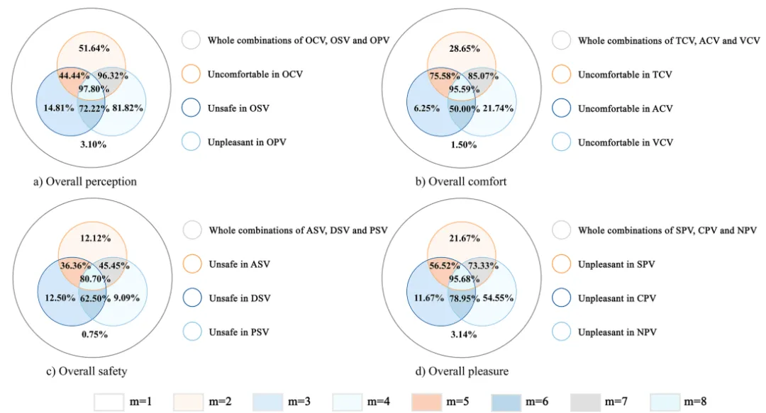
论文原图 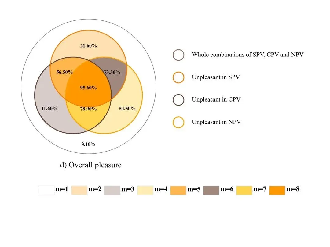
仿图 
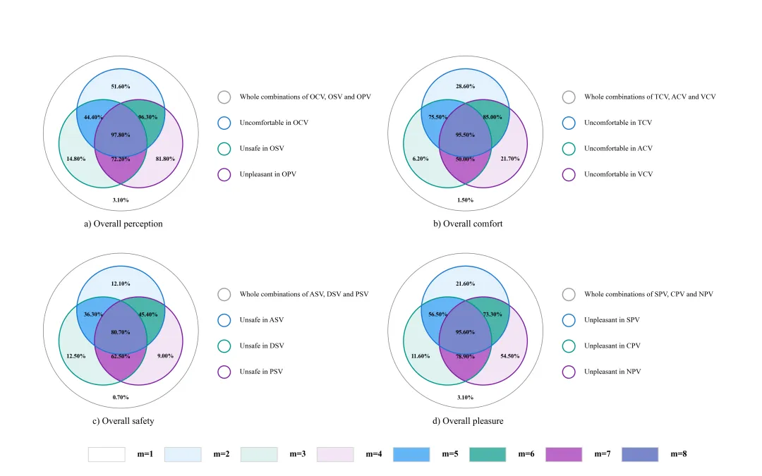
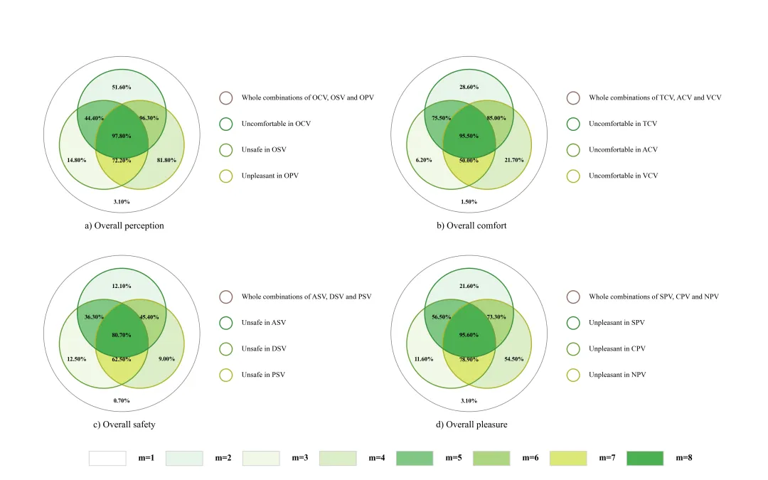
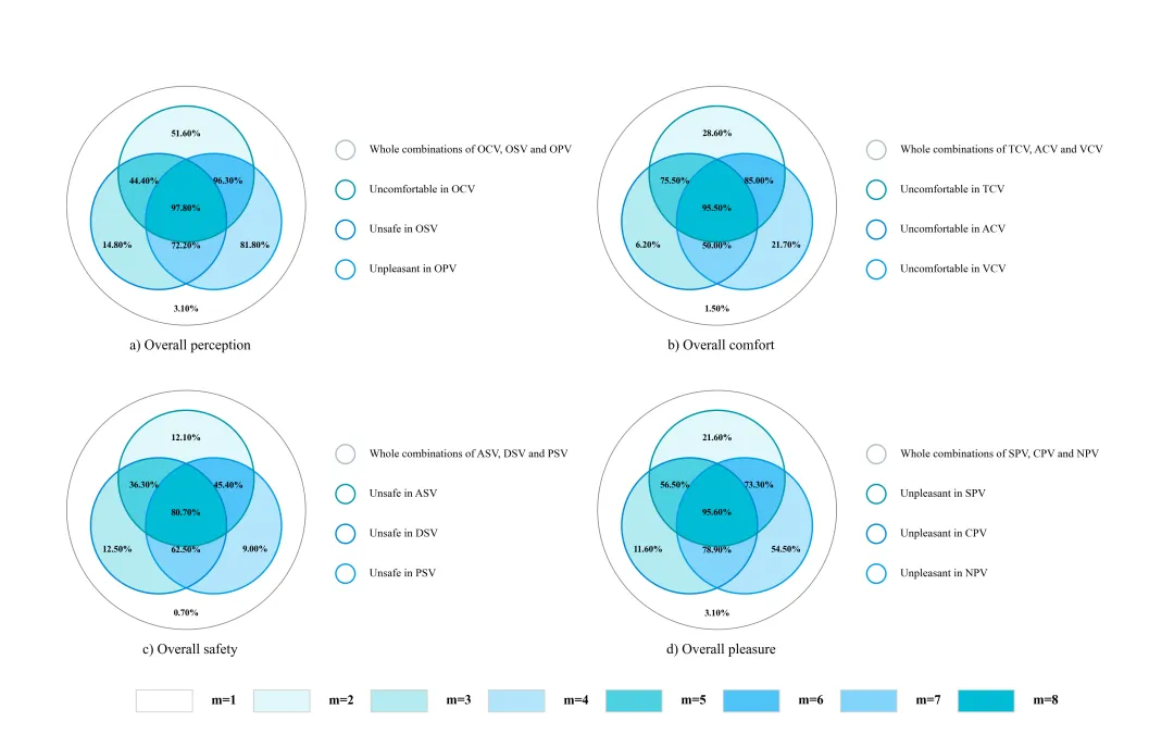
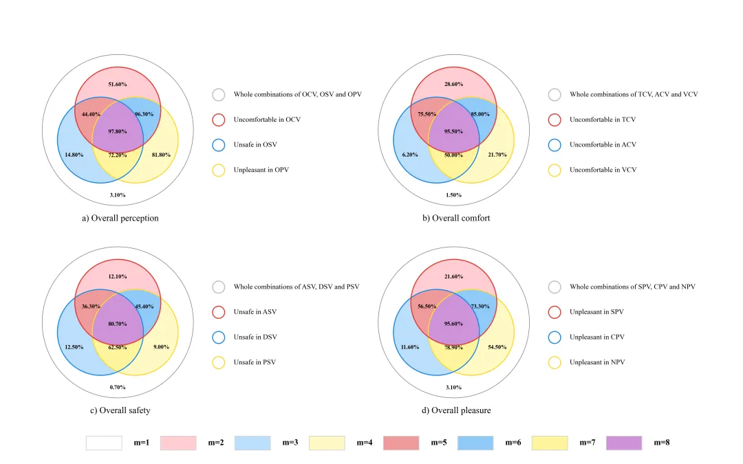
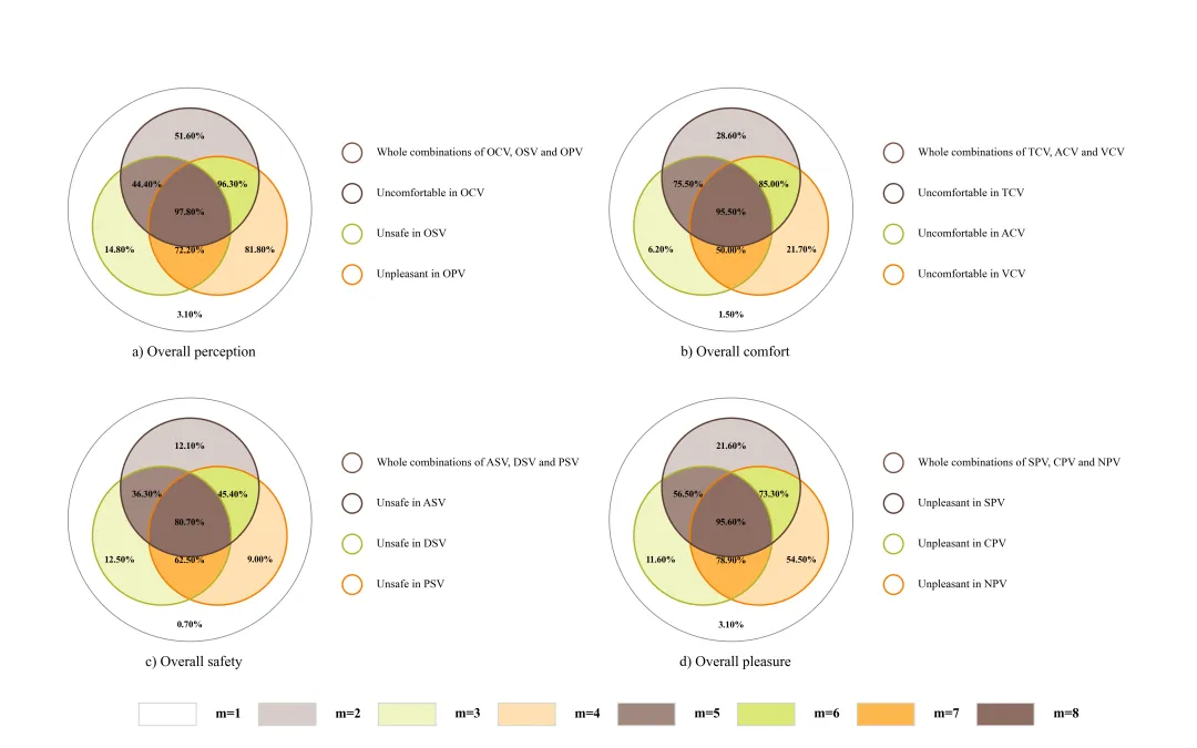
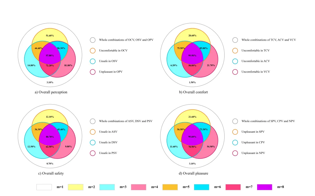
多种配色 



库的导入以及字体设置 

分析函数 该分析部分的核心原理是利用 Pandas 的 

颜色库的设置以及配色方案的选择 

韦恩图绘制函数 

单张子图绘制与保存,包括子图的绘制以及下面图例的设置部分 

执行部分,包括数据读取分析、子图及组合图绘制等 



期刊图片复现|Python绘制二维偏依赖PDP图 期刊复现|python绘制基于SHAP分析和GAM模型拟合的单特征依赖图 期刊图片复现|python绘制带有渐变颜色shap特征重要性组合图(条形图+蜂巢图) 期刊复现|用Python绘制SHAP特征重要性总览图、依赖图、双特征交互效应SHAP图,解锁XGBoost模型的终极奥秘 期刊图片复现|Python绘制shap重要性蜂巢图+单特征依赖图+交互效应强度气泡图+交互效应依赖图(回归+二分类+分类) 

需要的请后台私信我获取详细信息,注意只会分享练习数据和代码文件,不会提供答疑服务,代码文件中已经包含了每行代码的完整注释!!
代码绘制成果展示
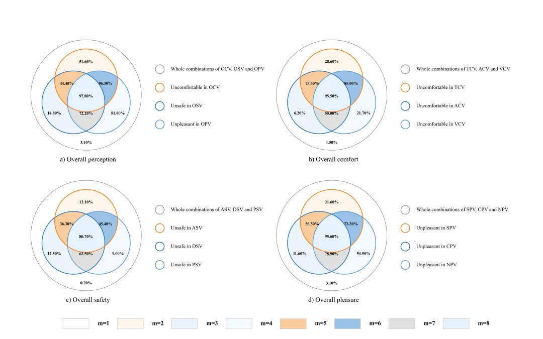
代码解释
第一部分
# =========================================================================================# ====================================== 1. 库的导入 =========================================# =========================================================================================import matplotlib.pyplot as pltfrom matplotlib_venn import venn3, venn3_circlesfrom matplotlib.patches import Circle, Rectanglefrom matplotlib.transforms import Affine2Dimport pandas as pdimport mathplt.rcParams['font.family'] = 'serif'plt.rcParams['font.serif'] = ['Times New Roman']plt.rcParams['axes.unicode_minus'] = Falseimport matplotlibmatplotlib.rcParams['pdf.fonttype'] = 42matplotlib.rcParams['ps.fonttype'] = 42
第二部分
groupby 方法,将三个二值(0或1)特征因子变量视为韦恩图的三个集合边界,把原始数据按照这三个因子的所有逻辑组合进行切片分组,随后计算每个特定分组内目标变量的算术平均值,最后将这些统计均值格式化为百分比,并根据组合索引映射到韦恩图对应的区域,从而展示不同因子在单独存在或叠加状态下对整体感知指标的具体贡献程度。# =========================================================================================# ====================================== 2.数据分析函数=========================================# =========================================================================================def analyze_perception_data(df):charts_config = {'a': {'factors': ['OCV_neg', 'OSV_neg', 'OPV_neg'], #因子列'target': 'OEV_neg', #目标变量列名'title': 'a) Overall perception', #图表标题'legend': ['Whole combinations of OCV, OSV and OPV', 'Uncomfortable in OCV', 'Unsafe in OSV','Unpleasant in OPV'] #图例的文本},'b': {'factors': ['TCV_neg', 'ACV_neg', 'VCV_neg'],'target': 'OCV_neg_result','title': 'b) Overall comfort','legend': ['Whole combinations of TCV, ACV and VCV', 'Uncomfortable in TCV', 'Uncomfortable in ACV','Uncomfortable in VCV']},'c': {'factors': ['ASV_neg', 'DSV_neg', 'PSV_neg'],'target': 'OSV_neg_result','title': 'c) Overall safety','legend': ['Whole combinations of ASV, DSV and PSV', 'Unsafe in ASV', 'Unsafe in DSV', 'Unsafe in PSV']},'d': {'factors': ['SPV_neg', 'CPV_neg', 'NPV_neg'],'target': 'OPV_neg_result','title': 'd) Overall pleasure','legend': ['Whole combinations of SPV, CPV and NPV', 'Unpleasant in SPV', 'Unpleasant in CPV','Unpleasant in NPV']}}analyzed_data = {} #用于存储分析后的数据结果for key, config in charts_config.items(): #遍历每一个图表配置grouped = df.groupby(config['factors'])[config['target']].mean() #根据配置的因子对数据进行分组,并计算目标变量的平均值print(grouped)values = {} # 初始化一个字典,用于存储韦恩图各部分的百分比数值# 格式化百分比values['top'] = f"{grouped[(1, 0, 0)] * 100:.2f}%" #顶部圆独有部分的均值values['left'] = f"{grouped[(0, 1, 0)] * 100:.2f}%" #左下圆独有部分的均值values['right'] = f"{grouped[(0, 0, 1)] * 100:.2f}%" #右下圆独有部分的均值values['left_top'] = f"{grouped[(1, 1, 0)] * 100:.2f}%" #左上交叉部分的均值values['right_top'] = f"{grouped[(1, 0, 1)] * 100:.2f}%" #右上交叉部分的均值values['left_right'] = f"{grouped[(0, 1, 1)] * 100:.2f}%" #下方左右交叉部分的均值values['center'] = f"{grouped[(1, 1, 1)] * 100:.2f}%" #中心三圆交叉部分的均值outside_val = f"{grouped[(0, 0, 0)] * 100:.2f}%" #三个因子均为0时的均值,外部analyzed_data[key] = { #将分析结果存入字典中'title': config['title'], #标题'values': values, #各部分数值'outside': outside_val, # 外部数值'legend': config['legend'] #图例文本}print(values)return analyzed_data #返回分析数据
第三部分
# =========================================================================================# ====================================== 3.颜色库 =========================================# =========================================================================================COLOR_LIBRARY = {1: {'m1': '#FFFFFF', 'm2': '#FFF5EB', 'm3': '#EBF4FA', 'm4': '#F5FAFE','m5': '#F9CB9C', 'm6': '#9BC2E6', 'm7': '#E0E0E0', 'm8': '#E6F2FF','border_top': '#F48024', 'border_left': '#2E75B6', 'border_right': '#5B9BD5', 'border_gray': '#A0A0A0'},}SELECTED_SCHEME = 1 # 选择配色方案palette = COLOR_LIBRARY.get(SELECTED_SCHEME, COLOR_LIBRARY[1]) # 获取配色方案
第四部分
# =========================================================================================# ====================================== 4.韦恩图绘制函数=========================================# =========================================================================================def draw_venn_unit(ax, data_dict):vals = data_dict['values'] # 提取分析的数值colors = palette # 获取当前选定的颜色方案#绘制基础韦恩图v = venn3(subsets=(1, 1, 1, 1, 1, 1, 1), ax=ax, set_labels=None)# 绘制韦恩图的圆周轮廓线c = venn3_circles(subsets=(1, 1, 1, 1, 1, 1, 1), ax=ax, linewidth=1.5)#绕中心旋转 180 度,将倒三角变为正三角tr = Affine2D().rotate_deg(180) + ax.transData#定义韦恩图各部分ID及颜色的映射关系mapping = {'001': {'key': 'top', 'color': colors['m2']},'010': {'key': 'left', 'color': colors['m3']},'100': {'key': 'right', 'color': colors['m4']},'011': {'key': 'left_top', 'color': colors['m5']},'101': {'key': 'right_top', 'color': colors['m6']},'110': {'key': 'left_right', 'color': colors['m7']},'111': {'key': 'center', 'color': colors['m8']}}patch.set_transform(tr) #对图形块应用旋转变换if info.get('color'):patch.set_facecolor(info['color']) #设置图形块的填充颜色patch.set_alpha(1.0) #设置透明度if label:x, y = label.get_position() #获取标签当前的坐标位置new_x, new_y = -x, -y #坐标反转#微调文字位置if pid == '001': new_y -= 0.05if pid == '110': new_y += 0.05if pid == '111': new_y -= 0.02label.set_position((new_x, new_y))label.set_text(vals[info['key']]) #设置标签文本为对应的数值label.set_fontsize(9) #设置字体大小label.set_fontweight('bold') #设置字体加粗#遍历所有的圆轮廓for circle in c:circle.set_transform(tr) #对圆轮廓应用旋转变换# 设置的边框颜色c[0].set_edgecolor(colors['border_right'])c[1].set_edgecolor(colors['border_left'])c[2].set_edgecolor(colors['border_top'])#外围圆圈outer_circle = Circle((0, 0),radius=0.75,transform=ax.transData,fill=False,edgecolor='gray',linewidth=0.8)ax.add_patch(outer_circle) #添加到坐标轴上#外围圆圈数值ax.text(0, -0.65, data_dict['outside'], ha='center', va='center', fontsize=9, fontweight='bold')#绘制右侧图例legend_left = 1.0 #图例左边界的x坐标start_y = 0.35 #图例起始的y坐标step_y = 0.25 #图例之间的垂直间距r = 0.06 #图例小圆圈的半径# 图例属性设置,文本, 填充色, 边框色items = [(data_dict['legend'][0], 'none', colors['border_gray']),(data_dict['legend'][1], 'none', colors['border_top']),(data_dict['legend'][2], 'none', colors['border_left']),(data_dict['legend'][3], 'none', colors['border_right'])]#循环绘制for i, (text, face, edge) in enumerate(items):y_pos = start_y - i * step_y #当前图例的y坐标# 绘制圆圈ax.add_patch(Circle((legend_left, y_pos),r,facecolor=face,edgecolor=edge,linewidth=1.5))# 绘制文字ax.text(legend_left + 0.15,y_pos,text,va='center',fontsize=11)#绘制子图标题ax.text(0.25, -0.05, data_dict['title'], ha='center', va='center', transform=ax.transAxes, fontsize=14)ax.set_xlim(-0.8, 2.5) #x轴显示范围ax.set_ylim(-0.8, 0.8) #y轴显示范围ax.axis('off') #关闭坐标轴显示ax.set_aspect('equal') #设置坐标轴比例为1:1
第五部分
# =========================================================================================# ====================================== 5.子图绘制及图例设置函数=========================================# =========================================================================================def plot_and_save_individual(data_charts, output_dir=r'E:\公众号素材\1118-韦恩图'):palette_name = f"palette_{SELECTED_SCHEME}" #文件名for key, data_dict in data_charts.items(): # 遍历所有分析好的数据fig, ax = plt.subplots(figsize=(8, 6)) #创建图形draw_venn_unit(ax, data_dict) #调用绘图函数绘制韦恩图# 添加一个新的坐标轴用于绘制图例legend_ax = fig.add_axes([0.1,#左0.2,#下0.8,# 宽0.05])#高legend_ax.axis('off')colors = palette # 获取当前选定的颜色方案m_legend_items = [ #定义底部图例项列表('m=1', colors['m1'], 'lightgray'),('m=8', colors['m8'], 'lightgray')]num_items = len(m_legend_items) #图例的总数item_width = 1.0 / num_items #每个图例的宽度#绘制图例for i, (label, fill, edge) in enumerate(m_legend_items):x_pos = i * item_width + 0.02 #计算当前项的x起始位置#创建图例的图形rect = Rectangle((x_pos, 0.2),0.06,0.75,facecolor=fill,edgecolor=edge,transform=legend_ax.transAxes,zorder=20)legend_ax.add_patch(rect) # 添加到坐标轴#图例的文本legend_ax.text(x_pos + 0.065,0.65,label,transform=legend_ax.transAxes,va='center',fontsize=12,fontweight='bold')plt.subplots_adjust(left=0.05, right=0.95, top=0.95, bottom=0.35) # 调整子图布局边距#保存plt.close(fig)
第六部分
# =========================================================================================# ====================================== 6.数据读取分析、子图及组合图绘制执行部分=========================================# =========================================================================================if __name__ == "__main__":excel_filename = r'mulated_research_data.xlsx' #数据文件output_dir = r'' #输出文件夹raw_df = pd.read_excel(excel_filename) #读取all_charts_data = analyze_perception_data(raw_df) #调用分析函数处理数据plot_and_save_individual(all_charts_data, output_dir) #调用函数绘制#绘制组合图keys_to_draw = ['a', 'b', 'c', 'd'] # 定义需要包含在组合图中的图表key列表num_plots = len(keys_to_draw) #子图数量cols = 2 #列rows = math.ceil(num_plots / cols) #行数fig_width = 8 * cols #总宽度fig_height = 5 * rows #总高度#创建画布fig, axes = plt.subplots(rows, cols, figsize=(fig_width, fig_height))axes_flat = axes.flatten() # 将多维axes数组展平为一维#遍历每一个子图区域并调用绘图函数for i, ax in enumerate(axes_flat): # 遍历所有的子图坐标轴if i < num_plots: # 如果索引在需要绘制的图表范围内key = keys_to_draw[i] # 获取对应的图表keydraw_venn_unit(ax, all_charts_data[key]) # >>> 调用核心绘图函数在当前子图区域绘图 <<<else: # 如果超出范围ax.axis('off') # 关闭该子图显示legend_ax = fig.add_axes([0.1, 0.02, 0.8, 0.05]) #添加一个新的坐标轴用于绘制图例legend_ax.axis('off') # 关闭该坐标轴的显示plt.subplots_adjust(left=0.05,right=0.95,top=0.95,bottom=0.15 / rows,wspace=0.01,hspace=-0.1)plt.savefig(save_path_png, dpi=300)plt.savefig(save_path_pdf, dpi=300)
如何应用?
1.目标、特征因子定义,右侧图例和名称设置:
'a': {'factors': ['OCV_neg', 'OSV_neg', 'OPV_neg'], #因子列'target': 'OEV_neg', #目标变量列名'title': 'a) Overall perception', #图表标题'legend': ['Whole combinations of OCV, OSV and OPV', 'Uncomfortable in OCV', 'Unsafe in OSV','Unpleasant in OPV'] #图例的文本},
2.设置绘图使用的颜色方案:
SELECTED_SCHEME = 20 # 选择配色方案3.设置子图的保存地址:
save_path_png = fr"{palette_name}.png"save_path_pdf = fr"{palette_name}.pdf"
4.设置原始数据的路径:
excel_filename = r'research_data.xlsx'5.设置组合图的保存路径:
save_path_png = fr"combined_{SELECTED_SCHEME}.png"save_path_pdf = fr"combined_{SELECTED_SCHEME}.pdf"
推荐
获取方式
本文来自网友投稿或网络内容,如有侵犯您的权益请联系我们删除,联系邮箱:596563534@qq.com 。
