期刊图片复现|Python绘制高颜值星状图
- 2026-10-11 06:11:58
期刊图片复现|Python绘制高颜值星状图

论文:Spatial-temporal heterogeneity of ecosystem service interactions and theirsocial-ecological drivers: Implications for spatial planning and management 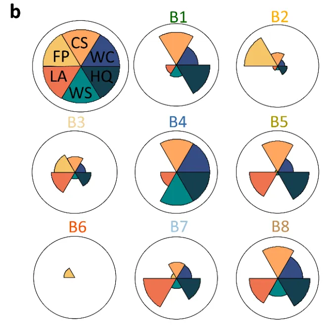
论文原图 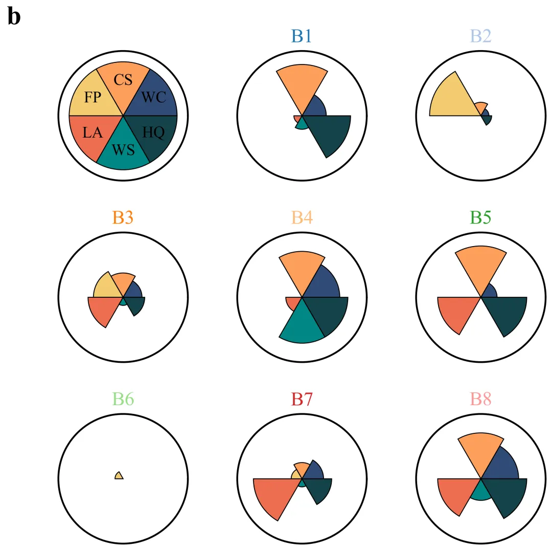
仿图 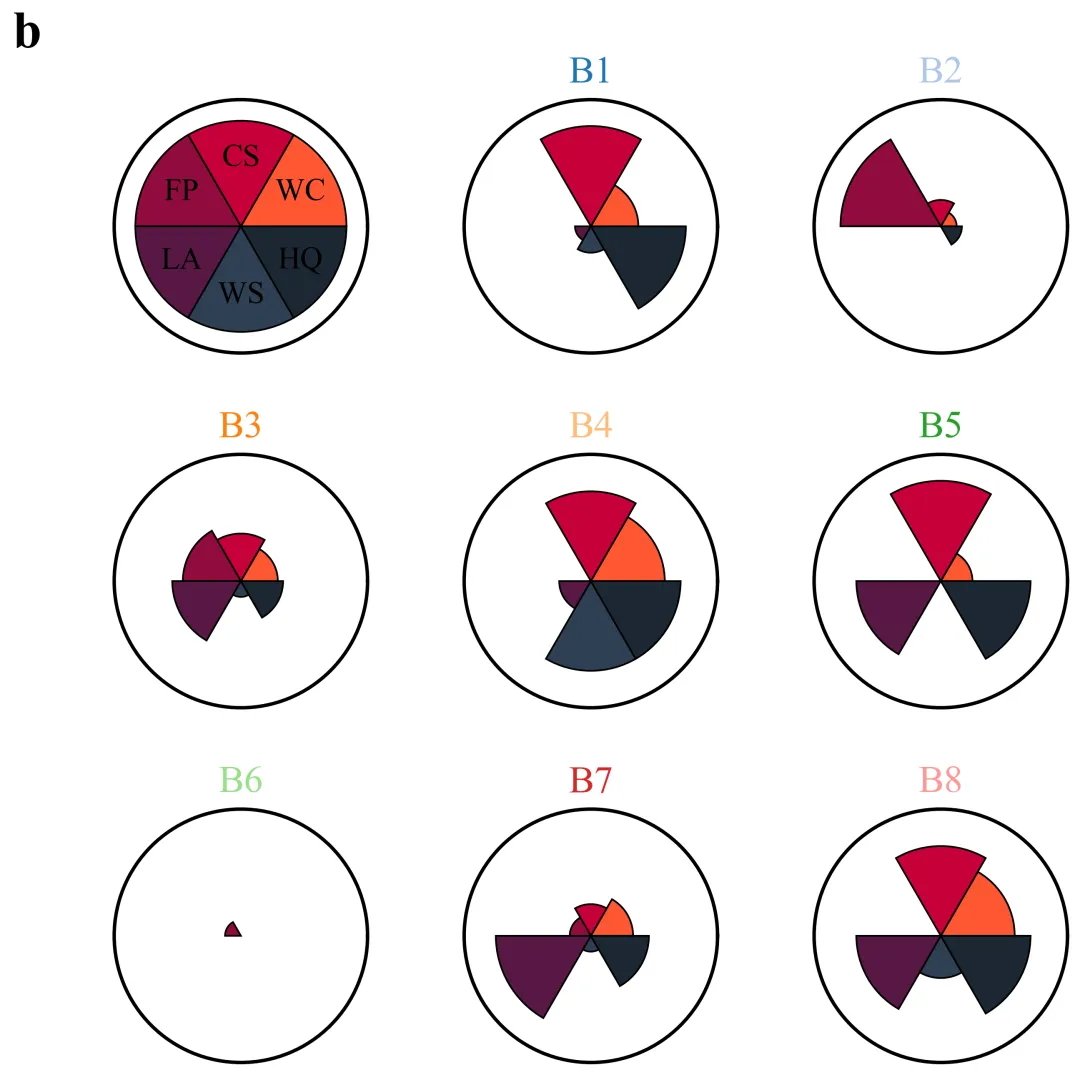
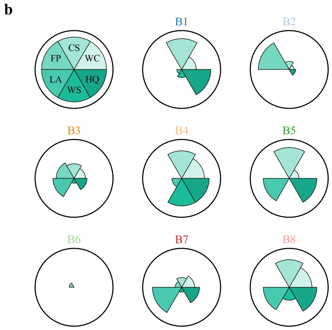
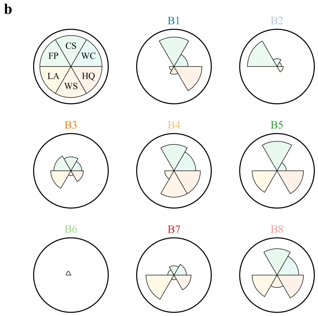
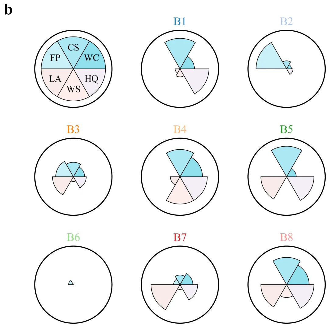
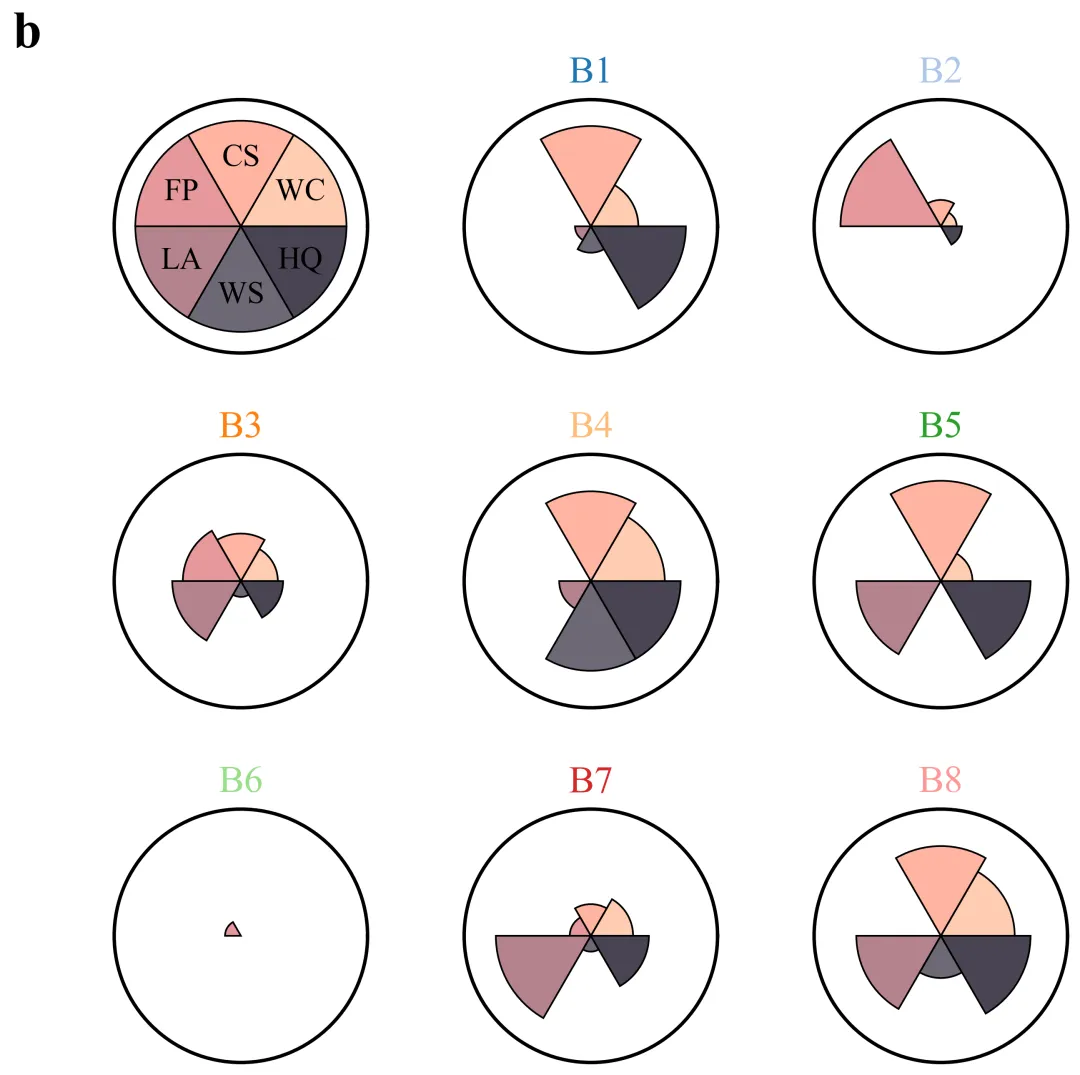
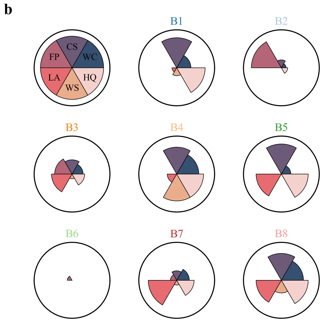
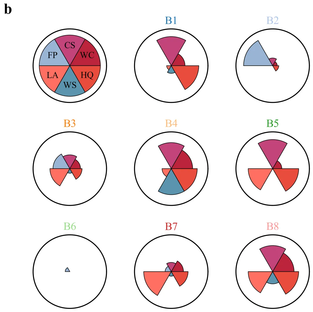
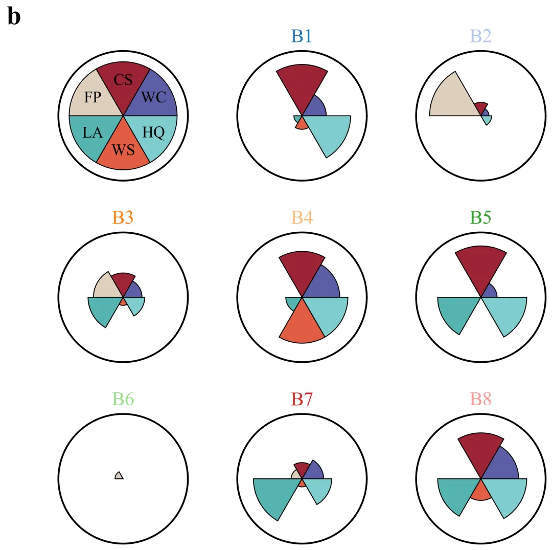
多种配色 



库的导入以及字体设置 

设置颜色库 

绘图函数:数据准备与网格计算 

绘图函数:创建画布与子图坐标系格式化 

绘图函数:绘制参考图图例 

绘图函数:其他子图绘制 

执行部分 



期刊图片复现|Python绘制二维偏依赖PDP图 期刊复现|python绘制基于SHAP分析和GAM模型拟合的单特征依赖图 期刊图片复现|python绘制带有渐变颜色shap特征重要性组合图(条形图+蜂巢图) 期刊复现|用Python绘制SHAP特征重要性总览图、依赖图、双特征交互效应SHAP图,解锁XGBoost模型的终极奥秘 期刊图片复现|Python绘制shap重要性蜂巢图+单特征依赖图+交互效应强度气泡图+交互效应依赖图(回归+二分类+分类) 

公众号中目前包含270+篇代码+数据+参考论文,后续将会持续更新,需要请后台私信我,注意只会分享练习数据、参考论文和代码文件,仅提供有关代码的答疑,不会提供其他答疑服务,代码文件中已经包含了每行代码的完整注释!!!
代码绘制成果展示
代码解释
第一部分
# =========================================================================================# ====================================== 1. 环境设置 =======================================# =========================================================================================import matplotlib.pyplot as pltimport numpy as np
第二部分
# =========================================================================================# ======================================2.颜色库=======================================# =========================================================================================COLOR_SCHEMES = {1: ['#314B76', '#FC9F5B', '#F3CC71', '#ED6D4E', '#008784', '#144249'],}
第三部分
# =========================================================================================# ======================================3.绘图函数=======================================# =========================================================================================def plot_advanced_forest_chart(df, scheme_id):total_plots = len(df) + 1 #子图数cols = int(np.ceil(np.sqrt(total_plots))) #列数rows = int(np.ceil(total_plots / cols)) #行数
第四部分
outer_circle_linewidth = 2.0 #外圈线宽max_radius_limit = 1.2 #最大半径#创建画布fig, axs = plt.subplots(rows, #行cols, #列subplot_kw={'projection': 'polar'}, #极坐标图figsize=(cols * 10 / 3, rows * 10 / 3)) #画布大小ax.grid(False) #关闭网格线ax.spines['polar'].set_visible(True) #外圈边框ax.spines['polar'].set_edgecolor('black') #外圈边框颜色ax.spines['polar'].set_linewidth(outer_circle_linewidth) #外圈线宽ax.set_ylim(0, max_radius_limit) #半径显示范围
第五部分
ax_leg = axs[0, 0] #取第一个子图作图例#设置图例ax_leg.bar(angles, #角度[1] * num_cats, #半径width=width, #扇形宽度bottom=0.0, #起始半径color=colors_to_use, #扇形颜色edgecolor='black', #边框颜色linewidth=1) #边框线宽
第六部分
positions = [] #初始化子图位置列表if vals[i] > 0:ax.bar(angles[i], #角度vals[i], #半径width=width, #宽度bottom=0.0, #起始半径color=colors_to_use[i], #颜色edgecolor='black', #边框颜色linewidth=1) #边框线宽
第七部分
# =========================================================================================# ======================================4.执行部分=======================================# =========================================================================================if __name__ == '__main__':excel_file = r'data.xlsx'df_real = pd.read_excel(excel_file) #读取数据scheme_id = 1selected_hex_colors = COLOR_SCHEMES[scheme_id]print('正在绘制并保存方案:', scheme_id)plot_advanced_forest_chart(df_real, scheme_id)
如何应用到你自己的数据
1.设置原始数据的保存路径,执行部分:
excel_file = r'data.xlsx'2.设置是否进行批量绘图,执行部分:
plot_all = True3.设置非类别列的类名,绘图函数部分:
categories = [col for col in df.columns if col != 'Bundle'] #类别名4.设置绘图结果的保存地址,绘图函数部分:
plt.savefig(fr'scheme_{scheme_id}.png', dpi=300, bbox_inches='tight')推荐
获取方式
本文来自网友投稿或网络内容,如有侵犯您的权益请联系我们删除,联系邮箱:596563534@qq.com 。
