import pandas as pdimport numpy as np# 生成样本数据data = pd.DataFrame({ 'Department': ['Sales', 'Marketing', 'HR', 'IT', 'Finance'], 'Actual': np.random.randint(50, 100, size=5), 'Target': np.random.randint(70, 90, size=5), 'Poor': [60] * 5, 'Satisfactory': [80] * 5, 'Good': [100] * 5})data
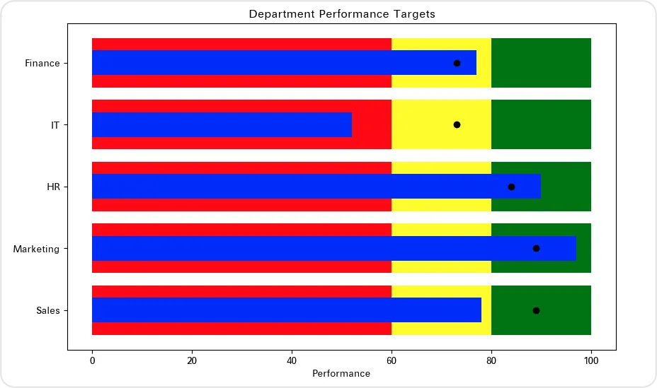
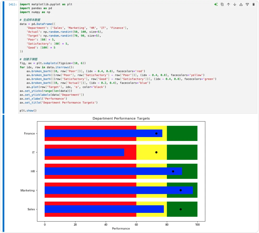
import matplotlib.pyplot as plt import pandas as pd import numpy as np # 生成样本数据 data = pd.DataFrame({ 'Department': ['Sales', 'Marketing', 'HR', 'IT', 'Finance'], 'Actual': np.random.randint(50, 100, size=5), 'Target': np.random.randint(70, 90, size=5), 'Poor': [60] * 5, 'Satisfactory': [80] * 5, 'Good': [100] * 5 }) # 创建子弹图 fig, ax = plt.subplots(figsize=(10, 6)) for idx, row in data.iterrows(): ax.broken_barh([(0, row['Poor'])], (idx - 0.4, 0.8), facecolors='red') ax.broken_barh([(row['Poor'], row['Satisfactory'] - row['Poor'])], (idx - 0.4, 0.8), facecolors='yellow') ax.broken_barh([(row['Satisfactory'], row['Good'] - row['Satisfactory'])], (idx - 0.4, 0.8), facecolors='green') ax.broken_barh([(0, row['Actual'])], (idx - 0.2, 0.4), facecolors='blue') ax.plot(row['Target'], idx, 'o', color='black') ax.set_yticks(range(len(data))) ax.set_yticklabels(data['Department']) ax.set_xlabel('Performance') ax.set_title('Department Performance Targets') plt.show()
 10个月宝宝每天需要喝多少奶粉?