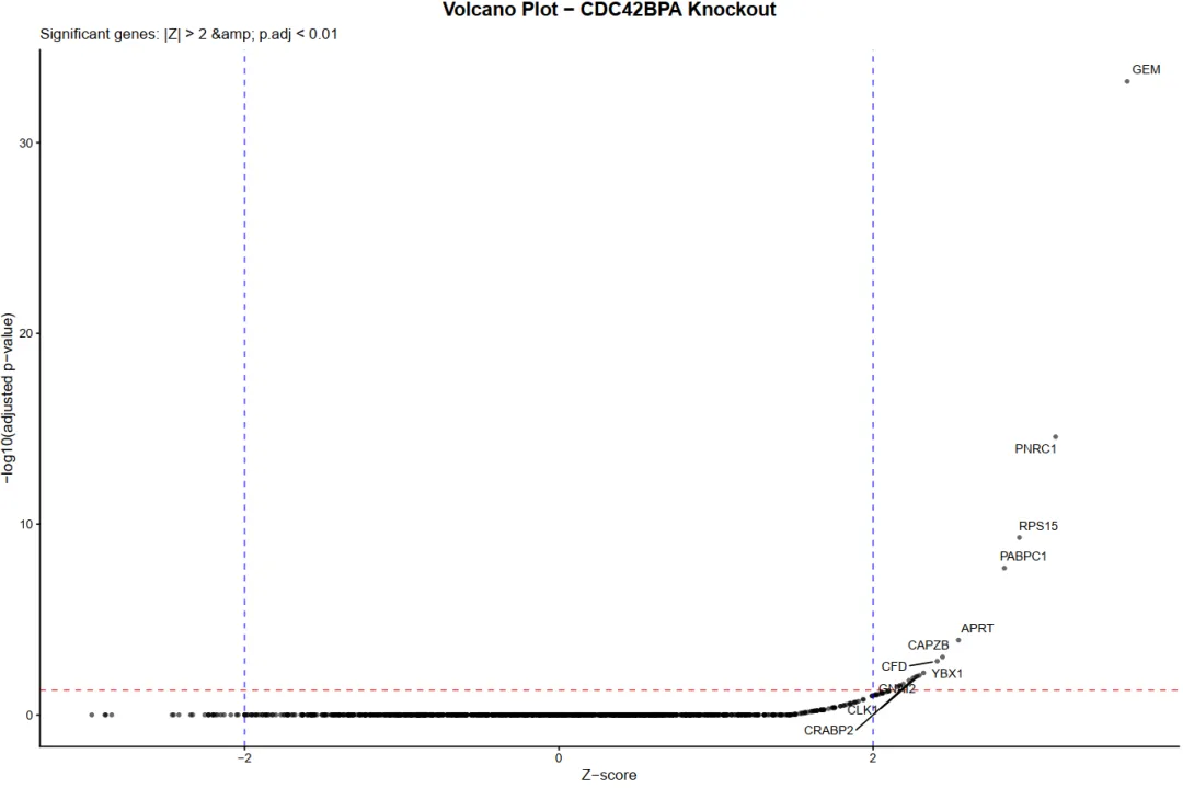
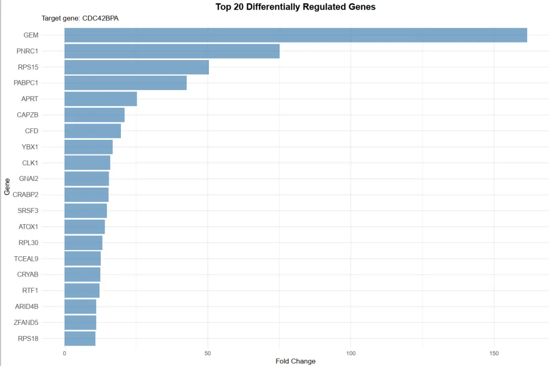
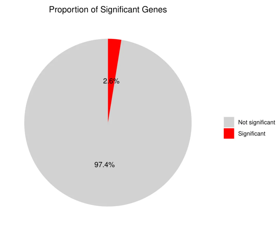
library(scTenifoldKnk)library(Seurat)library(ggplot2)library(dplyr)library(igraph)library(ggrepel)set.seed(123)pbmc <- readRDS("pbmc_macrophage.rds")# 1. 提取巨噬细胞 (Macrophage)pbmc_macrophage <- subset(pbmc, subset = cluster == "Macrophage")# 2. 保存为 rds 文件saveRDS(pbmc_macrophage, file = "pbmc_macrophage.rds")pbmc <- readRDS("pbmc_macrophage.rds")#pbmc <- subset(pbmc, subset = Type == "Tumor")countMat = GetAssayData(pbmc, layer = "counts")pbmc <- FindVariableFeatures(object=pbmc, selection.method="vst", nfeatures=10000)hvgs <- VariableFeatures(pbmc)target_gene="HLA-G" data=as.data.frame(countMat[unique(c(target_gene,hvgs)),])#选取表达均值最高的前10000个细胞进行分析#cell_mean <- colMeans(data, na.rm = TRUE)#top_cell_idx <- order(cell_mean, decreasing = TRUE)[1:min(10000, length(cell_mean))]#data <- data[, top_cell_idx]#rm(pbmc)#rm(countMat)#执行虚拟敲除result <- scTenifoldKnk(countMatrix = data, gKO = target_gene, #需要敲除的基因 qc = TRUE, #是否进行QC qc_mtThreshold = 0.1, #mt的阈值 qc_minLSize = 1000, #文库阈值(细胞测到的基因总数) nc_nNet = 10, #子网络数量 nc_nCells = 500 #每个网络中随机抽取的细胞数 500)df=result$diffRegulationdf <- df[df$gene != target_gene, ]write.table(df, file="allDiff.txt", sep="\t", quote=F, row.names=F)outTab=df[df$p.adj<0.05,]write.table(outTab, file="sigDiff.txt", sep="\t", quote=F, row.names=F)###########################柱状图############################绘制柱状图top_genes <- head(df[order(-df$FC), ], 20)p1=ggplot(top_genes, aes(x=reorder(gene, FC), y=FC)) + geom_bar(stat='identity', fill='#5A9BD4') + coord_flip() + labs(title="Top 20 Differentially Regulated Genes", x="Gene", y="FC") + theme_minimal() + theme(plot.title = element_text(hjust = 0.5))#输出图形pdf(file="barplot.pdf", width=6, height=5)print(p1)dev.off()###########################火山图############################准备火山图的数据df$log_p.adj <- -log10(df$p.adj)df$significant <- ifelse(df$p.adj < 0.05, "Significant", "Not significant")label_genes <- subset(df, p.adj < 0.05)# 绘制火山图y_upper <- quantile(df$log_p.adj, 0.999, na.rm = TRUE)p2=ggplot(df, aes(x=Z, y=log_p.adj, color=significant)) + geom_point(alpha=0.7, size=1) + # 设置点的透明度和大小 # 定义图形的颜色 scale_color_manual(values = c("Significant" = "red", "Not significant" = "gray50")) + geom_hline(yintercept=-log10(0.05), linetype="dashed", color="red") + #在图形中标注基因的名称 geom_text_repel(data=label_genes, aes(label=gene), size=3, max.overlaps=50) + labs(title="", x="Z-score", y="-log10(p.adj)") + theme_classic() + # 设置纵坐标范围 coord_cartesian(ylim = c(0, y_upper)) + theme(legend.position = "none")#输出图形pdf(file="vol.pdf", width=6, height=5)print(p2)dev.off()###########################饼图############################准备饼图数据sig_count <- table(df$significant)sig_df <- as.data.frame(sig_count)colnames(sig_df) <- c("category", "count")sig_df$percentage <- paste0(round(sig_df$count / sum(sig_df$count) * 100, 1), "%")# 绘制饼图p3 <- ggplot(sig_df, aes(x="", y=count, fill=category)) + geom_bar(stat="identity", width=1) + geom_text(aes(label=percentage), position=position_stack(vjust=0.5), size=4) + coord_polar("y", start=0) + scale_fill_manual(values=c("Significant"="red", "Not significant"="lightgray")) + labs(title="Proportion of Significant Genes", fill="") + theme_minimal() + theme(axis.title.x = element_blank(), axis.title.y = element_blank(), axis.text = element_blank(), panel.grid = element_blank(), legend.position = "right", plot.title = element_text(hjust = 0.5))# 输出饼图pdf(file="pie.pdf", width=6, height=5)print(p3)dev.off()