关键点:multiplotyyy子函数的妙用
主函数
clc
clear all
close all
data1=readmatrix("data1.csv");
data2=readmatrix("data2.csv");
data3=readmatrix("data3.csv");
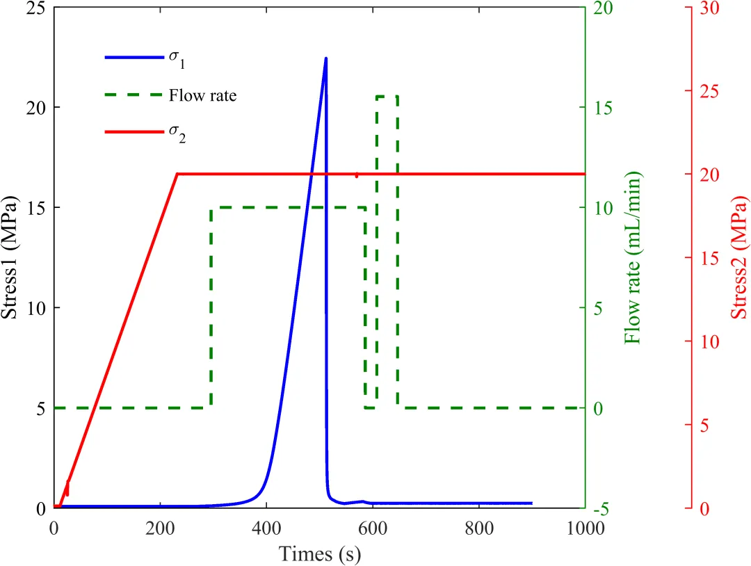
ylabels{1}='Stress1 (MPa)';
ylabels{2}='Flow rate (mL/min)';
ylabels{3}='Stress2 (MPa)';
num_data=9000;
[ax,hlines] = multiplotyyy({data2(3:num_data,1),data1(3:num_data,2)},{data2(3:num_data,1),data1(3:num_data,3)},...
{data2(3:num_data,1),data2(3:num_data,7)},ylabels);
lg=legend(cat(1,hlines{:}),'\sigma_1','Flow rate','\sigma_2');
set(lg, 'Units','normalized', 'Position',[0.14 0.71 0.2 0.2]);
set(lg, 'Box', 'off');
img =gcf;
exportgraphics(img,'three_y.png','Resolution',600) %分辨率高,存图速度慢
子函数-multiplotyyy
function [ax,hlines] = multiplotyyy(set1,set2,set3,ylabels)
% MULTIPLOTYYY - Extends plotyy to include a third y-axis and allows the
% user to plot multiple lines on each set of axes.
%
% Syntax: [ax,hlines] = plotyyy(set1,set2,set3,ylabels)
%
% Inputs: set1 is a cell array with the xdata and ydata for the first axes
% set2 is a cell array with the xdata and ydata for the second axes
% set3 is a cell array with the xdata and ydata for the third axes
% ylabels is a 3x1 cell array containing the ylabel strings
%
% Outputs: ax - 3x1 double array containing the axes' handles
% hlines - 3x1 cell array containing the lines' handles
narginchk(3,4)
if nargin==3
% Use empty strings for the ylabels
ylabels{1}=' '; ylabels{2}=' '; ylabels{3}=' ';
end
validateattributes(set1,{'cell'},{})
validateattributes(set2,{'cell'},{})
validateattributes(set3,{'cell'},{})
fig = figure('units','normalized');
% Plot the first set of lines
ax(1) = axes('Parent',fig);
hlines{1} = plot(set1{:},'Color','b', 'LineWidth', 1.5);
% ylim([0 12]);
xlabels='Times (s)';
ax(1).YColor = 'b';
lines = set(hlines{1}(1),'LineStyle');
lines(end) = [];
nlines = numel(lines);
set(gca,'Fontname','Times new roman');
% 右侧yy轴不显示刻度
yyaxis right
set(gca,'YTick',[]); % 去掉右侧刻度
yyaxis left% 切回左侧
markers = set(hlines{1}(1),'Marker');
markers(end) = [];
nmarkers = numel(markers);
% % if numel(hlines{1}) > 1
% % for idx = 1:numel(hlines{1})
% % hlines{1}(idx).LineStyle = lines{rem(idx,nlines)+1};
% % if numel(hlines{1}) > 4
% % hlines{1}(idx).Marker = markers{rem(idx,nmarkers)+1};
% % end
% % end
% % end
% Plot the second set of lines
ax(2) = axes('Parent',fig);
hlines{2} = plot(set2{:},'Color',[0 0.5 0], 'LineWidth', 1.5);
ylim([-5 20]);
set(ax(2),'YAxisLocation','right','Color','none','YColor',[0 0.5 0],...
'xlim',get(ax(1),'xlim'),'xtick',[],'box','off','XColor','k');
set(gca,'Fontname','Times new roman');
if numel(hlines{2}) >= 1
for idx = 1:numel(hlines{2})
set(hlines{2}(idx),'LineStyle',lines{rem(idx,nlines)+1})
if numel(hlines{2}) > 1
set(hlines{2}(idx),'Marker',markers{rem(idx,nmarkers)+1});
end
end
end
%Set the axes position and size
pos = [0.1 0.15 0.7 0.8];
offset = pos(3)/5.5;
pos(3) = pos(3) - offset/2;
ax(1).Position = pos;
xlabel(ax(1), 'Times (s)');
ax(2).Position = pos;
% Determine the position of the third axes
pos3 = [pos(1) pos(2) pos(3)+offset pos(4)];
% Determine the proper x-limits for the third axes
limx1 = ax(1).XLim;
limx3 = [limx1(1) limx1(1) + 1.2*(limx1(2)-limx1(1))];
ax(3) = axes('Parent',fig);
hlines{3} = plot(set3{:},'Color','r', 'LineWidth', 1.5);
ylim([0 30]);
set(ax(3),'Position',pos3,'box','off',...
'Color','none','XColor','k','YColor','r',...
'xtick',[],'xlim',limx3,'yaxislocation','right',...
'XColor','none');
set(gca,'Fontname','Times new roman');
% if numel(hlines{3}) > 1
% for idx = 1:numel(hlines{3})
% set(hlines{3}(idx),'LineStyle',lines{rem(idx,nlines)+1})
% if numel(hlines{3}) > 4
% set(hlines{3}(idx),'Marker',markers{rem(idx,nmarkers)+1});
% end
% end
% end
% Label all three y-axes
ax(1).YLabel.String = ylabels{1};
ax(2).YLabel.String = ylabels{2};
ax(3).YLabel.String = ylabels{3};