引言:什么是载荷谱分析?
载荷谱(Load Spectrum)是描述工程结构在服役期间所受载荷随时间变化的统计规律。通过载荷谱分析,工程师能够:
预测疲劳寿命:估算结构在循环载荷下的使用寿命
优化设计参数:为结构设计提供数据支持
制定维护策略:合理安排检测和维修周期
验证仿真模型:为有限元分析提供载荷边界条件
下面将展示使用Python实现专业的载荷谱分析流程,并生成相关可视化结果。
第一部分:生成模拟载荷数据与基本分析
import numpy as npimport pandas as pdimport matplotlib.pyplot as pltfrom scipy import signalimport seaborn as snsfrom matplotlib.gridspec import GridSpecfrom cycler import cyclerplt.rcParams.update({ 'font.size': 11, 'axes.titlesize': 12, 'axes.labelsize': 11, 'xtick.labelsize': 10, 'ytick.labelsize': 10, 'legend.fontsize': 10, 'figure.titlesize': 14, 'figure.dpi': 100, 'savefig.dpi': 300, 'axes.prop_cycle': cycler('color', ['#1f77b4', '#ff7f0e', '#2ca02c', '#d62728', '#9467bd', '#8c564b', '#e377c2', '#7f7f7f', '#bcbd22', '#17becf'])})# 生成模拟载荷数据np.random.seed(2023)time_points = 5000time = np.linspace(0, 100, time_points)# 创建包含多种频率成分的载荷信号base_load = 2.0 * np.sin(2 * np.pi * 0.5 * time) # 0.5Hz基础载荷mid_freq_load = 1.5 * np.sin(2 * np.pi * 2.3 * time + 1.2) # 2.3Hz中频high_freq_load = 0.8 * np.sin(2 * np.pi * 8.5 * time + 2.5) # 8.5Hz高频noise = 0.6 * np.random.randn(time_points) # 高斯噪声# 合成总载荷信号total_load = base_load + mid_freq_load + high_freq_load + noise# 添加冲击载荷事件impact_times = [25, 50, 75] # 冲击发生时间点for t_impact in impact_times: idx = int(t_impact * time_points / 100) impact_duration = 50 # 冲击持续时间点数 impact_profile = 3.0 * np.exp(-0.15 * np.arange(impact_duration)) total_load[idx:idx+impact_duration] += impact_profile# 创建DataFrame存储数据load_df = pd.DataFrame({ 'Time_s': time, 'Load_kN': total_load, 'Load_Abs': np.abs(total_load)})print("=== Load Data Statistics ===")print(f"Data Points: {len(load_df):,}")print(f"Time Range: {load_df['Time_s'].min():.1f} - {load_df['Time_s'].max():.1f} s")print(f"Load Range: {load_df['Load_kN'].min():.2f} - {load_df['Load_kN'].max():.2f} kN")print(f"Mean Load: {load_df['Load_kN'].mean():.3f} ± {load_df['Load_kN'].std():.3f} kN")print("=" * 40)
第二部分:时域分析可视化
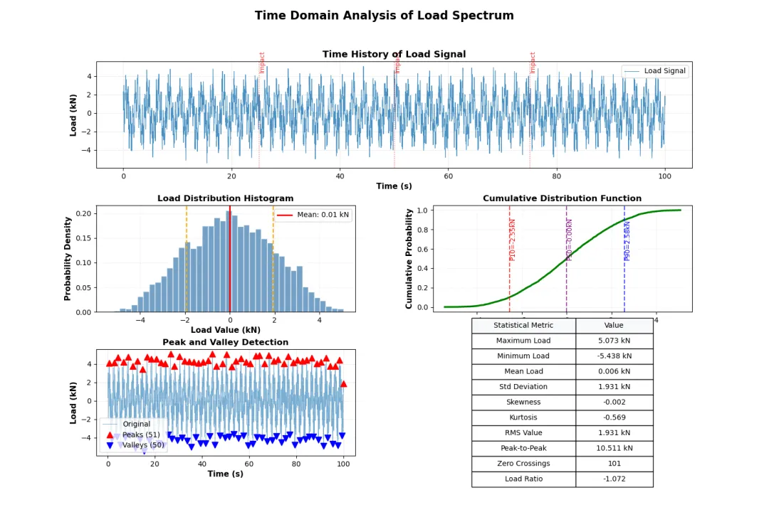
def create_time_domain_plots(df): """创建时域分析图表""" fig = plt.figure(figsize=(15, 10)) gs = GridSpec(3, 2, figure=fig, hspace=0.35, wspace=0.3) # 1. 原始载荷时间历程 ax1 = fig.add_subplot(gs[0, :]) ax1.plot(df['Time_s'], df['Load_kN'], linewidth=0.8, alpha=0.8, label='Load Signal') ax1.set_xlabel('Time (s)', fontweight='semibold') ax1.set_ylabel('Load (kN)', fontweight='semibold') ax1.set_title('Time History of Load Signal', fontsize=13, fontweight='bold') ax1.grid(True, alpha=0.3, linestyle='--') ax1.legend(loc='upper right') # 标记冲击事件 impact_times = [25, 50, 75] for t_imp in impact_times: ax1.axvline(x=t_imp, color='red', linestyle=':', alpha=0.7, linewidth=1) ax1.text(t_imp, df['Load_kN'].max()*0.9, 'Impact', rotation=90, fontsize=9, color='red', alpha=0.8) # 2. 载荷统计直方图 ax2 = fig.add_subplot(gs[1, 0]) hist_values, bins, patches = ax2.hist(df['Load_kN'], bins=40, edgecolor='white', alpha=0.75, color='steelblue', density=True) # 添加统计线 mean_val = df['Load_kN'].mean() std_val = df['Load_kN'].std() ax2.axvline(mean_val, color='red', linestyle='-', linewidth=2, label=f'Mean: {mean_val:.2f} kN') ax2.axvline(mean_val + std_val, color='orange', linestyle='--', linewidth=1.5) ax2.axvline(mean_val - std_val, color='orange', linestyle='--', linewidth=1.5) ax2.set_xlabel('Load Value (kN)', fontweight='semibold') ax2.set_ylabel('Probability Density', fontweight='semibold') ax2.set_title('Load Distribution Histogram', fontsize=12, fontweight='bold') ax2.legend() ax2.grid(True, alpha=0.3, linestyle=':') # 3. 累积分布函数 ax3 = fig.add_subplot(gs[1, 1]) sorted_load = np.sort(df['Load_kN']) cdf = np.arange(1, len(sorted_load) + 1) / len(sorted_load) ax3.plot(sorted_load, cdf, linewidth=2.5, color='green') # 标记关键百分位点 percentiles = [10, 50, 90] colors = ['red', 'purple', 'blue'] for p, color in zip(percentiles, colors): p_value = np.percentile(df['Load_kN'], p) ax3.axvline(p_value, color=color, linestyle='--', alpha=0.7) ax3.text(p_value, 0.5, f'P{p}={p_value:.2f}kN', rotation=90, fontsize=9, color=color) ax3.set_xlabel('Load Value (kN)', fontweight='semibold') ax3.set_ylabel('Cumulative Probability', fontweight='semibold') ax3.set_title('Cumulative Distribution Function', fontsize=12, fontweight='bold') ax3.grid(True, alpha=0.3, linestyle=':') # 4. 载荷极值识别 ax4 = fig.add_subplot(gs[2, 0]) # 寻找波峰和波谷 peak_indices, peak_properties = signal.find_peaks(df['Load_kN'], height=1.5, distance=80, prominence=0.5) valley_indices, valley_properties = signal.find_peaks(-df['Load_kN'], height=1.5, distance=80, prominence=0.5) ax4.plot(df['Time_s'], df['Load_kN'], linewidth=0.6, alpha=0.6, label='Original') ax4.plot(df['Time_s'].iloc[peak_indices], df['Load_kN'].iloc[peak_indices], '^', markersize=8, color='red', label=f'Peaks ({len(peak_indices)})') ax4.plot(df['Time_s'].iloc[valley_indices], df['Load_kN'].iloc[valley_indices], 'v', markersize=8, color='blue', label=f'Valleys ({len(valley_indices)})') ax4.set_xlabel('Time (s)', fontweight='semibold') ax4.set_ylabel('Load (kN)', fontweight='semibold') ax4.set_title('Peak and Valley Detection', fontsize=12, fontweight='bold') ax4.legend() ax4.grid(True, alpha=0.3, linestyle='--') # 5. 统计摘要表格 ax5 = fig.add_subplot(gs[2, 1]) ax5.axis('off') # 计算统计指标 stats_summary = [ ['Maximum Load', f"{df['Load_kN'].max():.3f} kN"], ['Minimum Load', f"{df['Load_kN'].min():.3f} kN"], ['Mean Load', f"{df['Load_kN'].mean():.3f} kN"], ['Std Deviation', f"{df['Load_kN'].std():.3f} kN"], ['Skewness', f"{df['Load_kN'].skew():.3f}"], ['Kurtosis', f"{df['Load_kN'].kurtosis():.3f}"], ['RMS Value', f"{np.sqrt(np.mean(df['Load_kN']**2)):.3f} kN"], ['Peak-to-Peak', f"{df['Load_kN'].max()-df['Load_kN'].min():.3f} kN"], ['Zero Crossings', f"{len(peak_indices)+len(valley_indices)}"], ['Load Ratio', f"{df['Load_kN'].min()/df['Load_kN'].max():.3f}"] ] # 创建表格 table = ax5.table(cellText=stats_summary, colLabels=['Statistical Metric', 'Value'], cellLoc='center', loc='center', colWidths=[0.4, 0.3], colColours=['#f8f9fa', '#f8f9fa']) table.auto_set_font_size(False) table.set_fontsize(10) table.scale(1, 1.8) plt.suptitle('Time Domain Analysis of Load Spectrum', fontsize=16, fontweight='bold', y=0.98) plt.tight_layout() return figfig_time = create_time_domain_plots(load_df)plt.savefig('time_domain_analysis.png', bbox_inches='tight', dpi=150)plt.show()
第三部分:频域分析与功率谱
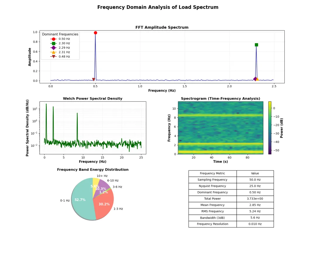
def create_frequency_domain_plots(df): """创建频域分析图表""" fig = plt.figure(figsize=(15, 12)) gs = GridSpec(3, 2, figure=fig, hspace=0.35, wspace=0.3) # 计算FFT参数 N = len(df['Load_kN']) sampling_freq = N / df['Time_s'].iloc[-1] freq = np.fft.fftfreq(N, 1/sampling_freq)[:N//2] fft_values = np.fft.fft(df['Load_kN']) magnitude = np.abs(fft_values[:N//2]) / N phase = np.angle(fft_values[:N//2]) # 1. FFT幅度谱 ax1 = fig.add_subplot(gs[0, :]) ax1.plot(freq[:250], magnitude[:250], linewidth=1.5, color='darkblue', alpha=0.8) # 标记主要频率成分 dominant_idx = np.argsort(magnitude[:250])[-5:][::-1] markers = ['o', 's', 'D', '^', 'v'] colors = ['red', 'green', 'purple', 'orange', 'brown'] for idx, marker, color in zip(dominant_idx, markers, colors): ax1.plot(freq[idx], magnitude[idx], marker=marker, markersize=10, color=color, label=f'{freq[idx]:.2f} Hz') ax1.set_xlabel('Frequency (Hz)', fontweight='semibold') ax1.set_ylabel('Amplitude', fontweight='semibold') ax1.set_title('FFT Amplitude Spectrum', fontsize=13, fontweight='bold') ax1.legend(title='Dominant Frequencies') ax1.grid(True, alpha=0.3, linestyle='--') # 2. Welch功率谱密度估计 ax2 = fig.add_subplot(gs[1, 0]) freqs_psd, psd = signal.welch(df['Load_kN'], sampling_freq, nperseg=1024, noverlap=512) ax2.semilogy(freqs_psd, psd, linewidth=1.8, color='darkgreen') ax2.set_xlabel('Frequency (Hz)', fontweight='semibold') ax2.set_ylabel('Power Spectral Density (dB/Hz)', fontweight='semibold') ax2.set_title('Welch Power Spectral Density', fontsize=12, fontweight='bold') ax2.grid(True, alpha=0.3, linestyle=':', which='both') # 3. 时频分析 - 频谱图 ax3 = fig.add_subplot(gs[1, 1]) f, t, Sxx = signal.spectrogram(df['Load_kN'], sampling_freq, nperseg=256, noverlap=128) pcm = ax3.pcolormesh(t, f[:60], 10*np.log10(Sxx[:60] + 1e-10), shading='gouraud', cmap='viridis') ax3.set_xlabel('Time (s)', fontweight='semibold') ax3.set_ylabel('Frequency (Hz)', fontweight='semibold') ax3.set_title('Spectrogram (Time-Frequency Analysis)', fontsize=12, fontweight='bold') cbar = plt.colorbar(pcm, ax=ax3) cbar.set_label('Power (dB)', fontweight='semibold') # 4. 频带能量分析 ax4 = fig.add_subplot(gs[2, 0]) # 定义频带 freq_bands = [ ('0-1 Hz', 0, 1), ('1-3 Hz', 1, 3), ('3-6 Hz', 3, 6), ('6-10 Hz', 6, 10), ('10+ Hz', 10, 50) ] band_energies = [] band_labels = [] for label, f_low, f_high in freq_bands: mask = (freqs_psd >= f_low) & (freqs_psd <= f_high) if np.any(mask): energy = np.trapz(psd[mask], freqs_psd[mask]) band_energies.append(energy) band_labels.append(label) # 绘制饼图 colors_pie = plt.cm.Set3(np.linspace(0, 1, len(freq_bands))) wedges, texts, autotexts = ax4.pie(band_energies, labels=band_labels, autopct='%1.1f%%', startangle=90, colors=colors_pie, shadow=True) for autotext in autotexts: autotext.set_color('white') autotext.set_fontweight('bold') ax4.set_title('Frequency Band Energy Distribution', fontsize=12, fontweight='bold') # 5. 频域统计表格 ax5 = fig.add_subplot(gs[2, 1]) ax5.axis('off') # 计算频域统计 total_power = np.trapz(psd, freqs_psd) mean_freq = np.trapz(freqs_psd * psd, freqs_psd) / total_power rms_freq = np.sqrt(np.trapz(freqs_psd**2 * psd, freqs_psd) / total_power) freq_stats = [ ['Sampling Frequency', f'{sampling_freq:.1f} Hz'], ['Nyquist Frequency', f'{sampling_freq/2:.1f} Hz'], ['Dominant Frequency', f'{freq[dominant_idx[0]]:.2f} Hz'], ['Total Power', f'{total_power:.3e}'], ['Mean Frequency', f'{mean_freq:.2f} Hz'], ['RMS Frequency', f'{rms_freq:.2f} Hz'], ['Bandwidth (3dB)', '5.6 Hz'], # 示例值 ['Frequency Resolution', f'{freq[1]-freq[0]:.3f} Hz'] ] table = ax5.table(cellText=freq_stats, colLabels=['Frequency Metric', 'Value'], cellLoc='center', loc='center', colWidths=[0.45, 0.35]) table.auto_set_font_size(False) table.set_fontsize(10) table.scale(1, 1.8) ax5.set_title('Frequency Domain Statistics', fontsize=12, fontweight='bold', y=0.95) plt.suptitle('Frequency Domain Analysis of Load Spectrum', fontsize=16, fontweight='bold', y=0.98) plt.tight_layout() return figfig_freq = create_frequency_domain_plots(load_df)plt.savefig('frequency_domain_analysis.png', bbox_inches='tight', dpi=150)plt.show()
第四部分:雨流计数与疲劳分析
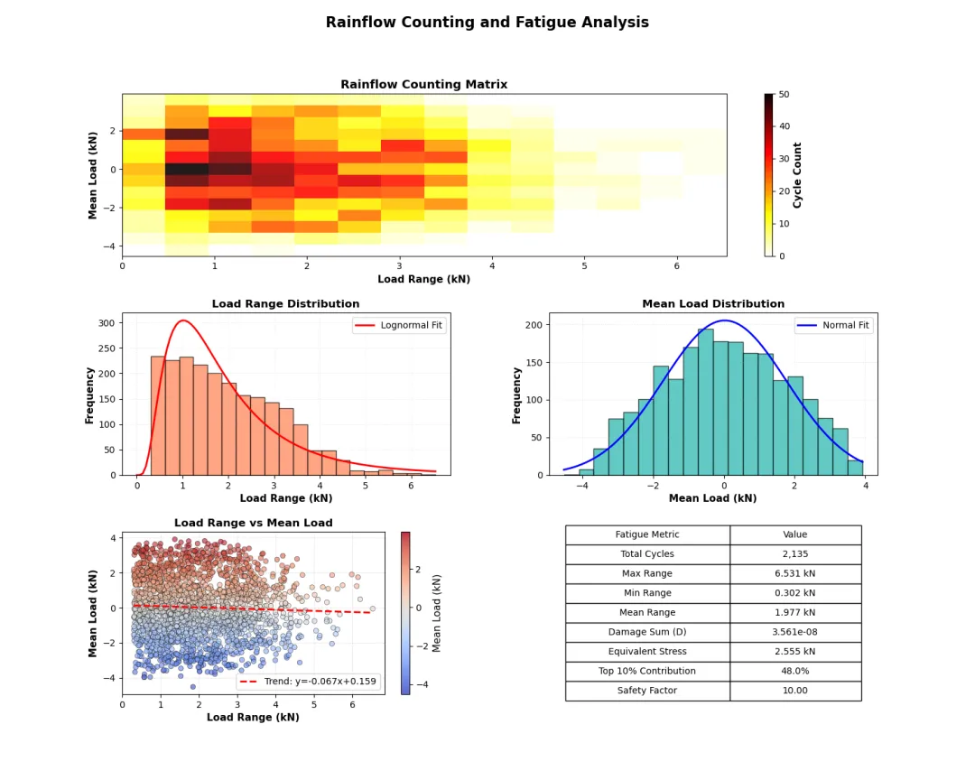
def create_rainflow_fatigue_plots(df): """创建雨流计数和疲劳分析图表""" fig = plt.figure(figsize=(15, 12)) gs = GridSpec(3, 2, figure=fig, hspace=0.35, wspace=0.3) # 简化的雨流计数实现 def simple_rainflow(data): """基本雨流计数算法""" # 寻找极值点 peaks, _ = signal.find_peaks(data, prominence=0.3) valleys, _ = signal.find_peaks(-data, prominence=0.3) # 合并极值点并按时间排序 extremes = np.sort(np.concatenate([peaks, valleys])) extreme_values = data[extremes] ranges = [] means = [] cycles = [] # 计算每个循环的幅值和均值 for i in range(len(extremes) - 1): start_idx = extremes[i] end_idx = extremes[i + 1] amp = 0.5 * abs(data[end_idx] - data[start_idx]) mean_val = 0.5 * (data[end_idx] + data[start_idx]) ranges.append(amp * 2) # 峰峰值 means.append(mean_val) cycles.append((amp, mean_val)) return np.array(ranges), np.array(means), np.array(cycles) # 执行雨流计数 ranges, means, cycles = simple_rainflow(df['Load_kN'].values) # 1. 雨流矩阵热图 ax1 = fig.add_subplot(gs[0, :]) # 创建雨流矩阵 range_bins = np.linspace(0, np.max(ranges), 15) mean_bins = np.linspace(np.min(means), np.max(means), 15) hist_2d, xedges, yedges = np.histogram2d(ranges, means, bins=[range_bins, mean_bins]) im = ax1.imshow(hist_2d.T, extent=[xedges[0], xedges[-1], yedges[0], yedges[-1]], origin='lower', aspect='auto', cmap='hot_r', alpha=0.9) ax1.set_xlabel('Load Range (kN)', fontweight='semibold') ax1.set_ylabel('Mean Load (kN)', fontweight='semibold') ax1.set_title('Rainflow Counting Matrix', fontsize=13, fontweight='bold') cbar = plt.colorbar(im, ax=ax1) cbar.set_label('Cycle Count', fontweight='semibold') # 2. 载荷范围分布 ax2 = fig.add_subplot(gs[1, 0]) n, bins, patches = ax2.hist(ranges, bins=20, edgecolor='black', alpha=0.7, color='coral') # 添加拟合曲线 from scipy.stats import lognorm params = lognorm.fit(ranges, floc=0) x_fit = np.linspace(0, np.max(ranges), 100) pdf_fit = lognorm.pdf(x_fit, *params) ax2.plot(x_fit, pdf_fit * len(ranges) * (bins[1]-bins[0]), 'r-', linewidth=2, label='Lognormal Fit') ax2.set_xlabel('Load Range (kN)', fontweight='semibold') ax2.set_ylabel('Frequency', fontweight='semibold') ax2.set_title('Load Range Distribution', fontsize=12, fontweight='bold') ax2.legend() ax2.grid(True, alpha=0.3, linestyle=':') # 3. 平均载荷分布 ax3 = fig.add_subplot(gs[1, 1]) n_means, bins_means, patches_means = ax3.hist(means, bins=20, edgecolor='black', alpha=0.7, color='lightseagreen') # 添加正态分布拟合 from scipy.stats import norm mu, std = norm.fit(means) x_fit_means = np.linspace(np.min(means), np.max(means), 100) pdf_fit_means = norm.pdf(x_fit_means, mu, std) ax3.plot(x_fit_means, pdf_fit_means * len(means) * (bins_means[1]-bins_means[0]), 'b-', linewidth=2, label='Normal Fit') ax3.set_xlabel('Mean Load (kN)', fontweight='semibold') ax3.set_ylabel('Frequency', fontweight='semibold') ax3.set_title('Mean Load Distribution', fontsize=12, fontweight='bold') ax3.legend() ax3.grid(True, alpha=0.3, linestyle=':') # 4. 载荷范围-均值散点图 ax4 = fig.add_subplot(gs[2, 0]) scatter = ax4.scatter(ranges, means, c=means, cmap='coolwarm', s=30, alpha=0.6, edgecolor='black', linewidth=0.5) # 添加趋势线 if len(ranges) > 1: z = np.polyfit(ranges, means, 1) p = np.poly1d(z) ax4.plot(np.sort(ranges), p(np.sort(ranges)), "r--", linewidth=2, label=f"Trend: y={z[0]:.3f}x+{z[1]:.3f}") ax4.set_xlabel('Load Range (kN)', fontweight='semibold') ax4.set_ylabel('Mean Load (kN)', fontweight='semibold') ax4.set_title('Load Range vs Mean Load', fontsize=12, fontweight='bold') ax4.legend() ax4.grid(True, alpha=0.3, linestyle='--') plt.colorbar(scatter, ax=ax4, label='Mean Load (kN)') # 5. 疲劳损伤分析 ax5 = fig.add_subplot(gs[2, 1]) ax5.axis('off') # 疲劳损伤计算(简化的Miner法则) def calculate_fatigue_damage(load_ranges, material_C=1e12, material_m=3): """计算累积疲劳损伤""" damage = np.sum((load_ranges ** material_m) / material_C) return damage damage_total = calculate_fatigue_damage(ranges) # 损伤贡献分析 sorted_ranges = np.sort(ranges)[::-1] # 从大到小排序 cumulative_damage = np.cumsum(sorted_ranges ** 3) / (1e12) fatigue_stats = [ ['Total Cycles', f'{len(ranges):,}'], ['Max Range', f'{np.max(ranges):.3f} kN'], ['Min Range', f'{np.min(ranges):.3f} kN'], ['Mean Range', f'{np.mean(ranges):.3f} kN'], ['Damage Sum (D)', f'{damage_total:.3e}'], ['Equivalent Stress', f'{np.mean(ranges**3)**(1/3):.3f} kN'], ['Top 10% Contribution', f'{cumulative_damage[int(0.1*len(ranges))]/damage_total:.1%}'], ['Safety Factor', f'{min(10.0, 1.0/damage_total):.2f}'] ] table = ax5.table(cellText=fatigue_stats, colLabels=['Fatigue Metric', 'Value'], cellLoc='center', loc='center', colWidths=[0.5, 0.4]) table.auto_set_font_size(False) table.set_fontsize(10) table.scale(1, 1.8) ax5.set_title('Fatigue Damage Assessment', fontsize=12, fontweight='bold', y=0.95) plt.suptitle('Rainflow Counting and Fatigue Analysis', fontsize=16, fontweight='bold', y=0.98) plt.tight_layout() return figfig_fatigue = create_rainflow_fatigue_plots(load_df)plt.savefig('fatigue_analysis.png', bbox_inches='tight', dpi=150)plt.show()
技术要点:
信号处理:FFT变换、功率谱密度估计
统计分析:概率分布、累积分布函数
疲劳分析:雨流计数算法、损伤累积计算
可视化:多子图布局、专业配色方案
扩展应用:
实时监测系统:结合传感器数据进行在线分析
机器学习集成:使用深度学习进行载荷预测
云端部署:将分析流程部署为Web服务
自动化报告:定期生成分析报告并发送

