3-[Python]"时间-区间-数值"3D表面绘图
- 2026-07-03 22:05:52
基于矢量面数据属性表绘制三维表面分布图
1. 试验简介
基于土地利用类型面数据属性表,选取面积字段(area),按某一数值将面积范围划分为等间距的面积区间,根据区间统计土地利用类型斑块数量(count)和总和面积(total square),进而利用Python的第三方库matplotlib绘制“时间-面积区间-斑块数量/总和面积”三维表面。
2. 数据信息
(1)产品来源:MCD12Q1土地利用/覆被数据集
数据批量下载见:空间数据炼金术 | 1-土地覆被栅格数据批量下载
(2)数据名称:2001-2024年土地利用面数据属性表(.xls文件)
数据获取批量操作见:
① 土地利用栅格数据转换为矢量面数据:地学统计分析 | 3-土地覆被点数据批量提取,看这一篇就够了
② 面数据批量添加面积字段、计算面积与导出属性表:地学统计分析 | 5-[Arcpy]面数据批量添加面积字段、计算面积并导出属性表
3. 绘图过程
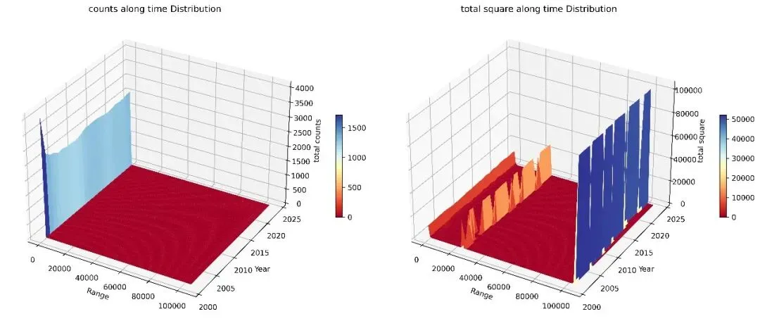
(1)结果图
(2)[Python]代码
① 第三方库导入
1 2 3 4 5 6 import osimport pandas as pdimport numpy as npimport matplotlib.pyplot as pltimport matplotlib.colors as mcolorsfrom matplotlib.ticker import ScalarFormatter
② 土地利用面数据属性表所在文件夹路径
1 folder1_path = r"土地利用面数据属性表所在文件夹绝对路径"
③ 提取年份、定义面积区间、获取区间内斑块数量与总和面积
定义函数:
1 2 3 4 5 6 7 8 9 10 11 12 13 14 15 16 17 18 19 20 21 22 23 24 25 def process_folder(folder_path): files = [] years = set() for root, dirs, fs in os.walk(folder_path): for f in fs: if f.endswith('.xls'): file_path = os.path.join(root, f) year = int(f[:4]) years.add(year) df = pd.read_excel(file_path) if 'area' in df.columns: files.append([year, df['area'].values]) min_area = min([np.min(data[1]) for data in files]) max_area = max([np.max(data[1]) for data in files]) bins = np.arange(min_area, max_area+100, 1000)#区间间隔 counts_df = pd.DataFrame(index=bins[:-1], columns=sorted(years)) sums_df = pd.DataFrame(index=bins[:-1], columns=sorted(years)) for year in sorted(years): year_areas = [data[1] for data in files if data[0] == year] flat_areas = np.concatenate(year_areas) counts, _ = np.histogram(flat_areas, bins=bins) counts_df[year] = counts sums = [np.sum(area[np.digitize(area, bins) == i]) for i in range(1, len(bins)) for area in year_areas] sums_df[year] = sums return counts_df, sums_df
执行计算:
1 2 3 4 5 6 count_dfs = []sum_dfs = []for folder_path in [folder1_path]: counts_df, sums_df = process_folder(folder_path) count_dfs.append(counts_df) sum_dfs.append(sums_df)
打印结果:
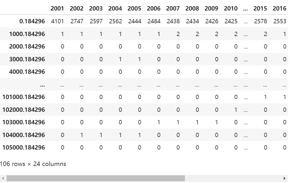
区间斑块数量:
1 count_dfs[0].iloc[:,:]
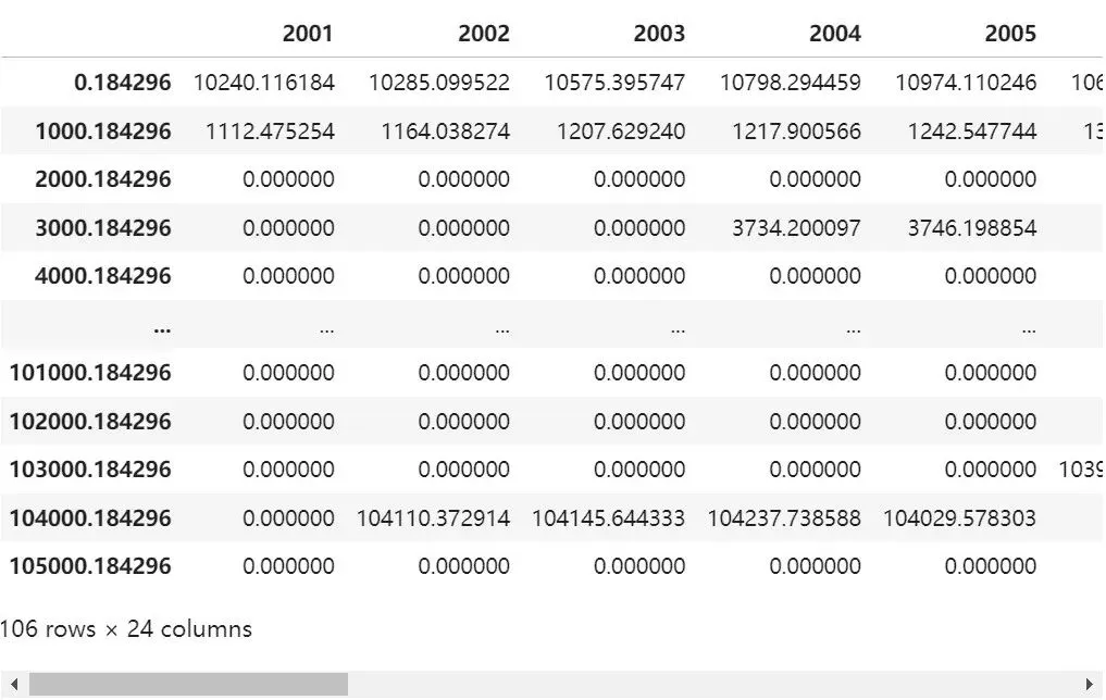
区间总和面积:
1 sum_dfs[0].iloc[:,:]
④ “时间-面积区间-斑块数量/总和面积”三维表面绘图
1 2 3 4 5 6 7 8 9 10 11 12 13 14 15 16 17 18 19 20 21 22 23 24 25 26 27 28 29 30 31 32 33 34 35 36 # 设置图形布局为 1 行 2 列fig, axes = plt.subplots(1, 2, figsize=(15, 10), subplot_kw={'projection': '3d'})for i, (quantity_df, sum_df) in enumerate(zip(count_dfs, sum_dfs)): years = quantity_df.columns ranges = quantity_df.index X, Y = np.meshgrid(ranges, years) Z_quantity = quantity_df.values ax = axes[0] surf_counts=ax.plot_surface(X, Y, Z_quantity.T, cmap='RdYlBu',label='counts', shade=True, rcount=Z_quantity.T.shape[0], ccount=Z_quantity.T.shape[1])#Z_quantity.T.shape[1] ax.set_xlabel('Range') ax.set_ylabel('Year') ax.set_zlabel('total counts') ax.set_title(f'counts along time Distribution') # 添加 colorbar 到数量图 fig.colorbar(surf_counts, ax=ax, shrink=0.2, aspect=15,pad=0.08) Z_sum = sum_df.values ax = axes[1] surf_sum=ax.plot_surface(X, Y, Z_sum.T, cmap='RdYlBu',label='total square', shade=True, rcount=Z_sum.T.shape[0], ccount=Z_sum.T.shape[1])#Z_sum.T.shape[1] ax.set_xlabel('Range') ax.set_ylabel('Year') ax.set_zlabel('total square') ax.set_title(f'total square along time Distribution') # 添加 colorbar 到求和图 fig.colorbar(surf_sum,ax=ax,shrink=0.2, aspect=15,pad=0.08)plt.tight_layout()plt.savefig('数量面积三维图.jpg',dpi=600,bbox_inches='tight')plt.show()
点个“看一看”吧