期刊图片复现|Python绘制XGB+SHAP特征重要性条形图+蜂巢图+玫瑰图组合图
- 2026-07-04 05:47:19
期刊图片复现|Python绘制XGB+SHAP特征重要性条形图+蜂巢图+玫瑰图组合图

论文:Uncovering the multiple socio-economic driving factors of carbon emissions in nine urban agglomerations of China based on machine learning 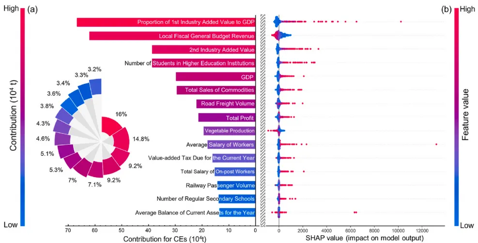
论文原图 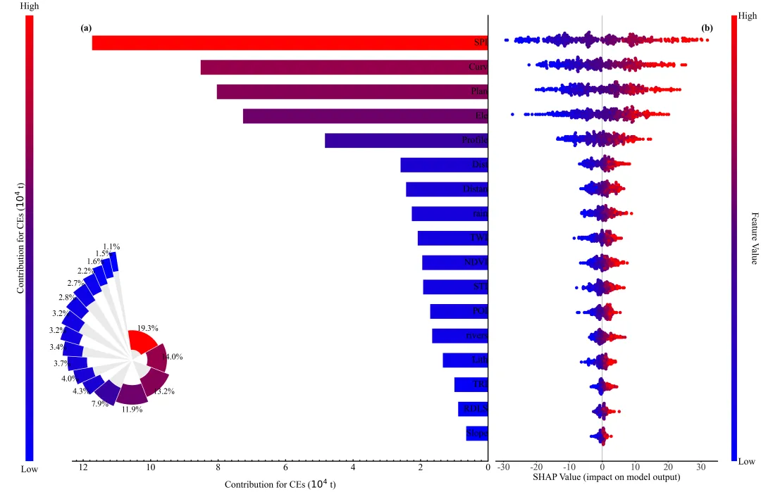
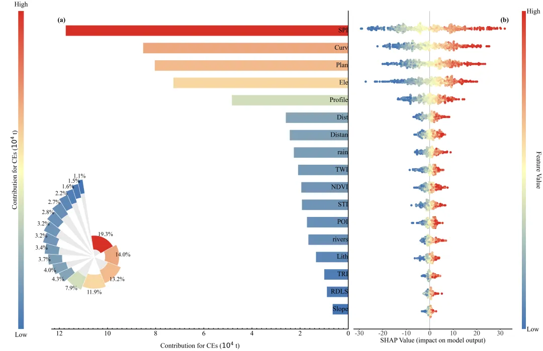
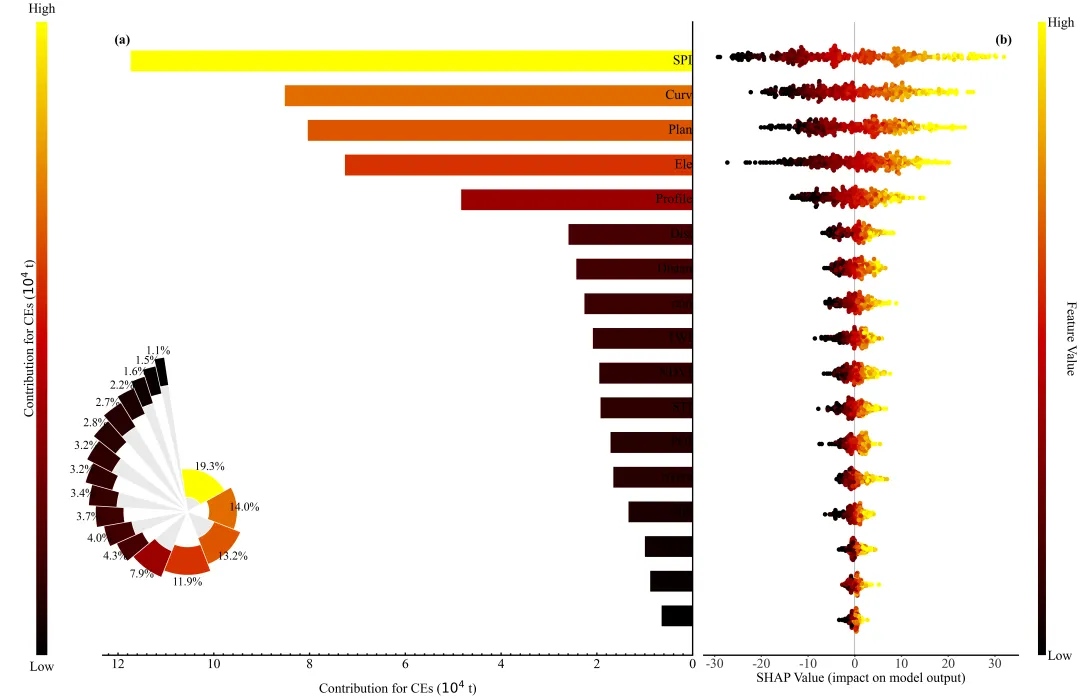
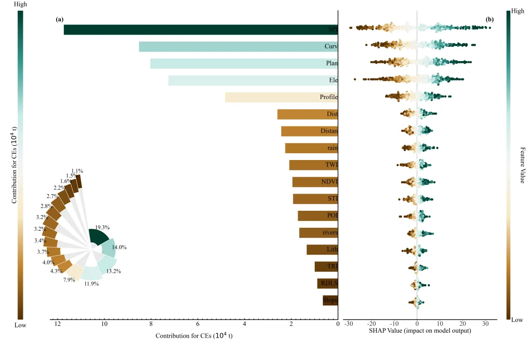
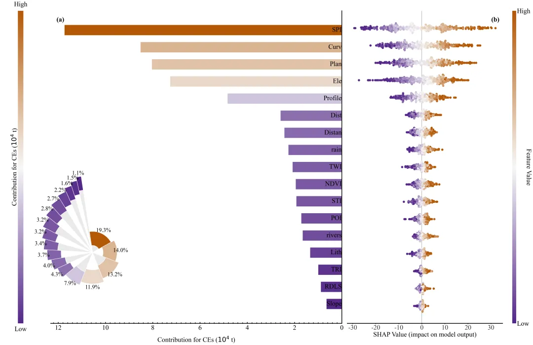
仿图 对之前的一个shap图进行了一些改造,主要的部分封装成了函数,同时加上了颜色库,便于更自由的切换配色。左侧图(a)是特征重要性条形图,它依据平均绝对SHAP值对特征进行了降序排列,条形的长度代表特征的全局重要性,即该特征对模型预测结果的平均贡献幅度,条形越长且颜色越红说明该特征越关键;左下角的嵌入式玫瑰图则以百分比形式补充展示了各特征的相对贡献占比。右侧图(b)是SHAP蜂巢图,用于展示特征的具体影响方向和分布:每一行对应左侧的一个特征,行中的每一个点代表一个样本;右侧最边缘的色条指示了特征本身的数值大小,红色代表该特征取值高,蓝色代表取值低;X轴代表特征对模型输出的影响值,点位于0轴右侧表示该样本的特征值导致预测结果增加,位于左侧则表示导致结果减少。 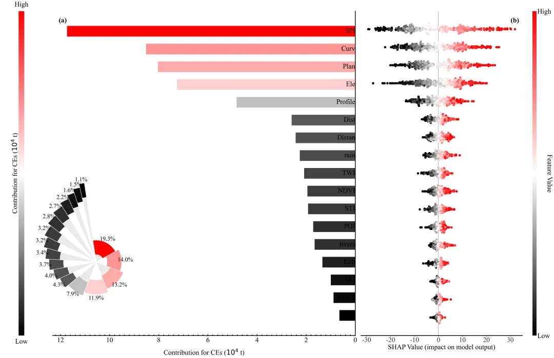
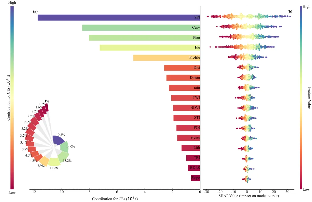
多种配色 


库的导入以及字体设置 

设置颜色库以及配色方案的选择 

特征重要性条形图和径向图/玫瑰图组合图绘制函数的开始部分。创建画布,手动计算布局参数来精确控制子图位置,添加两个坐标轴:一个用于左侧的颜色条,一个用于主要的条形图。绘制颜色条,去掉了默认刻度,并手动在颜色条的上下添加了“High”和“Low”文本,以及侧面的标题,用于指示SHAP值的大小方向。 

特征重要性条形图和径向图/玫瑰图组合图绘制函数的条形图部分,这一部分负责绘制特征重要性的水平条形图,根据SHAP值大小反转了Y轴,使得最重要的特征显示在顶部,反转了X轴,隐藏了Y轴的默认刻度标签,使用 text 函数手动在条形图的右侧添加特征名称。 

特征重要性条形图和径向图/玫瑰图组合图绘制函数的径向图/玫瑰图部分,这一部分在图表的左下角创建了一个嵌入的径向图/玫瑰图。使用创建极坐标系。计算了每个特征重要性占比,以此决定扇形的角度宽度。扇形由两部分组成:内部的灰白交替背景和外部根据SHAP值着色的环。计算了角度和半径位置,精确放置每个扇形和百分比标签。最后,隐藏了极坐标系的轴线和网格,调整了方向,并将生成的图片保存到指定路径。 

SHAP蜂巢图绘制函数,使用 shap.summary_plot 绘制标准的SHAP蜂巢图。 

无Y轴标签的SHAP蜂巢图绘制函数,这个函数的功能与上一个类似,但有一个区别,显移除了Y轴的标签。用于组合图的右侧部分,因为左侧的图表已经包含了特征名称。 

组合图绘制函数左侧,创建了一个大画布,设置了左右两个主绘图区域。按6:4的比例分配左侧(条形图+玫瑰图)和右侧(蜂巢图)的空间。 

组合图绘制函数的中部嵌入径向图,在组合图的左侧区域下方嵌入了径向图/玫瑰图。 

组合图绘制函数的右侧蜂巢图与保存,调用 

数据预处理与模型训练部分,从Excel文件读取数据。分离特征(X)和目标变量(y),并将数据划分为训练集和测试集。使用 

SHAP分析与绘图,使用 


期刊图片复现|Python绘制二维偏依赖PDP图 期刊复现|python绘制基于SHAP分析和GAM模型拟合的单特征依赖图 期刊图片复现|python绘制带有渐变颜色shap特征重要性组合图(条形图+蜂巢图) 期刊复现|用Python绘制SHAP特征重要性总览图、依赖图、双特征交互效应SHAP图,解锁XGBoost模型的终极奥秘 期刊图片复现|Python绘制shap重要性蜂巢图+单特征依赖图+交互效应强度气泡图+交互效应依赖图(回归+二分类+分类) 

公众号中的所有所有的免费代码都已经下架了,都并入到付费部分里了,付费合集代码和数据的购买通道已经开通,全部合集100元,后续将会持续更新,决定购买请后台私信我,注意只会分享练习数据和代码文件,不会提供答疑服务,代码文件中已经包含了每行代码的完整注释,购买前请确保真的需要!!!
代码绘制成果展示
代码解释
第一部分
# =========================================================================================# ====================================== 1. 环境设置 =======================================# =========================================================================================import pandas as pdimport numpy as npimport xgboostimport shapimport matplotlib.pyplot as pltimport matplotlib.colors as mcolorsimport matplotlib.ticker as tickerfrom matplotlib.cm import ScalarMappablefrom sklearn.model_selection import train_test_splitfrom sklearn.preprocessing import StandardScalerfrom shap.plots import beeswarmfrom sklearn.model_selection import GridSearchCV
第二部分
# =========================================================================================# ======================================2.颜色库=======================================# =========================================================================================COLOR_SCHEMES = {1: ["blue", "#4B0082", "red"],}# 设置当前使用的颜色方案CURRENT_SCHEME_ID = 15
第三部分
# =========================================================================================# ======================================3.特征重要性条形图和径向图/玫瑰图绘制函数=======================================# =========================================================================================def draw_bar_and_radial(sorted_features, sorted_shap_values, bar_colors, cmap, color_norm):fig = plt.figure(figsize=(16, 15))#创建画布# 画布边距left_margin, right_margin, bottom_margin, top_margin = 0.08, 0.08, 0.12, 0.12# 颜色条宽度colorbar_width = 0.02# 计算绘图区域的底部位置和高度plot_bottom = bottom_marginplot_height = 1.0 - bottom_margin - top_margin# 颜色条的左侧位置cbar_left = left_margin#条形图的左侧位置main_ax_left = cbar_left + colorbar_width + 0.04#条形图的宽度main_ax_width = 1.0 - main_ax_left - right_margin# 添加颜色条的坐标轴ax_cbar = fig.add_axes([cbar_left, plot_bottom, colorbar_width, plot_height])# 颜色条下方文本ax_cbar.text(0.5,-0.01,'Low''', transform=ax_cbar.transAxes,ha='center',va='top',fontsize=24)#去掉颜色条边框cbar.outline.set_visible(False)#颜色条标题ax_cbar.text(-1.4,0.5,'Contribution for CEs ($10^4$ t)',transform=ax_cbar.transAxes,fontsize=24,rotation=90,va='center')
第四部分
ax_bar.xaxis.tick_bottom()# 条形图x轴刻度位置ax_bar.xaxis.set_label_position("bottom")# 设置x轴标签位置# 反转x轴方向ax_bar.invert_xaxis()# 绘制水平条形图ax_bar.barh(y=range(len(sorted_features)), # Y坐标width=sorted_shap_values, # 水平条形宽度color=bar_colors, # 条形颜色height=0.6) # 条形高度# 反转y轴方向,使最重要的特征排在顶部ax_bar.invert_yaxis()# 设置x轴标签ax_bar.set_xlabel('Contribution for CEs ($10^4$ t)', size=24, labelpad=20)# 移除y轴刻度ax_bar.set_yticks([])# 去掉左侧和顶部边框ax_bar.spines[['left', 'top']].set_visible(False)# 设置右侧边框位置ax_bar.spines['right'].set_position(('data', 0))# 显示边框ax_bar.spines['right'].set_visible(True)ax_bar.spines['bottom'].set_visible(True)# 设置x轴主刻度样式ax_bar.tick_params(axis='x', # X轴which='major', # 应用于主刻度direction='in', # 朝内labelsize=24, # 刻度标签字体大小length=6, # 刻度线长度pad=8) # 标签与刻度线之间的距离# 子图标签ax_bar.text(0.02,0.98,'(a)',transform=ax_bar.transAxes,fontsize=30,weight='bold',ha='left',va='top')
第五部分
inset_left = main_ax_left - 0.15# 径向图/玫瑰图的左侧位置inset_bottom = plot_bottom - 0.05# 径向图/玫瑰图的底部位置inset_size = min(main_ax_width, plot_height) * 0.85# 径向图/玫瑰图的大小# 定义径向图/玫瑰图的矩形区域inset_ax_rect = [inset_left, inset_bottom, inset_size, inset_size]# 添加坐标轴作为径向图/玫瑰图ax_radial_inset = fig.add_axes(inset_ax_rect, projection='polar')# 背景透明ax_radial_inset.patch.set_alpha(0)# 计算每个特征占比百分比percentages = (sorted_shap_values / sorted_shap_values.sum()) * 100# 根据占比计算每个扇形的宽度widths = (sorted_shap_values / sorted_shap_values.sum()) * 2 * np.pi# 每个扇形的起始角度thetas = np.cumsum([0] + widths[:-1].tolist()) - one_oclock_offset# 绘制内部灰色扇形ax_radial_inset.bar(x=thetas, # 条形的起始角度位置height=inner_heights, # 内部灰色部分的长度width=widths, # 指定每个条形的角宽度color=inner_colors, # 条形的填充颜色align='edge', # 对齐方式为边缘对齐edgecolor='white', # 条形边框的颜色为白色linewidth=1.5) # 条形边框线的宽度# 绘制外部彩色环形ax_radial_inset.bar(x=thetas,height=[colored_ring_width] * num_vars,width=widths,bottom=inner_heights,color=bar_colors,align='edge',edgecolor='white',linewidth=1.5)ax_radial_inset.set_yticklabels([])# 移除径向图的y轴标签ax_radial_inset.set_xticklabels([])# 移除径向图的x轴标签# 隐藏极坐标轴的脊柱ax_radial_inset.spines['polar'].set_visible(False)# 关闭网格ax_radial_inset.grid(False)ax_radial_inset.set_theta_zero_location('N')#正北方向ax_radial_inset.set_theta_direction(-1)#顺时针ax_radial_inset.set_ylim(0, max(total_lengths) + 2)# 半径范围
第六部分
# =========================================================================================# ======================================4.SHAP蜂巢图函数=======================================# =========================================================================================def draw_native_beeswarm(shap_values, X, cmap):plt.figure(figsize=(16, 15))# 创建画布#绘制蜂巢图shap.summary_plot(shap_values, # SHAP值数据X, # 对应的特征矩阵数据plot_type="dot", # 蜂巢图show=False, # 不立即显示cmap=cmap) # 颜色映射# 如果存在多个坐标轴if len(plt.gcf().axes) > 1:cbar_ax = plt.gcf().axes[-1]# 获取颜色条坐标轴cbar_ax.set_ylabel('Feature Value', size=16, rotation=-90, labelpad=20)# 设置颜色条标签cbar_ax.tick_params(labelsize=14)# 设置颜色条刻度标签大小# 调整布局plt.tight_layout()
第七部分
# =========================================================================================# ======================================5.无Y轴标签的SHAP蜂巢图的函数=======================================# =========================================================================================def draw_beeswarm_no_labels(shap_values, X, cmap):# 创建画布plt.figure(figsize=(16, 15))# 绘制蜂巢图shap.summary_plot(shap_values,X,plot_type="dot",show=False,cmap=cmap)# 获取当前坐标轴ax_third_plot = plt.gca()# 移除y轴刻度标签(特征名)ax_third_plot.set_yticklabels([])ax_third_plot.set_ylabel('')# x轴标题ax_third_plot.set_xlabel("SHAP Value (impact on model output)", fontsize=18)# x轴刻度标签ax_third_plot.tick_params(axis='x', labelsize=14)# 处理颜色条(如果存在)if len(plt.gcf().axes) > 1:cbar_ax_third = plt.gcf().axes[-1] # 获取当前图形对象列表中的最后一个坐标轴cbar_ax_third.set_ylabel('Feature Value', # Y轴名size=16, # 字体大小rotation=-90, # 旋转labelpad=20) # 文本与坐标轴之间的距离cbar_ax_third.tick_params(labelsize=14) # 字体大小# 调整布局plt.tight_layout()
第八部分
# =========================================================================================# ======================================6.特征重要性条形图+蜂巢图+玫瑰图组合图绘制函数=======================================# =========================================================================================def draw_combined_plot(sorted_features, sorted_shap_values, shap_values, bar_colors, cmap, color_norm):# 创建画布fig_combined = plt.figure(figsize=(34, 25))# 定义边距和间距参数left_margin, right_margin, bottom_margin, top_margin = 0.05, 0.05, 0.02, 0.1space_between = 0.01# 左右子图之间的间距plot_bottom = bottom_margin# 绘图区域的底部plot_height = 1 - bottom_margin - top_margin# 绘图区域的高度total_plot_width = 1 - left_margin - right_margin - space_between# 宽度# 颜色条坐标轴ax_cbar_new = fig_combined.add_axes([cbar_left, plot_bottom, colorbar_width, plot_height])# 创建ScalarMappable对象,用于颜色映射sm = ScalarMappable(cmap=cmap, norm=color_norm)# 绘制颜色条cbar = fig_combined.colorbar(sm,cax=ax_cbar_new,orientation='vertical')# 设置标签cbar.set_label('', size=18, labelpad=5)# 移除刻度cbar.set_ticks([])# 设置刻度位置# 去掉边框cbar.outline.set_visible(False)# 颜色条标题ax_cbar_new.text(-1.4, # x坐标0.5, # y坐标'Contribution for CEs ($10^4$ t)', # 文本内容transform=ax_cbar_new.transAxes, # 使用相对坐标fontsize=30, # 字体大小rotation=90,# 旋转90度va='center')# 左侧条形图的位置main_ax_left = cbar_left + colorbar_width + 0.05# 添加条形图坐标轴ax_bar_new = fig_combined.add_axes([main_ax_left,#左plot_bottom, # 下left_plot_width, # 宽度plot_height]) # 高度# x轴刻度在底部ax_bar_new.xaxis.tick_bottom()# 设置x轴标签ax_bar_new.xaxis.set_label_position("bottom")# 反转x轴ax_bar_new.invert_xaxis()# 绘制水平条形ax_bar_new.barh(y=range(len(sorted_features)), # 数据width=sorted_shap_values, # 条形宽度color=bar_colors, # 颜色height=0.6) # 条形高度# 反转y轴ax_bar_new.invert_yaxis()# 设置x轴标题ax_bar_new.set_xlabel('Contribution for CEs ($10^4$ t)',size=30, labelpad=20)ax_bar_new.spines['right'].set_visible(True)ax_bar_new.spines['bottom'].set_visible(True)# 主刻度样式ax_bar_new.tick_params(axis='x',#轴which='major', # 主刻度direction='in', # 朝内labelsize=30, # 标签大小length=6, # 刻度长度# 图标签ax_bar_new.text(0.02,# x坐标0.98, # y坐标'(a)', # 文本内容transform=ax_bar_new.transAxes, # 使用相对坐标fontsize=30, # 字体大小weight='bold', # 字体加粗ha='left', # 水平左对齐va='top') # 垂直顶部对齐
第九部分
num_vars = len(sorted_features) # 特征数量# 百分比percentages = (sorted_shap_values / sorted_shap_values.sum()) * 100# 每个扇形的宽度widths = (sorted_shap_values / sorted_shap_values.sum()) * 2 * np.pi# 设置基础长度、增量和彩色环宽度base_length, fixed_increment, colored_ring_width = 3.0, 0.5, 2.0# 每个扇形的总长度total_lengths = [base_length + i * fixed_increment for i in range(num_vars)]# 内部灰色部分的高度inner_heights = [max(0, tl - colored_ring_width) for tl in total_lengths]# 定义内部颜色列表inner_colors = ['#EAEAEA', '#FFFFFF'] * (num_vars // 2 + 1)# 截取对应数量的颜色# 定义插图矩形区域inset_ax_rect = [inset_left,inset_bottom, inset_size, inset_size]# 添加径向极坐标轴ax_radial_inset_new = fig_combined.add_axes(inset_ax_rect, projection='polar')# 背景透明ax_radial_inset_new.patch.set_alpha(0)# 绘制内部背景条ax_radial_inset_new.bar(x=thetas,#角度height=inner_heights, # 高度width=widths, # 宽度color=inner_colors, # 颜色align='edge', # 对齐方式edgecolor='white', # 边缘颜色linewidth=1.5) # 线宽# 绘制外部彩色条ax_radial_inset_new.bar(x=thetas,#角度height=[colored_ring_width] * num_vars, # 高度width=widths, # 宽度bottom=inner_heights, # 底部起始位置color=bar_colors, # 颜色align='edge', # 对齐方式edgecolor='white', # 边缘颜色linewidth=1.5) # 线宽ax_radial_inset_new.spines['polar'].set_visible(False)# 隐藏网格ax_radial_inset_new.grid(False)ax_radial_inset_new.set_theta_zero_location('N')# 正北ax_radial_inset_new.set_theta_direction(-1)# 顺时针ax_radial_inset_new.set_ylim(0, max(total_lengths) + 2)# 半径范围
第十部分
shap.plots.beeswarm,将图形绘制在指定的坐标轴上。手动增大了散点的大小。移除了Y轴标签,并添加了X轴标签。添加子图编号,并调整了蜂巢图自带的颜色条的标签和旋转角度。将这张包组合图保存到指定文件夹。# 右侧蜂巢图位置right_plot_left = main_ax_left + left_plot_width + space_between# 添加蜂巢图坐标轴ax_beeswarm = fig_combined.add_axes([right_plot_left, plot_bottom, right_plot_width, plot_height])# 绘制蜂巢图beeswarm(shap_values,#数据max_display=len(sorted_features), # 最大显示特征数ax=ax_beeswarm, # 指定坐标轴show=False, # 不立即显示color=cmap, # 颜色映射plot_size=None) # 不自动调整大小ax_beeswarm.set_yticklabels([])# 移除y轴标签ax_beeswarm.set_ylabel('')# 移除y轴标题# 刻度标签大小cbar_ax_right.tick_params(labelsize=30)
第十一部分
StandardScaler 对特征进行标准化处理,并将其转回带有列名的 DataFrame 格式(以便SHAP能识别特征名)。初始化 XGBoost 回归器,设置参数网格,并使用 5 折交叉验证和网格搜索寻找最佳超参数。最后输出找到的最佳参数。# =========================================================================================# ======================================4.执行部分=======================================# =========================================================================================if __name__ == '__main__':# 读取数据data_df = pd.read_excel(r'data.xlsx')# 定义目标变量target_column_name = 'Target_y'# 提取目标变量数据y = data_df[target_column_name]# 提取特征变量数据(删除目标列)X = data_df.drop(columns=[target_column_name])# 获取所有特征名称并转换为列表feature_names = X.columns.tolist()# 划分训练集和测试集X_train, X_test, y_train, y_test = train_test_split(X, y, test_size=0.2, random_state=42)# 初始化回归模型xgb_reg = xgboost.XGBRegressor(objective='reg:squarederror', random_state=42)# 网格搜索grid_search = GridSearchCV(estimator=xgb_reg, param_grid=param_grid, cv=5, scoring='neg_mean_squared_error',n_jobs=-1, verbose=2)grid_search.fit(X_train_df, y_train)# 获取搜索到的最佳模型best_model = grid_search.best_estimator_print(f"找到的最佳参数: {grid_search.best_params_}")
第十二部分
TreeExplainer 计算测试集的SHAP值。计算每个特征的平均绝对SHAP值(代表全局重要性),并按降序排列,为绘图做准备。根据之前定义的颜色方案和SHAP值的大小,生成对应的颜色映射和每个条形的具体颜色。依次调用之前定义的四个绘图函数,生成并保存四张图片。# 最佳模型model = best_model# 创建SHAP树解释器对象,用于解释模型explainer = shap.TreeExplainer(model)# 计算测试集数据的SHAP值shap_values = explainer(X_test_df)# 计算所有样本SHAP绝对值的平均值,衡量特征整体重要性mean_abs_shap = np.abs(shap_values.values).mean(axis=0)# 创建包含特征重要性数值的Series,索引为特征名shap_series = pd.Series(mean_abs_shap, index=feature_names)# 对特征重要性进行降序排序shap_series.sort_values(ascending=False, inplace=True)# 生成每个条形对应的具体颜色值bar_colors = cmap(color_norm(sorted_shap_values))print(pd.DataFrame(shap_values.values[:5, :3], columns=feature_names[:3]).round(4))print("\n测试集特征平均重要性 (Mean |SHAP|):")print(np.round(sorted_shap_values, 4))# 调用函数绘图draw_bar_and_radial(sorted_features, sorted_shap_values, bar_colors, cmap, color_norm)draw_native_beeswarm(shap_values, X_test_df, cmap)draw_beeswarm_no_labels(shap_values, X_test_df, cmap)draw_combined_plot(sorted_features, sorted_shap_values, shap_values, bar_colors, cmap, color_norm)
如何应用到你自己的数据
1.设置颜色方案:
CURRENT_SCHEME_ID = 152.设置绘图结果的保存地址:
plt.savefig(fr'shap_bar_radial{CURRENT_SCHEME_ID}.png', dpi=208, bbox_inches='tight')plt.savefig(fr'shap_bar_radial{CURRENT_SCHEME_ID}.png', dpi=208, bbox_inches='tight')
3.设置原始数据的路径:
data_df = pd.read_excel(r'simulated_data.xlsx')4.设置目标变量:
target_column_name = 'Target_y'5.设置超参数的网格:
param_grid = { 'n_estimators': [100, 200],}推荐
获取方式
本文来自网友投稿或网络内容,如有侵犯您的权益请联系我们删除,联系邮箱:wyl860211@qq.com 。

