Python Tkinter 视觉效果优化:扁平化与美观主题实战指南
- 2026-09-07 20:30:29
做过 Tkinter 项目的人,多少都听过这句话——"这界面怎么这么土?"
不冤枉。默认的 Tkinter 界面,灰底灰按钮,控件边框带着浮雕感,字体是系统默认的宋体,整体风格停留在 Windows XP 时代。拿去给客户演示,对方第一反应往往是:"这是正式版吗?"
问题不在于 Tkinter 本身能力不行,而在于大多数教程只教你怎么"摆控件",从来不讲怎么让它好看。底层的 ttk 主题引擎、Style 配置系统、Canvas 自绘机制,这些才是让界面脱胎换骨的关键,却鲜有人系统讲过。
这篇文章就干这件事。从原理到代码,从快速美化到深度定制,给你一套在 Windows 下把 Tkinter 界面做到"现代感"的完整方案。所有代码在 Python 3.10 + Windows 11 环境下验证可运行。
🔍 先搞清楚:Tkinter 的视觉体系是怎么运作的
很多人不知道,Tkinter 其实有两套控件体系并存——tkinter(经典控件)和 tkinter.ttk(主题控件)。
经典控件,比如 tk.Button、tk.Label,样式完全靠属性硬写,bg、fg、relief,每个控件单独配,改起来费劲,统一性也差。ttk 控件则不同,它引入了主题(Theme)机制,通过 ttk.Style 统一管理所有控件的外观,一处改,全局生效。
import tkinter.ttk as ttkstyle = ttk.Style()print(style.theme_names())# ('winnative', 'clam', 'alt', 'default', 'classic', 'vista', 'xpnative')Windows 下内置了 vista、winnative、xpnative 等主题,但说实话,这几个主题的审美水准……和"现代"二字还差得远。clam 主题相对简洁,是自定义改造的最佳基底——后面咱们会重点用它。
核心结论:做视觉优化,优先用 ttk 控件 + ttk.Style 定制,而不是给每个 tk 控件单独设属性。
🚀 方案一:基于 ttkbootstrap 的快速现代化
如果项目工期紧,想最快速度出效果,ttkbootstrap 是目前最成熟的选择。它是对 ttk 的封装,内置了十几套 Bootstrap 风格主题,引入成本极低,做过web前端的一看就知道怎么个玩意了。
pip install ttkbootstrap直接看效果对比——原始代码:
# 原始 Tkinter 界面(灰色时代)import tkinter as tkroot = tk.Tk()root.title("原始界面")tk.Label(root, text="用户名").pack()tk.Entry(root).pack()tk.Button(root, text="登录").pack()root.mainloop()换成 ttkbootstrap 之后:
import ttkbootstrap as ttk from ttkbootstrap.constants import * # 一行代码切换主题 root = ttk.Window(themename="cosmo") # 可选: flatly, darkly, superhero, journal... root.title("bootstrap风格的登录界面") root.geometry("400x300") frame = ttk.Frame(root, padding=20) frame.pack(fill="both", expand=True) ttk.Label(frame, text="用户名", bootstyle="secondary").pack(anchor="w") ttk.Entry(frame, bootstyle="primary").pack(fill="x", pady=(4, 12)) ttk.Label(frame, text="密码", bootstyle="secondary").pack(anchor="w") ttk.Entry(frame, show="*", bootstyle="primary").pack(fill="x", pady=(4, 20)) # bootstyle 参数控制颜色语义:primary/success/danger/warning/info ttk.Button(frame, text="登录", bootstyle="primary", width=20).pack() root.mainloop()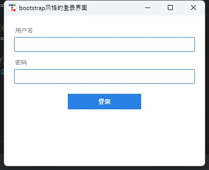
bootstyle 参数是 ttkbootstrap 的核心概念——它不是颜色,是语义。primary 是主色调,danger 是警告红,success 是确认绿,换主题时这些语义颜色自动跟着变,不需要改任何代码。
踩坑预警: ttkbootstrap 和原生 tk 控件混用会出现样式不一致的情况。建议整个项目统一用 ttkbootstrap 的控件,不要混搭 tk.Button 之类的经典控件。
🎨 方案二:纯手工定制 ttk.Style(零依赖)
不想引入第三方库?完全可以。ttk.Style 的配置能力比大多数人想象的强得多。
下面是一套完整的扁平化主题配置,从颜色系统到控件样式,一次性定义清楚:
import tkinter as tk from tkinter import ttk # ── 颜色系统(改这里就能换整体风格)── COLORS = { "bg_primary": "#1e1e2e", # 主背景(深色) "bg_secondary": "#2a2a3e", # 次级背景 "bg_card": "#313244", # 卡片背景 "accent": "#cba6f7", # 强调色(紫) "accent_hover": "#b4befe", # 悬停色 "text_primary": "#cdd6f4", # 主文字 "text_secondary": "#a6adc8", # 次级文字 "success": "#a6e3a1", # 成功绿 "danger": "#f38ba8", # 警告红 "border": "#45475a", # 边框色 } defapply_flat_theme(root): """ 应用扁平化深色主题 基于 clam 主题改造,保留 ttk 的主题引擎 """ root.configure(bg=COLORS["bg_primary"]) style = ttk.Style() style.theme_use("clam") # ── Frame ── style.configure("TFrame", background=COLORS["bg_primary"]) style.configure("Card.TFrame", background=COLORS["bg_card"], relief="flat") # ── Label ── style.configure( "TLabel", background=COLORS["bg_primary"], foreground=COLORS["text_primary"], font=("Microsoft YaHei UI", 10) ) style.configure( "Title.TLabel", font=("Microsoft YaHei UI", 16, "bold"), foreground=COLORS["accent"] ) style.configure( "Muted.TLabel", foreground=COLORS["text_secondary"], font=("Microsoft YaHei UI", 9) ) # ── Button ── style.configure( "TButton", background=COLORS["accent"], foreground=COLORS["bg_primary"], font=("Microsoft YaHei UI", 10, "bold"), borderwidth=0, relief="flat", padding=(16, 8) ) style.map( "TButton", background=[ ("active", COLORS["accent_hover"]), ("disabled", COLORS["border"]) ], foreground=[("disabled", COLORS["text_secondary"])] ) # 幽灵按钮 style.configure( "Ghost.TButton", background=COLORS["bg_primary"], foreground=COLORS["accent"], borderwidth=1, relief="solid", padding=(14, 7) ) style.map( "Ghost.TButton", background=[("active", COLORS["bg_secondary"])] ) # 危险按钮 style.configure( "Danger.TButton", background=COLORS["danger"], foreground=COLORS["bg_primary"], font=("Microsoft YaHei UI", 10, "bold"), borderwidth=0, relief="flat", padding=(16, 8) ) style.map( "Danger.TButton", background=[("active", "#e07090")] ) # ── Entry ── style.configure( "TEntry", fieldbackground=COLORS["bg_secondary"], foreground=COLORS["text_primary"], insertcolor=COLORS["accent"], borderwidth=1, relief="flat", padding=(10, 6) ) style.map( "TEntry", fieldbackground=[("focus", COLORS["bg_card"])], bordercolor=[ ("focus", COLORS["accent"]), ("!focus", COLORS["border"]) ] ) # ── Combobox ── style.configure( "TCombobox", fieldbackground=COLORS["bg_secondary"], background=COLORS["bg_secondary"], foreground=COLORS["text_primary"], arrowcolor=COLORS["accent"], borderwidth=1, relief="flat" ) # ── Treeview ── style.configure( "Treeview", background=COLORS["bg_secondary"], foreground=COLORS["text_primary"], fieldbackground=COLORS["bg_secondary"], rowheight=32, borderwidth=0, font=("Microsoft YaHei UI", 9) ) style.configure( "Treeview.Heading", background=COLORS["bg_card"], foreground=COLORS["text_secondary"], font=("Microsoft YaHei UI", 9, "bold"), relief="flat", borderwidth=0 ) style.map( "Treeview", background=[("selected", COLORS["accent"])], foreground=[("selected", COLORS["bg_primary"])] ) # ── Scrollbar ── style.configure( "Vertical.TScrollbar", background=COLORS["bg_card"], troughcolor=COLORS["bg_secondary"], borderwidth=0, arrowsize=0, width=6 ) style.map( "Vertical.TScrollbar", background=[("active", COLORS["border"])] ) # ── Progressbar ── style.configure( "TProgressbar", troughcolor=COLORS["bg_card"], background=COLORS["accent"], borderwidth=0, thickness=6 ) return style defbuild_demo_ui(root, style): """构建完整演示界面,覆盖所有主题组件""" root.title("Flat Dark Theme — Demo") root.geometry("780x600") root.resizable(False, False) # ── 外层滚动容器 ── canvas = tk.Canvas( root, bg=COLORS["bg_primary"], highlightthickness=0 ) scrollbar = ttk.Scrollbar( root, orient="vertical", command=canvas.yview, style="Vertical.TScrollbar" ) canvas.configure(yscrollcommand=scrollbar.set) scrollbar.pack(side="right", fill="y") canvas.pack(side="left", fill="both", expand=True) # 内容主框架(放进 canvas) main = ttk.Frame(canvas) main_window = canvas.create_window((0, 0), window=main, anchor="nw") def_on_frame_configure(e): canvas.configure(scrollregion=canvas.bbox("all")) def_on_canvas_configure(e): canvas.itemconfig(main_window, width=e.width) main.bind("<Configure>", _on_frame_configure) canvas.bind("<Configure>", _on_canvas_configure) # 鼠标滚轮支持 def_on_mousewheel(e): canvas.yview_scroll(int(-1 * (e.delta / 120)), "units") canvas.bind_all("<MouseWheel>", _on_mousewheel) pad = {"padx": 32, "pady": 12} # ── 标题区 ── header = ttk.Frame(main) header.pack(fill="x", padx=32, pady=(28, 4)) ttk.Label(header, text="Flat Dark Theme", style="Title.TLabel").pack(anchor="w") ttk.Label( header, text="基于 ttk clam 引擎的扁平化深色主题演示", style="Muted.TLabel" ).pack(anchor="w", pady=(2, 0)) ttk.Separator(main, orient="horizontal").pack(fill="x", padx=32, pady=8) # ── 卡片:按钮组 ── _section_title(main, "按钮 Buttons") btn_card = ttk.Frame(main, style="Card.TFrame", padding=20) btn_card.pack(fill="x", **pad) btn_row = ttk.Frame(btn_card, style="Card.TFrame") btn_row.pack(anchor="w") ttk.Button(btn_row, text="主要按钮").pack(side="left", padx=(0, 10)) ttk.Button(btn_row, text="幽灵按钮", style="Ghost.TButton").pack(side="left", padx=(0, 10)) ttk.Button(btn_row, text="危险操作", style="Danger.TButton").pack(side="left", padx=(0, 10)) ttk.Button(btn_row, text="已禁用", state="disabled").pack(side="left") # ── 卡片:输入框 ── _section_title(main, "输入框 Entry & Combobox") entry_card = ttk.Frame(main, style="Card.TFrame", padding=20) entry_card.pack(fill="x", **pad) ttk.Label( entry_card, text="用户名", style="Muted.TLabel", background=COLORS["bg_card"] ).pack(anchor="w") username_var = tk.StringVar(value="") ttk.Entry(entry_card, textvariable=username_var, width=36).pack( anchor="w", pady=(4, 12) ) ttk.Label( entry_card, text="角色", style="Muted.TLabel", background=COLORS["bg_card"] ).pack(anchor="w") combo_var = tk.StringVar(value="管理员") ttk.Combobox( entry_card, textvariable=combo_var, values=["管理员", "编辑", "访客"], width=34, state="readonly" ).pack(anchor="w", pady=(4, 0)) # ── 卡片:进度条 ── _section_title(main, "进度条 Progressbar") prog_card = ttk.Frame(main, style="Card.TFrame", padding=20) prog_card.pack(fill="x", **pad) prog_var = tk.IntVar(value=68) ttk.Progressbar( prog_card, variable=prog_var, maximum=100, length=500 ).pack(anchor="w") ttk.Label( prog_card, text="当前进度:68%", style="Muted.TLabel", background=COLORS["bg_card"] ).pack(anchor="w", pady=(6, 0)) # ── 卡片:Treeview 表格 ── _section_title(main, "表格 Treeview") tree_card = ttk.Frame(main, style="Card.TFrame", padding=20) tree_card.pack(fill="x", **pad) columns = ("id", "name", "role", "status") tree = ttk.Treeview(tree_card, columns=columns, show="headings", height=5) tree.heading("id", text="ID") tree.heading("name", text="姓名") tree.heading("role", text="角色") tree.heading("status", text="状态") tree.column("id", width=60, anchor="center") tree.column("name", width=160, anchor="w") tree.column("role", width=120, anchor="center") tree.column("status", width=100, anchor="center") sample_data = [ ("001", "Alice", "管理员", "在线"), ("002", "Bob", "编辑", "离线"), ("003", "Charlie", "访客", "在线"), ("004", "Diana", "编辑", "在线"), ("005", "Eve", "访客", "离线"), ] for row in sample_data: tree.insert("", "end", values=row) tree.pack(fill="x") # ── 底部间距 ── ttk.Frame(main, height=24).pack() def_section_title(parent, text): """小节标题辅助函数""" ttk.Label( parent, text=text, style="Muted.TLabel" ).pack(anchor="w", padx=32, pady=(16, 0)) if __name__ == "__main__": root = tk.Tk() style = apply_flat_theme(root) build_demo_ui(root, style) root.mainloop()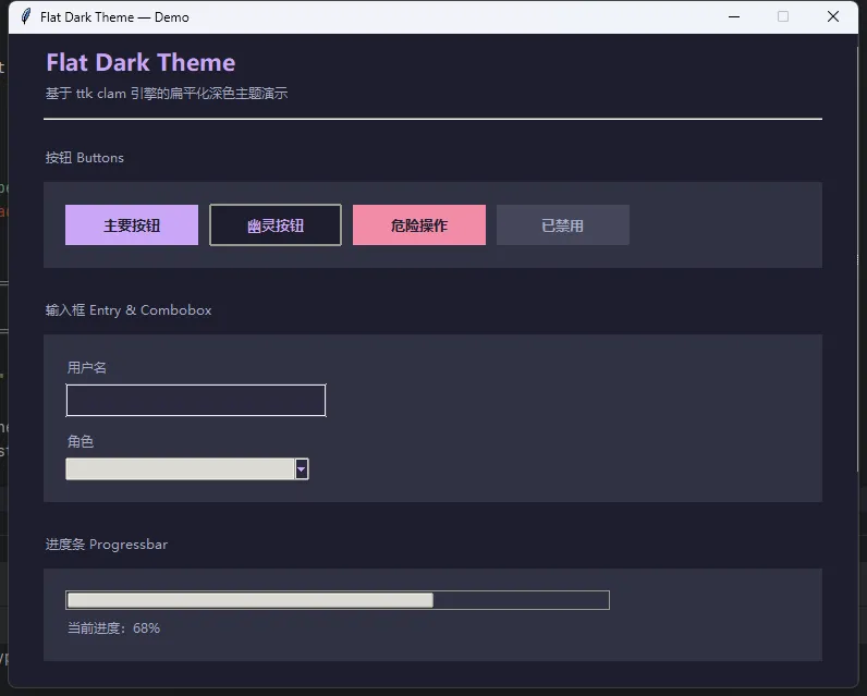
这套配置有几个设计决策值得解释一下。
clam 作为基底,是因为它的控件结构比 default 更容易被覆盖——default 主题有些属性是硬编码在 Tcl 层面的,Python 这边改不动。clam 相对"干净",改造空间大。
style.map() 是处理状态变化的关键方法,用于定义鼠标悬停(active)、禁用(disabled)、聚焦(focus)等状态下的样式差异。只用 configure() 的话,按钮按下去没有任何视觉反馈,体验很差。
🪟 方案三:Canvas 自绘——突破 ttk 的天花板
ttk.Style 能覆盖大部分场景,但有些效果它做不到——圆角按钮、渐变背景、自定义进度条动画。这时候就得上 Canvas 自绘了。
下面实现一个带圆角和悬停效果的自定义按钮:
import math import tkinter as tk classRoundedButton(tk.Canvas): """ 圆角按钮,纯 Canvas 实现 支持悬停颜色变化和点击回调 """def__init__(self, parent, text, command=None, width=120, height=36, radius=8, bg_normal="#cba6f7", bg_hover="#b4befe", bg_press="#a0a8d8", fg="#1e1e2e", font=("Microsoft YaHei UI", 10, "bold"), **kwargs): super().__init__( parent, width=width, height=height, bg=parent.cget("bg"), highlightthickness=0, **kwargs ) self.command = command self.bg_normal = bg_normal self.bg_hover = bg_hover self.bg_press = bg_press self.radius = radius self.width_ = width self.height_ = height self._rect = self._draw_rounded_rect(bg_normal, radius) self._text = self.create_text( width // 2, height // 2, text=text, fill=fg, font=font ) self.bind("<Enter>", self._on_enter) self.bind("<Leave>", self._on_leave) self.bind("<ButtonPress-1>", self._on_press) self.bind("<ButtonRelease-1>", self._on_release) def_draw_rounded_rect(self, color, r): w, h = self.width_, self.height_ self.delete("rounded_rect") # 动态采样点:确保每个圆角至少有 72 个采样点 N = max(72, int(r * 10)) points = [] corners = [ (r, r, 180, 270), (w - r, r, 270, 360), (w - r, h - r, 0, 90), (r, h - r, 90, 180), ] for cx, cy, a_start, a_end in corners: for i inrange(N + 1): angle = math.radians(a_start + (a_end - a_start) * i / N) points.append(cx + r * math.cos(angle)) points.append(cy + r * math.sin(angle)) self.create_polygon( points, smooth=False, fill=color, outline="", tags="rounded_rect" ) ifhasattr(self, "_text"): self.tag_raise(self._text) return"rounded_rect"def_set_color(self, color): self.itemconfig("rounded_rect", fill=color) def_on_enter(self, _): self._set_color(self.bg_hover) self.config(cursor="hand2") def_on_leave(self, _): self._set_color(self.bg_normal) self.config(cursor="") def_on_press(self, _): self._set_color(self.bg_press) def_on_release(self, _): self._set_color(self.bg_hover) ifself.command: self.command() classApp(tk.Tk): def__init__(self): super().__init__() self.title("RoundedButton 测试") self.resizable(False, False) self.configure(bg="#1e1e2e") # ── 顶部标题 ────────────────────────────── tk.Label( self, text="圆角按钮演示", bg="#1e1e2e", fg="#cdd6f4", font=("Microsoft YaHei UI", 14, "bold") ).pack(pady=(24, 4)) tk.Label( self, text="悬停 / 按下 / 松开,观察颜色变化", bg="#1e1e2e", fg="#6c7086", font=("Microsoft YaHei UI", 9) ).pack(pady=(0, 20)) # ── 计数器显示 ──────────────────────────── self._count = 0 self._count_var = tk.StringVar(value="点击次数:0") tk.Label( self, textvariable=self._count_var, bg="#1e1e2e", fg="#a6e3a1", font=("Microsoft YaHei UI", 11) ).pack(pady=(0, 16)) # ── 按钮区域 ────────────────────────────── btn_frame = tk.Frame(self, bg="#1e1e2e") btn_frame.pack(padx=32, pady=(0, 12)) # 默认紫色按钮 RoundedButton( btn_frame, text="点我计数", command=self._increment, width=130, height=38 ).grid(row=0, column=0, padx=8, pady=8) # 绿色主题按钮 RoundedButton( btn_frame, text="重置", command=self._reset, width=100, height=38, bg_normal="#a6e3a1", bg_hover="#94d3a2", bg_press="#7abf8a", fg="#1e1e2e" ).grid(row=0, column=1, padx=8, pady=8) # 红色主题按钮 RoundedButton( btn_frame, text="退出", command=self.destroy, width=100, height=38, bg_normal="#f38ba8", bg_hover="#e07090", bg_press="#c85878", fg="#1e1e2e" ).grid(row=0, column=2, padx=8, pady=8) # ── 大尺寸 / 大圆角 展示 ───────────────── tk.Label( self, text="不同尺寸 & 圆角半径", bg="#1e1e2e", fg="#6c7086", font=("Microsoft YaHei UI", 9) ).pack(pady=(8, 6)) size_frame = tk.Frame(self, bg="#1e1e2e") size_frame.pack(padx=32, pady=(0, 24)) RoundedButton( size_frame, text="小按钮", width=80, height=26, radius=6, bg_normal="#89b4fa", bg_hover="#74a8f5", bg_press="#5a8ee0", fg="#1e1e2e", font=("Microsoft YaHei UI", 8, "bold") ).grid(row=0, column=0, padx=8) RoundedButton( size_frame, text="标准按钮", width=120, height=36, radius=10, bg_normal="#cba6f7", bg_hover="#b4befe", bg_press="#a0a8d8", fg="#1e1e2e" ).grid(row=0, column=1, padx=8) RoundedButton( size_frame, text="大 按 钮", width=180, height=50, radius=18, bg_normal="#fab387", bg_hover="#f09070", bg_press="#d87858", fg="#1e1e2e", font=("Microsoft YaHei UI", 12, "bold") ).grid(row=0, column=2, padx=8) # ── 状态栏 ──────────────────────────────── self._status_var = tk.StringVar(value="就绪") tk.Label( self, textvariable=self._status_var, bg="#181825", fg="#585b70", font=("Microsoft YaHei UI", 8), anchor="w", padx=10 ).pack(fill="x", side="bottom", ipady=4) # ── 回调 ────────────────────────────────────── def _increment(self): self._count += 1self._count_var.set(f"点击次数:{self._count}") self._status_var.set(f"已点击 {self._count} 次") def_reset(self): self._count = 0self._count_var.set("点击次数:0") self._status_var.set("已重置") if __name__ == "__main__": App().mainloop()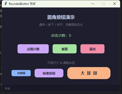
用法和普通按钮一样,直接 pack() 或 grid():
btn = RoundedButton( frame, text="开始处理", command=lambda: print("clicked"), width=140, height=40, radius=10)btn.pack(pady=10)smooth=True 是圆角效果的关键参数,它让折线多边形的顶点变成曲线过渡。highlightthickness=0 去掉 Canvas 默认的焦点边框,否则点击后会出现一圈蓝色虚线,很丑。
⚠️ 几个必须注意的细节
字体选择是视觉的灵魂。 Windows 下用 Microsoft YaHei UI(微软雅黑 UI),比普通微软雅黑渲染更清晰,尤其是小字号。代码字体用 Consolas。千万别用宋体——那是上个时代的遗留物。
ipady 和 padding 的区别。ipady 是 pack()/grid() 布局管理器的内边距,影响控件占位;padding 是 ttk.Style 里的内边距,影响控件内容区域。两者叠加使用,才能让输入框有足够的点击区域。
深色主题下的滚动条问题。 默认滚动条在深色背景下会显示白色边框,用 style.configure("Vertical.TScrollbar", borderwidth=0) 去掉,再配合 arrowsize=0 隐藏箭头,才能得到那种细线滚动条的现代感。
Canvas 按钮的"白边"问题。 Canvas 的 bg 参数必须设为父容器的背景色,否则圆角之外的区域会露出白色(或灰色)背景,圆角效果就毁了。用 parent.cget("bg") 动态获取父容器颜色,比硬编码颜色值更健壮。
💡 三句话技术洞察
ttk.Style是 Tkinter 的 CSS,学会它就等于掌握了全局样式控制权。
颜色系统先于控件样式——把颜色统一定义在字典里,后期换肤只改一处。
Canvas 自绘是突破 ttk 限制的最后手段,不到必要不动用,维护成本比 Style 高一个量级。
本文从 ttk.Style 的主题机制讲起,覆盖了 ttkbootstrap 快速方案、纯手工扁平化主题定制,以及 Canvas 圆角按钮的自绘实现,最后整合成一个完整的登录窗口示例。三套方案各有适用场景,按需取用即可。欢迎在评论区聊聊你在 Tkinter 界面美化上踩过的坑,或者分享你自己的主题配色方案。
🏷️ PythonTkinterGUI开发扁平化设计Windows桌面开发
随机文章
-
 10个月宝宝每天需要喝多少奶粉?
- 代码的“后悔药”:初探 Python 异常处理
- 别再只会用 for 循环了!深入理解 Python 迭代器 (核心原理 + 实战)
- 我用python重构了openclaw
- 自学学会python真的现实不?
- 【一起学 Python】第 49 天:高级 OOP 特性之装饰器原理与编写
- GEE(Python版本)多源数据+数理统计网格化全球制图分析
- 彻底搞懂 Python 生成器:从入门到"yield"深处
- 零基础自学Python的正确顺序,保姆级攻略,少走90%弯路
- Python岗位变多了,工资却卡在原地,我投了47份简历没回音.
- 知识分享 | 《Linux & 安全测试命令最全整理:一套命令,让你玩转系统,小白也能看懂的命令行指南》