当前位置:首页>python>手把手教你用 Python 绘制“顶刊级”多维混淆矩阵

手把手教你用 Python 绘制“顶刊级”多维混淆矩阵

  • 2026-09-09 19:55:18
手把手教你用 Python 绘制“顶刊级”多维混淆矩阵

!

参考文章

📜 论文标题:Addressing synergistic climate-urbanization impacts: A coupled PLUS-ML

framework for projecting future LCZ and SUHI

📆 发表时间:2026年

https://doi.org/10.1016/j.scs.2026.107237

在机器学习分类任务中,混淆矩阵是我们评估模型性能最核心的工具。

但是,你是不是经常遇到这些痛点?

❌ sklearn 或 seaborn 默认画出来的矩阵太单调,只有色块和数字。

❌ 报告里总是需要一张混淆矩阵图 + 一张精度指标表格”,排版割裂。

❌ 放到学术论文里,默认图表的样式总显得不够“高级”和“专业”。

今天,带来了一套顶刊级的混淆矩阵改进绘图方案

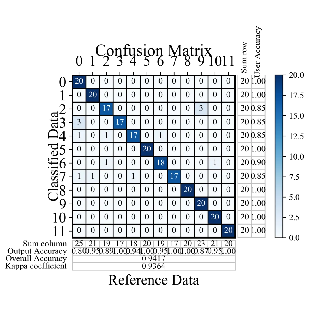
1.打破传统混淆矩阵只显示“预测对错数量”的局限。在主矩阵的外围,完美融合了分类任务必看的核心指标:

- 右侧拓展 :无缝拼接 Sum row(真实样本总数) 与 User Accuracy(用户精度/精确率) 。

- 下方拓展 :无缝拼接 Sum column(预测样本总数) 与 Output Accuracy(制图精度/召回率) 。

- 全局统览 :底部独立区域直观展示 Overall Accuracy(总体精度) 和 Kappa Coefficient(Kappa系数) 。 价值 :读者只需看一张图,就能获取模型在各个类别上的详尽表现,彻底告别“图表分离”的尴尬!

01

!

1.基础版混淆矩阵绘制

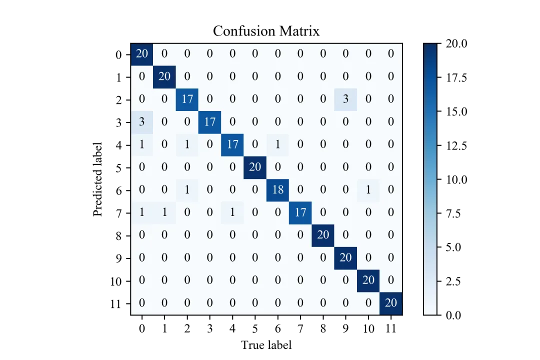
基础版混淆矩阵图直观展示模型在多分类任务上的预测效果,矩阵行代表预测类别,列代表真实类别,对角线上数值为各类别正确预测样本数,非对角元素为错分样本数量,可清晰反映不同类别的识别准确率与误判情况,是评估分类模型性能的基础可视化结果。

def plot_confusion_matrix(cm, labels=None, true_labels=None,                          pred_labels=None, title=None, normalize=False,                          hide_zeros=False, x_tick_rotation=0, ax=None,                          figsize=None, cmap='Blues', title_fontsize="large",                          text_fontsize="medium"):    """    绘制混淆矩阵的函数。    参数:    ----------    cm : numpy.ndarray        混淆矩阵,形状为 (n_classes, n_classes)    labels : array-like, optional        类别标签列表,如果为None则使用数字索引    true_labels : array-like, optional        真实标签的子集,用于只显示特定类别    pred_labels : array-like, optional        预测标签的子集,用于只显示特定类别    title : str, optional        图表标题,如果为None则使用默认标题    normalize : bool, default=False        是否将混淆矩阵归一化到[0,1]区间    hide_zeros : bool, default=False        是否隐藏值为0的单元格文本    x_tick_rotation : int, default=0        x轴标签旋转角度    ax : matplotlib.axes.Axes, optional        用于绘图的matplotlib轴对象,如果为None则创建新的    figsize : tuple, optional        图形大小,(宽度, 高度),单位为英寸    cmap : str, default='Blues'        热力图的颜色主题    title_fontsize : str or int, default="large"        标题字体大小    text_fontsize : str or int, default="medium"        文本字体大小    返回:    -------    matplotlib.axes.Axes        包含绘制的混淆矩阵的轴对象    功能说明:    --------    1. 支持原始数值和归一化后的混淆矩阵显示    2. 可自定义颜色主题和字体大小    3. 支持标签旋转以适应长文本    4. 自动调整文本颜色以提高可读性    5. 可选择性显示部分类别    """    if ax is None:        fig, ax = plt.subplots(1, 1, figsize=figsize)    cm = cm    if labels is None:        classes = np.arange(len(cm))    else:        classes = np.asarray(labels)    if normalize:        cm = cm.astype('float') / cm.sum(axis=1)[:, np.newaxis]        cm = np.around(cm, decimals=2)        cm[np.isnan(cm)] = 0.0    if true_labels is None:        true_classes = classes    else:        validate_labels(classes, true_labels, "true_labels")        true_label_indexes = np.in1d(classes, true_labels)        true_classes = classes[true_label_indexes]        cm = cm[true_label_indexes]    if pred_labels is None:        pred_classes = classes    else:        validate_labels(classes, pred_labels, "pred_labels")        pred_label_indexes = np.in1d(classes, pred_labels)        pred_classes = classes[pred_label_indexes]        cm = cm[:, pred_label_indexes]    if title:        ax.set_title(title, fontsize=title_fontsize)    elif normalize:        ax.set_title('Normalized Confusion Matrix', fontsize=title_fontsize)    else:        ax.set_title('Confusion Matrix', fontsize=title_fontsize)    image = ax.imshow(cm, interpolation='nearest', cmap=plt.cm.get_cmap(cmap))    plt.colorbar(mappable=image,shrink=1)    true_classes=true_classes    pred_classes=true_classes    x_tick_marks = np.arange(len(pred_classes))    y_tick_marks = np.arange(len(true_classes))    ax.set_xticks(x_tick_marks)    ax.set_xticklabels(pred_classes, fontsize=text_fontsize,                       rotation=x_tick_rotation)    ax.set_yticks(y_tick_marks)    ax.set_yticklabels(true_classes, fontsize=text_fontsize)    thresh = cm.max() / 2.    for i, j in itertools.product(range(cm.shape[0]), range(cm.shape[1])):        if not (hide_zeros and cm[i, j] == 0):            ax.text(j, i, cm[i, j],                    horizontalalignment="center",                    verticalalignment="center",                    fontsize=text_fontsize,                    color="white" if cm[i, j] > thresh else "black")    ax.set_ylabel('Predicted label', fontsize=text_fontsize)    ax.set_xlabel('True label', fontsize=text_fontsize)    ax.grid('off')    return axfrom sklearn.ensemble import RandomForestClassifierfrom sklearn.datasets import load_digits as load_dataimport matplotlib.pyplot as pltcm=np.array([[20,0,0,0,0,0,0,0,0,0,0,0],             [0,20,0,0,0,0,0,0,0,0,0,0],             [0,0,17,0,0,0,0,0,0,3,0,0],             [3,0,0,17,0,0,0,0,0,0,0,0],             [1,0,1,0,17,0,1,0,0,0,0,0],             [0,0,0,0,0,20,0,0,0,0,0,0],             [0,0,1,0,0,0,18,0,0,0,1,0],             [1,1,0,0,1,0,0,17,0,0,0,0],             [0,0,0,0,0,0,0,0,20,0,0,0],             [0,0,0,0,0,0,0,0,0,20,0,0],             [0,0,0,0,0,0,0,0,0,0,20,0],             [0,0,0,0,0,0,0,0,0,0,0,20],             ])#两个输入参数,一个cm代表混淆矩阵各个位置数值,一个y_true代表类别有几个plot_confusion_matrix(cm=cm,normalize=False)# 去除网格线plt.grid(False)plt.savefig('混淆矩阵5.png',dpi=300)plt.show()

02

!

2.进阶版混淆矩阵绘制

相较于基础版本,进阶版新增完整量化评估指标体系:右侧展示各类别行样本总数与用户精度,下方呈现列样本总数、输出精度,底部同步标注总体精度与 Kappa 系数,实现样本数量、分类精度、模型一致性的全方位量化呈现;同时搭配自定义边框、字体、颜色映射、标签旋转等精细化排版设计,支持归一化显示、零值隐藏、类别筛选等扩展功能,兼顾可视化美观度与模型评估专业性,可全面、精准地反映多分类模型的整体性能、分类可靠性与误差分布规律,满足专业场景下的模型评估与结果展示需求。

import itertoolsimport matplotlib.pyplot as pltimport numpy as npfrom sklearn.metrics import confusion_matrixfrom sklearn.preprocessing import label_binarizefrom sklearn.preprocessing import LabelEncoderfrom sklearn.metrics import roc_curvefrom sklearn.metrics import aucfrom sklearn.metrics import precision_recall_curvefrom sklearn.metrics import average_precision_scorefrom sklearn.utils.multiclass import unique_labelsfrom sklearn.metrics import silhouette_scorefrom sklearn.metrics import silhouette_samplesfrom sklearn.calibration import calibration_curvefrom scikitplot.helpers import binary_ks_curve, validate_labelsfrom scikitplot.helpers import cumulative_gain_curvedef plot_confusion_matrix(cm, labels=None, true_labels=None,                          pred_labels=None, title=None, normalize=False,                          hide_zeros=False, x_tick_rotation=0, ax=None,                          figsize=None, cmap='Blues', title_fontsize="large",                          text_fontsize="medium"):    """    绘制混淆矩阵的函数。    参数:    ----------    cm : numpy.ndarray        混淆矩阵,形状为 (n_classes, n_classes)    labels : array-like, optional        类别标签列表,如果为None则使用数字索引    true_labels : array-like, optional        真实标签的子集,用于只显示特定类别    pred_labels : array-like, optional        预测标签的子集,用于只显示特定类别    title : str, optional        图表标题,如果为None则使用默认标题    normalize : bool, default=False        是否将混淆矩阵归一化到[0,1]区间    hide_zeros : bool, default=False        是否隐藏值为0的单元格文本    x_tick_rotation : int, default=0        x轴标签旋转角度    ax : matplotlib.axes.Axes, optional        用于绘图的matplotlib轴对象,如果为None则创建新的    figsize : tuple, optional        图形大小,(宽度, 高度),单位为英寸    cmap : str, default='Blues'        热力图的颜色主题    title_fontsize : str or int, default="large"        标题字体大小    text_fontsize : str or int, default="medium"        文本字体大小    返回:    -------    matplotlib.axes.Axes        包含绘制的混淆矩阵的轴对象    功能说明:    --------    1. 支持原始数值和归一化后的混淆矩阵显示    2. 可自定义颜色主题和字体大小    3. 支持标签旋转以适应长文本    4. 自动调整文本颜色以提高可读性    5. 可选择性显示部分类别    """    if ax is None:        fig, ax = plt.subplots(1, 1, figsize=figsize if figsize is not None else (12, 10))    cm = np.asarray(cm)    if labels is None:        classes = np.arange(len(cm))    else:        classes = np.asarray(labels)    cm_stats = cm.astype(float)    if true_labels is None:        true_classes = classes    else:        validate_labels(classes, true_labels, "true_labels")        true_label_indexes = np.in1d(classes, true_labels)        true_classes = classes[true_label_indexes]        cm_stats = cm_stats[true_label_indexes]    if pred_labels is None:        pred_classes = classes    else:        validate_labels(classes, pred_labels, "pred_labels")        pred_label_indexes = np.in1d(classes, pred_labels)        pred_classes = classes[pred_label_indexes]        cm_stats = cm_stats[:, pred_label_indexes]    cm_plot = cm_stats.copy()    if normalize:        cm_plot = cm_plot / cm_plot.sum(axis=1, keepdims=True)        cm_plot = np.around(cm_plot, decimals=2)        cm_plot[np.isnan(cm_plot)] = 0.0    if title:        plot_title = title    elif normalize:        plot_title = 'Normalized Confusion Matrix'    else:        plot_title = 'Confusion Matrix'    def _inc_fontsize(size, delta=5):        if isinstance(size, (int, float)):            return size + delta        size_map = {            'xx-small': 6,            'x-small': 8,            'small': 10,            'medium': 12,            'large': 14,            'x-large': 16,            'xx-large': 18        }        return size_map.get(str(size).lower(), 12) + delta    tick_label_fontsize = _inc_fontsize(text_fontsize)    axis_label_fontsize = _inc_fontsize(text_fontsize)    title_draw_fontsize = _inc_fontsize(title_fontsize)    image = ax.imshow(cm_plot, interpolation='nearest', cmap=plt.cm.get_cmap(cmap))    n_rows, n_cols = cm_plot.shape    sum_row = cm_stats.sum(axis=1)    sum_col = cm_stats.sum(axis=0)    diag = np.diag(cm_stats)    user_acc = np.divide(diag, sum_row, out=np.zeros_like(diag), where=sum_row != 0)    output_acc = np.divide(diag, sum_col, out=np.zeros_like(diag), where=sum_col != 0)    total = cm_stats.sum()    overall_acc = diag.sum() / total if total != 0 else 0.0    expected_acc = np.sum(sum_row * sum_col) / (total * total) if total != 0 else 0.0    kappa = (overall_acc - expected_acc) / (1 - expected_acc) if (1 - expected_acc) != 0 else 0.0    x_tick_marks = np.arange(n_cols)    y_tick_marks = np.arange(n_rows)    ax.set_xticks(x_tick_marks)    ax.set_xticklabels(pred_classes, fontsize=tick_label_fontsize, rotation=x_tick_rotation)    ax.set_yticks(y_tick_marks)    ax.set_yticklabels(true_classes, fontsize=tick_label_fontsize)    ax.xaxis.tick_top()    ax.xaxis.set_label_position('top')    thresh = cm_plot.max() / 2.0 if cm_plot.size else 0    for i, j in itertools.product(range(n_rows), range(n_cols)):        if not (hide_zeros and cm_plot[i, j] == 0):            cell_value = f"{cm_plot[i, j]:.2f}" if normalize else f"{int(cm_plot[i, j])}"            ax.text(j, i, cell_value,                    horizontalalignment="center",                    verticalalignment="center",                    fontsize=text_fontsize,                    color="white" if cm_plot[i, j] > thresh else "black")    right_gap = 0.2    bottom_gap = 0.2    aux_color = '#bfbfbf'    right_x0 = n_cols - 0.5 + right_gap    right_x1 = right_x0 + 2    bottom_row_h = 0.55    bottom_y0 = n_rows - 0.5 + bottom_gap    bottom_y1 = bottom_y0 + 2 * bottom_row_h    overall_y0 = bottom_y1    overall_y1 = overall_y0 + 2 * bottom_row_h    for i in range(n_rows):        ax.text(right_x0 + 0.5, i, f"{int(sum_row[i])}", ha="center", va="center", fontsize=text_fontsize)        ax.text(right_x0 + 1.5, i, f"{user_acc[i]:.2f}", ha="center", va="center", fontsize=text_fontsize)    for j in range(n_cols):        ax.text(j, bottom_y0 + 0.5 * bottom_row_h, f"{int(sum_col[j])}", ha="center", va="center", fontsize=text_fontsize)        ax.text(j, bottom_y0 + 1.5 * bottom_row_h, f"{output_acc[j]:.2f}", ha="center", va="center", fontsize=text_fontsize)    ax.text(right_x0 + 0.5, -1.8, 'Sum row', ha='center', va='center', fontsize=text_fontsize, rotation=90)    ax.text(right_x0 + 1.5, -2.2, 'User Accuracy', ha='center', va='center', fontsize=text_fontsize, rotation=90)    ax.text(-0.9, bottom_y0 + 0.5 * bottom_row_h, 'Sum column', ha='right', va='center', fontsize=text_fontsize)    ax.text(-0.9, bottom_y0 + 1.5 * bottom_row_h, 'Output Accuracy', ha='right', va='center', fontsize=text_fontsize)    ax.text(-0.9, overall_y0 + 0.5 * bottom_row_h, 'Overall Accuracy', ha='right', va='center', fontsize=text_fontsize)    ax.text((n_cols - 1) / 2, overall_y0 + 0.5 * bottom_row_h, f"{overall_acc:.4f}", ha='center', va='center', fontsize=text_fontsize)    ax.text(-0.9, overall_y0 + 1.5 * bottom_row_h, 'Kappa coefficient', ha='right', va='center', fontsize=text_fontsize)    ax.text((n_cols - 1) / 2, overall_y0 + 1.5 * bottom_row_h, f"{kappa:.4f}", ha='center', va='center', fontsize=text_fontsize)    for x in np.arange(-0.5, n_cols + 0.5, 1):        ax.plot([x, x], [-0.5, n_rows - 0.5], color='black', linewidth=1.2)    for y in np.arange(-0.5, n_rows + 0.5, 1):        ax.plot([-0.5, n_cols - 0.5], [y, y], color='black', linewidth=1.2)    ax.plot([-0.5, n_cols - 0.5], [-0.5, -0.5], color='black', linewidth=2.2)    ax.plot([-0.5, n_cols - 0.5], [n_rows - 0.5, n_rows - 0.5], color='black', linewidth=2.2)    ax.plot([n_cols - 0.5, n_cols - 0.5], [-0.5, n_rows - 0.5], color='black', linewidth=2.2)    for x in [right_x0, right_x0 + 1, right_x1]:        ax.plot([x, x], [-0.5, n_rows - 0.5], color=aux_color, linewidth=0.9)    for y in np.arange(-0.5, n_rows + 0.5, 1):        ax.plot([right_x0, right_x1], [y, y], color=aux_color, linewidth=0.9)    for x in np.arange(-0.5, n_cols + 0.5, 1):        ax.plot([x, x], [bottom_y0, bottom_y1], color=aux_color, linewidth=0.9)    for y in [bottom_y0, bottom_y0 + bottom_row_h, bottom_y1, overall_y0 + bottom_row_h, overall_y1]:        ax.plot([-0.5, n_cols - 0.5], [y, y], color=aux_color, linewidth=0.9)    for x in [-0.5, n_cols - 0.5]:        ax.plot([x, x], [bottom_y0, overall_y1], color=aux_color, linewidth=0.9)    ax.set_xlim(-0.5, right_x1 + 0.3)    ax.set_ylim(overall_y1 + 0.3, -0.5)    total_height = overall_y1 + 0.8    matrix_height_ratio = n_rows / total_height    cax = ax.inset_axes([1.03, 1 - matrix_height_ratio, 0.04, matrix_height_ratio])    plt.colorbar(mappable=image, cax=cax)    matrix_center_x = (n_cols - 1) / 2    matrix_center_y = (n_rows - 1) / 2    ax.text(matrix_center_x, -2.2, plot_title,            ha='center', va='center', fontsize=title_draw_fontsize, clip_on=False)    ax.text(matrix_center_x, overall_y1 + 0.8, 'Reference Data',            ha='center', va='center', fontsize=axis_label_fontsize, clip_on=False)    ax.text(-1.8, matrix_center_y, 'Classified Data',            ha='center', va='center', rotation=90, fontsize=axis_label_fontsize, clip_on=False)    ax.grid(False)    for spine in ax.spines.values():        spine.set_visible(False)    return axfrom sklearn.ensemble import RandomForestClassifierfrom sklearn.datasets import load_digits as load_dataimport matplotlib.pyplot as pltcm=np.array([[20,0,0,0,0,0,0,0,0,0,0,0],             [0,20,0,0,0,0,0,0,0,0,0,0],             [0,0,17,0,0,0,0,0,0,3,0,0],             [3,0,0,17,0,0,0,0,0,0,0,0],             [1,0,1,0,17,0,1,0,0,0,0,0],             [0,0,0,0,0,20,0,0,0,0,0,0],             [0,0,1,0,0,0,18,0,0,0,1,0],             [1,1,0,0,1,0,0,17,0,0,0,0],             [0,0,0,0,0,0,0,0,20,0,0,0],             [0,0,0,0,0,0,0,0,0,20,0,0],             [0,0,0,0,0,0,0,0,0,0,20,0],             [0,0,0,0,0,0,0,0,0,0,0,20],             ])#两个输入参数,一个cm代表混淆矩阵各个位置数值,一个y_true代表类别有几个plot_confusion_matrix(cm=cm,normalize=False,figsize=(5,5))# 去除网格线plt.grid(False)plt.tight_layout()plt.savefig('混淆矩阵1.png',dpi=300)plt.show()

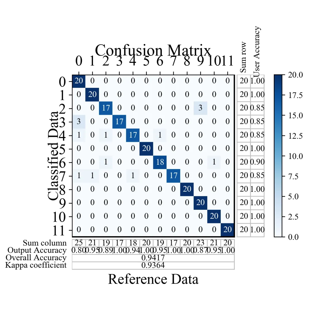
也可以将混淆矩阵内部边框去掉,看起来更清晰

import itertoolsimport matplotlib.pyplot as pltimport numpy as npfrom sklearn.metrics import confusion_matrixfrom sklearn.preprocessing import label_binarizefrom sklearn.preprocessing import LabelEncoderfrom sklearn.metrics import roc_curvefrom sklearn.metrics import aucfrom sklearn.metrics import precision_recall_curvefrom sklearn.metrics import average_precision_scorefrom sklearn.utils.multiclass import unique_labelsfrom sklearn.metrics import silhouette_scorefrom sklearn.metrics import silhouette_samplesfrom sklearn.calibration import calibration_curvefrom scikitplot.helpers import binary_ks_curve, validate_labelsfrom scikitplot.helpers import cumulative_gain_curvedef plot_confusion_matrix(cm, labels=None, true_labels=None,                          pred_labels=None, title=None, normalize=False,                          hide_zeros=False, x_tick_rotation=0, ax=None,                          figsize=None, cmap='Blues', title_fontsize="large",                          text_fontsize="medium"):    """    绘制混淆矩阵的函数。    参数:    ----------    cm : numpy.ndarray        混淆矩阵,形状为 (n_classes, n_classes)    labels : array-like, optional        类别标签列表,如果为None则使用数字索引    true_labels : array-like, optional        真实标签的子集,用于只显示特定类别    pred_labels : array-like, optional        预测标签的子集,用于只显示特定类别    title : str, optional        图表标题,如果为None则使用默认标题    normalize : bool, default=False        是否将混淆矩阵归一化到[0,1]区间    hide_zeros : bool, default=False        是否隐藏值为0的单元格文本    x_tick_rotation : int, default=0        x轴标签旋转角度    ax : matplotlib.axes.Axes, optional        用于绘图的matplotlib轴对象,如果为None则创建新的    figsize : tuple, optional        图形大小,(宽度, 高度),单位为英寸    cmap : str, default='Blues'        热力图的颜色主题    title_fontsize : str or int, default="large"        标题字体大小    text_fontsize : str or int, default="medium"        文本字体大小    返回:    -------    matplotlib.axes.Axes        包含绘制的混淆矩阵的轴对象    功能说明:    --------    1. 支持原始数值和归一化后的混淆矩阵显示    2. 可自定义颜色主题和字体大小    3. 支持标签旋转以适应长文本    4. 自动调整文本颜色以提高可读性    5. 可选择性显示部分类别    """    if ax is None:        fig, ax = plt.subplots(1, 1, figsize=figsize if figsize is not None else (12, 10))    cm = np.asarray(cm)    if labels is None:        classes = np.arange(len(cm))    else:        classes = np.asarray(labels)    cm_stats = cm.astype(float)    if true_labels is None:        true_classes = classes    else:        validate_labels(classes, true_labels, "true_labels")        true_label_indexes = np.in1d(classes, true_labels)        true_classes = classes[true_label_indexes]        cm_stats = cm_stats[true_label_indexes]    if pred_labels is None:        pred_classes = classes    else:        validate_labels(classes, pred_labels, "pred_labels")        pred_label_indexes = np.in1d(classes, pred_labels)        pred_classes = classes[pred_label_indexes]        cm_stats = cm_stats[:, pred_label_indexes]    cm_plot = cm_stats.copy()    if normalize:        cm_plot = cm_plot / cm_plot.sum(axis=1, keepdims=True)        cm_plot = np.around(cm_plot, decimals=2)        cm_plot[np.isnan(cm_plot)] = 0.0    if title:        plot_title = title    elif normalize:        plot_title = 'Normalized Confusion Matrix'    else:        plot_title = 'Confusion Matrix'    def _inc_fontsize(size, delta=5):        if isinstance(size, (int, float)):            return size + delta        size_map = {            'xx-small': 6,            'x-small': 8,            'small': 10,            'medium': 12,            'large': 14,            'x-large': 16,            'xx-large': 18        }        return size_map.get(str(size).lower(), 12) + delta    tick_label_fontsize = _inc_fontsize(text_fontsize)    axis_label_fontsize = _inc_fontsize(text_fontsize)    title_draw_fontsize = _inc_fontsize(title_fontsize)    image = ax.imshow(cm_plot, interpolation='nearest', cmap=plt.cm.get_cmap(cmap))    n_rows, n_cols = cm_plot.shape    sum_row = cm_stats.sum(axis=1)    sum_col = cm_stats.sum(axis=0)    diag = np.diag(cm_stats)    user_acc = np.divide(diag, sum_row, out=np.zeros_like(diag), where=sum_row != 0)    output_acc = np.divide(diag, sum_col, out=np.zeros_like(diag), where=sum_col != 0)    total = cm_stats.sum()    overall_acc = diag.sum() / total if total != 0 else 0.0    expected_acc = np.sum(sum_row * sum_col) / (total * total) if total != 0 else 0.0    kappa = (overall_acc - expected_acc) / (1 - expected_acc) if (1 - expected_acc) != 0 else 0.0    x_tick_marks = np.arange(n_cols)    y_tick_marks = np.arange(n_rows)    ax.set_xticks(x_tick_marks)    ax.set_xticklabels(pred_classes, fontsize=tick_label_fontsize, rotation=x_tick_rotation)    ax.set_yticks(y_tick_marks)    ax.set_yticklabels(true_classes, fontsize=tick_label_fontsize)    ax.xaxis.tick_top()    ax.xaxis.set_label_position('top')    thresh = cm_plot.max() / 2.0 if cm_plot.size else 0    for i, j in itertools.product(range(n_rows), range(n_cols)):        if not (hide_zeros and cm_plot[i, j] == 0):            cell_value = f"{cm_plot[i, j]:.2f}" if normalize else f"{int(cm_plot[i, j])}"            ax.text(j, i, cell_value,                    horizontalalignment="center",                    verticalalignment="center",                    fontsize=text_fontsize,                    color="white" if cm_plot[i, j] > thresh else "black")    right_gap = 0.2    bottom_gap = 0.2    aux_color = '#bfbfbf'    right_x0 = n_cols - 0.5 + right_gap    right_x1 = right_x0 + 2    bottom_row_h = 0.55    bottom_y0 = n_rows - 0.5 + bottom_gap    bottom_y1 = bottom_y0 + 2 * bottom_row_h    overall_y0 = bottom_y1    overall_y1 = overall_y0 + 2 * bottom_row_h    for i in range(n_rows):        ax.text(right_x0 + 0.5, i, f"{int(sum_row[i])}", ha="center", va="center", fontsize=text_fontsize)        ax.text(right_x0 + 1.5, i, f"{user_acc[i]:.2f}", ha="center", va="center", fontsize=text_fontsize)    for j in range(n_cols):        ax.text(j, bottom_y0 + 0.5 * bottom_row_h, f"{int(sum_col[j])}", ha="center", va="center", fontsize=text_fontsize)        ax.text(j, bottom_y0 + 1.5 * bottom_row_h, f"{output_acc[j]:.2f}", ha="center", va="center", fontsize=text_fontsize)    ax.text(right_x0 + 0.5, -1.8, 'Sum row', ha='center', va='center', fontsize=text_fontsize, rotation=90)    ax.text(right_x0 + 1.5, -2.2, 'User Accuracy', ha='center', va='center', fontsize=text_fontsize, rotation=90)    ax.text(-0.9, bottom_y0 + 0.5 * bottom_row_h, 'Sum column', ha='right', va='center', fontsize=text_fontsize)    ax.text(-0.9, bottom_y0 + 1.5 * bottom_row_h, 'Output Accuracy', ha='right', va='center', fontsize=text_fontsize)    ax.text(-0.9, overall_y0 + 0.5 * bottom_row_h, 'Overall Accuracy', ha='right', va='center', fontsize=text_fontsize)    ax.text((n_cols - 1) / 2, overall_y0 + 0.5 * bottom_row_h, f"{overall_acc:.4f}", ha='center', va='center', fontsize=text_fontsize)    ax.text(-0.9, overall_y0 + 1.5 * bottom_row_h, 'Kappa coefficient', ha='right', va='center', fontsize=text_fontsize)    ax.text((n_cols - 1) / 2, overall_y0 + 1.5 * bottom_row_h, f"{kappa:.4f}", ha='center', va='center', fontsize=text_fontsize)    ax.plot([-0.5, n_cols - 0.5], [-0.5, -0.5], color='black', linewidth=1.5)    ax.plot([-0.5, n_cols - 0.5], [n_rows - 0.5, n_rows - 0.5], color='black', linewidth=1.5)    ax.plot([-0.5, -0.5], [-0.5, n_rows - 0.5], color='black', linewidth=1.5)    ax.plot([n_cols - 0.5, n_cols - 0.5], [-0.5, n_rows - 0.5], color='black', linewidth=1.5)    for x in [right_x0, right_x0 + 1, right_x1]:        ax.plot([x, x], [-0.5, n_rows - 0.5], color=aux_color, linewidth=0.9)    for y in np.arange(-0.5, n_rows + 0.5, 1):        ax.plot([right_x0, right_x1], [y, y], color=aux_color, linewidth=0.9)    for x in np.arange(-0.5, n_cols + 0.5, 1):        ax.plot([x, x], [bottom_y0, bottom_y1], color=aux_color, linewidth=0.9)    for y in [bottom_y0, bottom_y0 + bottom_row_h, bottom_y1, overall_y0 + bottom_row_h, overall_y1]:        ax.plot([-0.5, n_cols - 0.5], [y, y], color=aux_color, linewidth=0.9)    for x in [-0.5, n_cols - 0.5]:        ax.plot([x, x], [bottom_y0, overall_y1], color=aux_color, linewidth=0.9)    ax.set_xlim(-0.5, right_x1 + 0.3)    ax.set_ylim(overall_y1 + 0.3, -0.5)    total_height = overall_y1 + 0.8    matrix_height_ratio = n_rows / total_height    cax = ax.inset_axes([1.03, 1 - matrix_height_ratio, 0.04, matrix_height_ratio])    plt.colorbar(mappable=image, cax=cax)    matrix_center_x = (n_cols - 1) / 2    matrix_center_y = (n_rows - 1) / 2    ax.text(matrix_center_x, -2.2, plot_title,            ha='center', va='center', fontsize=title_draw_fontsize, clip_on=False)    ax.text(matrix_center_x, overall_y1 + 0.8, 'Reference Data',            ha='center', va='center', fontsize=axis_label_fontsize, clip_on=False)    ax.text(-1.8, matrix_center_y, 'Classified Data',            ha='center', va='center', rotation=90, fontsize=axis_label_fontsize, clip_on=False)    ax.grid(False)    for spine in ax.spines.values():        spine.set_visible(False)    return axfrom sklearn.ensemble import RandomForestClassifierfrom sklearn.datasets import load_digits as load_dataimport matplotlib.pyplot as pltcm=np.array([[20,0,0,0,0,0,0,0,0,0,0,0],             [0,20,0,0,0,0,0,0,0,0,0,0],             [0,0,17,0,0,0,0,0,0,3,0,0],             [3,0,0,17,0,0,0,0,0,0,0,0],             [1,0,1,0,17,0,1,0,0,0,0,0],             [0,0,0,0,0,20,0,0,0,0,0,0],             [0,0,1,0,0,0,18,0,0,0,1,0],             [1,1,0,0,1,0,0,17,0,0,0,0],             [0,0,0,0,0,0,0,0,20,0,0,0],             [0,0,0,0,0,0,0,0,0,20,0,0],             [0,0,0,0,0,0,0,0,0,0,20,0],             [0,0,0,0,0,0,0,0,0,0,0,20],             ])#两个输入参数,一个cm代表混淆矩阵各个位置数值,一个y_true代表类别有几个plot_confusion_matrix(cm=cm,normalize=False,figsize=(5,5))# 去除网格线plt.grid(False)plt.tight_layout()plt.savefig('混淆矩阵3.png',dpi=300)plt.show()
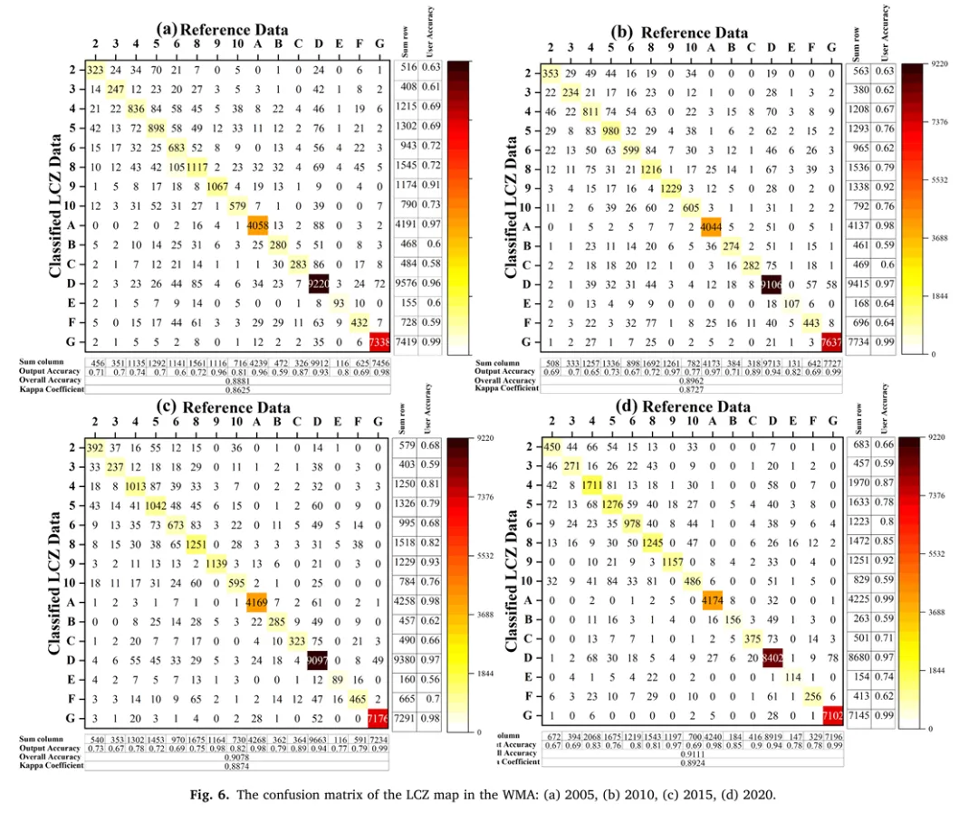
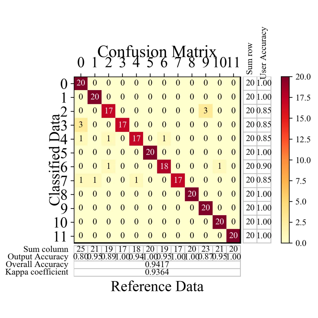
换一种符合参考文章的配色,配置了高对比度的 YlOrRd (黄橙红)热力配色

import itertoolsimport matplotlib.pyplot as pltimport numpy as npfrom sklearn.metrics import confusion_matrixfrom sklearn.preprocessing import label_binarizefrom sklearn.preprocessing import LabelEncoderfrom sklearn.metrics import roc_curvefrom sklearn.metrics import aucfrom sklearn.metrics import precision_recall_curvefrom sklearn.metrics import average_precision_scorefrom sklearn.utils.multiclass import unique_labelsfrom sklearn.metrics import silhouette_scorefrom sklearn.metrics import silhouette_samplesfrom sklearn.calibration import calibration_curvefrom scikitplot.helpers import binary_ks_curve, validate_labelsfrom scikitplot.helpers import cumulative_gain_curvedef plot_confusion_matrix(cm, labels=None, true_labels=None,                          pred_labels=None, title=None, normalize=False,                          hide_zeros=False, x_tick_rotation=0, ax=None,                          figsize=None, cmap='YlOrRd', title_fontsize="large",                          text_fontsize="medium"):    """    绘制混淆矩阵的函数。    参数:    ----------    cm : numpy.ndarray        混淆矩阵,形状为 (n_classes, n_classes)    labels : array-like, optional        类别标签列表,如果为None则使用数字索引    true_labels : array-like, optional        真实标签的子集,用于只显示特定类别    pred_labels : array-like, optional        预测标签的子集,用于只显示特定类别    title : str, optional        图表标题,如果为None则使用默认标题    normalize : bool, default=False        是否将混淆矩阵归一化到[0,1]区间    hide_zeros : bool, default=False        是否隐藏值为0的单元格文本    x_tick_rotation : int, default=0        x轴标签旋转角度    ax : matplotlib.axes.Axes, optional        用于绘图的matplotlib轴对象,如果为None则创建新的    figsize : tuple, optional        图形大小,(宽度, 高度),单位为英寸    cmap : str, default='Blues'        热力图的颜色主题    title_fontsize : str or int, default="large"        标题字体大小    text_fontsize : str or int, default="medium"        文本字体大小    返回:    -------    matplotlib.axes.Axes        包含绘制的混淆矩阵的轴对象    功能说明:    --------    1. 支持原始数值和归一化后的混淆矩阵显示    2. 可自定义颜色主题和字体大小    3. 支持标签旋转以适应长文本    4. 自动调整文本颜色以提高可读性    5. 可选择性显示部分类别    """    if ax is None:        fig, ax = plt.subplots(1, 1, figsize=figsize if figsize is not None else (12, 10))    cm = np.asarray(cm)    if labels is None:        classes = np.arange(len(cm))    else:        classes = np.asarray(labels)    cm_stats = cm.astype(float)    if true_labels is None:        true_classes = classes    else:        validate_labels(classes, true_labels, "true_labels")        true_label_indexes = np.in1d(classes, true_labels)        true_classes = classes[true_label_indexes]        cm_stats = cm_stats[true_label_indexes]    if pred_labels is None:        pred_classes = classes    else:        validate_labels(classes, pred_labels, "pred_labels")        pred_label_indexes = np.in1d(classes, pred_labels)        pred_classes = classes[pred_label_indexes]        cm_stats = cm_stats[:, pred_label_indexes]    cm_plot = cm_stats.copy()    if normalize:        cm_plot = cm_plot / cm_plot.sum(axis=1, keepdims=True)        cm_plot = np.around(cm_plot, decimals=2)        cm_plot[np.isnan(cm_plot)] = 0.0    if title:        plot_title = title    elif normalize:        plot_title = 'Normalized Confusion Matrix'    else:        plot_title = 'Confusion Matrix'    def _inc_fontsize(size, delta=5):        if isinstance(size, (int, float)):            return size + delta        size_map = {            'xx-small': 6,            'x-small': 8,            'small': 10,            'medium': 12,            'large': 14,            'x-large': 16,            'xx-large': 18        }        return size_map.get(str(size).lower(), 12) + delta    tick_label_fontsize = _inc_fontsize(text_fontsize)    axis_label_fontsize = _inc_fontsize(text_fontsize)    title_draw_fontsize = _inc_fontsize(title_fontsize)    image = ax.imshow(cm_plot, interpolation='nearest', cmap=plt.cm.get_cmap(cmap))    n_rows, n_cols = cm_plot.shape    sum_row = cm_stats.sum(axis=1)    sum_col = cm_stats.sum(axis=0)    diag = np.diag(cm_stats)    user_acc = np.divide(diag, sum_row, out=np.zeros_like(diag), where=sum_row != 0)    output_acc = np.divide(diag, sum_col, out=np.zeros_like(diag), where=sum_col != 0)    total = cm_stats.sum()    overall_acc = diag.sum() / total if total != 0 else 0.0    expected_acc = np.sum(sum_row * sum_col) / (total * total) if total != 0 else 0.0    kappa = (overall_acc - expected_acc) / (1 - expected_acc) if (1 - expected_acc) != 0 else 0.0    x_tick_marks = np.arange(n_cols)    y_tick_marks = np.arange(n_rows)    ax.set_xticks(x_tick_marks)    ax.set_xticklabels(pred_classes, fontsize=tick_label_fontsize, rotation=x_tick_rotation)    ax.set_yticks(y_tick_marks)    ax.set_yticklabels(true_classes, fontsize=tick_label_fontsize)    ax.xaxis.tick_top()    ax.xaxis.set_label_position('top')    thresh = cm_plot.max() / 2.0 if cm_plot.size else 0    for i, j in itertools.product(range(n_rows), range(n_cols)):        if not (hide_zeros and cm_plot[i, j] == 0):            cell_value = f"{cm_plot[i, j]:.2f}" if normalize else f"{int(cm_plot[i, j])}"            ax.text(j, i, cell_value,                    horizontalalignment="center",                    verticalalignment="center",                    fontsize=text_fontsize,                    color="white" if cm_plot[i, j] > thresh else "black")    right_gap = 0.2    bottom_gap = 0.2    aux_color = '#bfbfbf'    right_x0 = n_cols - 0.5 + right_gap    right_x1 = right_x0 + 2    bottom_row_h = 0.55    bottom_y0 = n_rows - 0.5 + bottom_gap    bottom_y1 = bottom_y0 + 2 * bottom_row_h    overall_y0 = bottom_y1    overall_y1 = overall_y0 + 2 * bottom_row_h    for i in range(n_rows):        ax.text(right_x0 + 0.5, i, f"{int(sum_row[i])}", ha="center", va="center", fontsize=text_fontsize)        ax.text(right_x0 + 1.5, i, f"{user_acc[i]:.2f}", ha="center", va="center", fontsize=text_fontsize)    for j in range(n_cols):        ax.text(j, bottom_y0 + 0.5 * bottom_row_h, f"{int(sum_col[j])}", ha="center", va="center", fontsize=text_fontsize)        ax.text(j, bottom_y0 + 1.5 * bottom_row_h, f"{output_acc[j]:.2f}", ha="center", va="center", fontsize=text_fontsize)    ax.text(right_x0 + 0.5, -1.8, 'Sum row', ha='center', va='center', fontsize=text_fontsize, rotation=90)    ax.text(right_x0 + 1.5, -2.2, 'User Accuracy', ha='center', va='center', fontsize=text_fontsize, rotation=90)    ax.text(-0.9, bottom_y0 + 0.5 * bottom_row_h, 'Sum column', ha='right', va='center', fontsize=text_fontsize)    ax.text(-0.9, bottom_y0 + 1.5 * bottom_row_h, 'Output Accuracy', ha='right', va='center', fontsize=text_fontsize)    ax.text(-0.9, overall_y0 + 0.5 * bottom_row_h, 'Overall Accuracy', ha='right', va='center', fontsize=text_fontsize)    ax.text((n_cols - 1) / 2, overall_y0 + 0.5 * bottom_row_h, f"{overall_acc:.4f}", ha='center', va='center', fontsize=text_fontsize)    ax.text(-0.9, overall_y0 + 1.5 * bottom_row_h, 'Kappa coefficient', ha='right', va='center', fontsize=text_fontsize)    ax.text((n_cols - 1) / 2, overall_y0 + 1.5 * bottom_row_h, f"{kappa:.4f}", ha='center', va='center', fontsize=text_fontsize)    ax.plot([-0.5, n_cols - 0.5], [-0.5, -0.5], color='black', linewidth=1.5)    ax.plot([-0.5, n_cols - 0.5], [n_rows - 0.5, n_rows - 0.5], color='black', linewidth=1.5)    ax.plot([-0.5, -0.5], [-0.5, n_rows - 0.5], color='black', linewidth=1.5)    ax.plot([n_cols - 0.5, n_cols - 0.5], [-0.5, n_rows - 0.5], color='black', linewidth=1.5)    for x in [right_x0, right_x0 + 1, right_x1]:        ax.plot([x, x], [-0.5, n_rows - 0.5], color=aux_color, linewidth=0.9)    for y in np.arange(-0.5, n_rows + 0.5, 1):        ax.plot([right_x0, right_x1], [y, y], color=aux_color, linewidth=0.9)    for x in np.arange(-0.5, n_cols + 0.5, 1):        ax.plot([x, x], [bottom_y0, bottom_y1], color=aux_color, linewidth=0.9)    for y in [bottom_y0, bottom_y0 + bottom_row_h, bottom_y1, overall_y0 + bottom_row_h, overall_y1]:        ax.plot([-0.5, n_cols - 0.5], [y, y], color=aux_color, linewidth=0.9)    for x in [-0.5, n_cols - 0.5]:        ax.plot([x, x], [bottom_y0, overall_y1], color=aux_color, linewidth=0.9)    ax.set_xlim(-0.5, right_x1 + 0.3)    ax.set_ylim(overall_y1 + 0.3, -0.5)    total_height = overall_y1 + 0.8    matrix_height_ratio = n_rows / total_height    cax = ax.inset_axes([1.03, 1 - matrix_height_ratio, 0.04, matrix_height_ratio])    plt.colorbar(mappable=image, cax=cax)    matrix_center_x = (n_cols - 1) / 2    matrix_center_y = (n_rows - 1) / 2    ax.text(matrix_center_x, -2.2, plot_title,            ha='center', va='center', fontsize=title_draw_fontsize, clip_on=False)    ax.text(matrix_center_x, overall_y1 + 0.8, 'Reference Data',            ha='center', va='center', fontsize=axis_label_fontsize, clip_on=False)    ax.text(-1.8, matrix_center_y, 'Classified Data',            ha='center', va='center', rotation=90, fontsize=axis_label_fontsize, clip_on=False)    ax.grid(False)    for spine in ax.spines.values():        spine.set_visible(False)    return axfrom sklearn.ensemble import RandomForestClassifierfrom sklearn.datasets import load_digits as load_dataimport matplotlib.pyplot as pltcm=np.array([[20,0,0,0,0,0,0,0,0,0,0,0],             [0,20,0,0,0,0,0,0,0,0,0,0],             [0,0,17,0,0,0,0,0,0,3,0,0],             [3,0,0,17,0,0,0,0,0,0,0,0],             [1,0,1,0,17,0,1,0,0,0,0,0],             [0,0,0,0,0,20,0,0,0,0,0,0],             [0,0,1,0,0,0,18,0,0,0,1,0],             [1,1,0,0,1,0,0,17,0,0,0,0],             [0,0,0,0,0,0,0,0,20,0,0,0],             [0,0,0,0,0,0,0,0,0,20,0,0],             [0,0,0,0,0,0,0,0,0,0,20,0],             [0,0,0,0,0,0,0,0,0,0,0,20],             ])#两个输入参数,一个cm代表混淆矩阵各个位置数值,一个y_true代表类别有几个plot_confusion_matrix(cm=cm, normalize=False, figsize=(5,5), cmap='YlOrRd')# 去除网格线plt.grid(False)plt.tight_layout()plt.savefig('混淆矩阵4.png',dpi=300)plt.show()

总结

改进混淆矩阵绘图,彻底打破了传统绘图在图表展示上的割裂感,实现了一张图集成“预测对错分布”、“行列精度统计”及“全局评估指标”的全景式学术级排版。它在主混淆矩阵的右侧无缝拼接了真实样本总数(Sum row)与用户精度(UA),在下方拓展了预测样本总数(Sum column)与制图精度(PA),并在底部独立展示了总体精度(OA)与 Kappa 系数,避免了报告中图表分离的尴尬。

!

点击蓝字 关注我们

最新文章

随机文章