python数据可视化技巧的100个练习 -- 9. 人口与 GDP 的气泡图
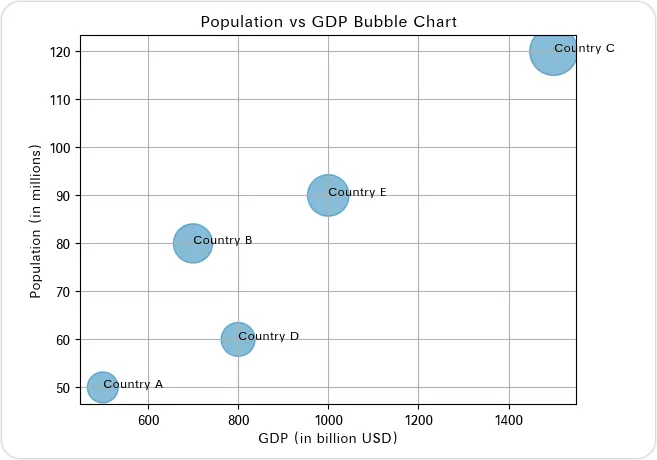
一家跨国公司正在评估潜在的市场扩张目标。他们根据人口和 GDP 来考虑各国。你的任务是生成一个气泡图,以可视化不同国家人口与 GDP 之间的关系。国家:['Country A', 'Country B', 'Country C', 'Country D', 'Country E']人口(以百万为单位):[50, 80, 120, 60, 90]GDP(以十亿美元为单位):[500, 700, 1500, 800, 1000]【数据生成代码示例】
import pandas as pdcountries = ['Country A', 'Country B', 'Country C', 'Country D', 'Country E']population = [50, 80, 120, 60, 90]gdp = [500, 700, 1500, 800, 1000]data = pd.DataFrame({'Country': countries, 'Population': population, 'GDP': gdp})
【图表答案】
【代码答案】
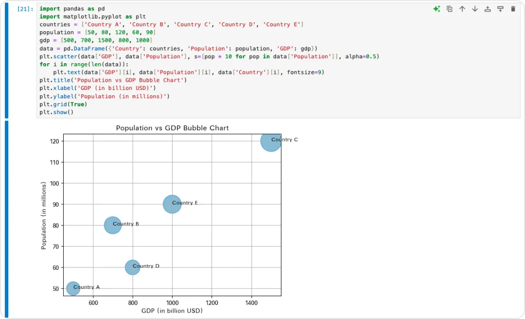
import pandas as pdimport matplotlib.pyplot as pltcountries = ['Country A', 'Country B', 'Country C', 'Country D', 'Country E']population = [50, 80, 120, 60, 90]gdp = [500, 700, 1500, 800, 1000]data = pd.DataFrame({'Country': countries, 'Population': population, 'GDP': gdp})plt.scatter(data['GDP'], data['Population'], s=[pop * 10 for pop in data['Population']], alpha=0.5)for i in range(len(data)): plt.text(data['GDP'][i], data['Population'][i], data['Country'][i], fontsize=9)plt.title('Population vs GDP Bubble Chart')plt.xlabel('GDP (in billion USD)')plt.ylabel('Population (in millions)')plt.grid(True)plt.show()
这个练习涉及创建一个气泡图,以可视化不同国家人口与 GDP 之间的关系。首先,我们导入必要的库:用于数据处理的 pandas 和用于绘图的 matplotlib。我们使用 pandas 创建一个 DataFrame,列出国家、人口和 GDP。人口数据将用于确定气泡的大小。使用 matplotlib 的 scatter 函数创建气泡图。x 轴代表 GDP,y 轴代表人口。气泡的大小(s 参数)按人口比例设置,alpha 值使气泡半透明。循环为每个气泡添加文本标签,在对应的(GDP,人口)坐标处显示国家名称。添加标题和标签以提高可读性,并启用网格线以便更容易解读。最后,plt.show() 显示图表。这个问题帮助用户练习数据可视化,特别是创建和自定义气泡图,这对于同时比较多个变量非常有用。【小知识】
气泡图是散点图的一种变体,其中通过标记的大小显示数据的第三个维度。它们特别适用于需要显示三个不同度量之间的关系的情况。例如,在商业中,它们可以用来绘制财务数据,如收入、利润和市场份额,提供多维度的绩效视图。此外,气泡图有助于识别复杂数据集中的模式、趋势和异常值,使其成为数据分析和呈现中的重要工具。