Python绘图 | Nature不同细胞类型中标记基因的表达点图复现(包含完整代码)
- 2026-10-01 06:12:06
Python绘图 | Nature不同细胞类型中标记基因的表达点图复现(包含完整代码)在单细胞测序论文中,标记基因表达点图是一项“标配”可视化内容。它能在同一张图中同时呈现四个关键信息:基因在哪种细胞中表达?表达量多高?表达细胞的比例是多少?以及如何区分功能相似的细胞类型?本期推文将使用Python,完整复现发表于 《Nature》 杂志的论文 “Single-cell spatiotemporal dissection of the human maternal–fetal interface” 中的标记基因表达点图,并附上完整可复现代码。 原文中的结果图:Fig. 1 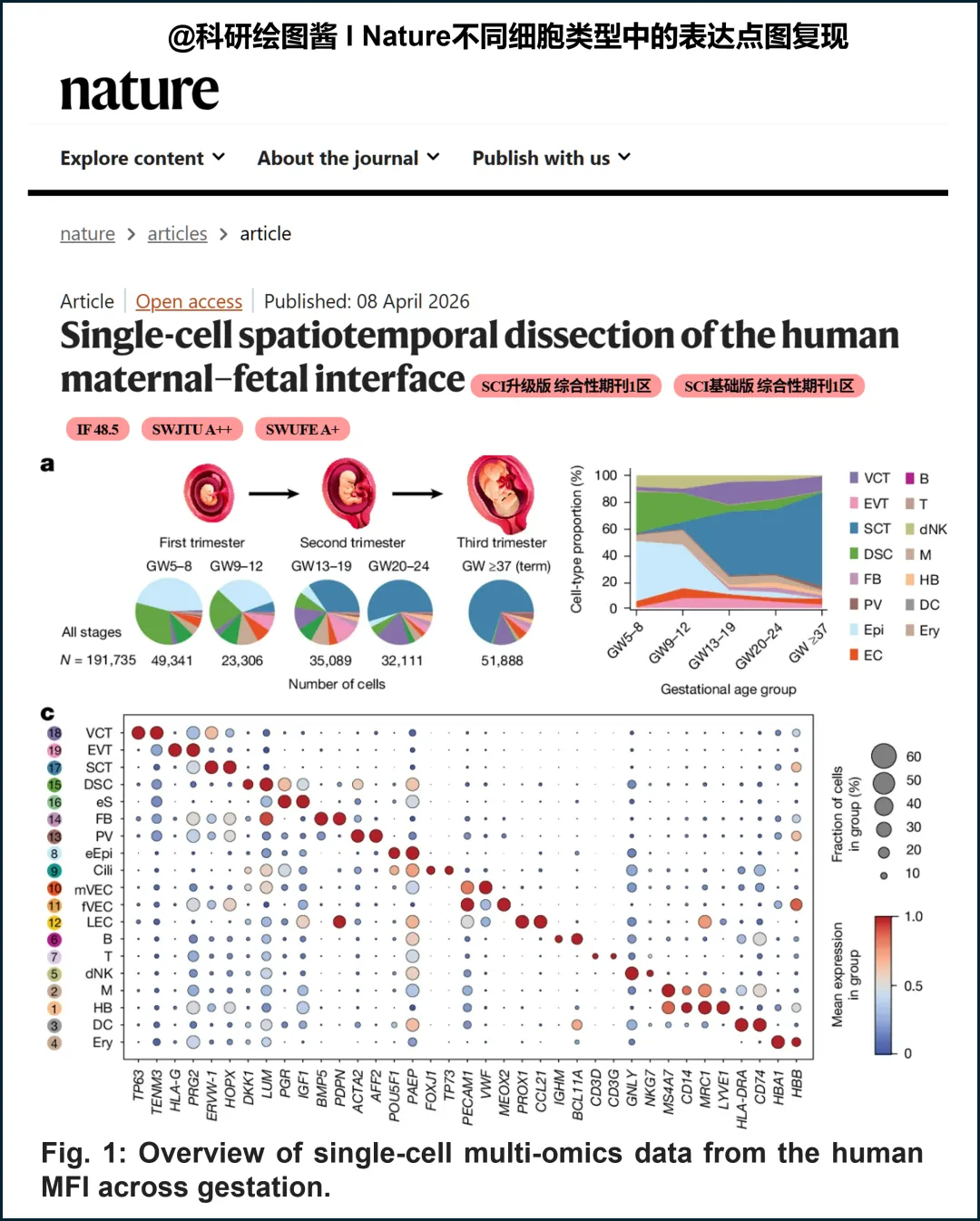
下面展示了如何用Python复现的过程,包含了绘制的完整代码。 由于原文没有提供源数据,复现图是用模拟数据进行的可视化。 1. 导入绘图相关的Python包: 2. 定义绘图相关的元素: 3. 绘图主函数: 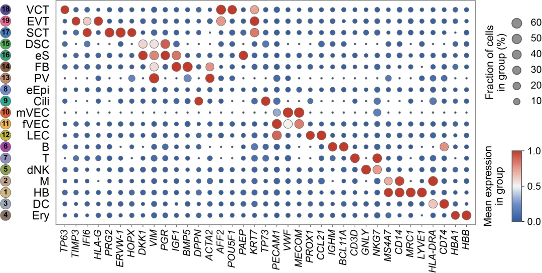
好了,本期内容到此结束,喜欢的小伙伴可以转发分享,收藏,别忘了来个三连击啊~~~ Python绘图 | 复现顶刊中机器学习SHAP特征重要性交互网络与个性化解释图(包含完整代码) R绘图 | Science网络相关性热图复现(包含完整代码) R绘图 | NC相关性矩阵热图复现(包含完整代码) R绘图 | CNS 级相关性矩阵热图复现进阶教程(含完整代码)

添加小编微信进群交流学习!
R代码
from pathlib import Pathimport pandas as pdimport numpy as npimport matplotlib as mplimport matplotlib.pyplot as pltfrom matplotlib.colors import LinearSegmentedColormapfrom matplotlib import transforms
CELL_TYPES = ["VCT", "EVT", "SCT", "DSC", "eS", "FB", "PV", "eEpi", "Cili","mVEC", "fVEC", "LEC", "B", "T", "dNK", "M", "HB", "DC", "Ery"]GENES = ["TP63", "TIMP3", "IFI6", "HLA-G", "PRG2", "ERVW-1", "HOPX", "DKK1", "VIM","PGR", "IGF1", "BMP5", "DPPN", "ACTA2", "AFF2", "POU5F1", "PAEP", "KRT7","TP73", "PECAM1", "VWF", "MECOM", "PROX1", "CCL21", "IGHM", "BCL11A","CD3D", "GNLY", "NKG7", "MS4A7", "CD14", "MRC1", "LYVE1", "HLA-DRA","CD74", "HBA1", "HBB"]LEFT_NUMBERS = [18, 19, 17, 15, 16, 14, 13, 8, 9, 10, 11, 12, 6, 7, 5, 2, 1, 3, 4]LEFT_COLORS = ["#5a4a9c", "#f06597", "#3f7fbf", "#4caf50", "#33a37a","#8b5a3c", "#c4876a", "#6f8ed6", "#2ba88f", "#e55c30","#f0b44d", "#c8bc2f", "#a843a8", "#8f8fbe", "#8fa34d","#c0a28a", "#d2b681", "#9ea8b8", "#8a7466"]mpl.rcParams["font.family"] = "sans-serif"mpl.rcParams["font.sans-serif"] = ["Arial", "DejaVu Sans", "Liberation Sans"]mpl.rcParams["pdf.fonttype"] = 42mpl.rcParams["ps.fonttype"] = 42
def plot(dot_df: pd.DataFrame, out_png: Path, out_pdf: Path | None = None) -> None:required = {"cell_type", "gene", "pct_exp", "avg_exp_scaled"}missing = required - set(dot_df.columns)df = dot_df.copy()df["cell_type"] = pd.Categorical(df["cell_type"], categories=CELL_TYPES, ordered=True)df["gene"] = pd.Categorical(df["gene"], categories=GENES, ordered=True)df = df.dropna(subset=["cell_type", "gene"]).sort_values(["cell_type", "gene"]).reset_index(drop=True)x_map = {g: i for i, g in enumerate(GENES)}y_map = {c: i for i, c in enumerate(CELL_TYPES)}df["x"] = df["gene"].map(x_map).astype(float)df["y"] = df["cell_type"].map(y_map).astype(float)fig = plt.figure(figsize=(10, 5), dpi=300)fig.patch.set_facecolor("white")ax = fig.add_axes([0.10, 0.14, 0.71, 0.76])ax.set_facecolor("white")cmap = LinearSegmentedColormap.from_list("nature_bwr",["#2c5aa0", "#6f8fc8", "#f5f5f5", "#e89b8e", "#c23a2b"],)p = np.clip(df["pct_exp"].to_numpy(), 0.0, 60.0)s_min, s_max = 5.0, 140.0sizes = s_min + (s_max - s_min) * np.sqrt(p / 60.0)sc = ax.scatter(df["x"],df["y"],s=sizes,c=np.clip(df["avg_exp_scaled"].to_numpy(), 0.0, 1.0),cmap=cmap,vmin=0,vmax=1,edgecolors="#6e6e6e",linewidths=0.6,alpha=1.0,)ax.set_xlim(-0.8, len(GENES) - 0.2)ax.set_ylim(-0.8, len(CELL_TYPES) - 0.2)ax.invert_yaxis()ax.set_xticks(range(len(GENES)))ax.set_xticklabels(GENES, rotation=90, ha="center", va="top", fontsize=12, fontstyle="italic")ax.set_yticks(range(len(CELL_TYPES)))ax.set_yticklabels(CELL_TYPES, fontsize=14)ax.tick_params(axis="y", pad=8)ax.tick_params(axis="x", length=3, width=0.8, color="#666666")ax.tick_params(axis="y", length=0)for side in ["top", "right", "left", "bottom"]:ax.spines[side].set_visible(True)ax.spines[side].set_color("#8d8d8d")ax.spines[side].set_linewidth(1.0)trans = transforms.blended_transform_factory(ax.transAxes, ax.transData)x_out = -0.12for i, ct in enumerate(CELL_TYPES):y = y_map[ct]ax.scatter(x_out,y,s=160,c=LEFT_COLORS[i],edgecolors="#6d6d6d",linewidths=0.6,zorder=7,transform=trans,clip_on=False,)ax.text(x_out,y,str(LEFT_NUMBERS[i]),color="black",fontsize=9,ha="center",va="center",fontweight="bold",zorder=8,transform=trans,clip_on=False,)leg_ax = fig.add_axes([0.845, 0.50, 0.14, 0.38])leg_ax.set_axis_off()levels = [60, 50, 40, 30, 20, 10]ys = np.linspace(0.85, 0.15, len(levels))for yv, lv in zip(ys, levels):s = s_min + (s_max - s_min) * np.sqrt(lv / 60.0)leg_ax.scatter(0.25, yv, s=s, c="#8f8f8f", edgecolors="#5e5e5e", linewidths=1.0)leg_ax.text(0.42, yv, f"{lv}", va="center", fontsize=12)leg_ax.text(0.00, 0.50, "Fraction of cells\nin group (%)", rotation=90,va="center", ha="center", fontsize=13)leg_ax.set_xlim(0, 1)leg_ax.set_ylim(0, 1)cax = fig.add_axes([0.872, 0.15, 0.016, 0.24])cb = plt.colorbar(sc, cax=cax)cb.set_ticks([0.0, 0.5, 1.0])cb.ax.tick_params(labelsize=12)cb.outline.set_edgecolor("#5e5e5e")cb.outline.set_linewidth(1.0)fig.text(0.842, 0.27, "Mean expression\nin group", rotation=90,va="center", ha="center", fontsize=13)plt.savefig(out_png, dpi=300)if out_pdf is not None:plt.savefig(out_pdf, format="pdf")plt.close(fig)
复现图如下
往期回顾
参考文献:Wang, C., Zhou, Y., Wang, Y. et al. Single-cell spatiotemporal dissection of the human maternal–fetal interface. Nature (2026). https://doi.org/10.1038/s41586-026-10316-x
以上内容为原创,转载需声明出处。
🔥亲测有效,一键运行,助你快速上手!
🔥整理不易,欢迎点赞分享给更多小伙伴~
本文来自网友投稿或网络内容,如有侵犯您的权益请联系我们删除,联系邮箱:596563534@qq.com 。
随机文章
-
 10个月宝宝每天需要喝多少奶粉?
- Python应用|第三周接口安全测试
- Python应用|软件测试和网络安全
- Python应用|核心应用场景
- Python应用|30天学习计划
- Python应用|第四周生成作品集
- Python+LangChain/LangGraph框架开发Ai智能体系列��17节 | RAG 进阶 | LangChain RetrievalQA + 自定义 Retriever + 过滤策略
- 用 COMSOL+Python 打造锂电池数字孪生:从 300 次仿真到 DNN 秒级预测
- 4_Python_列表
- Python 装饰器:给函数穿上"外衣"
- python一机一码激活注册系统 一分钟接入