期刊图片复现|Python绘制径向堆叠图
- 2026-10-11 06:23:35
期刊图片复现|Python绘制径向堆叠图

论文:Integrative cross‐tissue analysis unveils complement‐immunoglobulin augmentation and dysbiosis‐related fatty acid metabolic remodelingmduring mammalian aging 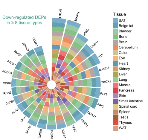
论文原图 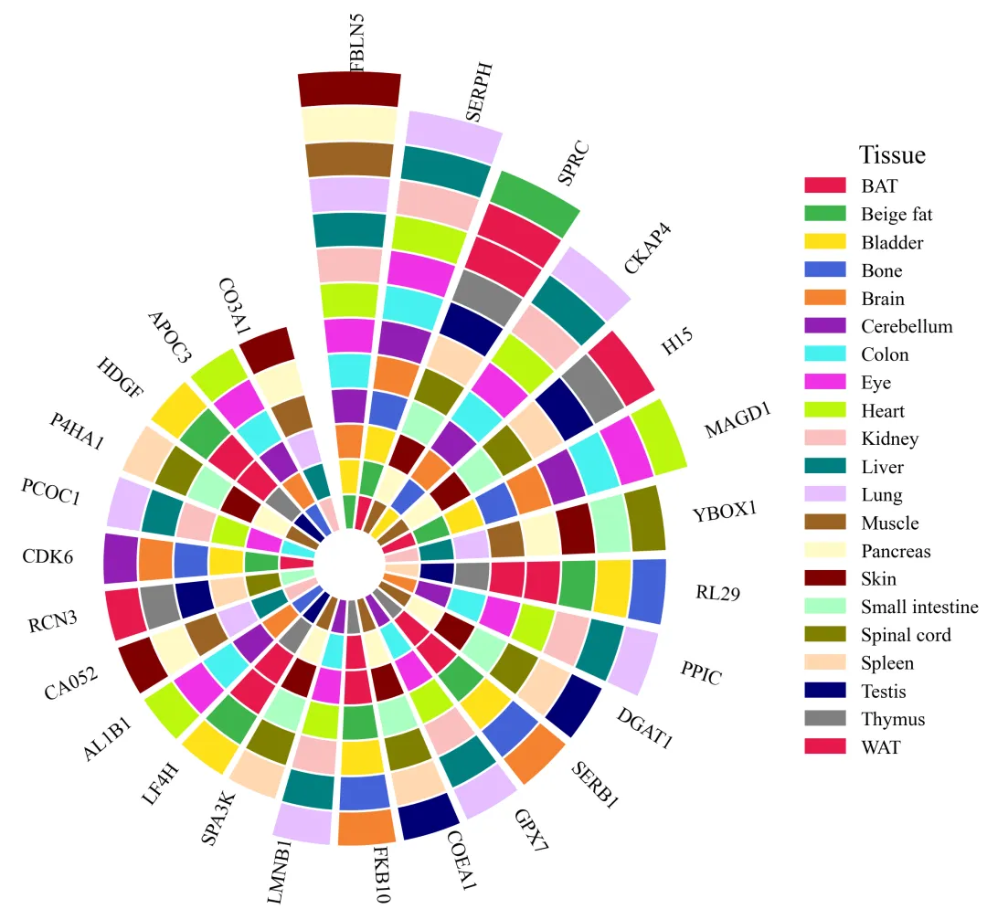
仿图 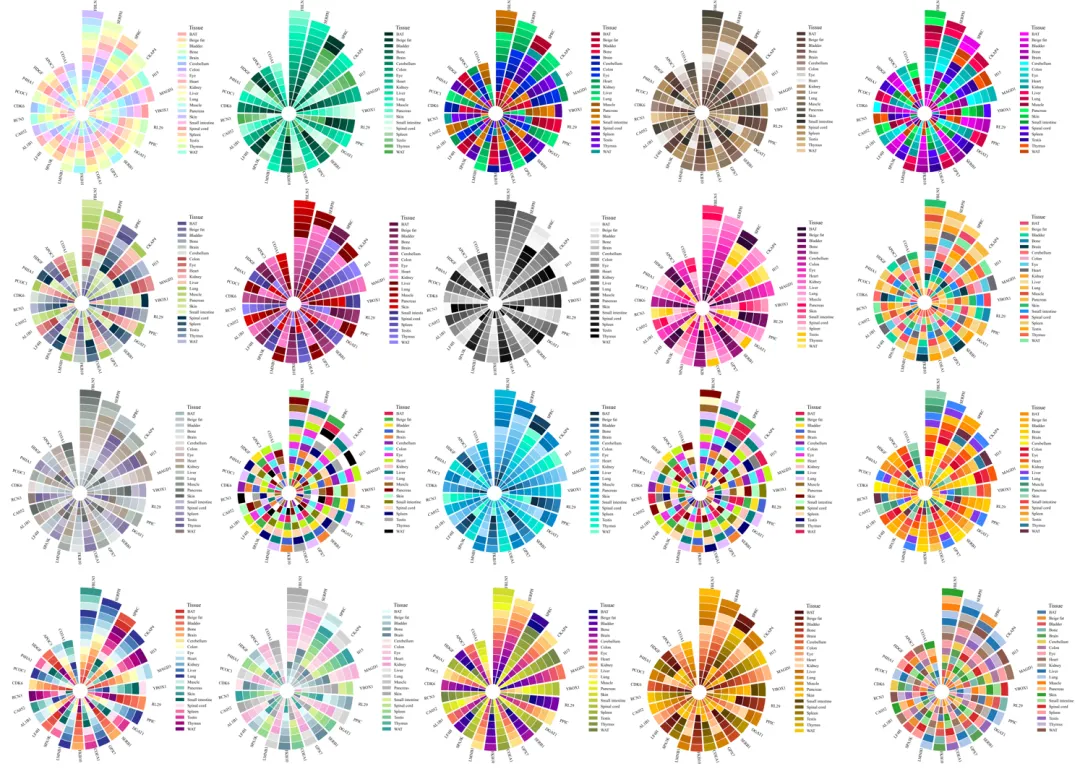
多种配色 



导入库与全局样式配置,是代码实现的基础同时也是绘图前的准备工作。 

颜色库设置 

绘图函数设置,接受文件路径和颜色方案参数 

颜色选择和数据读取 

绘图前准备,设置画布,清理图面,设置主图的几何参数 

开始绘制径向的柱子 

添加外围的名称标注 

图例设置 

执行部分 



Python绘制组合雷达图 python绘制进阶版雷达图-径向山脊图 python绘制径向气泡雷达图 

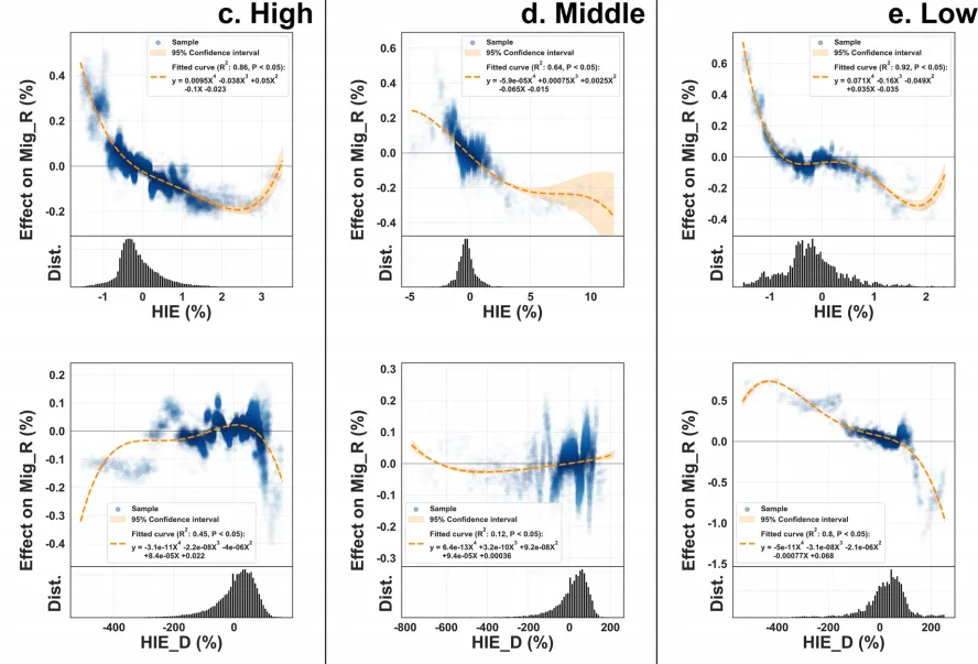


需要的请后台私信我获取详细信息,注意只会分享练习数据和代码文件,不会提供答疑服务,代码文件中已经包含了每行代码的完整注释!!!
代码绘制成果展示
代码解释
第一部分
# =========================================================================================# ====================================== 1. 库的导入 =========================================# =========================================================================================import matplotlib.pyplot as pltimport numpy as npimport matplotlib.patches as mpatchesimport matplotlib as mplimport pandas as pdimport matplotlibmatplotlib.rcParams['pdf.fonttype'] = 42matplotlib.rcParams['ps.fonttype'] = 42mpl.rcParams['font.family'] = 'Times New Roman'
第二部分
# =========================================================================================# ======================================2.颜色库设置=========================================# =========================================================================================selected_scheme = 1 # 选择要使用配色方案COLOR_THEMES = {1: ['#e6194b', '#3cb44b'],2: ['#577590', '#43aa8b'],}
第三部分
def plot_radial_chart_from_file(data_file_path, palette_choice=1):第四部分
selected_colors = COLOR_THEMES.get(palette_choice, 1)df_map = pd.read_excel(data_file_path, sheet_name='ProteinTissueMap')df_order = pd.read_excel(data_file_path, sheet_name='ProteinOrder')item_col = df_map.columns[0] # 用于定义画多少个径向的柱子category_col = df_map.columns[1] # 堆叠的层order_col = df_order.columns[0] # 画的顺序# 每个径向对应多少层item_category_map = df_map.groupby(item_col)[category_col].apply(list).to_dict()# 将定义顺序的数据列转换为列表ordered_items = df_order[order_col].tolist()unique_categories = sorted(df_map[category_col].unique())category_colors = {category: selected_colors[i % len(selected_colors)] for i, category inenumerate(unique_categories)}
第五部分
num_items = len(ordered_items) # 径向主的总数angle_range = 2 * np.pi * 0.98 # 整个图的总角度,设置一个开口angles = np.linspace(0, angle_range, num_items, endpoint=False).tolist() # 每个径向柱子的角度bar_width = (angle_range / num_items) * 0.9 # 计算每个柱子的宽度fig, ax = plt.subplots(figsize=(12, 12), subplot_kw={'projection': 'polar'})ax.grid(False)ax.set_xticks([])ax.set_yticks([])ax.spines['polar'].set_visible(False)ax.set_theta_offset(np.pi / 2)ax.set_theta_direction(-1)
第六部分
# 绘制堆叠的柱子for i, item in enumerate(ordered_items):angle = angles[i]#从第二层开始绘真实的数据bottom = 2for category in categories_for_item:color = category_colors.get(category, '#000000')ax.bar(angle, height=0.98, width=bar_width, bottom=bottom, color=color, edgecolor='white', linewidth=0.98)bottom += 1max_stacked_height = max(max_stacked_height, bottom)
第七部分
ax.set_rlim(1, max_stacked_height + 1.5)for i, item in enumerate(ordered_items):angle_rad = angles[i]bar_length = len(item_category_map.get(item, []))label_radius = 1 + bar_length + 1.5visual_angle_deg = np.rad2deg(np.pi / 2 - angle_rad) % 360ax.text(angle_rad, label_radius, item, ha=alignment, va='center', rotation=rotation, fontsize=12)
第八部分
# 创建图例 ---legend_patches = [mpatches.Patch(color=color, label=category) for category, color incategory_colors.items()]#添加图例ax.legend(handles=legend_patches,title='Tissue',title_fontsize='16',fontsize='12',bbox_to_anchor=(0.9, 0.9),frameon=False)
第八部分
if __name__ == '__main__':excel_filename = r'radial_chart_data.xlsx'plot_radial_chart_from_file(excel_filename, palette_choice=selected_scheme)
如何应用?
1.选择配色:
selected_scheme = 102.选择绘图的数据:
excel_filename = r'radial_chart_data.xlsx'3.设置输出路径:
png_filename = fr'radial_chart_{selected_scheme}.png'pdf_filename = fr'radial_chart_{selected_scheme}.pdf'
推荐
预告
获取方式
本文来自网友投稿或网络内容,如有侵犯您的权益请联系我们删除,联系邮箱:596563534@qq.com 。
