Python绘制回归拟合图+边际直方图+残差图组合图
- 2026-10-11 06:11:55
Python绘制回归拟合图+边际直方图+残差图组合图

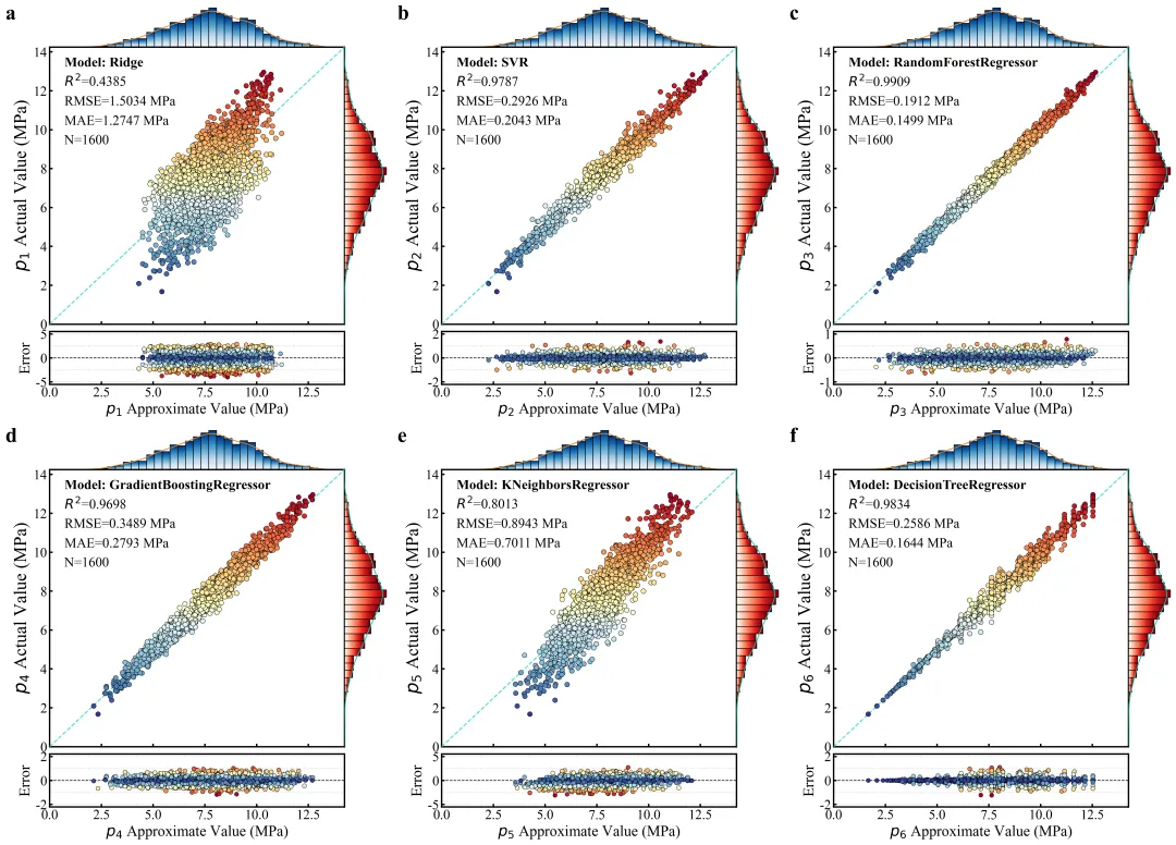
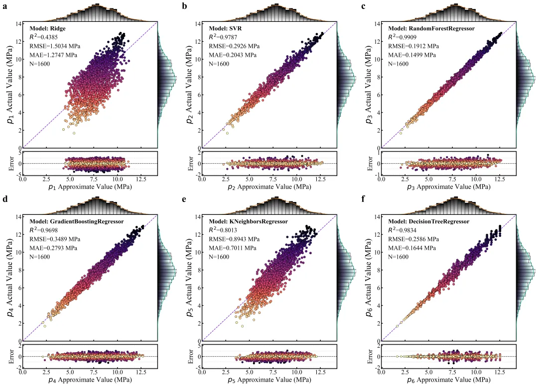
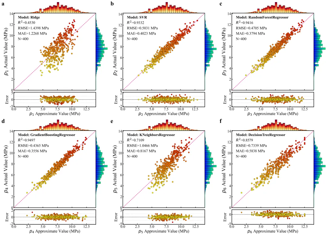
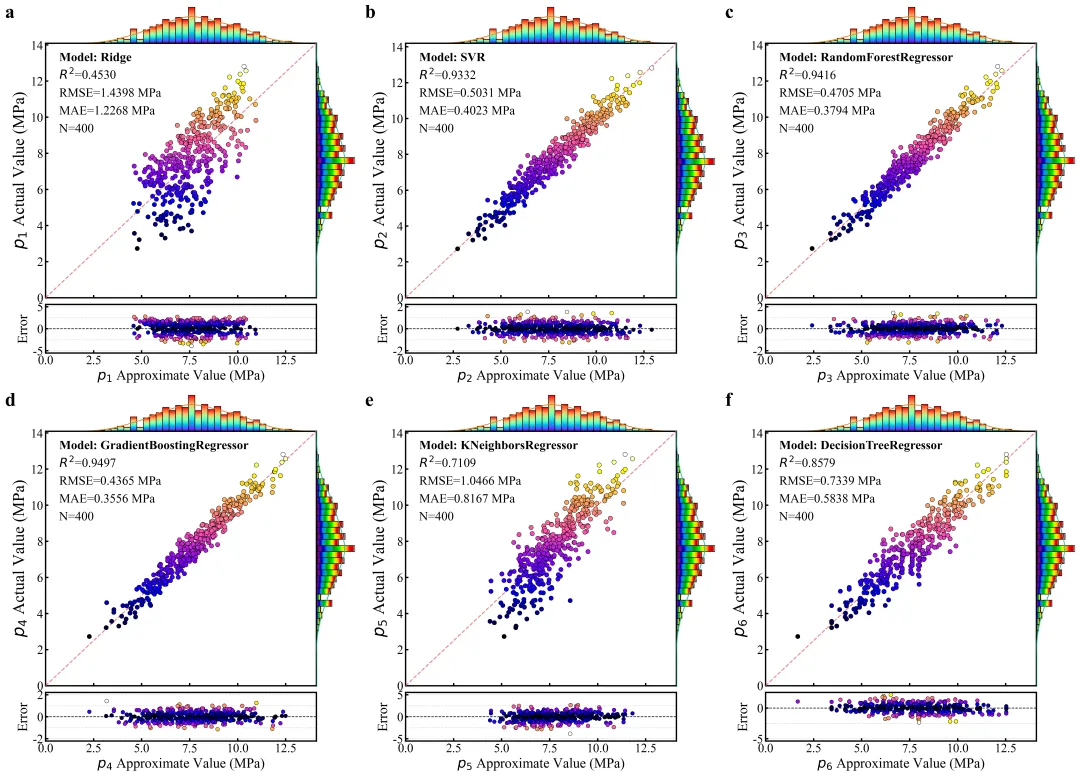
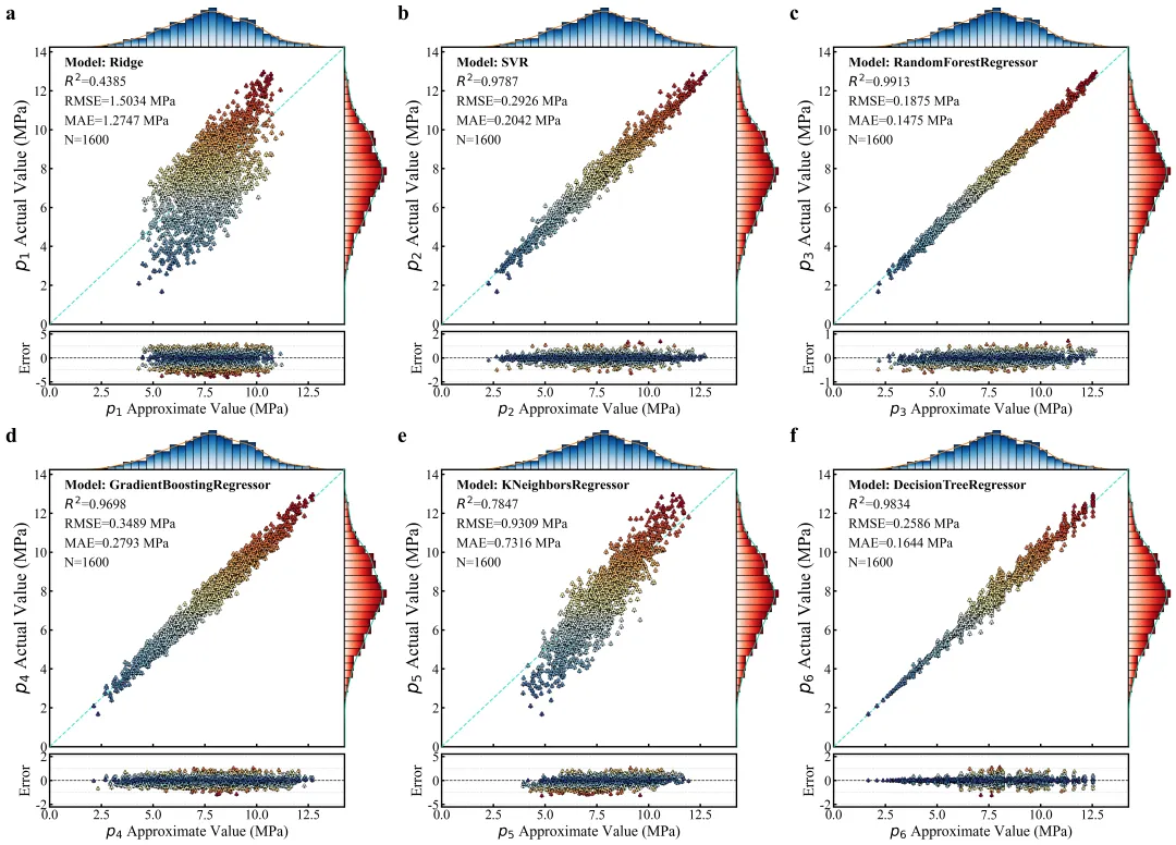
这张组合图展示了六种不同机器学习模型在回归预测任务中的训练评估结果,通过散点回归图、边际分布图和残差图三个维度深度解析了模型的性能。主散点图直观反映了预测值与真实值的拟合程度,其中随机森林和决策树的散点紧密围绕参考线分布,展现出极高的拟合精度;每个子图的顶部和右侧分别有渐变色的边际直方图及核密度估计曲线,清晰地展示了特征数据的分布特性与集中趋势。底部的残差图则进一步量化了预测误差,通过散点在零刻度线附近的上下波动范围,揭示了各模型在不同取值区间的稳定性。同时标注了 R2、RMSE、MAE 等关键统计指标。 多种配色方案 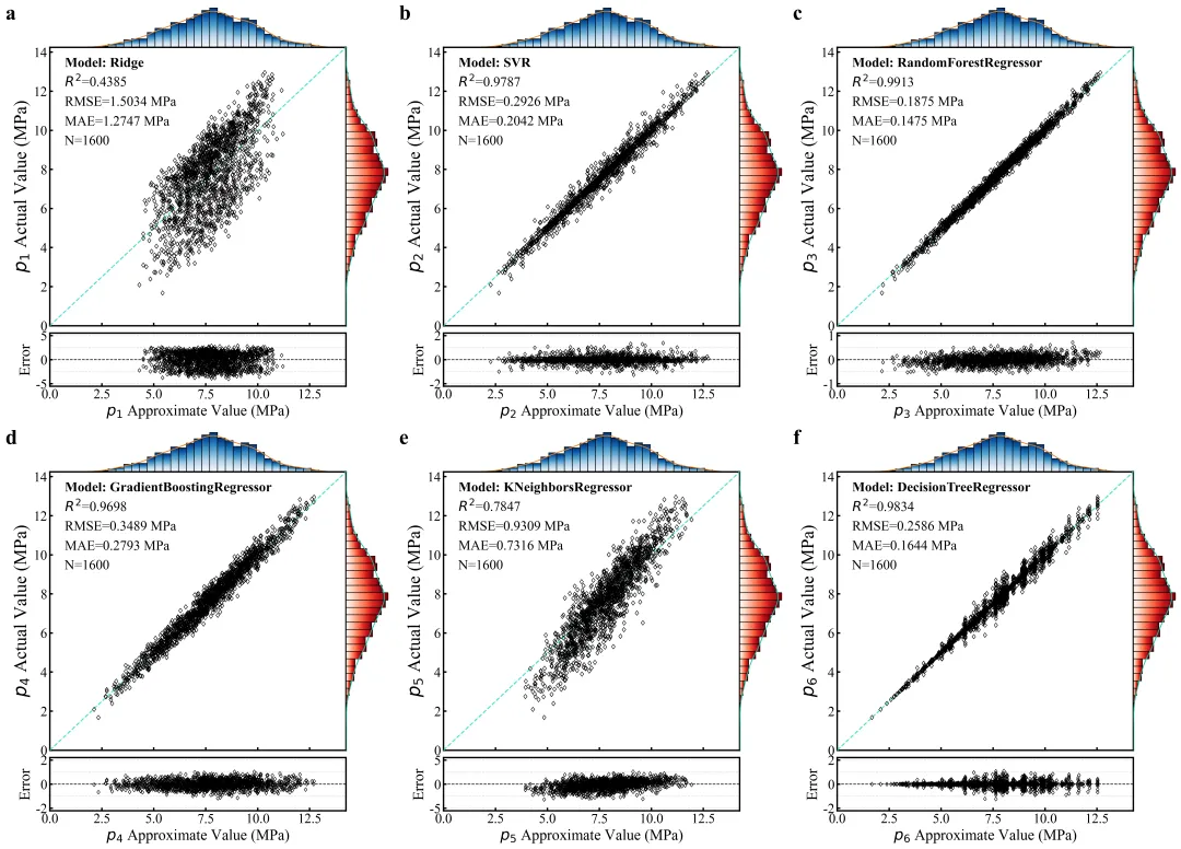
多种标记方案 



库的导入以及字体设置 

颜色库的设置,设计了20种配色 

形状标记库的设置,用于设置散点的形状 

渐变直方图绘制函数,用于绘制边缘柱状图 

主图绘制函数,包括回归拟合散点图、下面的残差图、上侧和右侧的分布直方图 

模型训练与超参数调优函数,注意使用的时候要注意修改这里的超参数以及交叉验证。 

子图的拼接函数,用于生成最后的组合图 

执行部分,主要的修改部分就集中在这里,包括数据的读取,颜色方案、标记方案的选择,数据集的划分,标准化处理,模型的训练与验证,绘图 



期刊图片复现|Python绘制二维偏依赖PDP图 期刊复现|python绘制基于SHAP分析和GAM模型拟合的单特征依赖图 期刊图片复现|python绘制带有渐变颜色shap特征重要性组合图(条形图+蜂巢图) 期刊复现|用Python绘制SHAP特征重要性总览图、依赖图、双特征交互效应SHAP图,解锁XGBoost模型的终极奥秘 期刊图片复现|Python绘制shap重要性蜂巢图+单特征依赖图+交互效应强度气泡图+交互效应依赖图(回归+二分类+分类) 

需要的请后台私信我,注意只会分享练习数据和代码文件,不会提供答疑服务,代码文件中已经包含了每行代码的完整注释!!!
代码绘制成果展示
代码解释
第一部分
import numpy as npimport pandas as pdimport matplotlib.pyplot as pltimport matplotlib.gridspec as gridspecimport osimport joblibfrom PIL import Imagefrom scipy.stats import gaussian_kdefrom sklearn.model_selection import train_test_split, GridSearchCV, KFoldfrom sklearn.ensemble import RandomForestRegressor, GradientBoostingRegressorfrom sklearn.linear_model import Ridge
第二部分
COLOR_SCHEMES = {1: ['RdYlBu_r', 'Blues', 'Reds', '#40E0D0'],}
第三部分
MARKER_LIB = {1: 'o',}
第四部分
# =========================================================================================# ======================================4.绘制渐变直方图的函数=======================================# =========================================================================================def draw_gradient_hist(ax, data, bins=30, orientation='vertical', cmap_name='Blues'):n, bins_edges = np.histogram(data, bins=bins, density=True) #对数据进行直方图统计并计算概率密度cm = plt.get_cmap(cmap_name) #获取颜色映射对象for i in range(len(n)): #遍历每一个柱子if n[i] > 0: #如果该柱子的高度大于0则进行绘制left, right = bins_edges[i], bins_edges[i + 1] #获取当前柱子的左右边界坐标if orientation == 'vertical': #如果是垂直grad = np.linspace(0.2, 0.8, 100).reshape(100, 1) #创建渐变数组#边框rect = plt.Rectangle((left, 0), #左下角起点坐标right - left, #矩形的宽度n[i], # 设置矩形的高度edgecolor='black', #矩形边框颜色fill=False, #不填充颜色linewidth=0.8, #边框线条的宽度zorder=2)else: # 如果是水平grad = np.linspace(0.2, 0.8, 100).reshape(1, 100) #创建渐变数组ax.imshow(grad,extent=[0, n[i], left, right],aspect='auto',cmap=cm,origin='lower',zorder=1)rect = plt.Rectangle((0, left),n[i],right - left,edgecolor='black',fill=False,linewidth=0.8,zorder=2)ax.add_patch(rect) # 边框添加到指定的坐标轴中
第五部分
# =========================================================================================# ======================================6.主图绘制函数=======================================# =========================================================================================def plot_academic_evaluation(y_true, y_pred, label_id, model_real_name, save_path_base, color_list, marker_cfg):main_cmap = color_list[0] #主图的散点颜色映射marg_x_cmap = color_list[1] #横向边际直方图的颜色映射marg_y_cmap = color_list[2] #纵向边际直方图的颜色映射line_color = color_list[3] #参考线的颜色fig = plt.figure(figsize=(8, 9), dpi=100) #初始化画布gs_outer = gridspec.GridSpec(2, 1, height_ratios=[6, 1], hspace=0.04) #定义外部布局上下两部分,主图与残差图gs_inner = gridspec.GridSpecFromSubplotSpec(2, #2行2, #2列subplot_spec=gs_outer[0], #放置在外部网格的第一行区域内width_ratios=[7, 1], #左侧主图与右侧边际图height_ratios=[1, 7], #上方边际图与下方主图wspace=0, #子图之间的水平间距hspace=0) #子图之间的垂直间距ax_marg_x = fig.add_subplot(gs_inner[0, 0]) #创建顶部的横向边际分布图ax_joint = fig.add_subplot(gs_inner[1, 0]) #创建中央的散点回归图ax_marg_y = fig.add_subplot(gs_inner[1, 1], sharey=ax_joint) #创建右侧的纵向边际分布图,并共享Y轴ax_resid = fig.add_subplot(gs_outer[1, 0]) #创建底部的残差分布图fig.canvas.draw() #执行初步渲染以确定各组件的几何位置pos_joint = ax_joint.get_position() # 获取散点回归图实际坐标pos_resid = ax_resid.get_position() # 获取残差图在画布上的实际坐标ax_resid.set_position([pos_joint.x0, pos_resid.y0, pos_joint.width, pos_resid.height]) #调整残差图宽度使其与上方主图对齐error = y_true - y_pred #计算真实值与预测值之间的残差r2 = r2_score(y_true, y_pred) # 计算R1rmse = np.sqrt(mean_squared_error(y_true, y_pred)) # 计算RMSEmae = mean_absolute_error(y_true, y_pred) # 计算MAEn_samples = len(y_true) #样本总数#散点图绘制ax_joint.scatter(y_pred, #X轴y_true, #Y轴c=y_true, #散点的映射颜色随真实值的数值变化cmap=main_cmap, #颜色映射方案marker=marker_cfg, #散点的形状样式edgecolor='black', #外边框线linewidth=0.5, #外边框的线条粗细s=40, #散点的大小alpha=1, #透明度zorder=10)#绘制参考线ax_joint.plot([0, max_val], #起止点的横坐标[0, max_val], #起止点的纵坐标color=line_color, #参考线的颜色linestyle='--', #线型linewidth=1.5, #线条粗细zorder=5)#去掉x轴数值标注ax_joint.tick_params(labelbottom=False, labelleft=True)#添加文本标注ax_joint.text(0.05, 0.93, f'Model: {model_real_name}', transform=ax_joint.transAxes, fontweight='bold', fontsize=18) #模型名称ax_joint.text(0.05, 0.86, f'$R^2$={r2:.4f}', transform=ax_joint.transAxes, fontsize=18) #R2ax_joint.text(0.05, 0.79, f'RMSE={rmse:.4f} MPa', transform=ax_joint.transAxes, fontsize=18) #RMSEax_joint.text(0.05, 0.72, f'MAE={mae:.4f} MPa', transform=ax_joint.transAxes, fontsize=18) #MAEax_joint.text(0.05, 0.65, f'N={n_samples}', transform=ax_joint.transAxes, fontsize=18) #样本数量#纵轴标题ax_joint.set_ylabel(f'$p_{{{label_id}}}$ Actual Value (MPa)', fontsize=24)#子图编号ax_joint.text(-0.15, 1.1, f'{chr(96 + int(label_id))}', transform=ax_joint.transAxes, fontsize=28, fontweight='bold')#用于绘制核密度估计曲线xx = np.linspace(0, max_val, 200)# 在顶部图绘制KDE概率密度曲线ax_marg_x.plot(xx, #以生成的连续数值作为横坐标gaussian_kde(y_true)(xx), #使用高斯核密度估计函数计算 y_true 数据在对应点的概率密度值作为纵坐标color='#E67E22', #曲线颜色linewidth=1.2, #线条宽度zorder=5)# 在右侧图绘制KDE概率密度曲线ax_marg_y.plot(gaussian_kde(y_true)(xx),xx,color='#1ABC9C',linewidth=1.2,zorder=5)ax_marg_x.set_xlim(0, max_val) #顶部图的X轴范围ax_marg_y.set_ylim(0, max_val) #右侧图的Y轴范围#y=0 的基准线ax_resid.axhline(0, color='black', linestyle='--', linewidth=1, zorder=5)ax_resid.set_xlim(0, max_val) #残差图的X轴范围fig.canvas.draw() # 再次执行渲染以确定刻度位置yticks = ax_resid.get_yticks() #获取残差图当前的Y轴刻度值for y_t in yticks: # 遍历刻度值if y_t != 0: # 排除0刻度线# 绘制淡灰色的残差参考网格线ax_resid.axhline(y_t, #纵坐标值color='gray', #线条颜色linestyle='--', #线型linewidth=0.8, #宽度alpha=0.3, #透明度zorder=1)
第六部分
# =========================================================================================# ======================================6.模型训练与调优函数=======================================# =========================================================================================def train_best_models(X_train, y_train):#模型列表及超参数搜索空间model_configs = [("1", Ridge(), {'alpha': [0.1, 1.0, 10.0]}),("2", SVR(),{'C': [1, 10, 100],'gamma': ['scale']}),("3", RandomForestRegressor(random_state=42),{'n_estimators': [100, 200]}),("4", GradientBoostingRegressor(random_state=42),{'learning_rate': [0.01, 0.1],'n_estimators': [100]}),("5", KNeighborsRegressor(),{'n_neighbors': [3, 5, 7]}),("6", DecisionTreeRegressor(random_state=42),{'max_depth': [5, 10, None]})]best_models = {} #用于存储训练好的最佳模型cv = KFold(n_splits=3, shuffle=True, random_state=42) #交叉验证方案# 遍历模型配置for name, model, params in model_configs:print(f"正在调优模型 p_{name} ({model.__class__.__name__})")#初始化网格搜索grid = GridSearchCV(model, params, cv=cv, scoring='r2', n_jobs=-1)#执行搜索grid.fit(X_train, y_train)#保存最佳模型best_models[name] = (grid.best_estimator_, model.__class__.__name__)return best_models
第七部分
# =========================================================================================# ======================================7.图片拼接函数=======================================# =========================================================================================def stitch_images_grid(image_paths, n_cols, output_filename_base, save_dir):if not image_paths: return # 如果路径列表为空则直接返回images = [Image.open(path) for path in image_paths] #打开路径列表中的所有图片文件img_width, img_height = images[0].size #获取第一张图片的宽度和高度作为标准尺寸n_rows = (len(images) + n_cols - 1) // n_cols #根据总图数和列数计算所需的行数composite_image = Image.new('RGB', (n_cols * img_width, n_rows * img_height), color='white') #创建一个白色底图for i, img in enumerate(images): #遍历所有读取的图片row, col = i // n_cols, i % n_cols #计算当前图片在大图中的行列索引composite_image.paste(img, (col * img_width, row * img_height)) #将当前图片粘贴到指定位置img.close()composite_image.save(fr"{output_filename_base}.png")composite_image.save(fr"{output_filename_base}.pdf")
第八部分
# =========================================================================================# ======================================8.执行部分=======================================# =========================================================================================if __name__ == "__main__":scheme_index = 1 #颜色方案MARKER_index = 5 #标记方案#获取当前选定的配色和标记current_color_list = COLOR_SCHEMES.get(scheme_index, COLOR_SCHEMES[1])current_marker = MARKER_LIB.get(MARKER_index, 'o')save_dir=r"1221" # 设置主结果保存目录df = pd.read_excel(r"data.xlsx" ) #读取数据X = df.iloc[:, :-1].values #特征y = df.iloc[:, -1].values #目标model_save_dir = r"Models" #模型存储路径result_save_dir = r"Results_Excel" #预测结果存储路径#划分训练集和测试集X_train, X_test, y_train, y_test = train_test_split(X, y, test_size=0.2, random_state=42)#标准化处理scaler = StandardScaler()X_train_scaled = scaler.fit_transform(X_train)X_test_scaled = scaler.transform(X_test)#调用函数开始模型训练和调优trained_models = train_best_models(X_train_scaled, y_train)train_paths, test_paths = [], [] #用于记录图片路径#遍历每个训练好的模型,执行预测、保存模型、保存结果、绘图for name, (model, m_type) in trained_models.items():model_filename = f"model_p{name}_{m_type}.pkl" #模型保存的文件名#保存模型joblib.dump(model, os.path.join(model_save_dir, model_filename))#使用训练好的模型对测试集进行预测y_test_pred = model.predict(X_test_scaled)test_error = y_test - y_test_pred #残差#构建测试集预测结果的DataFramedf_test_res = pd.DataFrame({'Actual': y_test, #真值'Predicted': y_test_pred, #预测值'Error': test_error #误差})#保存df_test_res.to_excel(os.path.join(result_save_dir, f"test_results_p{name}.xlsx"), index=False)#测试集图保存的基本路径p_test = os.path.join(save_dir, f"test_p{name}_{scheme_index}_{MARKER_index}")#调用绘图函数plot_academic_evaluation(y_test, y_test_pred, name, m_type, p_test, current_color_list, current_marker)test_paths.append(p_test + ".png") #记录图片路径#对训练集进行预测y_train_pred = model.predict(X_train_scaled)train_error = y_train - y_train_pred #误差#训练集结果df_train_res = pd.DataFrame({'Actual': y_train,'Predicted': y_train_pred,'Error': train_error})#保存df_train_res.to_excel(os.path.join(result_save_dir, f"train_results_p{name}.xlsx"), index=False)#训练集图保存路径p_train = os.path.join(save_dir, f"train_p{name}_{scheme_index}_{MARKER_index}")#调用绘图函数plot_academic_evaluation(y_train, y_train_pred, name, m_type, p_train, current_color_list, current_marker)train_paths.append(p_train + ".png") #记录路径#组合图拼接stitch_images_grid(test_paths,n_cols=3,output_filename_base=f"Final_Validation_Combined_{scheme_index}_{MARKER_index}",save_dir=save_dir)stitch_images_grid(train_paths,n_cols=3,output_filename_base=f"Final_Training_Combined_{scheme_index}_{MARKER_index}",save_dir=save_dir)
如何应用到你自己的数据
1.选择你想要使用到的配色方案:
scheme_index = 1 #颜色方案2.选择你想要使用到的形状标记方案:
MARKER_index = 9 #标记方案3.绘图结果的保存路径:
save_dir=r"" #绘图结果保存4.读取原始数据:
df = pd.read_excel(r"data.xlsx" ) #读取数据5.划分特征数据以及目标数据:
X = df.iloc[:, :-1].values #特征y = df.iloc[:, -1].values #目标
6.定义模型的保存路径以及预测结果的保存路径:
model_save_dir = r"Models" #模型存储路径result_save_dir = r"Results_Excel" #预测结果存储路径
7.定义训练数据、验证数据的划分比例:
X_train, X_test, y_train, y_test = train_test_split(X, y, test_size=0.2, random_state=42)推荐
获取方式
本文来自网友投稿或网络内容,如有侵犯您的权益请联系我们删除,联系邮箱:596563534@qq.com 。
