期刊图片复现|Python绘制斯皮尔曼相关性分析+RF模型shap重要性组合图
- 2026-10-11 06:11:56
期刊图片复现|Python绘制斯皮尔曼相关性分析+RF模型shap重要性组合图

论文:Effects of nitrogen deposition on carbon and nutrient cycling along a natural soil acidity gradient as revealed by metagenomics 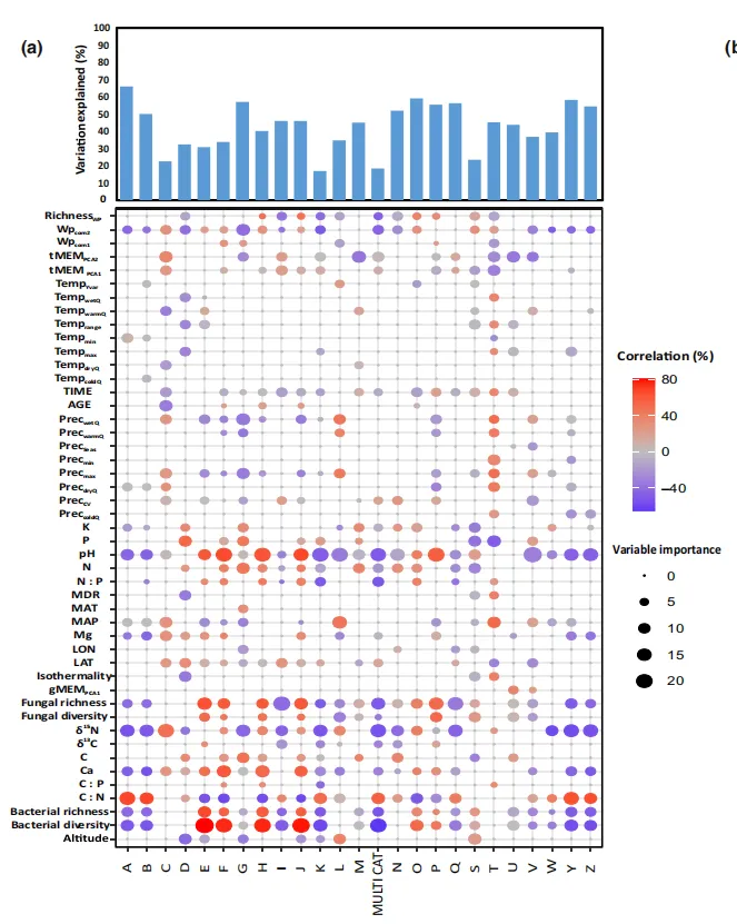
论文原图 本期复现的是一张模型性能评估、相关性分析、shap重要性分析的组合图,由上下两个部分组成,全面的展示多个特征与多个目标之间的复杂关系。它同时呈现了模型的预测性能、特征变量的重要性以及特征与目标之间的斯皮尔曼相关性。 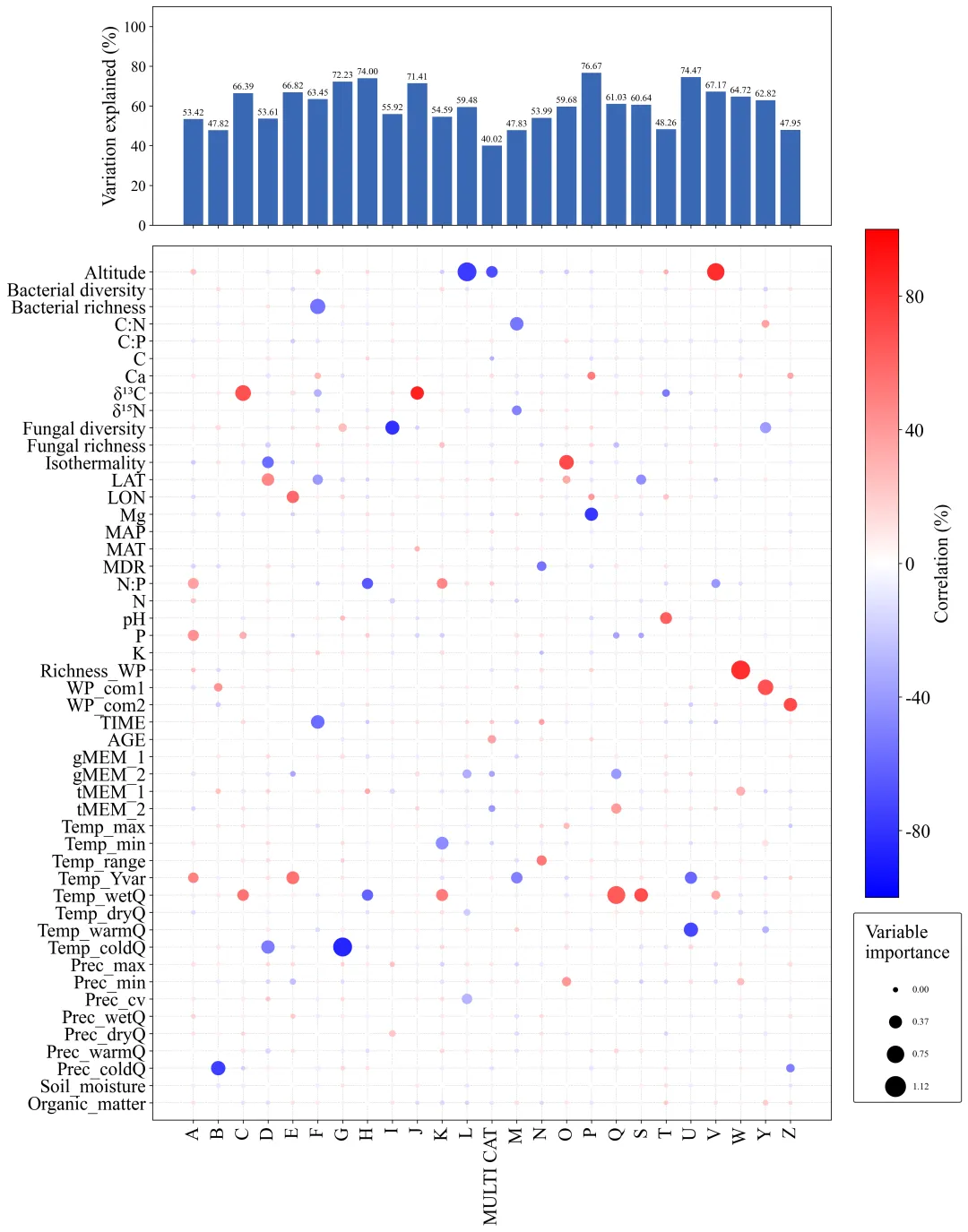
仿图 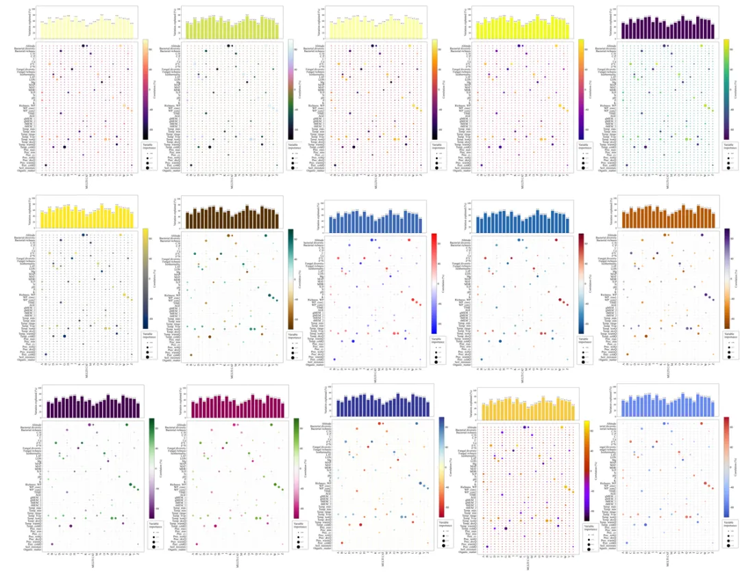
多种配色 



库的导入以及字体设置 

颜色库的设置及配色方案的选择 

原始数据的输入、特征变量、目标变量的读取,特征名称和目标名称的获取 主要的修改点都集中在这里 

分析部分 包括训练数据和验证数据的划分、网格搜随和交叉验证获取最佳的随机森林模型,对验证数据进行精度评估,进行shap分析获得特征重要性,进行spearman分析获取到等级相关系数 

将上一步的分析结果保存为本地的excel文件 

绘图函数 接受模型解释的方差 (R2)、斯皮尔曼相关系数、特征重要性、气泡图颜色映射、条形图颜色等参数 这里需要修改保存地址 



期刊图片复现|Python绘制二维偏依赖PDP图 期刊复现|python绘制基于SHAP分析和GAM模型拟合的单特征依赖图 期刊图片复现|python绘制带有渐变颜色shap特征重要性组合图(条形图+蜂巢图) 期刊复现|用Python绘制SHAP特征重要性总览图、依赖图、双特征交互效应SHAP图,解锁XGBoost模型的终极奥秘 期刊图片复现|Python绘制shap重要性蜂巢图+单特征依赖图+交互效应强度气泡图+交互效应依赖图(回归+二分类+分类) 

需要的请后台私信我获取详细信息,注意只会分享练习数据和代码文件,不会提供答疑服务,代码文件中已经包含了每行代码的完整注释!!!
代码绘制成果展示
上半部分的条形图用于展示模型的预测性能(R2)。
下半部分的气泡图用于展示预测变量与目标类别之间的相关性和重要性。气泡的大小表示shap重要性分析的结果,重要性越高气泡越大,气泡的颜色用于表示斯皮尔曼分析的结果,越接近1颜色越红,越接近-1颜色越蓝。
代码解释
第一部分
# =========================================================================================# ====================================== 1. 库的导入 =========================================# =========================================================================================import pandas as pdimport numpy as npimport matplotlib.pyplot as pltimport matplotlib.colors as mcolorsfrom sklearn.ensemble import RandomForestRegressorfrom sklearn.model_selection import train_test_split, GridSearchCVfrom scipy.stats import spearmanrimport shapplt.rcParams['font.family'] = 'Times New Roman'import matplotlibmatplotlib.rcParams['pdf.fonttype'] = 42matplotlib.rcParams['ps.fonttype'] = 42
第二部分
# =========================================================================================# ======================================2.颜色库设置========================================# =========================================================================================selected_scheme = 19# 选择配色方案color_schemes = {0: ('viridis', '#440154'),}
第三部分
# =========================================================================================# ======================================3.数据的读取及预处理========================================# =========================================================================================#原始数据的路径file_path = r'data.xlsx'X = pd.read_excel(file_path, sheet_name='Environmental Variables') #特征Y = pd.read_excel(file_path, sheet_name='COG Categories') #目标# 从读取的数据中动态获取标签列表env_vars_labels = X.columns.tolist() #获取特征名称# env_vars_labels.reverse() #顺序反转cog_cats_labels = Y.columns.tolist() #目标名称
第四部分
# =========================================================================================# ======================================4.分析========================================# =========================================================================================importances_df = pd.DataFrame(index=env_vars_labels, columns=cog_cats_labels) #用于存储特征重要性correlations_df = pd.DataFrame(index=env_vars_labels, columns=cog_cats_labels) #用于存储相关性系数variation_explained = pd.Series(index=cog_cats_labels, dtype=float) #用于存储模型解释的方差(R2分数)for cog in cog_cats_labels: #逐个目标进行分析print(f"正在分析{cog}")X_ordered = X[env_vars_labels]#划分数据X_train, X_test, y_train, y_test = train_test_split(X_ordered, Y[cog], test_size=0.3, random_state=42)#定义超参数网格param_grid = {'n_estimators': [50, 100],'max_depth': [10],'min_samples_leaf': [1, 2]}#初始化RF回归器实例rf = RandomForestRegressor(random_state=42)gd = GridSearchCV(estimator=rf, param_grid=param_grid, cv=3, n_jobs=-1, scoring='r2') #设置网格搜索#在训练数据上执行网格搜索gd.fit(X_train, y_train)#最佳模型best_rf = gd.best_estimator_variation_explained[cog] = best_rf.score(X_test, y_test) #计算R2print('R2',variation_explained[cog])explainer = shap.TreeExplainer(best_rf) #为训练好的最佳随机森林模型创建一个SHAP解释器shap_values = explainer.shap_values(X_test) #SHAP值# 将重要性按正确的顺序存入DataFrameimportances_df[cog] = np.abs(shap_values).mean(axis=0)print('重要性', importances_df[cog])for env_var in env_vars_labels: # 始一个内层循环,遍历每一个环境变量corr, _ = spearmanr(X[env_var], Y[cog]) # 计算当前变量与目标之间的斯皮尔曼相关系数correlations_df.loc[env_var, cog] = corr #保存相关系数print('相关系数', correlations_df[cog])
第五部分
# =========================================================================================# ======================================5.保存分析结果========================================# =========================================================================================#分析结果保存路径output_excel_path = r'analysis_results.xlsx'#保存with pd.ExcelWriter(output_excel_path, engine='xlsxwriter') as writer:variation_explained.to_excel(writer, sheet_name='Variation Explained (R2)', header=['R2_Score'])importances_df.to_excel(writer, sheet_name='SHAP Feature Importance')correlations_df.to_excel(writer, sheet_name='Spearman Correlations')
第六部分
# =========================================================================================# ======================================6.绘图函数=======================================# =========================================================================================def plot_correlation_heatmap(variation_explained, correlations_df, importances_df, selected_cmap, bar_color='skyblue'):plot_data = correlations_df.reset_index().melt(id_vars='index', var_name='COG', value_name='Correlation') #格式转换,方便绘图plot_data.rename(columns={'index': 'Variable'}, inplace=True) #重命名列plot_data['Importance'] = importances_df.reset_index().melt(id_vars='index', value_name='Importance')['Importance'] #转换min_imp = plot_data['Importance'].min() #重要性的最小值max_imp = plot_data['Importance'].max() #重要性的最大值plot_data['Normalized_Importance'] = (plot_data['Importance'] - min_imp) / (max_imp - min_imp) if max_imp > min_imp else 0.5fig, axes = plt.subplots(2, 1, figsize=(14, 18), sharex=True, gridspec_kw={'height_ratios': [2, 8]}, constrained_layout=True)axes[0].bar(variation_explained.index, variation_explained.values * 100, color=bar_color, edgecolor='none')axes[0].set_ylabel('Variation explained (%)', fontsize=20)axes[0].set_ylim(0, 110)for index, value in enumerate(variation_explained.values):label = f'{value * 100:.2f}'axes[0].text(index, value * 100 + 1, label, ha='center', va='bottom', fontsize=10, color='black')axes[1].grid(True, which='both', linestyle='--', linewidth=0.5, color='lightgrey', zorder=0)axes[1].set_xticks(np.arange(len(cog_cats_labels)))axes[1].set_xticklabels(cog_cats_labels, rotation=90)axes[1].set_yticks(np.arange(len(env_vars_labels)))axes[1].set_yticklabels(env_vars_labels)axes[1].set_ylim(-1, len(env_vars_labels) + 0.5)axes[1].tick_params(axis='both', which='major', labelsize=20)cbar = fig.colorbar(scatter, ax=axes, location='right', shrink=0.6)cbar.set_label('Correlation (%)', fontsize=20)cbar.set_ticks([-0.8, -0.4, 0, 0.4, 0.8])cbar.set_ticklabels(['-80', '-40', '0', '40', '80'])for t in cbar.ax.get_yticklabels():t.set_fontsize(20)legend = fig.legend(handles=legend_handles, title='Variable\nimportance', loc='center right', bbox_to_anchor=(1.01, 0.18), frameon=True, edgecolor='black', labelspacing = 2.5, borderpad=1.2)plt.setp(legend.get_title(), fontsize='20')
如何应用?
1.选择你想要使用到的配色方案:
selected_scheme = 19# 选择配色方案2.定义分析所需要使用的原始数据的文件路径:
file_path = r'data.xlsx'3.提取需要用到的特征数据和目标数据的表:
X = pd.read_excel(file_path, sheet_name='Environmental Variables') #特征Y = pd.read_excel(file_path, sheet_name='COG Categories') #目标
4.定义分析结果的excel文件的保存路径:
output_excel_path = r'analysis_results.xlsx'5.定义绘图结果的保存路径,这个在绘图函数里面:
plt.savefig(fr'heatmap_{selected_scheme}.png', dpi=300, bbox_inches='tight')plt.savefig( fr'heatmap_{selected_scheme}.pdf', bbox_inches='tight')
推荐
获取方式
本文来自网友投稿或网络内容,如有侵犯您的权益请联系我们删除,联系邮箱:596563534@qq.com 。
