期刊图片复现|Python绘制组合式相关性网络热力图
- 2026-10-11 06:11:54
期刊图片复现|Python绘制组合式相关性网络热力图

公众号所有的免费代码将于1208号全部下架,需要的请尽快领取,具体获取方式请查看1202的文章,过时不补。 论文:Do ecosystem service gains promote human Well-being? Unpacking the ecosystem–human well-being link in fragile landscapes 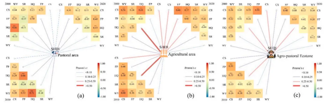
论文原图 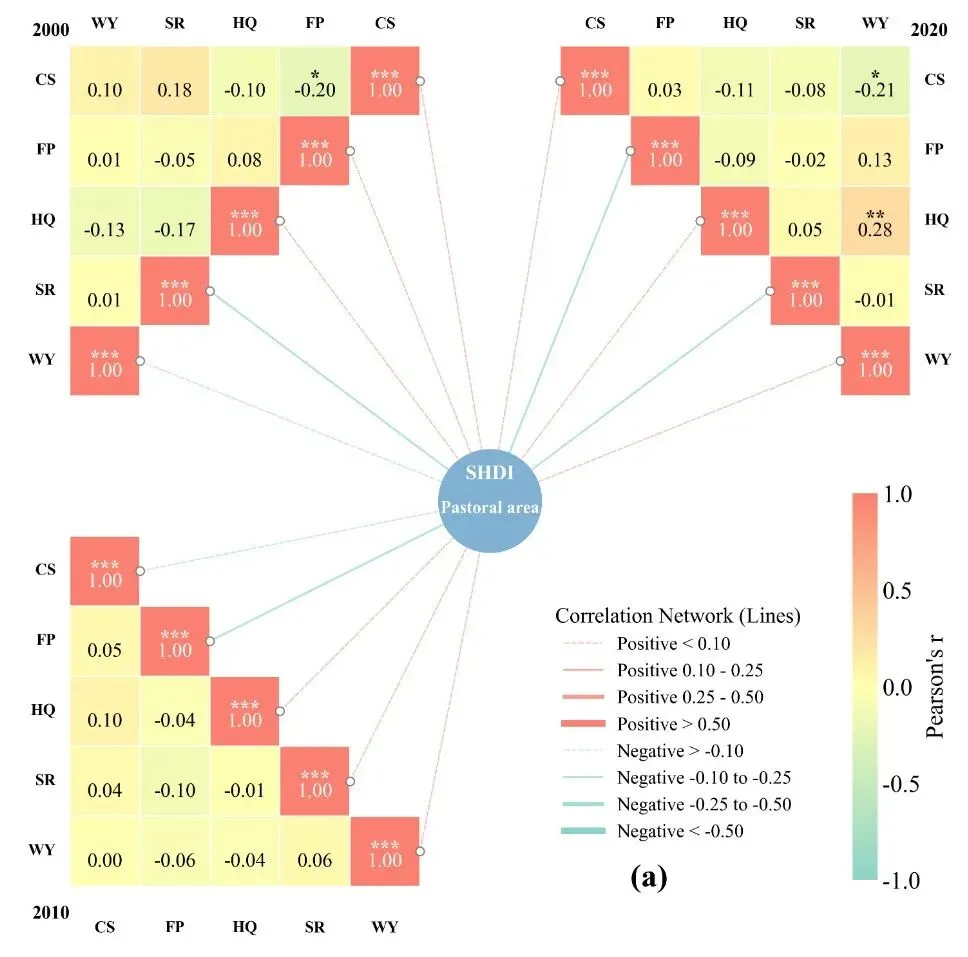
仿图 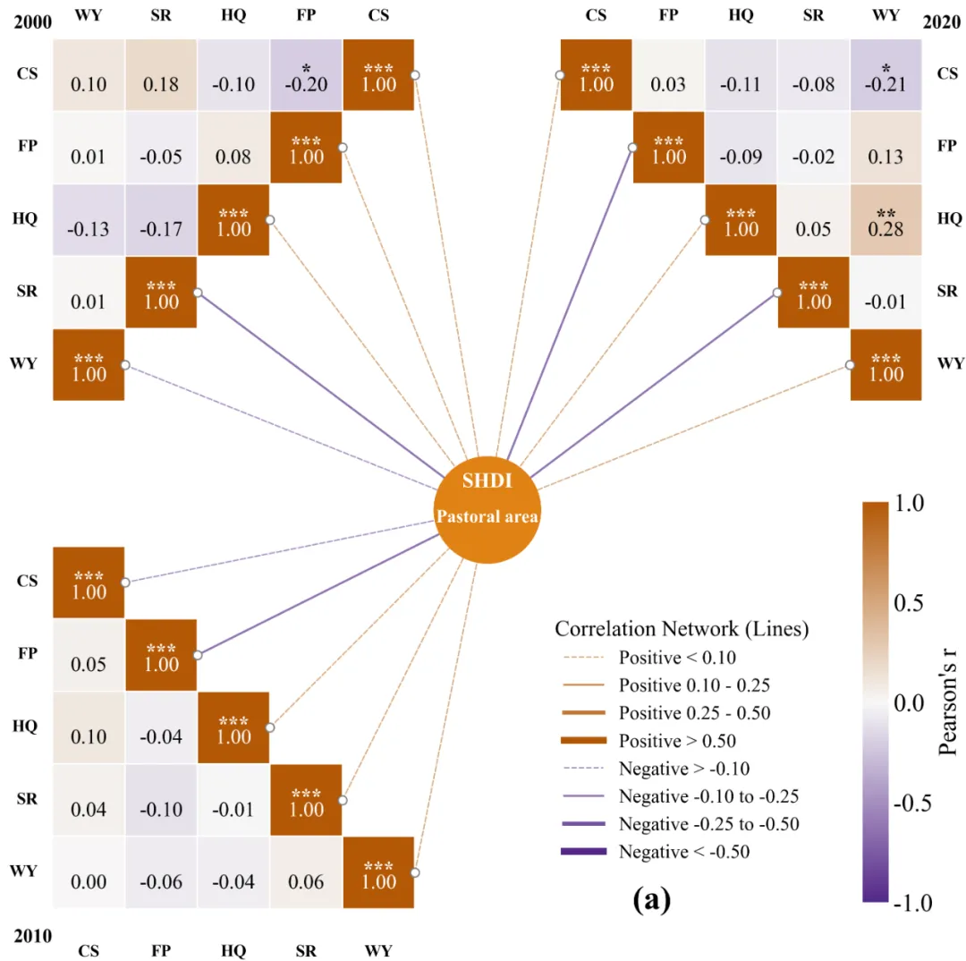
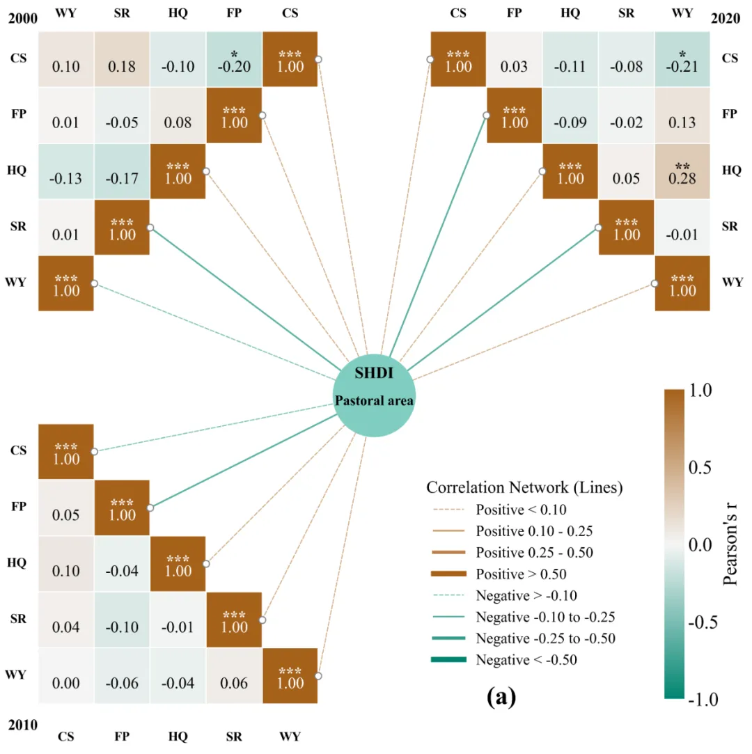
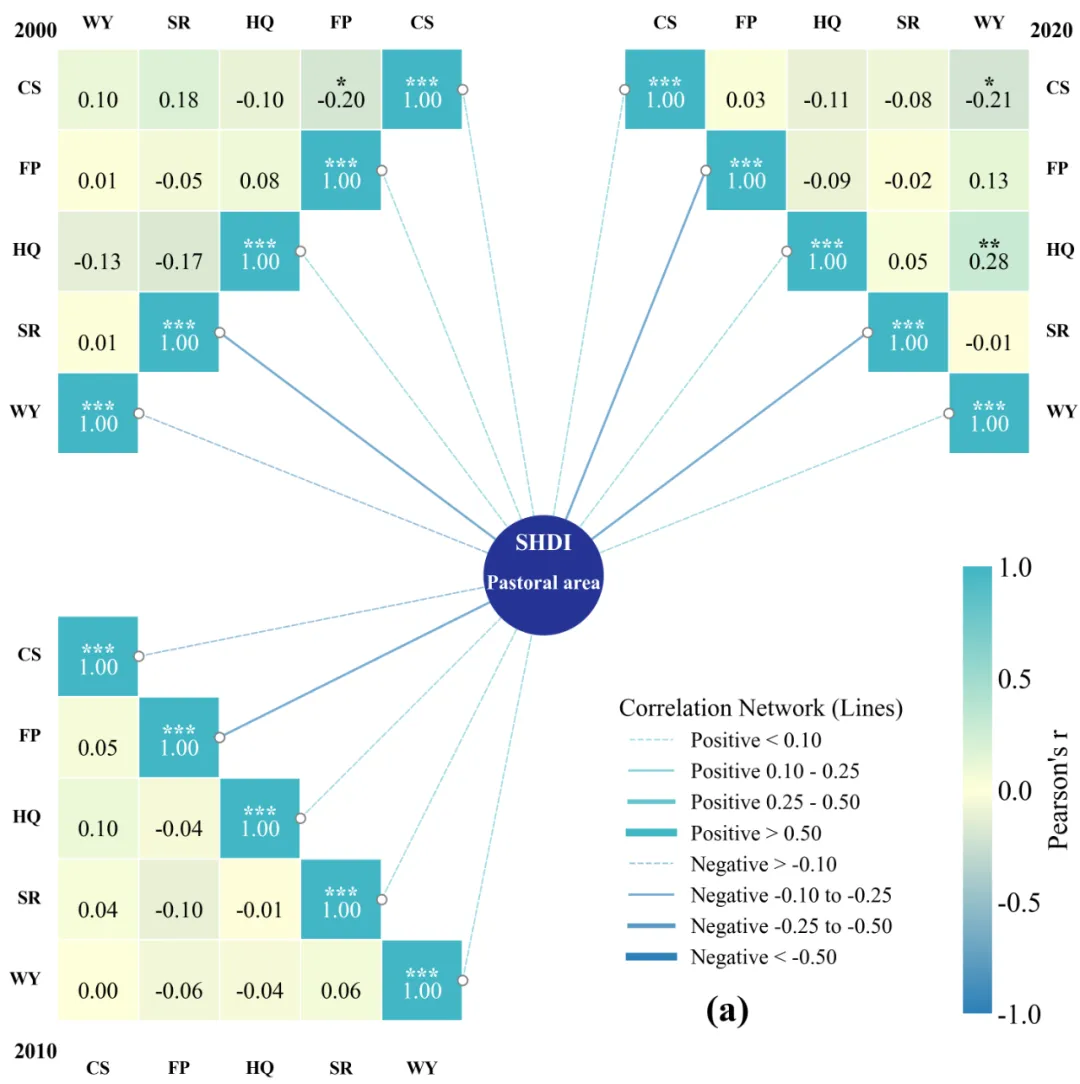
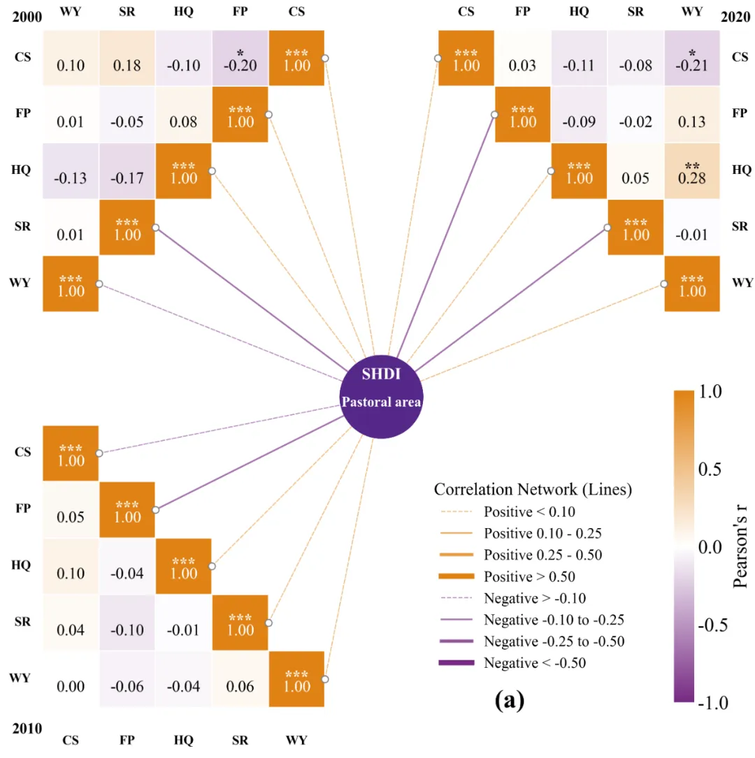
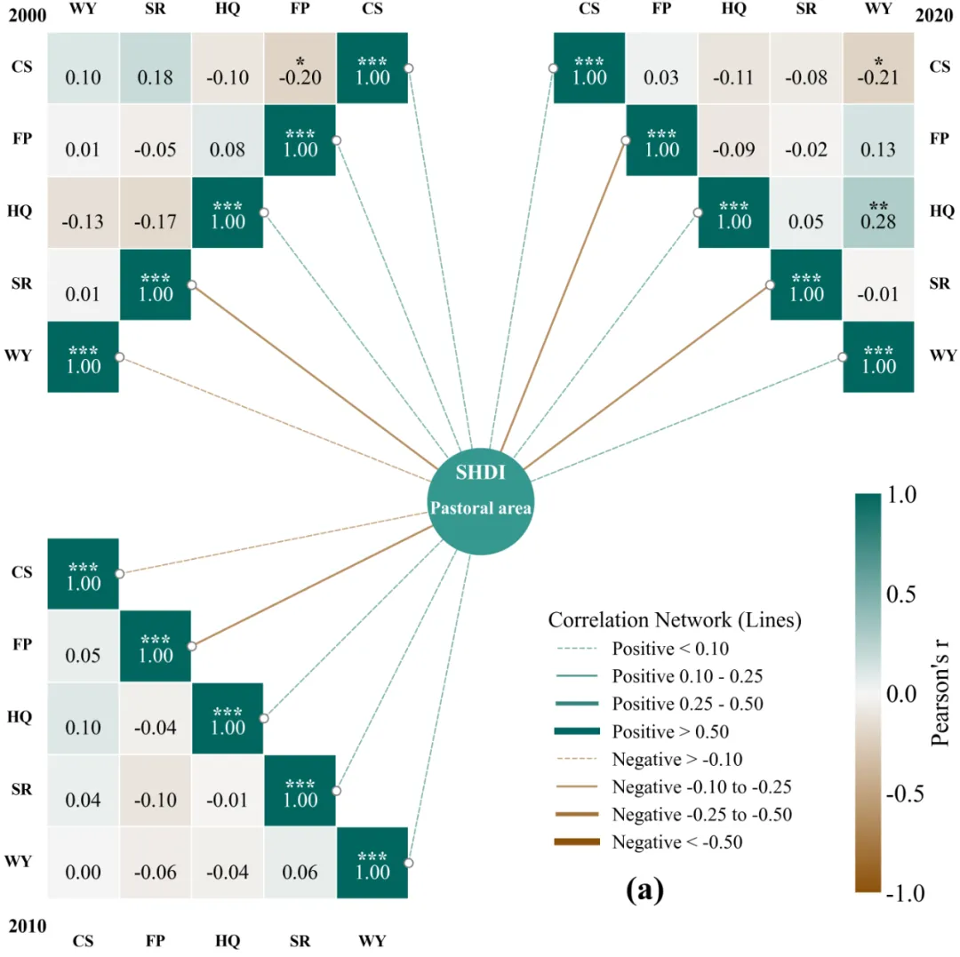
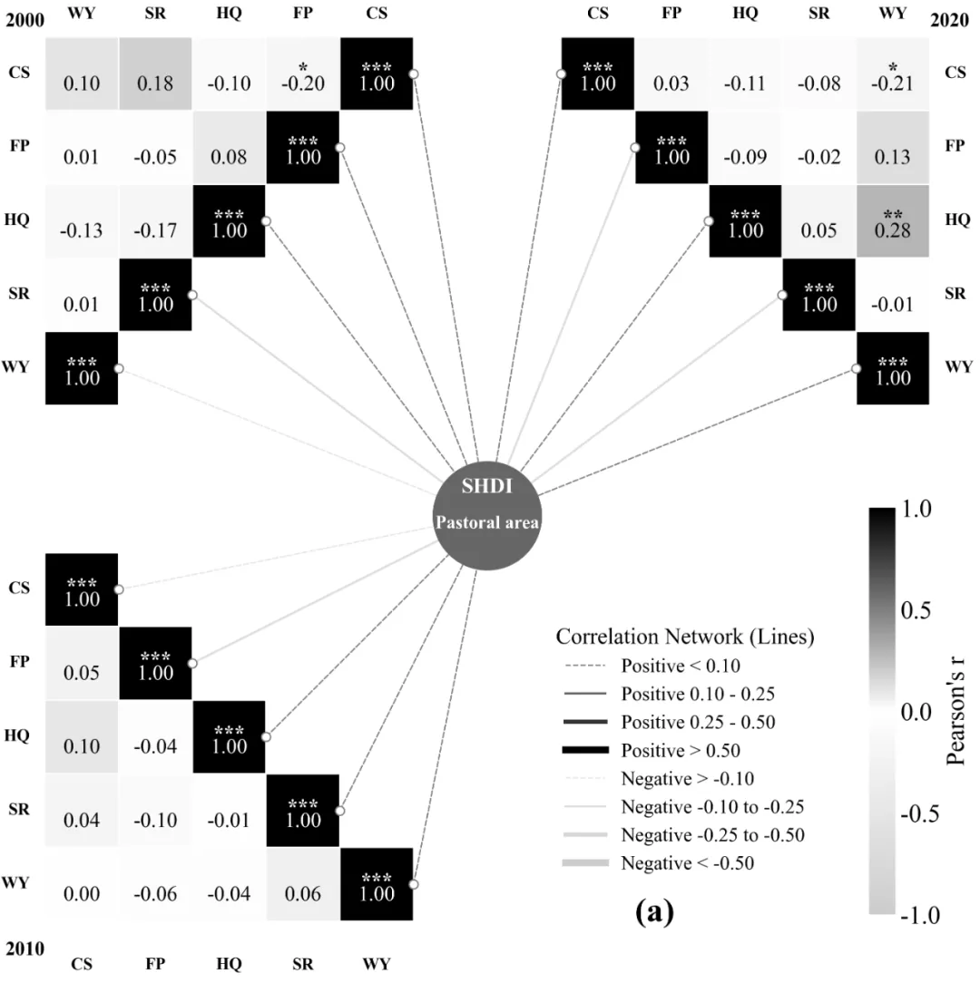
多种配色 



库的导入以及字体设置 

颜色库的设置以及配色方案的选择 

数据分析函数,特征数据的提取,目标数据的提取,特征间相关性、显著性计算,每个时期数据与目标之间的相关性和显著性计算,分析结果的保存等 

网络线线条设置函数,根据分析的结果来设置网络线的粗细、颜色 

热图绘制函数,绘制不同区域的3个三角热图,添加网络线的锚点 

主绘图函数,包括画布的设置,3个热图的位置布局,热图函数调用绘图,中心目标圆形图案的绘制,网络线的绘制,颜色条和图例的添加,保存路径设置 

执行部分,包括定义需要分析的特征,表,输入输出文件的保存路径,数据的分析以及绘图函数的调用执行 



期刊图片复现|Python绘制二维偏依赖PDP图 期刊复现|python绘制基于SHAP分析和GAM模型拟合的单特征依赖图 期刊图片复现|python绘制带有渐变颜色shap特征重要性组合图(条形图+蜂巢图) 期刊复现|用Python绘制SHAP特征重要性总览图、依赖图、双特征交互效应SHAP图,解锁XGBoost模型的终极奥秘 期刊图片复现|Python绘制shap重要性蜂巢图+单特征依赖图+交互效应强度气泡图+交互效应依赖图(回归+二分类+分类) 

需要的请后台私信我获取详细信息,注意只会分享练习数据和代码文件,不会提供答疑服务,代码文件中已经包含了每行代码的完整注释!!!
代码绘制成果展示
代码解释
第一部分
import matplotlib.pyplot as pltimport matplotlib.patches as patchesimport matplotlib.colorbar as colorbarfrom matplotlib.lines import Line2Dimport matplotlib.colors as mcolorsimport matplotlibimport pandas as pdfrom scipy.stats import pearsonrimport osmatplotlib.rcParams['pdf.fonttype'] = 42matplotlib.rcParams['ps.fonttype'] = 42plt.rcParams['font.family'] = 'serif'plt.rcParams['font.serif'] = ['Times New Roman']plt.rcParams['axes.unicode_minus'] = False
第二部分
# =========================================================================================# =====================================2.颜色库设置=========================# =========================================================================================color_library = {1: {'heatmap_negative': "#4575b4", 'heatmap_zero': "#ffffbf", 'heatmap_positive': "#d73027",'center_circle_face': "#4d4d4d", 'center_text': "#ffffff",},}COLOR_CHOICE = 5 # 选择颜色方案selected_colors = color_library[COLOR_CHOICE] # 获取选定的颜色配置def get_cmap_from_selection(colors):nodes = [0.0, 0.5, 1.0] #定义颜色渐变的节点位置,0为负值,0.5为中间值,1为正值colors_list = [colors['heatmap_negative'], colors['heatmap_zero'], colors['heatmap_positive']] #提取颜色配置构建列表cmap = mcolors.LinearSegmentedColormap.from_list("custom_corr_cmap",list(zip(nodes, colors_list))) # 生成自定义 Colormapreturn cmap # 返回生成的颜色映射对象current_cmap = get_cmap_from_selection(selected_colors) # 根据当前选定的颜色方案生成颜色映射norm = mcolors.Normalize(vmin=-1, vmax=1) #设置颜色映射的归一化范围
第三部分
# =========================================================================================# ======================================3.数据分析函数==============================# =========================================================================================def analyze_raw_data(raw_data_path, output_analysis_path, years, vars_list):calculated_data = {} #用于存储计算结果with pd.ExcelWriter(output_analysis_path) as writer: #使用 pandas创建Excel写入对象,准备保存文件for year in years: # 遍历每一个年份df_all = pd.read_excel(raw_data_path, sheet_name=f'{year}_RawData',index_col=0) #读取对应年份的Sheetdf_vars = df_all[vars_list] #特征数据center_series = df_all['SHDI'] #目标数据#特征数据之间进行相关行分析corr_matrix = df_vars.corr(method='pearson')#用于存储 P 值p_values = pd.DataFrame(index=vars_list, columns=vars_list, dtype=float)for c1 in vars_list: #行for c2 in vars_list: #列if c1 == c2: #如果是同一个变量p_values.loc[c1, c2] = 0.0else:_, p = pearsonr(df_vars[c1], df_vars[c2]) #计算两列数据相关系数和 P 值p_values.loc[c1, c2] = p #将计算得到的P值填入矩阵对应位置center_corrs = [] #用于存储特征与目标的相关性for var in vars_list: # 遍历每一个变量r, _ = pearsonr(df_vars[var], center_series) # 计算当前变量与目标的相关系数center_corrs.append(r) # 将相关系数添加到列表# 将相关性列表转换为DataFrame格式df_center_corr = pd.DataFrame(center_corrs,index=vars_list,columns=['Correlation_with_Center'])# 保存分析结果corr_matrix.to_excel(writer, sheet_name=f'{year}_Corr') #相关性p_values.to_excel(writer, sheet_name=f'{year}_P_Value') #P值df_center_corr.to_excel(writer, sheet_name=f'{year}_Center_Corr') #中心相关性数据# 将计算结果直接存入字典calculated_data[year] = {'corr': corr_matrix.values,'p': p_values.values,'r': df_center_corr['Correlation_with_Center'].values}return calculated_data #直接返回计算好的数据,供后续使用
第四部分
# =========================================================================================# ======================================4.网络线线线条设置函数=====================================# =========================================================================================def get_line_style(r_value):abs_r = abs(r_value) # 计算相关系数的绝对值c_pos = selected_colors['heatmap_positive'] # 正相关使用的颜色c_neg = selected_colors['heatmap_negative'] # 负相关使用的颜色#确定颜色,根据 r 值正负选择if r_value >= 0:line_color = c_poselse:line_color = c_neg#根据绝对值大小确定线宽、线型和透明度if abs_r < 0.10:return {'color': line_color, 'linestyle': '--', 'linewidth': 1.0, 'alpha': 0.5}elif 0.10 <= abs_r < 0.25:return {'color': line_color, 'linestyle': '-', 'linewidth': 1.5, 'alpha': 0.65}elif 0.25 <= abs_r < 0.50:return {'color': line_color, 'linestyle': '-', 'linewidth': 3.0, 'alpha': 0.8}else:return {'color': line_color, 'linestyle': '-', 'linewidth': 5.0, 'alpha': 1.0}
第五部分
# =========================================================================================# ======================================5.热图绘制函数=====================================# =========================================================================================def draw_triangle_heatmap(ax, corr_mat, p_mat, variables, start_x, start_y,type='bottom-left', title_year=''):n = len(variables) #变量的数量connection_points = [] #用于存储连接线的锚点坐标#左三角for i in range(n): # 遍历每一行cols_to_draw = n - i # 计算当前行需要绘制的列数,逐行递减for j_visual in range(cols_to_draw): # 遍历当前行的每一列col_data_idx = n - 1 - j_visual # 映射数据列索引,倒序row_data_idx = i # 设置数据行索引val = corr_mat[row_data_idx, col_data_idx] # 从相关性矩阵获取对应的值p = p_mat[row_data_idx, col_data_idx] # 从 P 值矩阵获取对应的值rect_x = start_x + j_visual # 计算方块的 X 轴坐标rect_y = start_y - i # 计算方块的 Y 轴坐标# 绘制方块rect = patches.Rectangle((rect_x, rect_y),1,1,facecolor=current_cmap(norm(val)),edgecolor='white')ax.add_patch(rect) #将矩形添加到轴上# 标注文本text_color = 'white' if abs(val) > 0.6 else 'black' #根据背景色深浅决定文字颜色#绘制相关系数数值ax.text(rect_x + 0.5,rect_y + 0.35,f"{val:.2f}",ha='center',va='center',fontsize=15,color=text_color,fontweight='normal')#设置显著性标记if p < 0.05:mark = '***' if p < 0.001 else ('**' if p < 0.01 else '*') # 根据 P 值大小确定星号数量#绘制显著性星号ax.text(rect_x + 0.5,rect_y + 0.52,mark, ha='center',va='center',fontsize=15,color=text_color,fontweight='bold')#左侧Y轴标签for i in range(n): # 遍历行,绘制 Y 轴标签label_y = start_y - i + 0.5 #标签的 Y 坐标# 绘制左侧的变量名ax.text(start_x - 0.2,label_y,variables[i],ha='right',va='center',fontsize=12,fontweight='bold')##顶部标签,X轴top_labels = variables[::-1] # 将变量列表反转,用于顶部 X 轴标签for i in range(n): #遍历列label_x = start_x + i + 0.5 #标签的 X 坐标# 绘制顶部的变量标签ax.text(label_x,start_y + 1.2,top_labels[i],ha='center',va='bottom',fontsize=12,fontweight='bold')#年份标注ax.text(start_x,start_y + 1.2,title_year,ha='right',va='center',fontsize=14,fontweight='bold')# 遍历行for i in range(n):cols_count = n - i #计算当前行方块数offset = i # 计算每行的水平偏移量for j_visual in range(cols_count): #遍历列rect_x = start_x + offset + j_visual #方块的 X 轴坐标rect_y = start_y - i #方块的 Y 轴坐标row_data_idx = i #数据行索引col_data_idx = i + j_visual #数据列索引val = corr_mat[row_data_idx, col_data_idx] # 获取相关系数数值p = p_mat[row_data_idx, col_data_idx] #获取 P 值#创建方块rect = patches.Rectangle((rect_x, rect_y),1,1,facecolor=current_cmap(norm(val)),edgecolor='white')ax.add_patch(rect) #添加text_color = 'white' if abs(val) > 0.6 else 'black' #设置文本颜色# 绘制数值ax.text(rect_x + 0.5,rect_y + 0.35,f"{val:.2f}",ha='center',va='center',fontsize=15,color=text_color,fontweight='normal')if p < 0.05: # 判断显著性mark = '***' if p < 0.001 else ('**' if p < 0.01 else '*')# 绘制ax.text(rect_x + 0.5,rect_y + 0.52,mark,ha='center',va='center',fontsize=15,color=text_color,fontweight='bold')#右侧标签,Y轴for i in range(n): # 遍历行label_y = start_y - i + 0.5 #标签 Y 坐标# 绘制ax.text(start_x + n + 0.2,label_y,variables[i],ha='left',va='center',fontsize=12,fontweight='bold')#顶部标签 ,X轴for i in range(n): #遍历列label_x = start_x + i + 0.5 #X 坐标#绘制顶部变量名ax.text(label_x,start_y + 1.2,variables[i],ha='center',va='bottom',fontsize=12,fontweight='bold')#年份ax.text(start_x + n,start_y + 1.2,title_year,ha='left',va='center',fontsize=14,fontweight='bold')for i in range(n): #行for j in range(i + 1): #列rect_x = start_x + j #方块 X 坐标rect_y = start_y - i #方块 Y 坐标val = corr_mat[i, j] #相关性数值p = p_mat[i, j] # 获取 P 值# 创建方块rect = patches.Rectangle((rect_x, rect_y),1,1,facecolor=current_cmap(norm(val)),edgecolor='white')ax.add_patch(rect) #添加text_color = 'white' if abs(val) > 0.6 else 'black' #文字颜色# 绘制相关数值ax.text(rect_x + 0.5,rect_y + 0.35,f"{val:.2f}",ha='center',va='center',fontsize=15,color=text_color, fontweight='normal')if p < 0.05: #显著性mark = '***' if p < 0.001 else ('**' if p < 0.01 else '*')ax.text(rect_x + 0.5,rect_y + 0.52,mark,ha='center',va='center',fontsize=15,color=text_color,fontweight='bold')#左侧标签,Y轴for i in range(n): #行label_y = start_y - i + 0.5 #Y 坐标#绘制ax.text(start_x - 0.2,label_y,variables[i],ha='right',va='center',fontsize=12,fontweight='bold')ax.text(label_x,start_y - (n - 1) - 0.5,variables[i],ha='center',va='top',fontsize=12,fontweight='bold')# 绘制年份ax.text(start_x,start_y - (n - 1) - 0.4,title_year,ha='right',va='center',fontsize=14,fontweight='bold')return connection_points
第六部分
# =========================================================================================# ======================================6.主绘图函数=====================================# =========================================================================================def create_complex_layout_plot(data, vars_list):fig, ax = plt.subplots(figsize=(20, 16)) # 创建画布和坐标轴ax.set_aspect('equal') #强制纵横比相等,保证方块是正方形n = len(vars_list) #变量数gap_width = 2.0 #设置中间间距宽度start_x_2000 = -gap_width / 2 - n #左上热图起始X坐标start_y_2000 = n + 2 #左上热图起始Y坐标start_x_2010 = -gap_width / 2 - n #右下热图起始X坐标start_y_2010 = 0 # 右下热图起始Y坐标start_x_2020 = gap_width / 2 #右上热图起始X坐标start_y_2020 = start_y_2000 #右上热图起始Y坐标#绘制三个热图pts_2000 = draw_triangle_heatmap(ax,data[2000]['corr'],data[2000]['p'],vars_list,start_x=start_x_2000,start_y=start_y_2000,type='top-left',title_year='2000')pts_2020 = draw_triangle_heatmap(ax,data[2020]['corr'],data[2020]['p'],vars_list,start_x=start_x_2020,start_y=start_y_2020,type='top-right',title_year='2020')pts_2010 = draw_triangle_heatmap(ax,data[2010]['corr'],data[2010]['p'],vars_list,start_x=start_x_2010,start_y=start_y_2010,type='bottom-left',title_year='2010')#绘制中心节点center_y = ((start_y_2000 - n) + (start_y_2010 + 1)) / 2 #中心圆的 Y 坐标center_x = 0 # 中心圆的 X 坐标c_face = selected_colors['center_circle_face'] #中心圆的填充色c_text = selected_colors['center_text'] #中心圆的文本色#绘制中心大圆ax.scatter(center_x,center_y,s=6000,marker='o',facecolor=c_face,edgecolor='none',zorder=100)#绘制中心文字#绘制圆内第一行文字ax.text(center_x,center_y + 0.25,"SHDI",ha='center',va='bottom',fontsize=15,fontweight='bold',color=c_text,zorder=101)# 绘制圆内第二行文字ax.text(center_x,center_y,"Pastoral area",ha='center',va='top',fontsize=13,fontweight='bold',color=c_text,zorder=101)ax.set_xlim(start_x_2000 - 3, start_x_2020 + n + 3) #X 轴显示范围ax.set_ylim(start_y_2010 - n - 2, start_y_2000 + 3) #Y 轴显示范围ax.axis('off') #隐藏边框和刻度#颜色条cbar_ax = fig.add_axes([0.7, 0.25, 0.013, 0.25]) #在图中添加一个新的坐标轴用于绘制颜色条# 创建颜色条对象cb = colorbar.ColorbarBase(cbar_ax,cmap=current_cmap,norm=norm,orientation='vertical')cb.set_label("Pearson's r", size=18) # 设置颜色条标题cb.set_ticks([-1, -0.5, 0, 0.5, 1]) #颜色条刻度cb.outline.set_visible(False) # 去掉边框cb.ax.tick_params(size=0, labelsize=18) #设置刻度参数#图例c_pos = selected_colors['heatmap_positive'] #正相关颜色c_neg = selected_colors['heatmap_negative'] #负相关颜色#定义图例项,分为两组legend_elements = [#正相关组Line2D([0], [0], color=c_pos, lw=1.0, linestyle='--', alpha=0.5, label='Positive < 0.10'),Line2D([0], [0], color=c_pos, lw=1.5, linestyle='-', alpha=0.65, label='Positive 0.10 - 0.25'),Line2D([0], [0], color=c_pos, lw=3.0, linestyle='-', alpha=0.8, label='Positive 0.25 - 0.50'),Line2D([0], [0], color=c_pos, lw=5.0, linestyle='-', alpha=1.0, label='Positive > 0.50'),#负相关组Line2D([0], [0], color=c_neg, lw=1.0, linestyle='--', alpha=0.5, label='Negative > -0.10'),Line2D([0], [0], color=c_neg, lw=1.5, linestyle='-', alpha=0.65, label='Negative -0.10 to -0.25'),Line2D([0], [0], color=c_neg, lw=3.0, linestyle='-', alpha=0.8, label='Negative -0.25 to -0.50'),Line2D([0], [0], color=c_neg, lw=5.0, linestyle='-', alpha=1.0, label='Negative < -0.50')]#绘制图例ax.legend(handles=legend_elements,loc='lower right',bbox_to_anchor=(0.76, 0.2),title="Correlation Network (Lines)",frameon=False,fontsize=14,title_fontsize=16,ncol=1)#小标题ax.text(start_x_2020 + n - 4, start_y_2010 - n + 1, "(a)", fontsize=24, fontweight='bold')
第七部分
# =========================================================================================# ======================================7. 主程序 =======================================# =========================================================================================if __name__ == "__main__":vars_list = ['CS', 'FP', 'HQ', 'SR', 'WY'] #特征years = [2000, 2010, 2020] #表raw_data_file = r'E:\公众号素材\1204\raw_data.xlsx' #原始数据文件完整路径analysis_result_file = r'E:\公众号素材\1204\simulation_results.xlsx' #分析结果文件完整路径#调用分析函数plot_data = analyze_raw_data(raw_data_file,analysis_result_file,years,vars_list)# 调用绘图函数create_complex_layout_plot(plot_data,vars_list)
如何应用?
1.选择你想要使用到的配色方案:
COLOR_CHOICE = 20 2.定义数据的目标变量:
center_series = df_all['SHDI'] #目标数据3.设置绘图结果的保存路径:
plt.savefig(fr'combined_heatmap{COLOR_CHOICE}.png', dpi=300, bbox_inches='tight')plt.savefig(fr'combined_heatmap{COLOR_CHOICE}.pdf', bbox_inches='tight')
4.定义特征变量:
vars_list = ['CS', 'FP', 'HQ', 'SR', 'WY'] #特征5.定义绘图所需要用到的表数据:
years = [2000, 2010, 2020] #表6.定义绘图所需要用到的原始数据文件的路径:
raw_data_file = r'data.xlsx' #原始数据文件完整路径7.定义分析结果的文件的保存路径:
analysis_result_file = r'results.xlsx' 推荐
获取方式
本文来自网友投稿或网络内容,如有侵犯您的权益请联系我们删除,联系邮箱:596563534@qq.com 。
