期刊图片复现|Python绘制多组学验证环形热图
- 2026-10-11 06:15:26

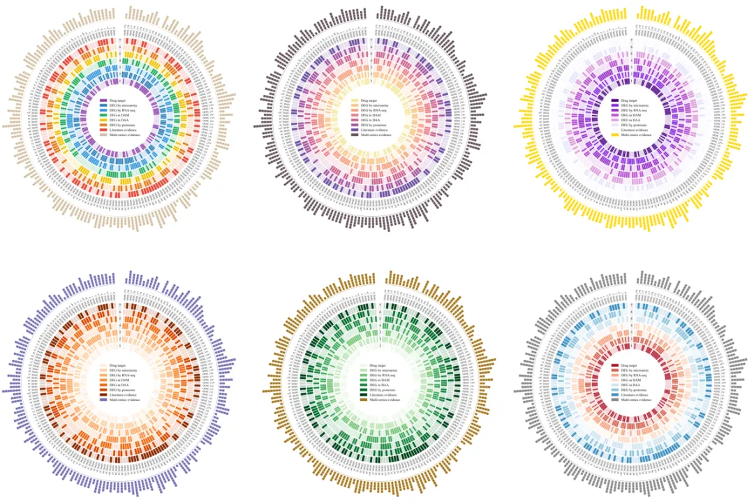
代码绘制成果展示

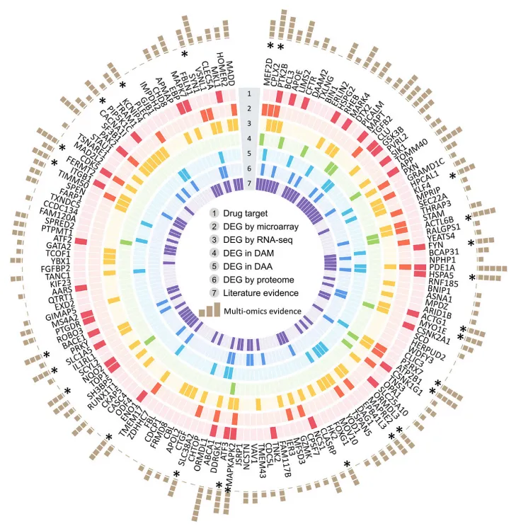
论文原图
Figure 5. Multi-omics observations of 156 prioritized AD-risk genes (alzRGs) by NETTAG Summary of multi-omics validations for all 156 predicted alzRGs (Table S3 and S4). The genes are sorted in predicted score decreasing order (clockwise direction). We have collected seven types of evidence, including drug target, differentially expressed genes (DEG) by microarray studies, DEG by bulk RNA-seq studies, DEG in disease-associated microglia (DAM), DEG in disease-associated astrocyte (DAA), DEG by proteome studies, and literature evidence. There are 126 predicted alzRGs that could be proved as associated with AD with at least one type of evidence.
通过NETTAG方法对156个优先筛选的阿尔茨海默病风险基因(alzRGs)进行的多组学观察该图总结了全部156个预测的alzRGs的多组学验证信息。这些基因按照预测得分的降序(顺时针方向)排列。收集了七种类型的证据,包括:药物靶点、微阵列研究发现的差异表达基因(DEG)、批量RNA测序研究发现的差异表达基因、疾病相关小胶质细胞(DAM)中的差异表达基因、疾病相关星形胶质细胞(DAA)中的差异表达基因、蛋白质组学研究发现的差异表达基因,以及文献证据。结果显示,有126个预测的alzRGs可以通过至少一种证据证明与阿尔茨海默病(AD)相关。
注意:此图只是实现了跟原文的呈现结果的一致性,模拟数据都是随机生成的,使用的时候请阅读原文,后面还会发我自己魔改的,想的是针对一组数据或者多组数据建立不同的模型来分析,看看前几个的影响重要性
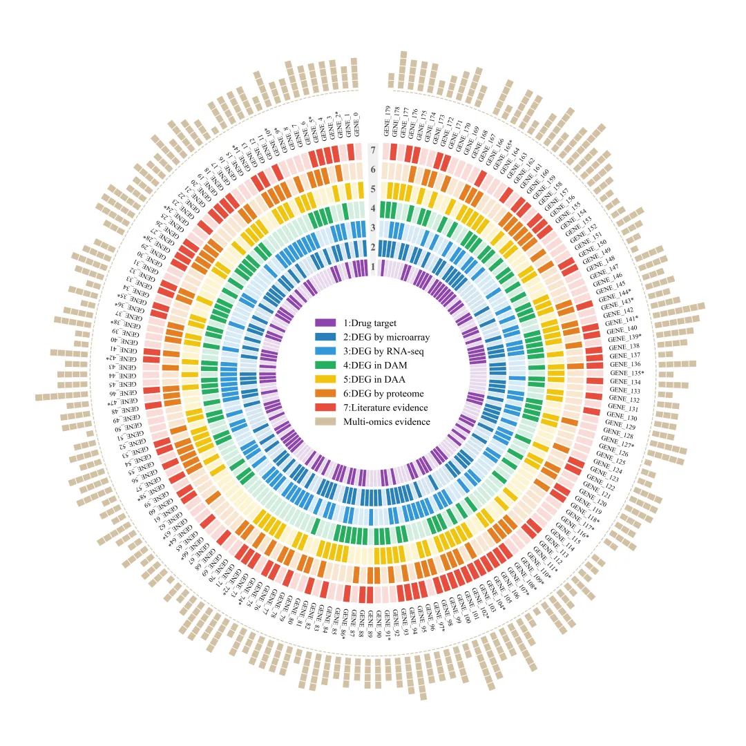
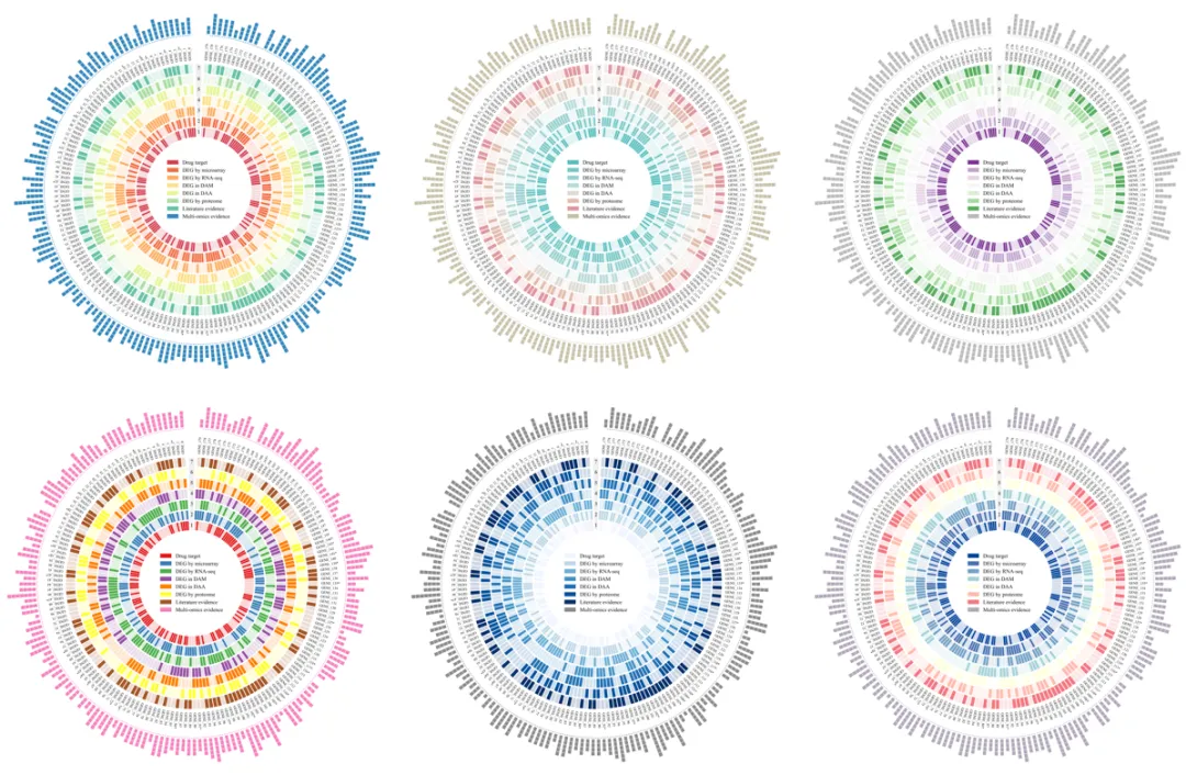
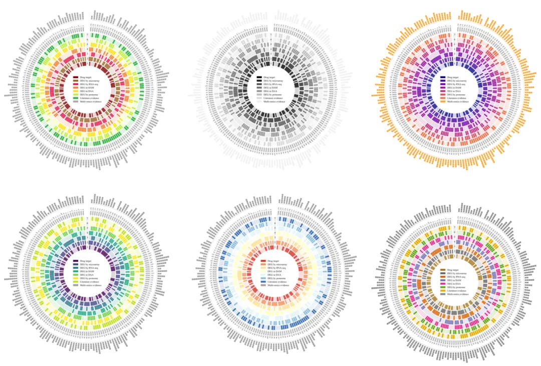
代码解释


第一部分

# =========================================================================================# ====================================== 1. 库的导入 =========================================# =========================================================================================import numpy as npimport matplotlib.pyplot as pltimport matplotlib.patches as mpatchesimport pandas as pdplt.rcParams['font.family'] = 'Times New Roman'import matplotlibmatplotlib.rcParams['pdf.fonttype'] = 42matplotlib.rcParams['ps.fonttype'] = 42

第二部分

# =========================================================================================# ======================================2.颜色库设置=========================================# =========================================================================================COLOR_LIBRARY = {1: {'ring_colors': ['#8E44AD', '#2980B9', '#3498DB', '#27AE60', '#F1C40F', '#E67E22', '#E74C3C'],'bar_color': '#d3c0a3'},}

第三部分

# =========================================================================================# ======================================3.绘图函数=========================================# =========================================================================================def plot_multi_omics_circos(gene_names,heatmap_data,color_scheme_id=1):

第四部分

#获取图层数和基因数num_layers, num_genes = heatmap_data.shapeprint(num_layers, num_genes)# 创建画布fig, ax = plt.subplots(figsize=(16, 16), subplot_kw=dict(projection='polar'))selected_scheme = COLOR_LIBRARY[color_scheme_id] #获取选定的配色方案ring_colors = selected_scheme['ring_colors'] #提取环的颜色列表bar_color = selected_scheme['bar_color'] #提取外部条的颜色ring_thickness = 1.2 #定义单个环的厚度radial_gap = 0.2 #环与环之间的径向间隔#中心空白区域的半径central_hole_radius = 7.0# 计算每个环的半径,环厚度+间隔step_with_gap = ring_thickness + radial_gap#每个环的起始半径位置ring_positions = np.arange(central_hole_radius, central_hole_radius + num_layers * step_with_gap, step_with_gap)#定义顶部开口的大小,使其相当于3个基因特征所占的宽度num_features_in_gap = 3#计算圆环需要划分成多少个小区域total_positions = num_genes + num_features_in_gap#每个小区域平均占用的角度(弧度)angular_width_per_position = 2 * np.pi / total_positions#计算开口的总角度gap_size_rad = num_features_in_gap * angular_width_per_position#环形图的起始角度start_angle = np.pi / 2 + gap_size_rad / 2#环形图的结束角度end_angle = start_angle + (2 * np.pi - gap_size_rad - 0.02)#生成每个小区域的角度坐标theta = np.linspace(start_angle, end_angle, num_genes)width = angular_width_per_position * 0.8 # 计算每个小区域的角度宽度

第五部分

#绘制7层环状热图for layer_idx in range(num_layers): #遍历所有的数据层for gene_idx in range(num_genes): #遍历该层中的所有基因#根据数值1或0确定色块的透明度alpha_value = 1.0 if heatmap_data[layer_idx, gene_idx] == 1 else 0.2#绘制色块ax.bar(x=theta[gene_idx], #角度位置height=ring_thickness, #高度/厚度width=width, #宽度bottom=ring_positions[layer_idx], #起始半径color=ring_colors[layer_idx], #颜色alpha=alpha_value, #透明度align='edge' #从指定的theta角度开始绘制)

第六部分

#绘制最外层的径向堆叠方块图block_height = 0.5 #每个小方块的高度block_spacing = 0.05 #小方块之间的垂直间隙outer_bar_bottom_radius = ring_positions.max() + ring_thickness + 4 #计算最外圈堆叠图的起始半径continue#设置第一个方块的起始半径current_bottom = outer_bar_bottom_radius#根据总数,循环绘制相应数量的堆叠方块for _ in range(num_blocks):#绘制单个方块ax.bar(x=theta[gene_idx], #方块的角度height=block_height, #高度width=width * 0.7, #角度宽度bottom=current_bottom, #起始半径color=bar_color, #颜色align='edge' #从指定的theta角度开始绘制)#更新下一个方块的起始半径位置,这样就可以实现堆叠的效果current_bottom += (block_height + block_spacing)

第七部分

#外围基因/特征标注的半径label_radius = ring_positions.max() + ring_thickness + 0.5rotation = angle_deg #文本的旋转角度ha = 'left' #水平对齐方式else:rotation = angle_deg #文本的旋转角度ha = 'left' #水平对齐方式#添加基因/特征的名称标注ax.text(theta[i] + width / 2, #角度位置label_radius, #半径gene_names[i], #内容,基因/特征的名称rotation=rotation, #文本的旋转角度ha=ha, #水平对齐方式va='center', #垂直对齐方式fontsize=8, #大小rotation_mode='anchor')

第八部分

#绘制虚线圈,分隔开主图与外围的堆叠图的区域#虚线圈的半径dashed_circle_radius = ring_positions.max() + ring_thickness + 3.8#绘制带开口的虚线圈ax.plot(np.linspace(start_angle, end_angle, 200),[dashed_circle_radius] * 200,color=bar_color,linestyle='--',lw=1,zorder=2)#定义开口处灰色背景条的中心角度label_angle = np.pi / 2#灰色背景的颜色gap_gray_color = '#f0f0f0'#灰色背景的高度gray_bar_height = (ring_positions.max() + ring_thickness) - ring_positions.min()#灰色背景的宽度gray_bar_width = 1.5 * angular_width_per_positionax.bar(x=label_angle, #背景条的中心角度height=gray_bar_height, #高度width=gray_bar_width, #宽度bottom=ring_positions[0], #起始半径color=gap_gray_color, #颜色align='center', #居中对齐zorder=0,edgecolor='white', #边缘线颜色linewidth=1 #边缘线宽度)ax.text(label_angle,r,str(i + 1),ha='center',va='center',fontsize=12,fontweight='bold',color='#555555',zorder=3)

第九部分

#图面清理ax.grid(False) #去掉自带网格线ax.set_yticklabels([]) #去掉自带半径的刻度标签ax.set_xticklabels([]) #去掉自带角度的刻度标签ax.spines['polar'].set_visible(False) #去掉自带外围黑圈max_stack_height = num_layers * (block_height + block_spacing) #计算最外层堆叠的最大高度max_radius = outer_bar_bottom_radius + max_stack_height #计算图表所需的最大半径ax.set_ylim(0, max_radius + 2) # 设置半径的显示范围#添加图例#定义与图片匹配的图例标签layer_labels = ['1:Drug target','2:DEG by microarray','3:DEG by RNA-seq','4:DEG in DAM','5:DEG in DAA','6:DEG by proteome','7:Literature evidence'] # 列表定义结束#创建图例用的色块ring_patches = [mpatches.Patch(color=ring_colors[i], label=layer_labels[i]) for i in range(num_layers)]#为最外圈的堆叠图创建图例bar_patch = mpatches.Patch(color=bar_color, label='Multi-omics evidence')#将所有图例元素合并all_patches = ring_patches + [bar_patch]#添加图例ax.legend(handles=all_patches,loc='center',frameon=False,fontsize=12)

第十部分

# =========================================================================================# ======================================4.程序执行部分=========================================# =========================================================================================if __name__ == '__main__':select_color = 9 #要使用的配色方案编号#文件路径excel_filename = r'data.xlsx'#读取df= pd.read_excel(excel_filename, index_col=0)#提取基因/特征名列表gene_names_from_excel = df.index.tolist()#提取热图数据,注意:绘图函数需要的数据形状是 (层数, 基因数),而Pandas读取的DataFrame是 (基因数, 层数),因此需要进行转置 (.T)heatmap_data_from_excel = df.values.T#调用函数进行绘图plot_multi_omics_circos(gene_names=gene_names_from_excel, #传入基因名数据heatmap_data=heatmap_data_from_excel, #传入热图数据color_scheme_id=select_color #配色方案)

如何应用?

1.选择配色方案:
select_color =20#要使用的配色方案编号2.设置文件的路径:
excel_filename = r'E:\公众号素材\多重检验环形图\multi_omics_data.xlsx'3.设置绘图结果的保存路径:
png_filename = fr'\{select_color}.png'pdf_filename = fr'\{select_color}.pdf'

推荐


获取方式