期刊图片复现|Python绘制shap交互特征网络图
- 2026-10-11 06:15:37
期刊图片复现|Python绘制shap交互特征网络图

论文:非洲地域功能空间演变的时空分异与驱动机制——基于时序遥感数据和可解释机器学习分析 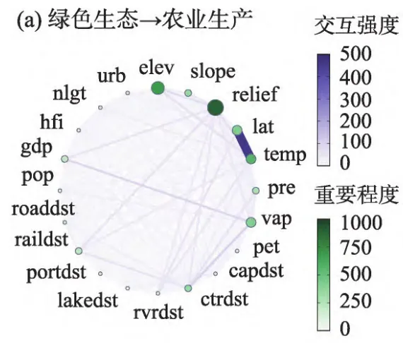
论文原图 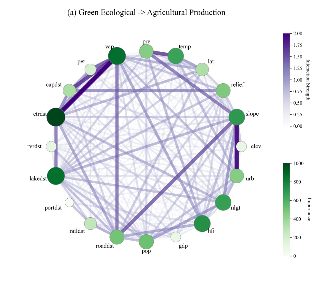
仿图 这张环形网络图展示了不同因子对目标影响的特征重要性及其相互间的交互作用。图中圆点代表各个特征变量,节点的大小和颜色的深浅对应其特征重要性的大小,其中vap、ctrdst、lakedst和hfi等节点颜色最深且体积较大,表明它们是关键主导因素。节点之间的连线表示特征间的交互强度,线条越粗且颜色越深代表交互效应越强。 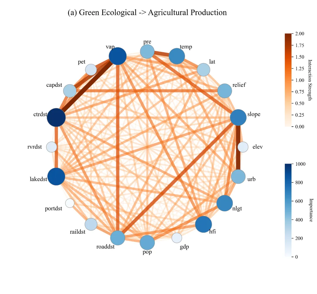
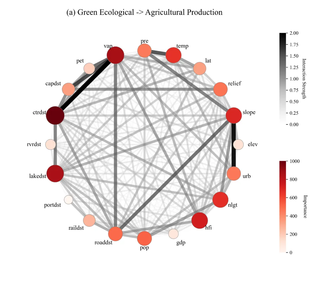
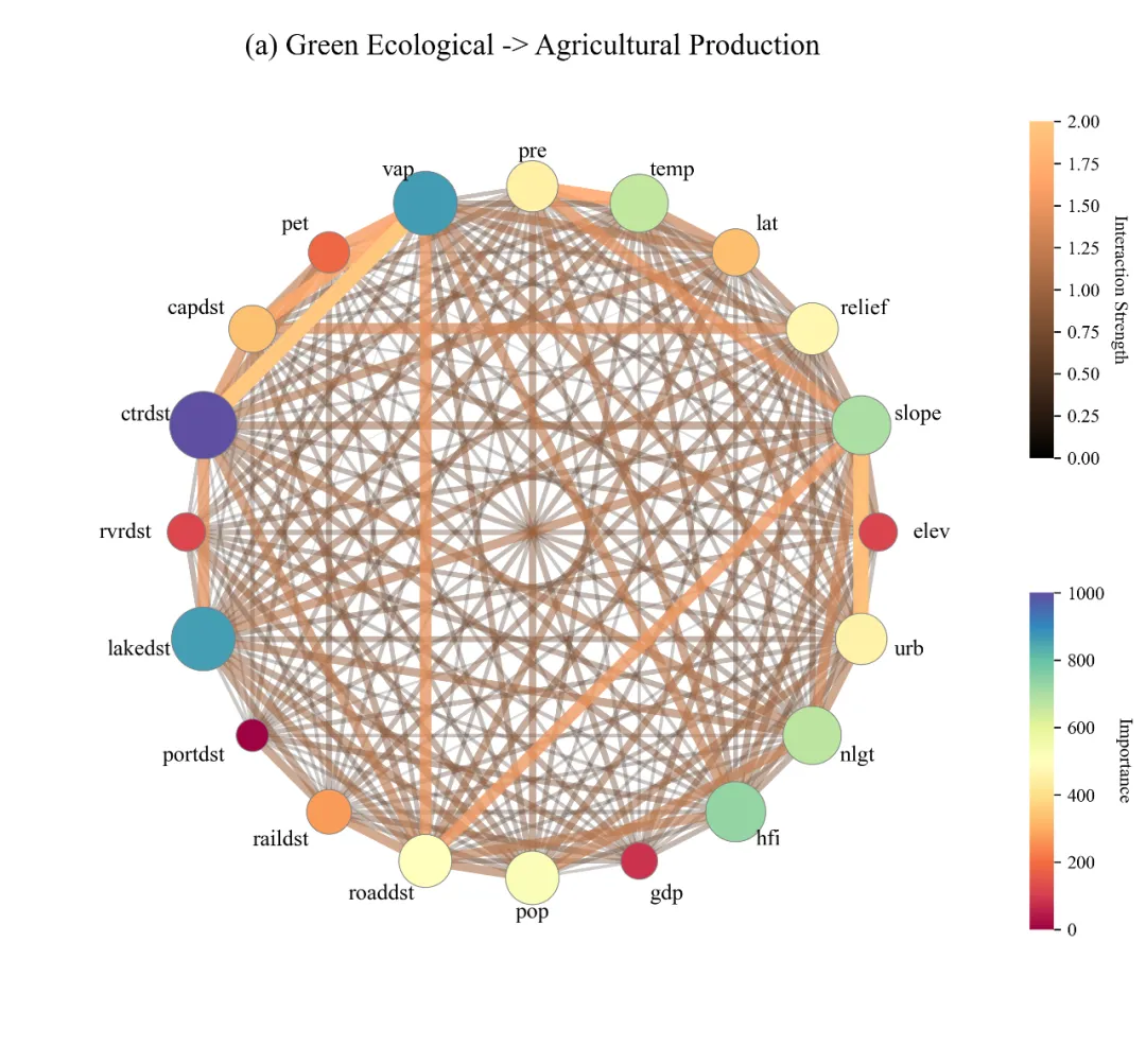
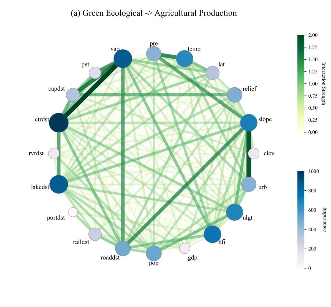
多种配色 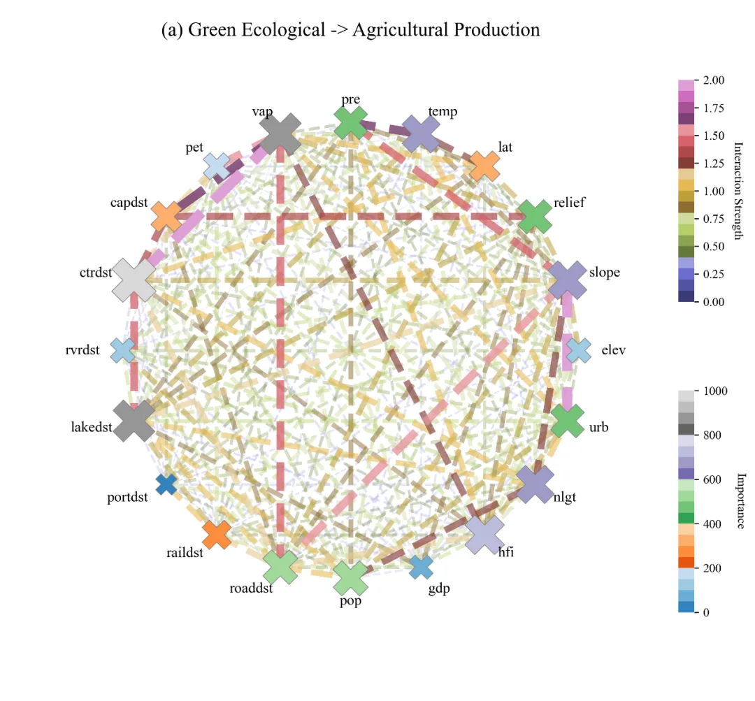
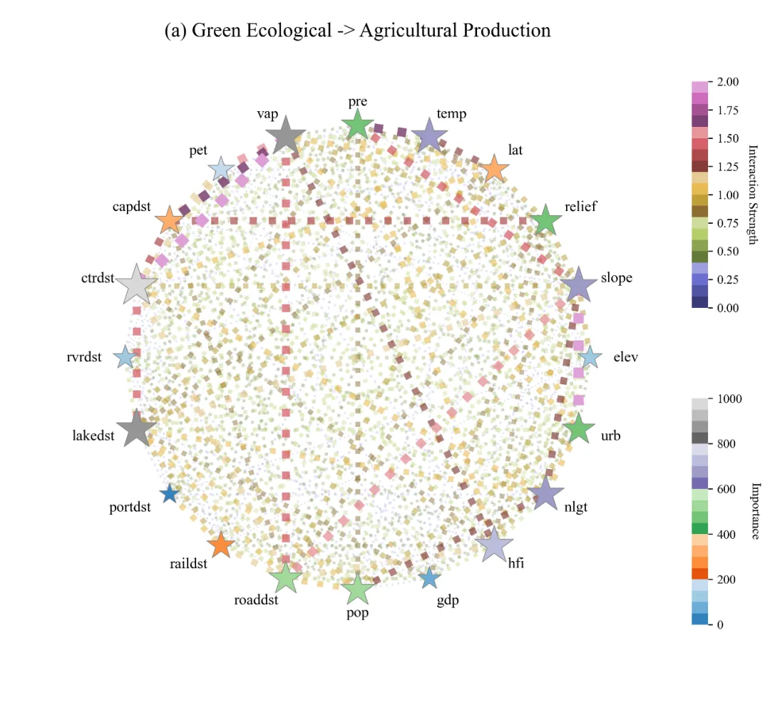
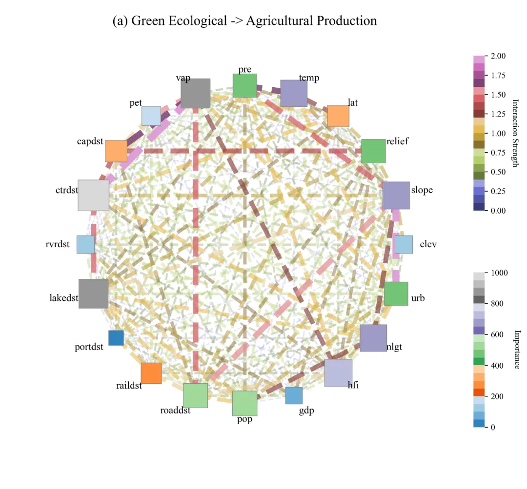
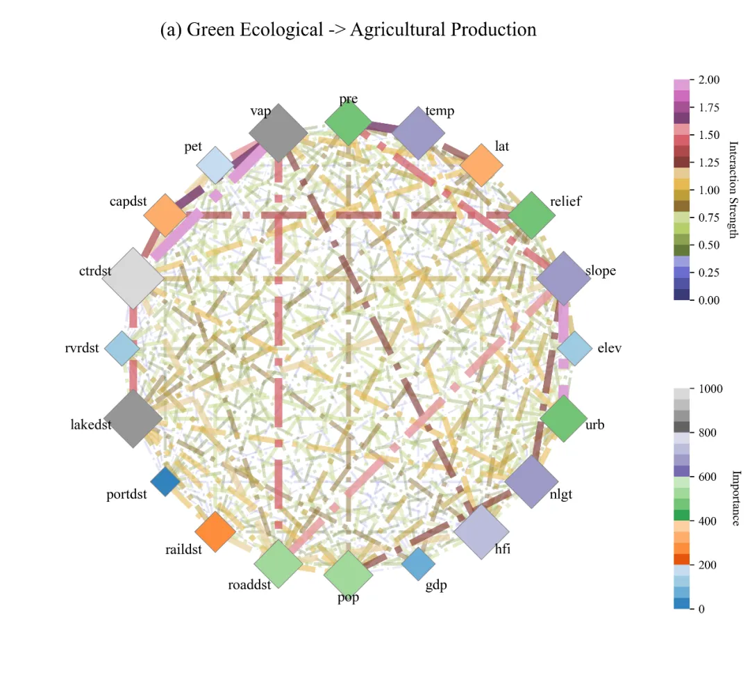
多种形状标记方案 


库的导入以及字体设置 

颜色库的设置以及配色方案的选择 

形状标记库的设置以及标记方案的选择 

原始数据的加载以及特征变量和目标变量的定义 

数据的划分以及模型的构建 

shap分析 

绘图函数 

调用绘图函数进行绘图 



期刊图片复现|Python绘制二维偏依赖PDP图 期刊复现|python绘制基于SHAP分析和GAM模型拟合的单特征依赖图 期刊图片复现|python绘制带有渐变颜色shap特征重要性组合图(条形图+蜂巢图) 期刊复现|用Python绘制SHAP特征重要性总览图、依赖图、双特征交互效应SHAP图,解锁XGBoost模型的终极奥秘 期刊图片复现|Python绘制shap重要性蜂巢图+单特征依赖图+交互效应强度气泡图+交互效应依赖图(回归+二分类+分类) 

需要的请后台私信我获取详细信息,注意只会分享练习数据和代码文件,不会提供答疑服务,代码文件中已经包含了每行代码的完整注释!!!
代码绘制成果展示
代码解释
第一部分
# =========================================================================================# ====================================== 1. 环境设置 =======================================# =========================================================================================import numpy as npimport pandas as pdimport xgboost as xgbimport shapimport matplotlib.pyplot as pltimport matplotlib.colors as mcolorsimport networkx as nximport warningsfrom sklearn.model_selection import train_test_split, GridSearchCVwarnings.filterwarnings("ignore", category=DeprecationWarning)warnings.filterwarnings("ignore", category=UserWarning)import matplotlibmatplotlib.rcParams['pdf.fonttype'] = 42matplotlib.rcParams['ps.fonttype'] = 42plt.rcParams['font.family'] = 'serif'plt.rcParams['font.serif'] = ['Times New Roman']plt.rcParams['axes.unicode_minus'] = False
第二部分
# =========================================================================================# ======================================2.颜色库=======================================# =========================================================================================COLOR_SCHEMES = {1: {'nodes': plt.cm.Greens, 'edges': plt.cm.Purples},}scheme_index = 20 #颜色方案
第三部分
# =========================================================================================# ======================================3.形状标记库=======================================# =========================================================================================MARKER_STYLE_SCHEMES = {1: {'marker': 'o', 'linestyle': '-'},}style_key =1#形状标记方案
第四部分
# =========================================================================================# ======================================4.数据加载=======================================# =========================================================================================#原始数据路径file_path = r'mock_data.xlsx'#读取数据df = pd.read_excel(file_path)#目标变量y = df.iloc[:, -1]#特征变量X = df.iloc[:, :-1]#获取特征列的名称并转换为列表features = X.columns.tolist()print(f"特征: {features}")print(f"数据类型: {X.shape}")
第五部分
# =========================================================================================# ======================================5.数据划分及模型构建=======================================# =========================================================================================#划分训练集和测试集X_train, X_test, y_train, y_test = train_test_split(X, y, test_size=0.2, random_state=42)#超参数网格param_grid = {'max_depth': [4, 6, 8],'learning_rate': [0.05, 0.1, 0.2],'n_estimators': [50, 100, 150]}#初始化XGBoost 回归模型xgb_model = xgb.XGBRegressor(random_state=42, n_jobs=-1)#初始化网格搜索对象grid_search = GridSearchCV(estimator=xgb_model, param_grid=param_grid, cv=5, scoring='neg_mean_squared_error',verbose=1)#在训练集上拟合grid_search.fit(X_train, y_train)print(f"最佳参数: {grid_search.best_params_}")#获取最佳模型best_model = grid_search.best_estimator_
第六部分
# =========================================================================================# ======================================6.SHAP分析=======================================# =========================================================================================#使用最佳模型创建SHAP树解释器explainer = shap.TreeExplainer(best_model)#测试集的SHAP交互值shap_interaction_values = explainer.shap_interaction_values(X_test)#测试集的SHAP值shap_values = explainer.shap_values(X_test)#特征重要性,绝对值后的平均值feature_importance = np.abs(shap_values).mean(axis=0)# 对特征重要性进行归一化处理importance_norm = (feature_importance - feature_importance.min()) / (feature_importance.max() - feature_importance.min())# 将归一化后的重要性缩放到 0-1000 范围importance_scaled = importance_norm * 1000# 计算平均交互矩阵,绝对值后的平均值mean_interaction_matrix = np.abs(shap_interaction_values).mean(axis=0)# 将对角线元素填充为 0,忽略特征自身的交互np.fill_diagonal(mean_interaction_matrix, 0)
第七部分
# =========================================================================================# ======================================7.绘图函数=======================================# =========================================================================================def plot_circular_interaction(features, importance, interaction_matrix,scheme_index=1,):#获取当前颜色方案current_color_scheme = COLOR_SCHEMES.get(scheme_index, COLOR_SCHEMES[1])#获取节点的颜色映射cmap_nodes = current_color_scheme['nodes']#获取连线的颜色映射cmap_edges = current_color_scheme['edges']#获取样式方案current_style_scheme = MARKER_STYLE_SCHEMES.get(style_key, MARKER_STYLE_SCHEMES[1])#获取节点形状标记node_marker = current_style_scheme['marker']#获取连线样式edge_linestyle = current_style_scheme['linestyle']#创建画布fig, ax = plt.subplots(figsize=(12, 10), subplot_kw={'aspect': 'equal'})#标签的坐标label_pos = {k: (v * 1.1) for k, v in pos.items()}#定义节点颜色的归一化范围norm_nodes = mcolors.Normalize(vmin=0, vmax=1000)#获取交互矩阵中的最大值max_interaction = interaction_matrix.max()#定义边颜色的归一化范围norm_edges = mcolors.Normalize(vmin=0, vmax=max_interaction)# 初始化交互列表interactions = []# 遍历特征for i in range(n_features):for j in range(i + 1, n_features):#两个特征之间的交互强度strength = interaction_matrix[i, j]# 如果交互强度大于 0if strength > 0:# 将交互对和强度添加到列表中interactions.append((features[i], features[j], strength))# 根据强度对交互列表进行排序interactions.sort(key=lambda x: x[2])# 遍历排序后的交互列表for u, v, strength in interactions:#根据强度获取线的颜色color = cmap_edges(norm_edges(strength))#线的粗细width = 0.5 + (strength / max_interaction) * 8#线的透明度alpha = 0.1 + (strength / max_interaction) * 0.9#绘制线nx.draw_networkx_edges(G,pos,edgelist=[(u, v)],width=width,edge_color=[color],style=edge_linestyle,alpha=alpha, ax=ax)# 初始化节点颜色列表node_colors = []# 初始化节点大小列表node_sizes = []# 遍历每个特征for i, feat in enumerate(features):#获取该特征的重要性imp = importance[i]#计算并添加节点颜色node_colors.append(cmap_nodes(norm_nodes(imp)))#计算并添加节点大小node_sizes.append(300 + imp * 1.0)# 遍历标签位置字典for node, (x, y) in label_pos.items():ha = 'center'#水平对齐方式#如果 x 坐标在右侧if x > 0.1:ha = 'left'# 设置左对齐#如果 x 坐标在左侧elif x < -0.1:ha = 'right'# 设置右对齐#绘制标签文本plt.text(x,y,node,size=12,horizontalalignment=ha,verticalalignment='center')#关闭坐标轴ax.axis('off')#x轴显示范围ax.set_xlim(-1.5, 1.5)#y轴显示范围ax.set_ylim(-1.5, 1.5)#标题plt.title('(a) Green Ecological -> Agricultural Production', y=0.95, fontsize=16, fontname='Times New Roman')# 定义边颜色条的位置,左,下,宽,高cbar_edge_pos = [0.82, 0.55, 0.015, 0.25]# 创建一个新的轴用于放颜色条cax_edge = fig.add_axes(cbar_edge_pos)#创建边颜色的标量映射对象sm_edge = plt.cm.ScalarMappable(cmap=cmap_edges, norm=mcolors.Normalize(vmin=0, vmax=int(max_interaction)))# 设置空数组sm_edge.set_array([])#绘制线的颜色条cbar_edge = plt.colorbar(sm_edge, cax=cax_edge)#设置线的颜色条的标签cbar_edge.set_label('Interaction Strength', rotation=270, labelpad=15, fontsize=10, fontname='Times New Roman')#去掉线的颜色条的轮廓线cbar_edge.outline.set_visible(False)#节点颜色条的位置cbar_node_pos = [0.82, 0.20, 0.015, 0.25]#添加节点颜色条的轴cax_node = fig.add_axes(cbar_node_pos)#创建节点颜色的标量映射对象sm_node = plt.cm.ScalarMappable(cmap=cmap_nodes, norm=norm_nodes)#设置空数组sm_node.set_array([])#绘制节点颜色条cbar_node = plt.colorbar(sm_node, cax=cax_node)#设置节点颜色条的标签cbar_node.set_label('Importance', rotation=270, labelpad=15, fontsize=10, fontname='Times New Roman')#去掉节点颜色条的轮廓线cbar_node.outline.set_visible(False)#保存save_path_png = fr"{style_key}_scheme{scheme_index}.png"save_path_pdf = fr"{style_key}_scheme{scheme_index}.pdf"plt.savefig(save_path_png, dpi=300, bbox_inches='tight')plt.savefig(save_path_pdf, bbox_inches='tight')
第八部分
if __name__ == "__main__":#调用绘图函数plot_circular_interaction(features,importance_scaled,mean_interaction_matrix,scheme_index=scheme_index)
推荐
1.选择你想要使用到的配色方案:
scheme_index = 1#颜色方案2.选择你想要使用到的形状标记方案:
style_index=1#形状标记方案3.设置元数据的路径:
file_path = r'data.xlsx'4.定义好你得特征变量以及目标变量:
#目标变量y = df.iloc[:, -1]#特征变量X = df.iloc[:, :-1]
5.划分好训练数据以及验证数据:
X_train, X_test, y_train, y_test = train_test_split(X, y, test_size=0.2, random_state=42)6.设置好超参数的范围:
param_grid = { 'max_depth': [4, 6, 8], 'learning_rate': [0.05, 0.1, 0.2], 'n_estimators': [50, 100, 150]}7.定义绘图结果的保存路径:
save_path_png = fr"{style_index}_scheme{scheme_index}.png"save_path_pdf = fr"{style_index}_scheme{scheme_index}.pdf"
推荐
获取方式
本文来自网友投稿或网络内容,如有侵犯您的权益请联系我们删除,联系邮箱:596563534@qq.com 。
